Play game
Typo Delivery Service's itch.io pageResults
| Criteria | Rank | Score* | Raw Score |
| Enjoyment | #52 | 3.353 | 3.353 |
| Presentation | #65 | 3.471 | 3.471 |
| Overall | #65 | 3.397 | 3.397 |
| Concept | #67 | 3.412 | 3.412 |
| interpretation of the Limitation | #70 | 3.353 | 3.353 |
Ranked from 17 ratings. Score is adjusted from raw score by the median number of ratings per game in the jam.
Team members
mtrovy (programming) and catamariii (2D sprites). a friend composed the background music but didnt want credits
Software used
Godot
Use of the limitation
The nature of the game is very chaotic. Most of the elements are random, i.e the lanes in which the boxes will spawn and what keys you need to press to balance the stacks of boxes
Cookies eaten
0
Leave a comment
Log in with itch.io to leave a comment.


Comments
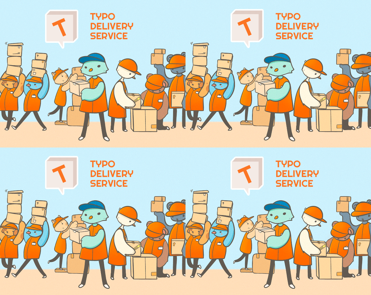
Simple but fun! I wish it had more feedback effects. And without a doubt, the most stylish cover image of the jam.
Score: 440 It was challenging to multitask at first :D but it was ok with a bit of training.
I don't know if you tried to but I would'e find interesting to map each box really syn with the beat of the music to add more rythm to get those DDR vibes :)
Nice job
Fast paced gameplay. Good animations and art style. chaotic speeds. Something different imo!
Silly, pretty good!
The characters are super cute, and I like your concept with the typing, it makes the game even more intense! Also the miniature of your game is really adorable. Great game!
Cool little game I like the art :)
Very enjoyable game! Concept and gameplay matches limitaion well, and the art is also cute o//
I think this was a very solid game idea and was well executed. The visuals and music worked well together. One thing I’d consider adding is some punishment for typing the wrong key when a tower is about to fall over. I wouldn’t make them lose a life immediately, just something to add more chaos like reducing the timer to type correctly or starting a timer for another tower to topple. I think this could make a minor improvement on an already great game. Good work!
Simple but fun game with adorable characters!
Very interesting game and love the graphics!
I love the graphical style - the simple 3d elements combined with some great looking 2d characters. And can't complain about that title screen! (expect maybe the white title blending with the soft blue background...)
Interesting idea, dividing the game straight in half with managing both the box holders and the box catchers. Multi-tasking is a challenge for me, so I tried my best and stopped at around 300.
What would be needed is more indications of losing lives and overall UI work, to make some things stand out more.
Good entry nonetheless! Really nice game you have here.
For some reason, I can't get the tower to disappear. Great graphics. The drawings are really cute!
I really enjoy it, I like the "paper" type graphics mixed with the 3D environment, I feel that there are not many games that use it and I think that gives it extra points, something that I like but I dislike is the perspective of the boxes because although sometimes it frustrates me not knowing where to place myself, it gives it a good spark of difficulty, I also think that the way to move the character is somewhat strange but I like it, in addition to the fact that the characters are very adorable, I do not feel that it fits very fine with the limitation but I feel that regarding the overload issue, I don't know if it was intentional, but you applied it in a very creative way
I thought it was a good game and I think it could even be something bigger
So, you definitly need to make it more clear to the player that they took damage. At my first death, i did not realize why i died, as the ui is very unnoticable. Also, the graphics are nice, but dont mix that with pixel art, that just doesnt work out. And this game doesnt seem that chaotic, although the limitation is "Chaos is everything". It was fun though.