Play game
Reakt's itch.io pageResults
| Criteria | Rank | Score* | Raw Score |
| interpretation of the Limitation | #36 | 3.727 | 3.727 |
| Overall | #83 | 3.205 | 3.205 |
| Presentation | #87 | 3.182 | 3.182 |
| Enjoyment | #93 | 2.909 | 2.909 |
| Concept | #99 | 3.000 | 3.000 |
Ranked from 11 ratings. Score is adjusted from raw score by the median number of ratings per game in the jam.
Team members
Me, myself and I
Software used
Unity
Use of the limitation
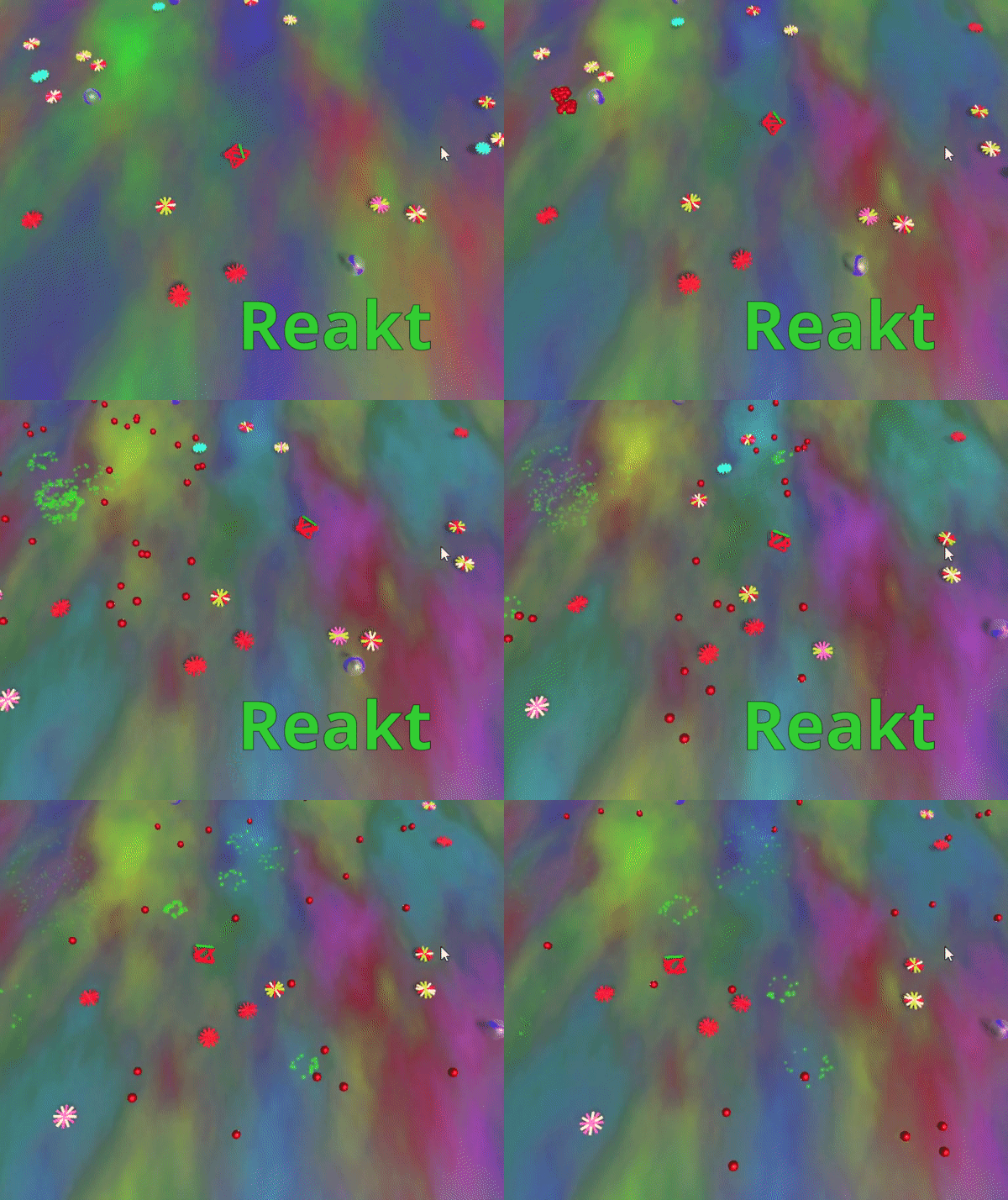
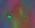
Random bullets = hell
Cookies eaten
0
Leave a comment
Log in with itch.io to leave a comment.


Comments
chaos indeed. I sure got reakt. this was fun
I was waiting for this comment!! It's technically pronounced "RE-ACT" XD
oh, cool! haha well in that case, I sure didn't REAKT fast enough
I like the health bar on the player allthough it's hard to see so I would also put a healthbar. Unfortunately when you teleport you risk getting damaged, you might want to teleport to a "safer" position. But I can see the concept and I think its nice :)
Thank you!
Interesting art style. I sure got reakt half the time when I teleported...
That was supposed to be part of the chaos, but I didn't realize how annoying they are (play testers are important!)
I like the audio used in this :)
Thanks! I released some of my soundtracks for free here you can check em out if you are interested!
Good chaos, great music. Might work better as a faster paced 2d game.
Do you have an mp3 of the music? I would buy it to use in games. I would buy it just to listen to it. You should put it on itch.
Thanks for playing! You are not the first to tell me that so I have setup a page now where you can download the music for free here. I didn't have time to master it or anything (I recently setup my new studio yesterday !! ), but eventually I might go back and make it nice. Feel free to use it in your games or I can make you some new (and hopefully better) music cheers! XD
Thank you!!!
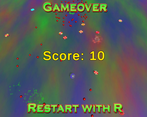
Fully embraced the limitation, it was quite chaotic. I played through a few times finally being able to get the a score of 8.
A small improvement might be including the players current health. But thinking about it more it might be left out by design
The player slowly turns red as you lose health. I thought about adding a health bar, but I didn't really want to build alot of UI purposefully for this project.
ohh the aesthetics were definitely on point, especially the music brought it all together imo. i feel like one to improve this would be making it easier to predict where a teleporter will take you? so it's still chaotic because the teleporters are randomly spawned inside all that mess and the game will feel more fair, but that's just my opinion. but still, fun!
I fully agree! Thanks for playing :)
That was fun, I like the aesthetics! Though I don't really like the teleporters
Thanks for playing!
Felt like everything was pretty slow, but had a fun time nonetheless! The teleporters didn't feel like they added too much though.
Really nice looking style though, felt retro, as if I was playing a Windows 98 screensaver
Thanks for playing! I think the sheer number of rigid bodies slowed down the game a bit. I don't really have proper bounds so the culling distance isn't great, but even without fixing that I agree it could be faster. The teleporters were supposed to be my main game mechanic, but as they were not that fun I moved away from using them as a core mechanic. Thanks :)
Fun little game, I like the 2.5D style and the bullet patterns are fun, one thing is that I don't really like the nature of the teleporters, sometimes they'll take you straight into danger.
Because CHAOS! With more time I would have had coins that added to your score instead of using the teleporters. Actually I probably should've just made sure they didn't teleport you ontop of enemies, but I wasn't keeping track of enemy position and by the time I got back around to fixing the teleporters I was out of time xd. Thanks for playing!
haha, yes that was fun, and I also agree with the comment below
I like the aesthetics of the game! :)