Play game
Lonely Little Reaper's itch.io pageResults
Criteria | Rank | Score* | Raw Score |
Use of the Limitation | #1 | 4.250 | 4.250 |
Overall | #2 | 4.083 | 4.083 |
Concept | #3 | 4.250 | 4.250 |
Presentation | #4 | 4.167 | 4.167 |
Enjoyment | #14 | 3.667 | 3.667 |
Ranked from 12 ratings. Score is adjusted from raw score by the median number of ratings per game in the jam.
Team members
Lifeless Carrot
Software used
Unity engine for the development, piskel for the art, beepbox and jsfxr for sound.
Use of the limitation
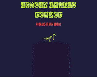
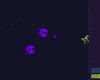
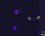
I created a 2d arena shooter about climbing out of the underworld. The player can only move up.
Cookies eaten
I have eaten 12 bags of pillsbury mini chocolate chip cookies during the span of my games development.
Leave a comment
Log in with itch.io to leave a comment.
Comments
Great feel on the shooting
Woahh!! The screen shake was amazing !!
Nice submission!! Visuals and the sound effects are nice!!
Nice concept :) I like idea with climbing and shooting. Graphic style fit to game. Sounds are nice. I really like the randomness of enemies stats. Also I like chest with upgrades :D Well done!
really liked the game one of the best in the jam tho i would recommend placing the ui on the left side of the screen because some writing is blocked by it and also a more visual indication of a successful block like the skulls fading to white when hitting the block or something
but otherwise a great concept and game overall!
Wow I really love it! Cool vibe and concept!
I really like the concept of climbing a wall while you're being attacked by monsters. Enjoyed playing this, it was a bit hard but that's what made it fun. There was a time when I was hit by a bullet while I was near the chest and the menu was open and I died which seemed unfair. Also, sometimes the menu buttons don't respond. Great entry overall!
well done art for your game was pretty hard to kill the enemies fast enough to prevent them from shooting a crap tone at me. Liked the spread shot could go nuts with it but still took to long to kill the enemies so didn't much further up then the 3 chest. As other have said the font was a bit hard to read was a bit better on fullscreen.
But anyways good job on your game.
Thanks! I had the same issue when testing, but I couldn't think off a way to fix that, I tried making the shield bigger, but the game quickly got too easy. I think maybe having it as an upgrade might have solved it(Maybe a difficulty slider?), but I already had my hands full with all the other upgrades. Either way I appreciate the feedback and will try to keep that in mind when working on my next game!
you are welcome . hard to get balancing just right on a game jam game. Best of luck on your next game and patching this game if you are going to do that
Neat graphics indeed. I really like the atmosphere and the simple mouse only controls. The game gets very challenging later on when enemies are spread apart and your small shield can't cover all their bullets:
One small complaint is that the font is a bit hard to read with that back highlight style. Other than that the game is fun and well made.
Very cool game overall. Good job
I agree! but I was really digging the font, so I did not really want to change it up, I think I should have made the background a lighter color to make the text easier to read, at the end of the day, we are all here to find and improve on our mistakes. I appreciate the feedback!
I adored the visuals of this game! Solidly made as well!
I appreciate it!