Play game
Stick & Stick's itch.io pageResults
Criteria | Rank | Score* | Raw Score |
Concept | #7 | 3.917 | 3.917 |
Use of the Limitation | #11 | 3.833 | 3.833 |
Overall | #15 | 3.646 | 3.646 |
Presentation | #27 | 3.667 | 3.667 |
Enjoyment | #31 | 3.167 | 3.167 |
Ranked from 12 ratings. Score is adjusted from raw score by the median number of ratings per game in the jam.
Team members
Frieda
Software used
Unity
Use of the limitation
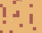
In order to finish the level, the player needs to move upwards. (I know, very original.)
Cookies eaten
This project wasn't really on the cookie monster tryhard level, so none. :/
Leave a comment
Log in with itch.io to leave a comment.
Comments
Well rounded game with the sound effects and nice simple graphics, however it is quite frustrating due to the lenght of the level
Nice game! I would suggest making a Unity WebGL build in the future to make it easier to play. You must have taken some inspiration from
Kuru Kuru Kururin
Thanks for your advise! Ill look into the WebGL for my next Project. I actually never heard of that game. But it does look similar lol.
Really good game! I kept making mistakes until I realized that A means clockwise and D means counter-clockwise. The graphics and music are spot on for a game like this. I can see myself playing it for hours. Nice work!
Thanks for your comment! Im so glad you liked it.
Nice ideia! Loved the music and sounds too. The gameplay is a little trick at the begining, but i learned fast! Nice submisison
nice game the controls got me killed a few times switched and went the wrong direction and bang a wall or a ledge. But it is differently different from the other games I have played so far this jam good jib
Nice and funny game, but controls are flipped and non intuitive because of that.
Thanks for your comment :). Well the input is flipped bc it rotates around so no matter how it can only be 50 percent right and then 50 percent flipped uk? I think I'm gonna add some UI to make it easier to understand.
Yeah I understand, but it was counter intuitive for me. Based on the comments here it seems that I'm not the only one. Try to just reverse the controls, should be better in my opinion.
I love the concept to the point where I would play a full game like this! My only issue is with the controls getting flipped and feeling weird, but the music and challenge more than made up for it!
Im so glad you liked it! Ya the flipping of the controls is a little problem rn xD
the implementation was great ,the game gives a good vibe with the music and colors chosen, and the gameplay was tricky at first to get used to, but then it was really fun. great game
Thank you :)
Very nice gameplay idea ! and good use of the limitation. maybe its just me but it would be nice if you added an UI Element or something that shows which direction you move next when pressing S and A. nice work
Thanks for your feedback! Yeah that with the UI is a good idea :)