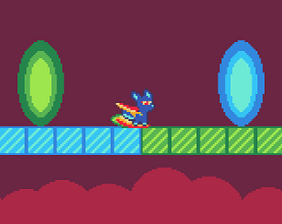
Nice challenging platformer! It was really satisfying feeling to hit off of the enemies! Nice game!
Play game
Cyber Surf's itch.io pageResults
| Criteria | Rank | Score* | Raw Score |
| Enjoyment | #10 | 3.538 | 3.538 |
| Presentation | #11 | 3.769 | 3.769 |
| Concept | #16 | 3.538 | 3.538 |
| Overall | #17 | 3.423 | 3.423 |
| Use of the Limitation | #30 | 2.846 | 2.846 |
Ranked from 13 ratings. Score is adjusted from raw score by the median number of ratings per game in the jam.
Team members
LaggyFox
Software used
Godot, Aseprite
Use of the limitation
Left mouse click makes you both attack and move around
Cookies eaten
0
Comments
Amazing platformer! Had flashbacks from hollow knight path of pain! Great job!
Wow, Your game is soo juicy and satisfying! I think the controls are a bit slippery but other than that, awesome gameplay
I love the idea and the game is definately a challenge 😅
I did play this when the submission first came out but really struggled so thought I would try again. Tried it now and still cant get very far. I feel that might very much be a me issue though just not having the skills needed 😂
Love the art style and the player character looks so cool/cute😎🎨
Thanks for the feedback!
Nah, I think I'm the issue here, grew up on games like Rayman 1 which are much harder than this game, so my perspective is kind of whack when it comes to difficulty. You can see the difficulty mentioned in other comments as well.
Will try to balance things out better next time, glad you liked the other aspects of the game though, and that you even played it twice :)
This game is making me rage, ahahahahaha. But I liked it! A very interesting action platformer, perfect for those who enjoy a good challenge
It took me a bit to figure out how the character moves when you click, but once I got it, the flow and feel of the game were awesome. It would be cool if the cursor changed to an icon pointing left or right depending on which way the character will go, along with other indicators like highlighting what's an enemy or making the type of floor that makes you lose more obvious. I really liked how the game quickly gets you back in when you lose so you can keep playing
The controls certainly took some getting used to, but once I got the hang of it, everything worked pretty well. In that sense, if anything, I'd say this game had too many buttons. The turrets role as enemies was pretty underwhelming for me. I don't think I ever hit a turret for the purpose of stunning it, although i would sometimes jump to them earlier than I had to, to negate the possibility their random shot would snipe me on the way in.
Really nice level design. Good difficulty scaling, if a bit on the harsh side. Ended in a good place.
For things I might change, first, if I could get away without having to use the mouse for the slash attack, sort of similar to Celeste's four direction dashing, I would consider using that with a larger aoe on the attack to simplify the controls, although the existing controls do work once you get a hang of them. I managed to catch on eventually, but I imagine some people would have a really rough time of it.
Secondly, this game has a lot of red going on, although you made good use of changing the values so it still reads very well. I'd look into taking the red out of the background and floor options red floortiles and reserve it for enemies their attacks, and the wall hazards. While everything worked, the green wall hazards especially didn't read that great at the edge of my vision depending on the wall color. It was a nice way to break up the monotony to have multiple wall colors to work with though.
It would also be nice if the camera moved ahead of you a bit based on your recent movement trend, especially when you are moving downward. With less visible screen, and the tendency to bounce up when you slashed something, the downward sections seemed a bit unplayable.
As a bonus, just a touch of movement in the clouds, whether in the parallax style, a slow pan, or both, would have been nice. In general though, the clouds were a great look for the background.


Leave a comment
Log in with itch.io to leave a comment.