Play game
Dijkstra Inc.'s itch.io pageResults
| Criteria | Rank | Score* | Raw Score |
| Graphics/Animation | #9 | 4.083 | 4.083 |
| Technical Implementation | #13 | 3.417 | 3.417 |
| Overall | #13 | 3.467 | 3.467 |
| Music/Sound | #17 | 3.333 | 3.333 |
| Fun/Design | #24 | 3.000 | 3.000 |
| Theme/Limitation | #25 | 3.500 | 3.500 |
Ranked from 12 ratings. Score is adjusted from raw score by the median number of ratings per game in the jam.
How does your game apply the limitation and theme?
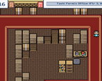
You are a delivery boy who just has to find bosses in the office to bring supplies to. Many values decay as time goes on - satisfaction (timeliness) of your deliveries, the money you can earn for the delivery, and your energy to be able to do deliveries. Your energy affects your speed.
Team Size
Solo (1)
Engine
Godot
Which diversifiers did you use, if any?
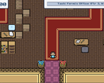
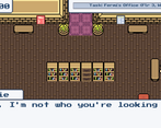
Who Needs Pixels? - the graphics are all 16x16 or less (or made of meta-tiles of 16x16).
Leave a comment
Log in with itch.io to leave a comment.


Comments
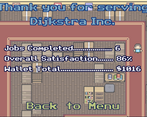
I liked the Zelda-esque look! But man this game was draining... I trudged along until the character quit, but I was ready to throw in the towel long before he did. Together we got in 12 deliveries with an 82% satisfaction. Oh, one thing that happened that was kind of funny but also glitchy, one of the NPCs trapped me when I was talking to one of the people I needed to complete the delivery, I think it was Kepler.
I definitely understand this game being draining. I had a lot more I would've added with extra time. I'm impressed with how much you delivered. I'm glad you had that glitch happen because I ran into that same glitch and forgot myself. I just kept bumping against the guy until he eventually moved and got out. Next time, I definitely have to work more on collision detection.
I really love the art style you went with! With the people wandering around, the desks, and the atmospheric sounds, you really nailed the office vibes. That being said, I feel like for a game so focused around navigation, you could've done with more ways of telling areas apart. I understand that this being a gamejam, it's not really feasible to make lots of landmarks, but maybe it could've been a good idea to colour code the hallways? I found myself getting them mixed up a lot, it might've been easier to remember if I could be like "oh right, Einstein is past the blue hallway". By the way, I gotta say, the name of the company being Dijkstra and the bosses all being scientists was a very cute idea. Good work overall!
I really like that color code idea! Definitely better than what I tried. I tried to add dialogue to random NPCs that would help, like saying which floor they're on and which boss they're closest to, but I'm not sure if it was obvious that random NPCs can be talked to. I'm glad you liked the art style and the overall vibe. And I appreciate you liking the names. I always really liked graph theory and other similar concepts when I took discrete mathematics in college, so I was glad when I found a way to implement Dijkstra's algorithm. It isn't too involved from the aspect of the player, but it was heavily used in me making sure the general layout was decent enough and that every combo had a path.
I did 7 deliveries before I ran out of energy, not sure if it's a good amount or not but I made over a grand for one day of work so I wish for this job in real life lol (ノ∀ ̄•)
(๑≧▽≦) Good job!
I'm impressed you were able to do 7. I haven't tried to see how many I could do, but I guarantee I'd suck even though I made the game. Haha. And thanks!
Really nice art, but walking around was mostly confusing, I could find anyway of knowing where I was and the hint was telling me to go "NW" which I guess was north west but then the doors would give me letters like A-B-C so I had no idea where to go. The art and presentation is great.
Yeah I realize now in retrospect that the cardinal directions isn't helpful because you can only see given rooms at a time. It made more sense when I had the idea for a map system. I plan on re-doing this game idea similarly but with small fixes and adding a map system.
I'm glad you liked the overall presentation.
i was running all over the place and talking to the same person like ten times i was a bit stressed but it was a good challenge
Thanks. I definitely am planning on putting together a mini-project that is similar outside of a game jam to work on moving around a map, working out UI issues, and implementing a few more similar things. Hopefully it works out the issues in this game.
I really enjoyed the mixing of the overhead sections with the jumping sections. While I only made it to my destinations because of luck, I started to get an idea of how the building was laid out by the time I ended up running out of energy. The visual style was very nice.
One bug I ran into was that sometimes the sprite for the character would not be facing the right way when I entered a jumping section. When it was facing the wrong way it would sometimes disappear when I jumped.
Yeah, I hated not being able to add energy refills. I had time left to do so but my job ended up taking up the remaining time I had. I knew it would probably take people a while to figure out the layout. That's why I set the timer and energy limit to be massive (relatively speaking).
I'm glad you liked the visuals. Yeah, I was lazy on that bug issue. I just didn't bother to tell it to update the location upon entering a new area, but that's something I should've done.
Interesting idea. The compass directions seemed pretty irrelevant to actually getting around though, I was just wandering around over a whole floor until I found the person. The way the camera moves up and down in the platforming areas is not good, it should follow more smoothly. Also please give the ability to do shorter jumps by holding the button for a shorter time. Making the player walk slower when energy is low feels bad when there's no way to restore it. The UI covers the top of the screen so much that it hides exits that are up there. The graphics are pretty nice, especially considering the low resolution, and you did a good job coming up with enough different stuff to find in a business building that the rooms don't look too repetitive. I also like all the name references.
Thanks. Yeah, I realize in retrospect that the compass was a bit irrelevant from the viewpoint of the player (made more sense in my original design). I was trying to duplicate the camera of Zelda Gameboy games, but unfortunately did not make it very successful for the side-scroller sections. I had hoped to fix issues like the UI and energy refills. Both I wanted to really work on more, but ran out of time due to work. I tried to work around the UI issue by having those carpets in doorways, but it definitely was a poor workaround.
I'm glad you liked the graphics and variety - I am heavily inspired by 2D Zelda games and other Gameboy games. I love the low resolution and find it easier to work with. I was going to just stick with only physicists and mathematicians for names, but then I quickly realized the building has too many workers, so I had to include TV characters, college friends, etc. Haha.
the game seems buggy: when I go back to the entrance I get the fermat task again, I can't find dijkstra, I'm lost
send help