Indie game storeFree gamesFun gamesHorror games
Game developmentAssetsComics
SalesBundles
Jobs
TagsGame Engines

[Submitted] Plastic Sea

A topic by beans and onions created Jul 14, 2018 Views: 1,365 Replies: 27
Viewing posts 1 to 20
Submitted (6 edits) (+5)(-101)

We've submitted our game!

https://itch.io/jam/my-first-game-jam-summer-2018/rate/282947

Thanks to everyone supporting, helping and following us through as we made our first game ever!

---------

Hello everyone,
this will be our first Game Jam and the very first game we'll be making.
We're absolute beginners in the field, but we're looking forward to learning a lot, even if we might not be able to complete our vision!

Plastic Sea

The Players controls a boat that collects various type of trash commonly found in the sea.
The more the Player collects, the cleaner the water and immediate environment (an island in the background) get.

Gameplay Goals

  • Make the Player Boat move according to player input
  • Spawn various trash, make it move across the screen
  • Make the trash collectable
  • Assign a score to the trash collected
  • Represent the score visually in the background
  • Startscreen
  • Credits

Art Required

  • Player Boat
  • Trash
  • Background (initial state)
  • Background (progress state)
  • Background (final state)
  • Background Music - jays head "I'm Floating!"
  • Sound Effects

Engine: Unity
Art Programs: PaintTool SAI, GIMP

Team:
Onion - Game Design, Coding
Bean - Game Design, Art, Social Media
Onion-Friend - Coding

Host(+1)

awww i just wanna say i love your icon! and also this sounds like a really cute game. i'm excited to see what it will look like!

Submitted (1 edit) (+3)

Thank you, J! We're really excited to work on it - hopefully it'll turn out to be as pleasant an experience as we imagine.


Day 01:

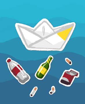
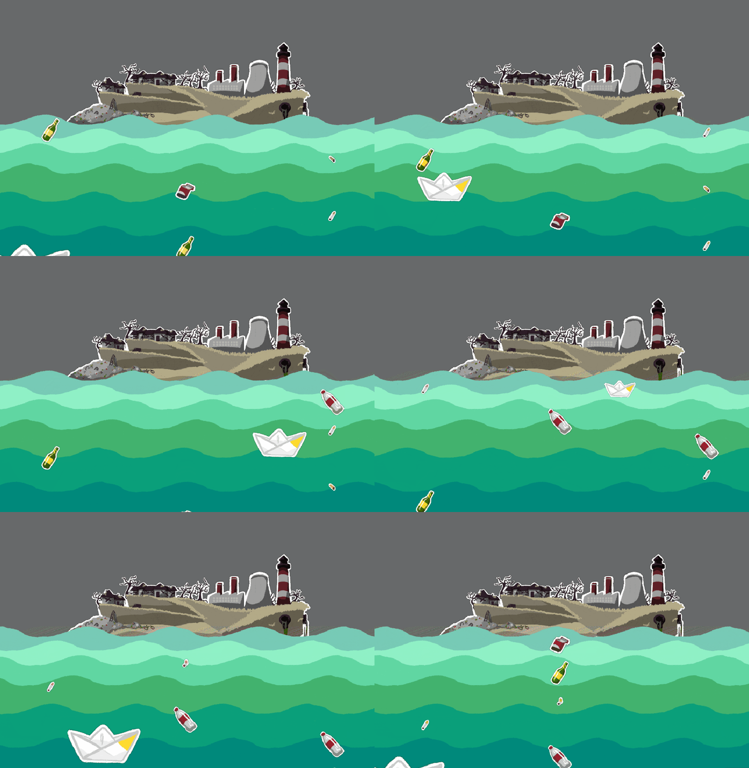
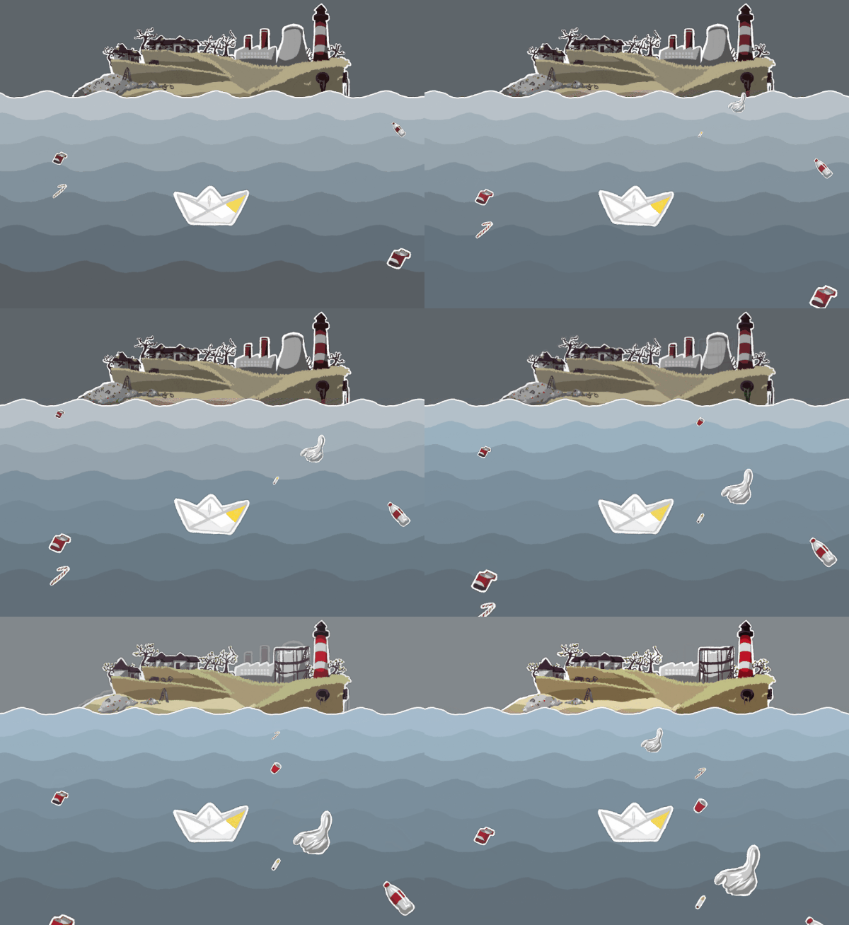
We created some first assets for the game: The boat the player will control, various trash items and simple waves for the background.
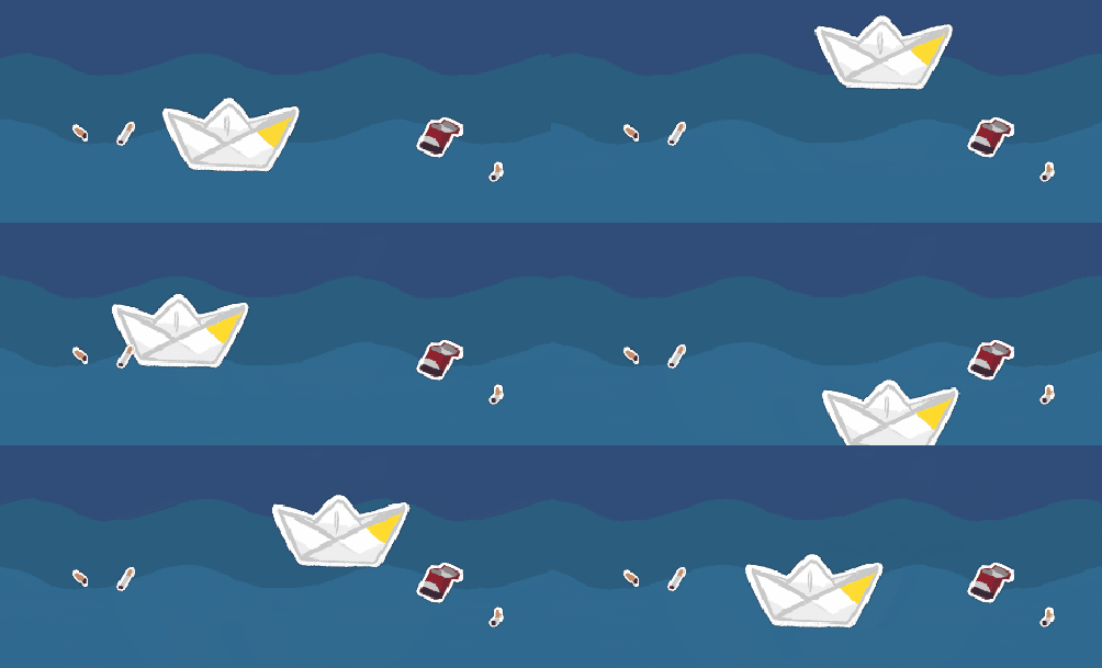
We also made the boat move, though we'll probably fine-tune things a lot in the next two weeks on that front and we've made the background waves shimmy back and forth!

Assets

First Assets: Boat, Trash, Waves

First moving images

In Motion: Boat, Waves

We also set up a Twitter & Instagram Account and will try to keep them updated alongside this DevLog.

Overall, it's been good progress for a first day, I think!

Submitted(+1)

Ahh! I'm loving the art style a lot! I second J on the icon haha - I'm super excited to see how this ends up!

Submitted

Thank you, haha, glad to see our icon is getting such positive feedback, too! We're excited to be working on it and hopefully various tutorials, google and books will carry us newbies through to a satisfying end.

(+1)

Loving the art style and overall theme! Looking forward to giving this a try.

Submitted(+1)

This looks really fun and I'm loving the little paper boat!! Good luck guys!

Submitted (1 edit)

Thank you all for the positive feedback!

Day 02:

Today we had a bit of support from an Onion-friend coding-wise. And we got permission from jays head to use their track "I'm Floating!" in our game after finding their music through the MFGJ-Discord!

In terms of coding, today Onion wanted the boat (and the trash objects) to be smaller when they're further back/up on the screen and bigger in the front/bottom. 


Had some mishaps there, but worked it out - or so we thought.
The boat does change size when it's moved along the y-axis now, but moving diagonally is causing trouble because the scaling is tied to the travelspeed up- and downwards and moving diagonally is slower along the y-axis... giving the boat more time to grow and shrink and turn upside-down.
So that's something he still needs to figure out properly.

Also started watching tutorials on how to spawn and collide objects in preparation for the trash spawning and collecting.

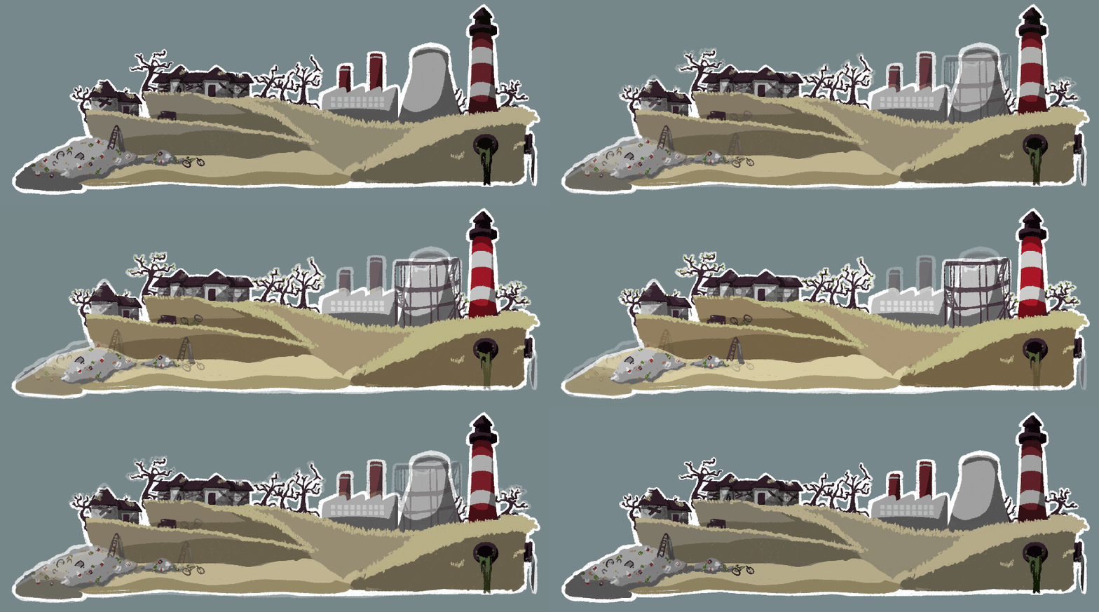
Art-wise, the trash objects are pretty much done and I've started working on the background isle in it's starting, polluted state. It's not all done yet and the imagery isn't very subtle, but I'm liking how it's turning out so far:


It's a bit of a challenge to try and keep things in a generally simplistic style, yet add details to make it all seem coherent and lively.


I also saw Trello being used in several projects in this community and after we mapped out our To-Dos on paper, I began transferring them:
https://trello.com/b/f7H4jaZ6/plastic-sea

Since I didn't clarify it before, I'll also add some info about who does what in the first post, though generally it can be assumed that most art-stuff, logging and social media-ing is done by me, "Bean", and most coding is done by "Onion".
I'm also interested in the coding side of things, so hopefully once all the art is done, I can try and get a bit more into understanding how it all works, too.

Overall, these first two days have been great already! Though there's been some moments of feeling lost or overwhelmed, it's motivating to have a community to share progress  and to interact with.

Submitted

Day 03:

First day of the jam where both of us are working our day-jobs, so we've not made huge leaps in progress today. 

The scaling of the moving objects (player and trash) was still a problem today... and that's without scaling the box colliders and the rigidbodies along with it.
With some fiddling and googling and brainstorming with the Onion-friend, things are looking up again, at least on scaling the object. 
If the scaling turns out to be too much of a stumbling point that's costing is a lot of time, we'll probably have to push it back and see about getting back to it when other things that are more important to gameplay are complete.


Art-wise today was focused on the second background-state. 
Originally I intended to go for three states: The polluted beginning, a midway point and the "win screen" final state. But I'm thinking to both make the changes less jarring from one state to the next, I'll include a second middle of the game state.

These are the two states I have so far:


If we've a lot of time left, we'll want to add some animation bits to them as well and I'll be cursing myself for not drawing it all more split up.
We'll also need to think about how the changes will appear. The current plan is to fade in the new state and out the old as seen above,... if we can figure that out in Unity ;)

Submitted

Looking good! I'm enjoying the art direction!

Submitted

Thank you!

Wah! I can’t wait to try this out~ The art and concept fit together so nicely...I’m in love with the little paper boat. Good luck with the movement scaling weirdness—you got this! (I feel like you’d enjoy playing “Flower” by ThatGameCompany.)

Submitted

Thank you! We're just keeping our fingers crossed for the scaling to not go haywire and to not be entirely to messy when applying it to the components needed... or something. 

Oh, I love Flower! and Journey! ... and flOw is okay, too.
I hadn't even thought to relate it to Flower and how the environment reacted to the player actions there, but yea, that is the kind of direction we'd like to go in - even if less directly linked to the input and less awe-inspiring. Haha.

Submitted

Day 04:

Another short day, today.

I decided to do some theory work today and learn a bit more from the Unity course I've started, so I can maybe help towards the second week and contribute things to the coding of a Start Menu and Credits, maybe.
I also worked on the third island state, but it's not done yet, so I'll share that at some later point.

Onion fiddled more with the actual game side of things and worked to get our trash spawning. 
For now it spawns in randomised order from three spawn points. Might still have to tweak the spawn speed there and sometimes a lot seems to spawn in one row.


I'm really excited we even got this far and that we've managed to put in some work every day so far, even if it might just be baby steps.
That said, we'll be MIA tomorrow, so there'll be no progress and no log.

Submitted

Day 05:

After three days off due to various reasons, we're back :)

Here's what we're currently struggling with: 
We have NO IDEA how to gradually change the colours and alpha of GameObjects in Unity, i.e. making the change over a few seconds when triggered, rather than changing all at once...
Pointers/Help would be GREATLY appreciated!

We keep looking at code people got in response to such questions, but it feels like we're still too early in our understanding to understand how to apply it.
It seems like it'd be no problem if we were dealing with a UI Image thanks to CrossFadeAlpha, but with GameObjects, it keeps us scratching our heads in confusion. 
We've been at it all day with no luck... Frustrating!

But let's get to what we did accomplish!

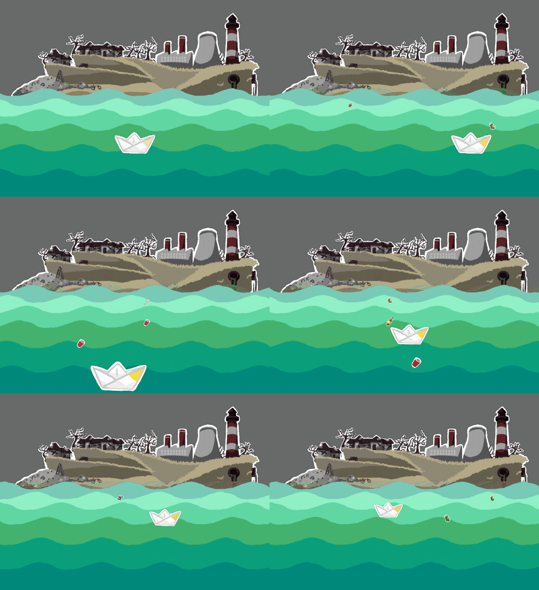
  1. Trash that spawns now also scales, becoming bigger as it floats "to the front". (Onion)
  2. Trash can now be collected. (Onion)
  3. Collected Trash increases the Score. (Onion)
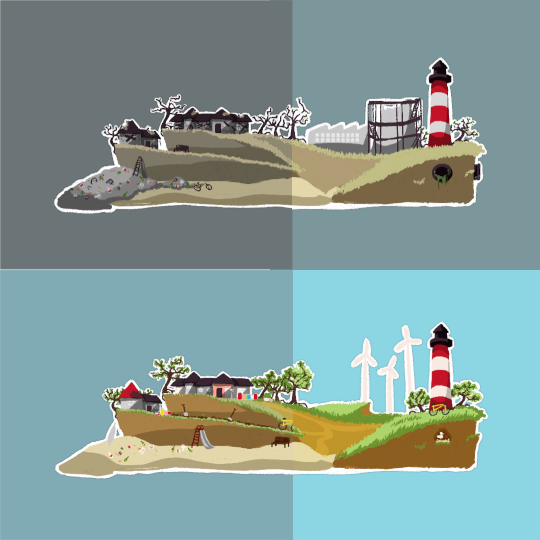
  4. Finished all four Island states. (Bean)
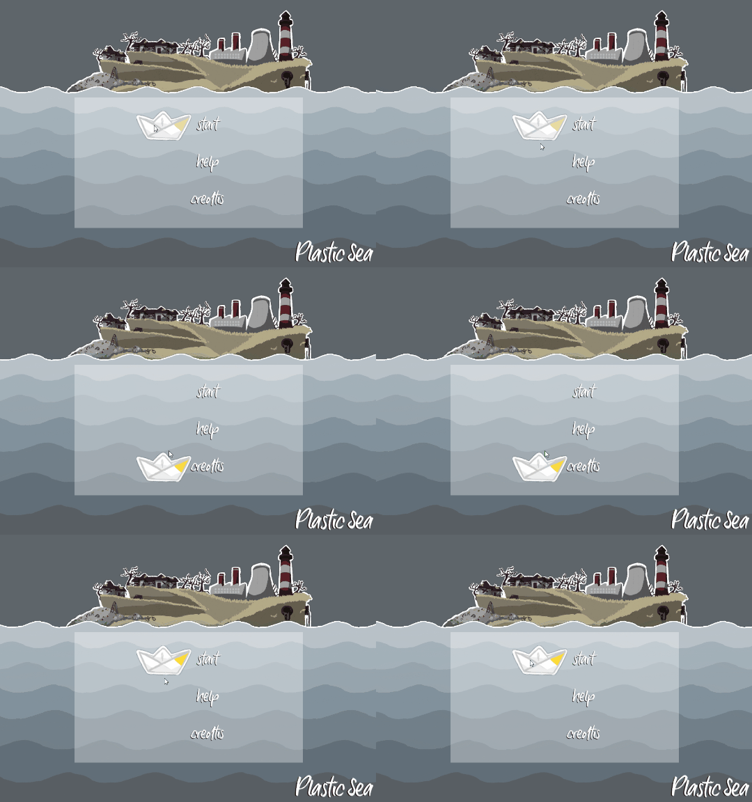
  5. Started on a Start Menu using this tutorial(Bean)

((1,2) trash spawns, scales and can be collected)

((4) the four island states)

((5) start menu wip)

To-Dos:

  • Figure out how to change colour properties of GameObjects gradually, rather than suddenly, when a certain score is reached. (Help! We're so stuck here!)
  • Create "End/Winning" State
  • Finalise Start Menu incl. Help- and Credits Panels or Scenes
Submitted
Deleted 5 years ago
Submitted

We're still struggling with implementing them, but we do hope that once(if) we manage, they'll do just that! Thank you. 

Submitted

I'm still in the early stages of learning Unity myself, but have you explore Lerp for changing colors?

Submitted

Thanks for the tip! We've been looking at lerps and such today and we just can't make heads or tails of it yet... maybe we've been at the problem too long and are just a bit overloaded with new information.... hopefully.

Submitted (2 edits)

Day 6:

AKA "make the score visible by smoothly changing the background island and the sky & water colours"-HELL.

After finishing the non-optional art assets, I joined in on the coding adventure, today.

I worked a bit more through the start menu. It's mostly done but parts are still clunky or not uniform enough for my taste, but I won't waste time fine tuning everything now, when there's still the most vital task left.
If we do have time in the end, I might yet try to do a Pause Menu as well, though that's really optional with our ~2~3 minute game experience.
(So much work for so little gametime! arghhhh)

The Start Menu includes a Start Button, upon pressing which one fades into the gameplay scene.
A  "Help" page, giving a short info about the objective and overview over the control schemes.
A "Credits" Page, including links to this GameJam, jays head's soundcloud and atm our Twitter (will likely change that to our itch.io profile, though).
And a toggle to mute the music (though, why would you??? it's beautiful)

I've recorded a video of the Start Menu and how the beginning of the game looks in motion:


We've spent the rest of the day struggling to try and make island images fade in and out when a certain score is met.
Onion managed to find a script that faded the first island and made a second appear, but to be honest, we had and still have no idea how it works, so we're struggling to figure out how to make the rest of it work!
At first it also didn't recognise when a certain score was reached. I'm proud to say that I somehow figured that out by adding a bool to our player script that changed to true when a certain score was met and then calling to that variable in the fading script. 

Still, we can't figure out why it sometimes works and sometimes doesn't and are far from also using it to change the colours of the waves!

In the coming days, we might just try and figure out how to do it via animations. I did manage to fade in and out a mono-coloured image for the scene transition, so maybe we'll figure that out, too. And it feels like that might be a much easier way to change the wave colours, too.

So if anyone has a good tutorial on how to trigger animations only when certain conditions in the scrips are met, let us know! Thanks.

Hopefully tomorrow will be a little less painful again. We're hopeful, but also a tiny bit panicked at the approaching end date, since there's at least two days where we won't be able to get anything done, again.

Submitted

Day 07:

We've made it! We're out of "make the score visible by smoothly changing the background island and the sky & water colours"-HELL! Praise thee animations!
I kind of wish we'd started looking into them earlier - it would've saved us a good day, but hey.

With the visual representation of the score being done-ish , time for a bit of review in regards to which of our initial goals we've achieved so far:

Gameplay Goals

  • Make the Player Boat move according to player input
  • Spawn various trash, make it move across the screen
  • Make the trash collectable
  • Assign a score to the trash collected
  • Represent the score visually in the background
  • Startscreen
  • Credits (initially meant this as credits when the game is over, but we've included them in the Start Menu, so...:)
  • End Game Screen 

Art Required

  • Player Boat
  • Trash
  • Background (initial state)
  • Background (progress state)
  • Background (progress state 2) 
  • Background (final state)
  • Background Music 
  • Sound Effects

Looking good. Maybe we were too timid in setting the scope for our idea? But with it being our first game, it was a bit hard to estimate.

So what are we going to do now?

  • Set up the game page here on itch.io (though only as a draft for now) including cover image and info text 
  • Fine tune the transition animations,
  • Fine tune trash spawn and pacing - how long should the game be?
  • Create an End Screen, thanking the Player for playing.
  • (optional) Use our newly acquired animation knowledge to add more details to the background.
  • (optional) Find fitting sound effects for things?
  • (optional) Create a Pause Menu (a bit unnecessary, maybe, on this short of an experience)
  • (optional) Other fun things we can do by Friday?

Good job on getting through almost your entire game!! Better your game smaller than expected than too big, right? It looks so cute to play and the artwork is absolutely perfect. Good luck fine tuning! :)

Submitted

Thank you for the positive feedback! 

I reckon since it's the first time we're making a game and taking part in a jam, it's a good first experience to actually feel like we'll get done within the time limit. Maybe in the future we'll be more ambitious, when we've got a better grasp of our skill level. :)

Submitted

Day 08:

Slow and short day today - the weather is just too nice to spend much time at the computer.

Gave our boat a little wiggle with our new animation powers and adjusted the transition animations to make the change take effect from front to back:


Also worked on further setting up the itch.io page with screenshots, a cover image and so far a very very very short info text about the premise of the game.

Adjusted how much trash spawns and how quick it moves, making it spawn less frequently and also go a little bit faster after each transition. Might not be the final state yet, but getting there.

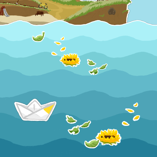
Still have to do an end screen. Would like to have non-trash floating on the water for that, but not sure what kind of stuff that would be...? We'll see if we can think of something. 

Only have about two evenings left to really work on things. 

Submitted

Nice work! I really enjoyed the animation and transition update!

Submitted

Day 09/10:

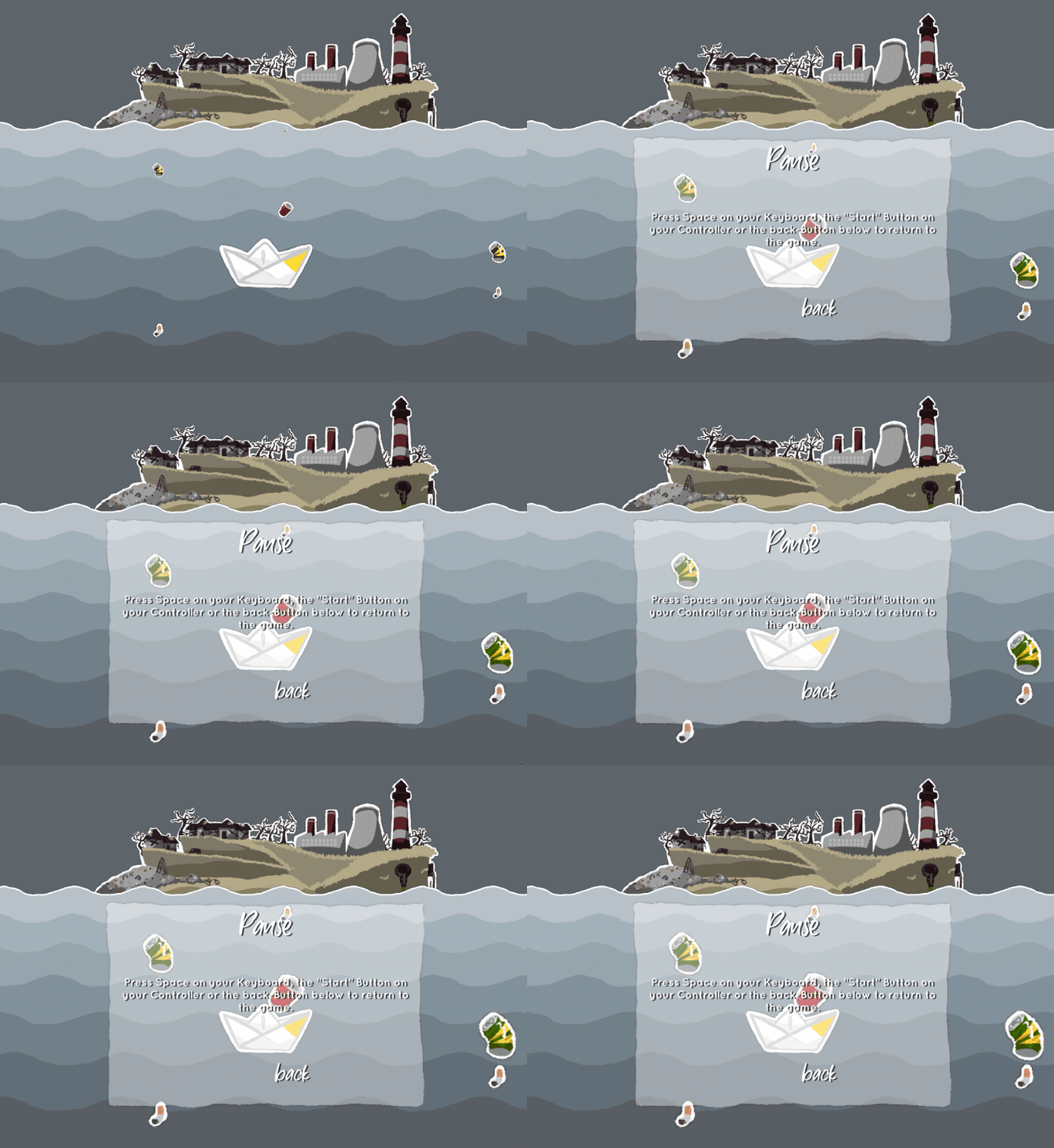
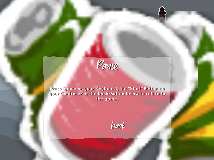
Was another short day yesterday. Started on a Pause Menu, but didn't work out all the kinks yet. Kinks being that the trash kept increasing in size despite the game being paused. Unlike motions, the scaling wasn't affected by the stopped time somehow? but we worked it out so it wouldn't do this:


Worked out the kinks today, will still add a tiny detail to it.

Added a bit to the transition animation, again, just a little flashiness but nothing major.

And we added an End Screen when a certain score is reached with the option to start over. (Note to self: See how/if music is affected by restarting...)
Also drew just a handful of items for the End Screen:


Tomorrow we'll try and see how adding some clouds in the background looks and we'll need to finalise everything and submit tomorrow, too, since it's our last possible day to work on things!

Submitted(+1)

We've submitted our game! 

https://itch.io/jam/my-first-game-jam-summer-2018/rate/282947

Thanks to everyone supporting, helping and following us through as we made our first game ever!

Submitted(+1)

Plastic Sea – Post Mortem

Getting Started

When it was clear we wanted to start making a game, we looked at the itch.io calendar and conveniently for starting on our first game ever, MyFirstGameJam was just around the corner.

We talked about the theme and came up with a handful of ideas to base a game around. We’d been tossing about the idea of a game that addresses the pollution of the oceans before, so this idea stuck.

The basic concept was defined: Steer a boat, collect trash, change the environment.

We also knew that we were going to work in 2D. It’s appealing to both of us, so we’d both chosen our courses to work with Unity in 2D a while back.

The art style was also defined very quickly. Our icon/page-art has the same paper cut-out aesthetic that we think is quite charming with the art style in it, so we decided to keep it, even if we didn’t enforce it on every little detail (e.g. the background island is a cut-out as a whole, rather than individual buildings being individual cut-outs layered over one another).

We drew out a table with different stages on a big piece of paper, defined columns: - for things to do that were mandatory for the game experience,

- those that were optional,

- what we’re currently working on

- and what we’d completed.

We filled the columns with colour-coded sticky notes depending on whether the task required art or coding and put them in order based on priority.

We also transferred this information and elaborated on it in a trello-board, which was neat since Bean uses JIRA at work and is familiar with that kind of setup.

Working through it

We got started, created first assets, made sure things that were supposed to move did and others didn’t.

There were some revisions to our wave-assets on the first few days.

They started out much more detailed, inspired by waves in paintings, but we dumbed them down a lot because they took away too much from the clarity on the screen. They made it all too busy with too much white, too hard on the eyes to make out the trash in it.

We tried dumbing them down little by little and eventually decided to keep it simple and try to keep the white cut-out aesthetic only on the last row of waves.

We also added one more state to the background than originally planned, to make the transitions more reasonable.

With programming we hit two snags:

1. Scaling the objects as they move from the back to the front.

It had been no problem to get the boat to move, but we had so learn a lot about the logic of the code and how to limit and adjust and were to put code.

At first we found the boat would scale down to 0 and then flip on it’s head. We adjusted the scaling better to the area the boat could move in.

Things seemed to work, until we realised that the scaling was tied to the how long it took to get from one point on the y-axis to another – so moving diagonally made the size change more and the boat could still be flipped.

We worked it out relatively quickly, though, with the help of our Onion Friend, who hadn’t worked with Unity or C# before but has general experience with programming and understands the logic better than we do.

2. Gradually changing the background island and waves with the player score.

Again, the start seemed simple enough, when we made the score rise with every trash object colliding with the player, but we had some trouble getting the script that changes the island to recognize when a certain “phase” had been reached.

Once we figured that out, we realised we didn’t understand the script that faded out one island and was supposed to fade in another enough to make it work.

We sunk a good two days into trying to work out a solution to fading out one object and fading in another, again with some help from the Onion Friend.

At the end of the two days we had a bunch of scripts, one for each island, that sort or did the job and no idea how to transfer the effect to the water without having to add another dozen almost identical scrips.

The turning point came with a comment on Twitter suggesting we use animations. We had already started dabbling in animations for a simple fade-effect between the different scenes, but it hadn’t occurred to us to use it for this at all.

Within an hour, we fixed the problem and got it done.

After that we mostly worked on cleaning up, adding an end screen, allowing the game to be paused and setting up the game page.

What was good?

We made a game! It’s short and not complex, but we hope it’s a nice, charming experience.

We’re super proud that we took this step and managed to complete it!

The scope was just right for us, allowing us to complete it and still have time to work on some optional things, though not all.

It was important to us to keep it simple, to keep it manageable, to factor in that we’re absolute beginners with game development, Unity, C#, programming in general, etc..

Setting up a board with the plan worked well for us to keep track of tasks, even when we added new ones during the development.

It was also great to have a community of like-minded people who encouraged and helped each other. Getting positive feedback was great to keep motivated and reading about other projects helped put things in perspective.

And it was fun to connect with others via social media – in our case on Twitter and Instagram. Though we were in the Discord Channel, we didn’t use that a lot. Looking at it here and there, it was kind of a surprise to see a whole different palette of projects than on Twitter, for example. Might also look into tumblr in the future.

What do we need to improve on?

There’s two major things that we’d likely profit from getting better at:

1. Comprehending solutions we find.

A lot of the time we’d look for solution through tutorial videos or skimming through responses to other people who had had the same or a similar problem in the past. Often we would simply try out the code given as a solution and if it worked that was that for us – until it didn’t work. And when it didn’t, we couldn’t really pinpoint why, because we didn’t know why it had worked or was supposed to work in the first place.

So while it was good that we practised gathering information and finding pointers for solutions, we hope that the more we learn about Unity and C# in general, the better we’ll understand the solutions and will be able to learn how things work for the next time we use it.

2. Getting hung up on challenges.

Above we mentioned or two big programming problems, the second of which cost us two days of us both looking for and trying out solutions and caused a lot of frustration.

We’d probably have been able to elaborate on some things if we had dropped the topic for a few hours or even a day or two to focus on other features.

This second programming snag also caused us to burn out. After two days of absolute frustration, the solution was so simple via animations that it was actually a bit demotivating.

We were done with all major features with still 3~4 evenings left to work on the game, but didn’t get nearly as much done during those as we could have. We were worn out and tired and wanted to just finalize things, but didn’t manage to do that as fast as we could have either, dragging out small tasks over the remaining days.

And then there’s a bunch of other things, too:

We didn’t really use our trello board after setting it up, instead relying on our paper board with the sticky notes, despite trello allowing for more detailed descriptions, checklists and so on.

We didn’t really go out of our way to find people who could help us with our problems and relied mostly on hoping to find a solution someone else had asked for in the past. So we could’ve been more direct and active in seeking answers.

We’re also fully aware that our gameplay is very very basic and absolutely nothing to write home about – the game works due to the theme, the beautiful music and the aesthetic, we think.

This is owed to us being so totally new to everything, but that shouldn’t be an excuse and one of our goals for future games should be to provide more engaging gameplay mechanics as well.

Also, we should’ve put the Help and Credit panels from the Start Menu in other places: Help, giving the objective and the controls, would’ve served better in a screen between the start screen and the game, while the Credits probably would’ve been better after game completion.

Where do we go from here?

MORE JAMS!

It was a good experience and we feel that while tutorials and udemy courses are good to get basics down, working on the game really forced us to use and transfer the knowledge and our acquired skills.

So before we start any smaller or bigger projects on the side, we’ll work on strengthening our skills by taking part in more jams and switching up who does what, too.

Submitted

Congratulations on your first jam entry! I think that you managed to create a delightful little game, which is really a great feat considering your level of experience. Don't worry too much about the fact, that you're having trouble with understanding the solutions that you implement in your game. I'm told that people much more experienced than you or I routinely face the same issue. Also, I can assure you that it gets a lot better with experience. Like with most other things, if you want to get better you have to 'put in the reps'. Ludum Dare is just around the corner, it's pretty much 'the' goto jam for most people, and it might offer you an interesting challenge by forcing you to make a game in 72h instead of two weeks. Anyway, I wish you good luck with your next project!