

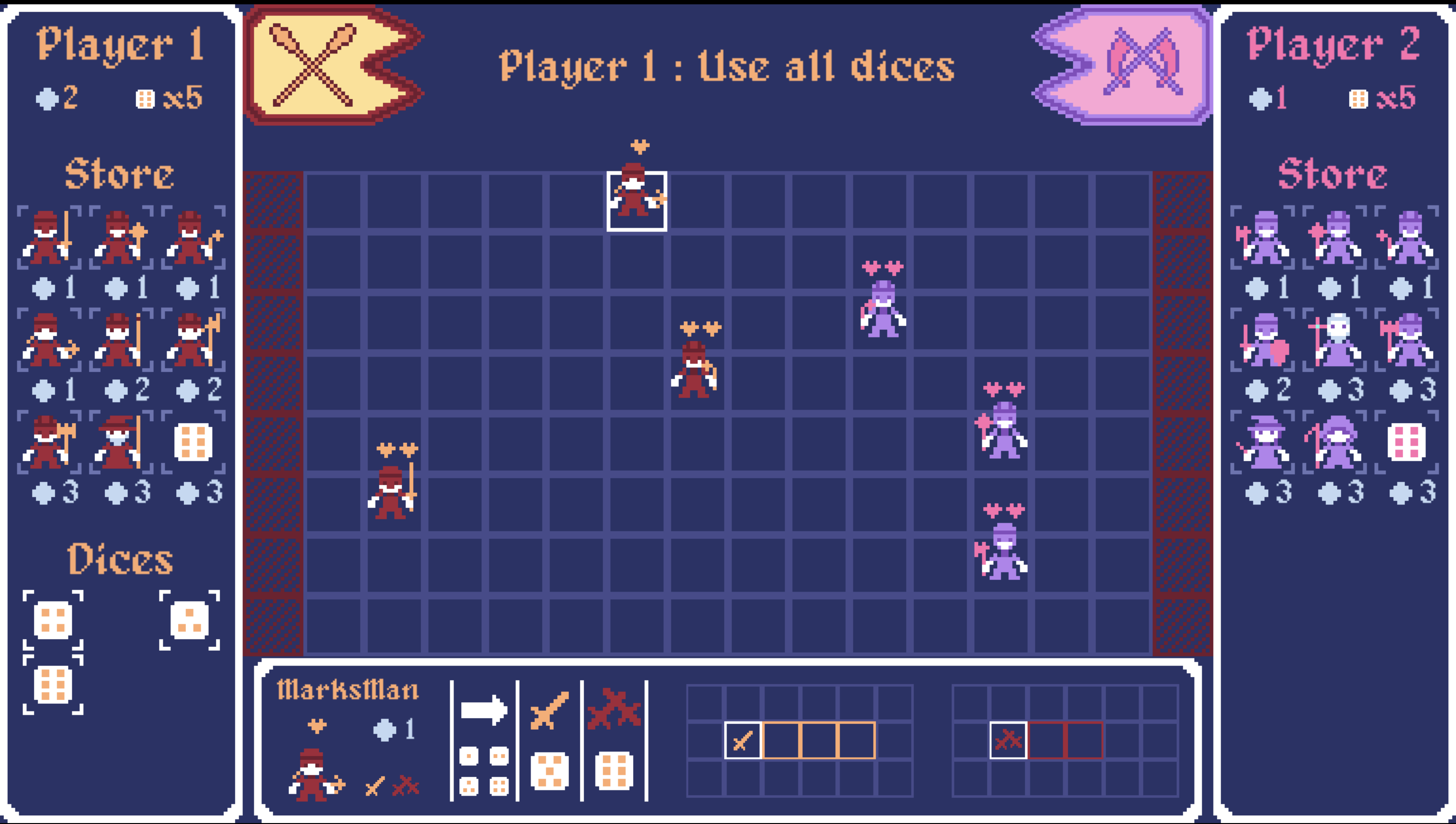
It's an interesting concept arising from the theme to use dice. Had issues playing it as the UI element down the bottom was stuck on Marksman from an enemy move. I didn't understand all the rules of the game, like the disappearing / shrinking board. I also found that when I was able to attack, that the options were limited -- I could attack towards the right, but not to the left, even if an enemy had maneuvered there.
Overall liked the simple pixel art graphics and the audio design, can see that there is a complex strategy game here, and unlike a lot of games for that jam, you have made a good use of the dice theme. It's worth further development.
Play game
Mini Dice Battle's itch.io pageResults
| Criteria | Rank | Score* | Raw Score |
| Gameplay/Design | #7 | 4.111 | 4.111 |
| Audio | #8 | 3.889 | 3.889 |
| Fun | #18 | 3.444 | 3.444 |
| Graphics | #19 | 3.667 | 3.667 |
Ranked from 9 ratings. Score is adjusted from raw score by the median number of ratings per game in the jam.
What would you like feedback on?
UI, Gameplay, Difficulty balance, Anything that come in mind.
What did you update?
Remade everything from scratch.
Added more fighters with diferent moves (heal, convert, raise deads)
Possibility to pick fighters before the game
Reworked the AI
Remade & clarified the UI
Name of updated upload (if downloadable)
Play in Browser
Comments
Thanks for the feedback & bug report. I'll check it out.
Glad you liked the design ! :)
The attacks being directed mostly to the right is by design to give more importance to placements. Some fighters are here to mitigate that. Rogue cans stab in the back. Flailman & Witch have circular attacks & a few others can hit on their side. But I can see it being unclear as the fighters are curently not properly introduced to the player.
Thanks again for the feedback ! :)
I think the presentation is really cute, and it looks clean, but it was really hard to discern what was what. The sprites are just too small and not unique enough to tell a difference, especially because there are 8 different ones to keep track of, all with different attack patterns, dice results, and cost.
Throughout the game, I felt it was really slow. I can see that there's more emphasis on the player coming up with their own strategy, but I think there was so much to do that without a softer introduction just forces the player to play randomly, which just isn't enjoyable. I think there just needs to be more restrictions on some aspects (like the number of types you're able to choose or have on the board) and more freedom with others (being able to move around more freely).
Overall, the start was really polished. A little more guidance would've streamlined the process, but it looks good so far. However, it kinda falls short during the actual game play.
Submitted
StargazerThanks for the feedback !
I'll work on introducing the gameplay elements & the different fighter through a solo campaign mode.
I'm also planning to change the sprites to something more detailed & personalized in the near future & upscale the whole thing to allow for a more detailed & clear interface since it's getting cramped with the recent adds.
thanks again for the review ! :)
Huh, this is weird. Feels like it should should be pretty much up my alley, but something here isn't quite clicking for me yet. I'm not sure exactly what it is, but I think it might be that I find the game to be lacking a bit of character. The sprites are fine (apart from being a bit hard to instantly identify, which would be nice), but not outstanding and the playing field just being an abstract blue grid doesn't really make me feel as if I was in the midst of an epic battle. Maybe going for something a little less abstract would help me to feel more engaged in the game.
Now, let's get to the nitpicky stuff:
The first thing that comes to mind is that it is very overwhelming on startup. Pretty much the first thing you're supposed to do is pick 8 characters and I don't even have any idea why or how the game works. I do like that there's such a variety of classes, but maybe don't start with all of them available from the get-go. Unlocking classes might also be an interesting meta-progression thing.
After I clicked auto and play for a little, I actually managed to understand the game pretty quickly. But yeah, adding a short tutorial mission the first time you play might be a good idea. Also, apparently you want to add a campaign mode? I fully support that!
Generally, I think that the game feels a bit too random and there are not enough ways to counteract. A lot of times, I found that my dice just weren't good to do anything useful. A few ideas how different dice could be made more useful:
I feel like movement is a bit limited and I think I would enjoy this game more if I could move up to n squares instead of exactly n. At the very least, you should allow me to reach squares of the same parity, as I should be able to just move back and forth.
I wonder if it might be more fun if there were a few characters that crit on something else than a 6. Like, the Rogue feels like a perfect fit for a 1 critical. Maybe I've just played too much Dicey Dungeons, though.
I would like if I could direct my attacks, though I do appreciate that the Rogue can backstab. That way, there's more chances for classes with small AoEs to hit something.
Finally, if none of these appeal to you, maybe add an extra die and you have to discard one die every turn. That way, there's a little less variance, though I also do appreciate that it increases the complexity of the system
It's a bit annoying how little you can do on your first turn but try to collect the coins. Maybe a sort of summoning sickness would help? That way, on your first real turn, there would already be enemy targets available for you.
I would really like to have an end turn button. Having to spend your unusable dice feels a little frustrating.
I read the description first and red vs orange was pretty confusing for me at first, and I figured a critical hit would always deal two damage. I like the way you do it in-game and you should probably use that for the description, too.
Balance seems fine in general, but a few things should maybe be adjusted. For example, the Swordsman (almost) seems strictly better than the Axeman, apart from a 4 roll. It seems like generally, 2 damage is a lot stronger than AoE, since I found enemies tended to be too spread out for it to be really worth it. Also, the way coins are generated now, it kind of incentivizes low-cost unit spam in order to maximize your chances of collecting them. In general, I think a different way to earn money might be nice, but I'm not sure how exactly. Maybe just a passive income?
Final nitpick: Pretty sure "dice" is already the plural, so "dices" is wrong.
The shrinking battlefield is a really nice touch, I like it!
Once again, sorry if this sounds overly negative. I do like the concept and the systems at play here, and I do think this could turn into a fun strategy game with a bit more work.
Submitted
Roll of the Dice's CottontailThanks for the feedbacks ! No problem on it being a bit negative, I'm ok with a harsh critic with interesting points ;)
Regarding the visual style, I went for soemthing very minimalistic, working solo on it I figured it ould save me some time and allow me to go further in terms of gameplay. I fully understand if it's not apealing for some and I'm actually thinking in changing into more detailed & personalized sprites later on but for now I guess it will have to do. ^^
Good catch on unlocking the classes. I'm actually planning to lock the different classes by default and unlock them as the player complete the solo campaign. But that will come later as I'm focusing on the gameplay first though I'll probalby at least add a short tutorial soon. Right now the game is more of a sandbox of what i'm planning to make available in the game.
Regarding the dice use.
I feel the movement restriction is a nice way to add challenge on positioning the units to avoid being able to reach ennemies or coins too easily (which would lower the interest of using dice as a game mechanic at all). This also add some challenge on the late game as the field get smaller and smaller and the player have to think twice about moving which unit where since he'll have to use every dice and might hurt units of his team since there is friendly fire. Same goes for the attack direction that always goes the same ways making the positioning of units a bit more crucial. But indeed some unit are there to mitigate that point (rogue can backstab, flailman and witch hit around them, some units also hit on their sides).
The crit on 1 might be too much of a handicap since it would impact the available moves making the positioning more difficults.
Discarding dice is a neat idea though, I might take it up. thanks :)
Summoning sickness is also a neat idea. Maybe the first turn of each player should be limited to only buying & placing units.
For the end turn button, as said above it make more sense not to have it in the late game as you might actually hurt your own army if you don't position carefully or make an unit too vulnerable. but I understand the frustration and I'll try to find a way to make it less annoying in the early game.
Agreed for the color coding of the movements displays. I had several feedback on that and it definetly need some clarification.
For the unit balance. low cost unit with high moves are indeed more advantageous in early game. High cost unit & AOE become more adventageous in the late game as the battlefiled is smaller and ennemies are forcibly less spread out. But I it need some more balancing :)
Thanks for the grammar check ! I'll fix that :) (odd nobody pointed it out yet :s )
Thanks again for all the feedbacks ! It gave me a few good pointers for improvements. Cheers :)
I really liked the game once I got it. But it really felt very daunting at first.
About the UI:
- I liked the font, was pretty readable.
- When fighting, I didn't understand whether my hits actually worked or not, perhaps the color of the enemy's hearts are too close to the empty heart color? (I don't know for sure, but then again I have slight color blindness) When one of mine got hit I understood that hearts change color instead of disappearing.
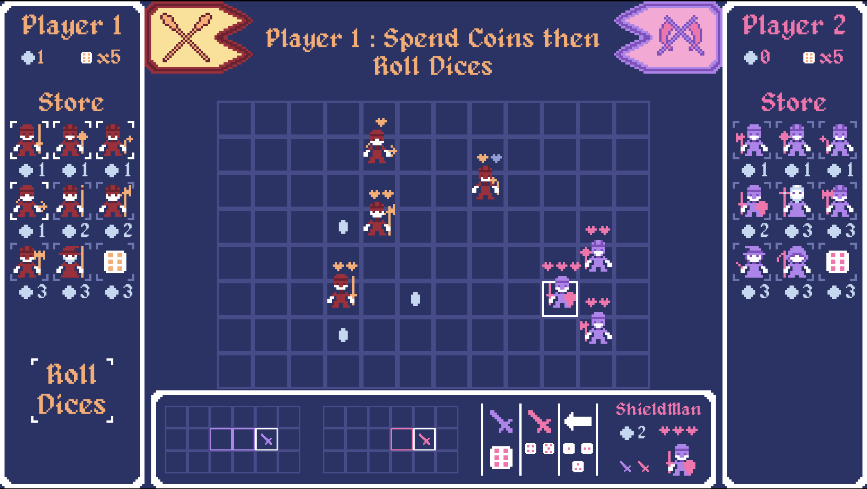
- I really liked the way you described characters in the fighter select screen, took me a while to understand that critical hit many times meant different area, and not increased damage (not sure if it's a big deal, other people might get it right faster). However there's the coin icon near the hearts that I had no idea what meant until I understood how fights ran.
- Also, I think the Auto option could select fighters but let the player decide when to start. I clicked it once to check and then there was no way back.
Gameplay:
- I was reaaaally lost on the start, I guess a quick tutorial could help. I wondered "how to spend coins?" for a few seconds. Took me a while to notice the coin and the cost under each fighter, maybe making rows a bit more spaced could help noticing too.
- Once you get the idea it is really neat, I just wish there was some more effects when enemies are hit or someone gets coins, but that's mostly to add more juice to it.
- As of now, it is really easy to defeat the AI, on my first run it used 2 fighters and one of them was killed by friendly fire when I wasn't even close by (?).
- The coin positioning can get somewhat unfair, on a second run it spawned all coins far from the middle and close to enemy area. Maybe making it more evenly distributed would be nicer.
- Maybe adding more coins to start or on the map could spice things up too, I didn't even need to use special characters like priests and necromancers because halberds killed enemies too easily.
All things considered, I really liked this one! The sheer amount of possible characters and attacks make it very interesting!
Submitted
Luck ArenaThanks for playing ! Glad you liked it :)
Your feedbacks are on point and will definetly help :)
- I should definetly introduce a sprite change on the hearts to help with readability for colorblind & attack animations or particle effects on hits would probably help also to make it more clear & juicy.
- You're not the first to be confused about what the difference between attacks and critticals. definetly need some rework to be clarified.
- 100% agreed for the auto select. Will change that asap.
- I plan to add a tutorial a bit later as part of a solo campaign mode. Hope it will help to introduce the game mechanics better.
- I did a lot of improvement on the AI since the jam but I agree it's still pretty dumb and easy ^^ Definetly need some rework.
- Agreed for the coin positioning. I'll work on that
- I've been going back and forth on the number of coins spawned. Haven't quite found the right balance between coin spawn / unit costs yet.
Thanks again for the feedbacks ! It's really appreciated :)
This is great. I'd be curious to see what the original is like, considering it says it's entirely remade. It does require a learning curve, like you might expect for a strategy game with a decent amount of depth, but the UI really helps to make a lot of that intuitive. It's great that hovering over a unit explains everything you'd want to know about them -- their movement, attacks, etc. Meanwhile it's great that all the units feel at least decently unique from each other when there's so many of them.
Some things I was confused about for a bit: at first I didn't understand why it seemed like sometimes I was able to move and sometimes I could attack. Obviously this meant I had to play the game for more than 30 seconds to find out, but I think there might be some subtle thing that could be done to make this even more obvious to brand new players. I think what's most confusing at first is that you're dropping dice on your units and they're sometimes disappearing without doing anything versus sometimes they require you to move. So the new player wonders, "Where did my die just go?" Since the units have different values for attack vs movement, you can't just color code the rolls, but I feel like there's something you could do here. I just think the first 30-60 seconds of playing an online browser game are essential, and most players may not be as persistent or astute to learn.
Also, it took me a while to try and figure out what raise dead was for. I saw the icon below the game window and wanted to make sure to try it before writing a review, but at first I couldn't find it -- I realized that I had to select the right units and get the necromancer before the game started eventually (the auto option is a great thing though for beginners who have no idea at that point what even matters). Then it took me like 3 games to actually figure out how to use it. My intuition was that you could bring back players that were killed somehow, but the tiles where they died weren't marked so that didn't seem to work. I was trying to use it on an enemy, but I wasn't rolling the 6s so it was taking forever -- then an enemy shot themself and I realized friendly fire was a thing, so I just converted one of my units to a skeleton. So the raise dead and convert features really don't seem all that different from each other -- just one takes over the unit and the other does that but makes them into a weak skeleton?
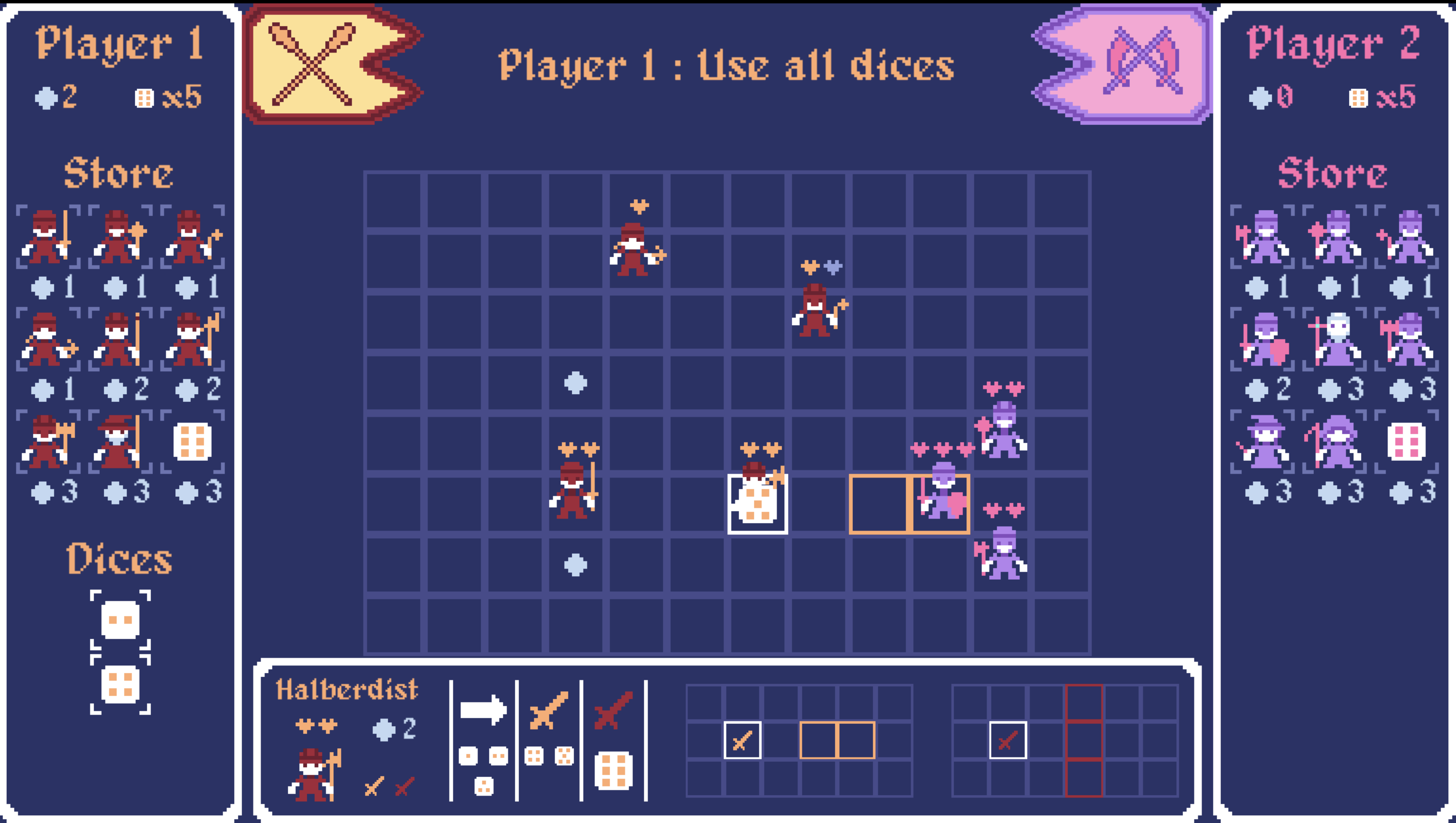
It dumbly also seemed to take me a bit to realize the storm was closing in -- I was like, "what's this red for?" It's actually a good design choice to slowly close the board in to force the game to eventually come to an end, and I blame myself for not understanding; every player's mileage will vary obviously, just trying to be thorough in what wasn't immediately intuitive to me personally (but it didn't take that long anyway, again you'd expect a learning curve here). On the other hand, placing units, attacking, buying things, is all very intuitive.
I was confused (and kind of still am) about what is a +1 attack vs +2. The reason being is that the image below the game has two differences -- multiple swords as well as being red vs yellow. I think higher attack means more swords, but I'm not sure -- my intuition is that multiple swords just means it can attack multiple enemies in a single hit, and that red would be a crit. But it seemed like red just signified you needed a higher roll to get that attack? And it usually was a greater range.
There maybe should be a couple difficulties for the AI for replayability purposes I think too -- I beat the AI first try (or at least first try after I refreshed midgame, so really second try). I'm curious too as to what method was used for the AI. Was it move lookahead with some randomness? But since the game does work as a two player game, you can challenge yourself in that way (if you have friends probably).
But overall, I really enjoyed this one -- decent amount of depth, great unit diversity, and good balance of coin cost to units, as well as having a decently original concept (coins scattered about the board helps to make movement more interesting and shapes the game into something more than just a standard tile-based strategy game).
Submitted
The Dogshank ReDICEtionThanks a lot for the complete feedback ! It's really appreciated :)
I'm hoping to address most of the early game confusion by introducing a short tutorial that will be part of the future campain mode & introduce each fighter type one by one along the campain as ennemies so the player can get familiar with each one before being able to play with them.
I'm also planning on a complete rework of the AI. I'll definetly make it more configurable to allow several difficulty levels.
Thanks again for the feedback ! cheers ! :)
Leave a comment
Log in with itch.io to leave a comment.