Play game
Woomie Antivirus's itch.io pageResults
| Criteria | Rank | Score* | Raw Score |
| Creativity | #3 | 4.000 | 4.000 |
| Overall | #6 | 3.333 | 3.333 |
| Pregnancy Content | #7 | 3.667 | 3.667 |
| Gameplay | #9 | 2.333 | 2.333 |
Ranked from 3 ratings. Score is adjusted from raw score by the median number of ratings per game in the jam.
Judge feedback
Judge feedback is anonymous and shown in a random order.
- Fairly simple game. I do like the concept of an antivirus that grows larger the more she is upgraded. Could play on other factors such as growing as more is quarantined and such. Enjoyable game, great job!
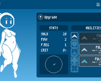
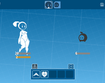
- Pregnancy content: Showing progression through preg-ression is always nice, and here it works very well, even having a reason for why it happens. I don't really have anything else to add here, this was well implemented. Gameplay: BOY, I SURE LOVE VARIANCE ON DAMAGE AND HEALING. It was mostly just clicking (Plus, the actual hitboxes for the timed clicks usually didn't line up), but I liked the variety of skills and the progression of enemies. In a more complete version, I'd really like the damage and healing variance to be tighter to speed things along a bit. Not too difficult or too hard, just took a while. Creativity: An antivirus that incubates an upgraded version of itself is an interesting concept! I would love to see if future generations are somehow different in gameplay or looks or if it will be limited to the "customize" option. Personal thoughts: This one felt like a pretty complete game, though I'd like to see how creating the new generation of Woomie would affect the game going forward. It's a real interesting concept and has a strong visual style that I quite like, so I'll definitely keep an eye on this.
Leave a comment
Log in with itch.io to leave a comment.


Comments
Loved the creativity for this one combining a digital antivirus companion with gradual pregnancy, and the overall stylistic presentation! I had fun and it definitely left me wanting more with the potential of the idea.
The challenging combat kept me engaged throughout and I was able to beat it after a few retries, though partly due to getting lucky in the enemies not using certain attacks.
I agree with some of the other existing feedback that it would feel a little better if the QTE portions offer slightly wider zones and make the number roll to depend more on the player's accuracy. Lessens the amount of discouraging misses or continued bad luck of low healing/damage.
If a player gets stuck on one of the later battles, it might also be nice if there was a side option for an easier repeatable battle to get a few credits.
Aside from combat, I'd love to interact more with the companion in the menu. Maybe ask her some simple questions, or have her remarks on being in the player's computer.
The greyed-out customization button had my hopes up for hairstyles or simple outfits, but I'm guessing it was left out due to limited time, which is understandable for a game jam. Good job overall!
This is a cute and creative little game. It is challenging, but not impossible, which is a nice balance. That said, there's very little here to scratch that pregnancy fetish itch, and I'm not sure it's a game I'll spend much time with. It's also frustratingly difficult to block infection attacks. Overall, though, a solid effort that I applaud for creativity!
extremely cute art, very neat premise, absolute tedious chore to play. every attack and dodge being tied to a qte makes it at times exhausting to play, particularly the final fight which I ended up giving up on not because I did not think I could beat it, but because I didn't want to. It was simply too much of a slog. My honest thought is that if you had a few abilities that didn't require a QTE or certain attacks below your level didn't require a qte to dodge, it'd be less tedious and tiring, but doing the same QTE for dodging strike or strike+, or for using your own strike or flag again and again is absolutely mind-numbing.
absolutely adorable protagonist though. really cannot overstate how precious she is. adore her.
this is one of the game that is really fun but lost its mark on balancing
Heal is RNG-riddled, so you either heal 2 or 21 lmao.
The AOE is pointless because it literally punishes you with more QTE to use it, the boss does an ungodly amount of damage, the QTE of the boss is almost impossible to counter, and the QTE detection is just weird and shoddy. This game is fun. the art is great but it has all the worst vestiges of games: bad RNG, bad QTE and upgrade bait skills.
I thought it is a fetish game.
very well done, although one complaint would be that the actual box where you can land a successful hit seems to be a little off, I have missed some hits that should have been counted and I always have to aim a little bit late.
not sure if this is due to computer lag or not
however if that is to be fixed, I can definitely see this being a bigger game
Yo. Really good. REAAAAALLLY GOOD.
Good gamplay, You have you art identity. I see a song button but i hear nothing. Perhaps a bug.
Good balance on skill. If i have only one thing to say, it's maybe a little hard for a begining.
In skill you have a lot of thing you can add. Defence, incrase speed, reduce speed, incrased gold... For enememis you can creat suicide bot or other you need to follow first cause he heal other.
It's juste idea cause i think you follow the right way for your project.
It has a feel of a real game.
Thank for you game and you work and cya for next updat. :3
Had a lot of fun with this game. You have a good thing going here. only real complaint I have is that the AOE's qte makes it kind of useless. otherwise it was a fun and cute experience.
also will parrot comments about debuffs and stuff. those would be nice to have a turn limit.
I really, really like the concept of this! Upgrades in games always feel awesome to earn, and the art is really clean as well. I like the aspect of the good and bas basically being opposite colors to each other, but as I'm sure you've heard there's some glaring issues in this that would be fantastic if they were looked at.
For starters, the finale is pretty close to impossible, as Penetrate+'s hitbox is essentially outside of the bar. That along with the ungodly damage that thing does every attack, the finale is completely unrelenting. The revival mechanic should be adjusted to only revive with a small amount of health, and probably shouldn't happen in a single turn...
As for the rng, that should probably be exclusive to the crit damage. I think it'd be much more enjoyable if either the line that goes past went slower, or if the hitboxes were all as large as the healing one is. But rather than being a solid block, the high damage/heal would be determined by how close to the center you stop the line, timing should be rewarded. In a similar sense, taking damage should be like that too, hitting the box on the edge will result in a little less than full damage, hitting it further in but not middle would do a little, and only when you smash the center do you dodge it entirely.
The upgrade system is cool, I like it a lot. Using what you earn from battles is always cool, but... I feel like because the price and timing can change on the things you upgrade, it's as much of an upgrade as it is a downgrade. It might be a good idea to make only benefits happen when upgrading.
Edit: Before I forget, status affects applied to you should wear off after 5 or 10 turns, constantly having infect damage for the rest of the fight is a liiiiiittle unbalanced. But the mechanic itself is top notch.
Lastly, I wanna talk about the lock mechanic. It's a good idea! But... Completely shielding the threat until you spend a turn just to unlock a single one that'll just put it back 2 turns later isn't the greatest. I feel it'd be best if the locks acted as a heavy shield rather than invulnerability, you can still damage through it, just with much less damage. And I feel like the Unlock technique should have its own upgrade tab, unlocking more enemies at once with a single usage, and maybe even damaging the enemies it removes the lock from.
But, I still think this has miles of potential! You made one of my favorite submissions to the jam, and I am glad the project is in good hands!
Need normal save system
Despite the pregnancy aspect taking a bit of a back seat, I do think this is one of the better, tasteful looking games submitted.
The gameplay is pretty good but I'm not really a fan of the random damage rolls occasionally being a little unfair. I also think the enemies do way more damage than Woomie in a singe turn and that makes the later half of the game feel super one-sided and unfair, but that could just be a skill issue on my end.
I have only one suggestion that hasn't been said by at least 10 other people and it's to please add keyboard support! At least the spacebar! Some of us are better button smashers than clickers.
Overall I think this game has the potential to be a really awesome game mechanic-wise (The art direction is 10/10 no notes) and I hope you do more with it after the game jam.
EDIT: I just remembered a suggestion I think would be a nice potential addition to the game later on: A mode selector. So anyone that wants to take it easy can do so (i.e, easier timing window, higher earnings per scan, less punishing failures.), and anyone who wants a little more of a challenge can select a harder mode. You could even have it so that players have to roll for a random penalty in harder modes.
Thank you! Definitely gonna have keyboard support in some capacity next update, and having other modes or at least making the main gameplay more fleshed out is also a priority
I liked the concept, but as others have said, some of the mechanics are holding it back. I think the suggestion of a preview for the bar you have to do for each move would be a great help, and narrowing the damage ranges as well. In relation to this specific jam, I also have to agree with N-Saint that the pregnancy aspect feels like an afterthought mechanically, but I will say the sprites are still cute regardless.
Thank you, didn't get to the point where I wanted to with the pregnancy themes (little Woomie's being non-targetable combat companions), but gonna rework the combat mechanics anyway so I can't say for sure what will and won't work going forward - also gonna try give Woomie more interactivity
I've found a couple bugs (i think?) No music, and sometimes I can't attack at all, the bar don't appear so there's nothing I can do
The combat system is great, same with the art. Hope this continues!
Really neat game. The visual styling was very enjoyable and consistent and I appreciated that. Loved all the detail and polish to it. Woomie has a very cute design and I definitely want to see more of what you have planned for her. I do wish the pregnancy was a bit more integrated into the game so we could see more of her reactions to it. The core gameplay was simple but very engaging would love to see it expanded. Some of the random rolls felt really bad since there was no control and made some turns feel almost wasted. Reducing the range of rolls or giving the player some more agency over it in some way would reduce frustration. I know others have mentioned it but it feels like the bar stops a frame late or is just not checking properly which leads to some other frustrations. The difficulty spike on the final boss was tough. Took a few tries but I got it. Penetrate is extra punishing because of the bar not stopping immediately and it does soooo much damage. Overall an excellent jam entry!
Thank you muchly, the values are a bit dodgy and inconsistent for sure, needs to be changed around - in regards to the hitboxes definitely need to find a solution, i've got a few theories but don't know for sure why it keeps happening and it's potentially looking like it's maybe more severe for certain devices - glad you showed the Tera whose boss!
Well i definitely enjoyed the game, wish there was a bit more content and i found that the hit window for avoiding/dealing attacks isnt properly aligned with the sprite which led to A LOT of frustration esp at the very end where i was about to beat the last virus but the game decided i didnt avoid the penetrate+ attack from the enemies despite my cursor literally being on the dead center and died to that needing to start the whole thing all over.
Also i kinda wish there would be a little more animation on/interaction with woomie like maybe rubbing their belly or sometimes it kicking on the main screen would be really cute and i do wish i would be able to continue the game after beating the final virus to get all the upgrades and stuff.
But other than that i really enjoyed it, works perfectly on the steam deck with proton experimental.
The hit window is a bit buggy / inconsistent sorry, going to look into fixing that soon - I definitely want to add some more interactivity going forward, also it's cool to hear you used a Steam Deck to play it!
Its very nice, but can be hard, like souls HARD.
Great game and concept. The battle system is there...
HOWEVER
Holy shit is the difficulty curve all over the place.
Infect++ is nearly unavoidable and a death sentence
Lock is frustrating and feels bad to deal with because it just wastes a turn. Your own infect should hit through the lock, it's a dot, I can't think of a single game where dots don't hit through shield type mechanics.
The multi hit pulse is basically useless because in addition to costing mana, it also has a harder input, and does less damage overall. It's not reliable enough to be a move to use and it's a risk in case you miss the input. I basically stopped using it after two attempts, one miss and one where it hit for minimum damage
Healing for random values feels bad, especially since the spread is so wide. Same for your max upgrade damage pulse. Rolling 3's is unbelievably frustrating.
If you're going to do damage windows, it should be tied to the input command. Better input, more damage. Like three levels of input. Miss, OK, and PERFECT.
EDIT: Another thing. There is lag between pressing inputs and the actual bar stopping. This is just absolutely unacceptable for a game with such a tight window of precision. Just... unimaginably frustrating to watch the meter continue moving after the input is pressed.
Thanks for your feedback, going to look into fixing a few of these issues and adding more content when I get the chance!
love the look of the game, and the battle system has potential, but I couldn't get past the gigamyte because it seems like the hitbox for their attack is misaligned from where the window is, so I would get the marker inside the box but still get hit. that, and my fully upgraded regen ability wouldn't heal enough and I'd lose more health than I could get back.
otherwise, cute!
Really cute, but I'm so bad at this kind of game I would have love an easy mode XD
Thanks, I might have accidentally made the game harder than it should of been - difficulty options are definitely on the todo list!
This game is full of charm! I love the visuals so much, and the battles are quite fun (if a little slow). I'm really looking forward to future updates!
Thank you muchly! It definitely can be a bit slow at times so gonna look into that