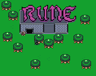
Play game
Rune's itch.io pageResults
| Criteria | Rank | Score* | Raw Score |
| Sound Design | #1 | 4.615 | 4.615 |
| Era "Feel" | #2 | 4.615 | 4.615 |
| Overall | #2 | 4.323 | 4.323 |
| Graphical Presentation | #3 | 4.385 | 4.385 |
| Fun | #3 | 4.077 | 4.077 |
| Controls | #3 | 3.923 | 3.923 |
Ranked from 13 ratings. Score is adjusted from raw score by the median number of ratings per game in the jam.
What style of retro game were you going for? (Year/Era/Console/etc)
Gameboy Color
Leave a comment
Log in with itch.io to leave a comment.


Comments
Incredibly charming and stupidly fun! The whole presentation of it immediately won me over, and it was simple enough for a noob like me to have fun playing!
The knockback on the saws/fans was a bit hard to deal with sometimes, since they made me clip through the edges of the walls and get stuck and killed. Also, once I died I couldn't respawn, it just froze on the death screen.
But none of that really hindered my enjoyment of the whole thing! Great work!
Thank you, the death bug was something we weren't aware of, we must have somehow broke it when we updated to v1.1. It's since been fixed and hopefully that'll be the last update.
Thank you for your feedback and for playing!
Very cute, links awakening clone with raccoons. It plays well, looks nice, sounds great. I enjoyed the dungeon, and the boss was perfect (pulling the tongue out with the hookshot was fantastic).
Some minor presentation issues (HUD covered top portion of gameplay area on my screen resolution (I have a widescreen monitor), and dialog box pixels seemed off somehow.
But overall I really enjoyed it, good work
The resolution problems are something that I'll need to fix in future games, it's something I've had a hard time with for awhile and I'll need to actually look into a solution for it rather than slapping the same scaling/UI on for every monitor.
Thank you for your feedback and for playing!
I thought the hit sounds/animations were great, having the enemies flash when you hit them and then explode when they die looked great! There were a couple spots in the beginning area where dialogue boxes popped up when I wasn't talking to anyone, and sometimes when I got hit by the rotating fans they would knock me back into the previous screen and I would have to wait for the screen transition. The sounds and music were excellent and I loved the colour palette, everything looks so alive!
Thank you for the feedback! Yes the dialogue boxes are very messed up we realized it as we were testing the web build.
Thank you for playing!
A very good recreation of the GBC Zeldas!
I do wish enemies dropped health, I ended up fighting the King with only a quarter heart left and he bugged out a bit. The dialog box stayed on screen for a while after the king started attacking, and so I died. But I also respawned in the same room which I'm not sure was intentional.
Also you have the hitbox of the two brothers having a conversation too tall, I tried to go into Rune's house and triggered conversations with both of them.
Thank you for the feedback! I'm aware of both bugs, however when you use the warp pad after getting the boss key it should heal you back to full health, maybe that's also bugged.
Thank you for playing!
Good execution for this zelda-like ! it lacks of sound for grappling, the hitbox of the rocks in boss area is strange, like the helix movement too, maybe it’s because of “unity” to try to made 2d i don’t know, but else it works fine.
The grapple was intended to have a noise, as was the sword with clinking onto walls but we ran out of time to implement either.
I'm not sure what you mean by the helix movement, but I agree the falling rock hitbox was a bit odd.
Thank you for playing!