Play game
Super Stealth AdvenTure's itch.io pageResults
| Criteria | Rank | Score* | Raw Score |
| Overall Good | #2 | 3.500 | 3.500 |
| Graphics | #4 | 3.667 | 3.667 |
| Overall | #4 | 3.250 | 3.250 |
| Sound | #5 | 2.833 | 2.833 |
| Modifier | #6 | 3.500 | 3.500 |
| Overall Bad | #7 | 3.500 | 3.500 |
| Gameplay | #9 | 2.500 | 2.500 |
Ranked from 6 ratings. Score is adjusted from raw score by the median number of ratings per game in the jam.
If you have implemented the modifier, how have you done so?
Attempted PS1 graphics, except everything has too many polygons
Leave a comment
Log in with itch.io to leave a comment.


Comments
This is one of the best looking games in the jam from a graphical perspective. The graphics are reminiscent of many early 3D games. Tomb Raider, on my Dreamcast comes to mind.
On the other hand though, the character models and animations are obviously a lot more detailed. While this could have been a problem, the lowered resolution creates the impression that they are worse than they actually are. Great move, weirdly enough!
If there is one deal breaker in this game, It's the lack of checkpoints. I managed to get just past the river after many trials and tribulations. The fact that there are no checkpoints, combined with the lack of health bar, makes it seem very random to the player when they die. There were times when I though I was playing perfectly, when suddenly I entered the T Pose of death. It made the combat seem more luck-based rather than skill-based, which is a shame.
I loved the use of music. The dubstep was a perfect fit. As someone who also learned blender for the first time in this jam, you seemed to learn much faster than I did! Environments and stuff looked great, and it helped to create a very coherent package.
Overall, this was a great game, as have been your previous ones. Well done, and good luck!
Thank you! I think I'd need better modeling knowledge to make truly low poly models that actually look like what they're supposed to be in the short duration of the jam. I'm really amazed by how few polygons developers got away with during those times!
I considered adding checkpoints, but wasn't sure how to do it in UE4, and it would also kind of break one of the three endings. I think it'd ultimately have been better to try anyway even with the weird interaction with Ending 2, since I had a small bit of time left!
I also definitely need to figure out UMG so I can actually add health bars next time, if I keep using the engine. I can see how it probably was very unclear from a gameplay point of view without those.
I hope you still had some fun with it despite these faults!
I'm glad I found that song, especially since it (completely unintentionally) seems to fit the tempo of Airi's stealth animation very well.
The models themselves are actually done in ZBrush, which I keep learning and then getting rusty in with alternating use and disuse... I don't think I could have made them with Blender in that timeframe, though.
I learned to animate in Blender using a nice paid video tutorial training series I'd gotten from a friend, which definitely helped with speed I think!
Thank you very much! SBIG has definitely been my favourite jam so far, thanks for the three times you've held it! I hope this jam returns 2020 and I can join again!
Thanks for your comment! I'm glad if you enjoyed the game.
I kind of imagine it's possible in some spots, though I didn't thoroughly test it myself!
I think what this submission lacked in the modifier it made up for on the so bad its good side. The dubstep whenever you crouch, the non-animated enemies who float in the air when you die, horrid level design and draw distance are all great touches.
The two things that to me stand out as falling under the retro modifier are the low draw distance and the zooming out and spinning of the camera when you die, all you'd really need on top of that is for there to be a really echo-y death scream ala Metal Gear Solid. The sound effects for the jumping, walking and some enemy attacks were some nice little flourishes.
From a certain perspective I can certainly say that this game is the most immersive with the removal of any HUD or menu whatsoever.
Also I have to congratulate you for learning UE4 and blender for the first time, as someone who has used blender since they were in elementary it's always nice to see people pick it up for fun.
Overall, good job man!
Thanks and I'm glad if you enjoyed the game for what it was! An MGS style death sound might have been fun, but hard to do with BFXR (which I use for sounds, but if I make more games in styles like these, I will need alternatives).
I've been liking HUD-less games ever since Mirror's Edge, if not earlier, but I think they're hard to do properly. I think this one would have certainly benefitted from some more information if it hadn't been for this particular jam!
Oh, it's not my first UE4 game, though I'm still learning a ton when it comes to the engine and spend a lot of time just figuring out how to do things, but I did use skeletal meshes and animations for the first time I think. I did have to learn Blender, but it actually seems pretty good for rigging and animating!
Thanks!
All respect with the T-POSE
Graphics
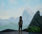
There is an adventurer named Airi, standing in front of an endless fog, mountains are visible in distance and shes imagining her adventure to the lost forest of wild and fearless evil to get home. But when you turn your mouse around, you find out that the best looking thing in this world is Airi herself.
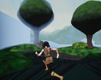
Super low poly tree cup cakes, with circles of grass on the ground and straight walls of rock and flat green to ensure you don't go out of game boundaries.
Who do you think guards this beautiful environment? Some disabled people with a fox mask and no fingers. They say "OOF" when they see you, and move their arms to magically summon an arrow to slowly fly toward you. But they just stand there hoping their arrow might hit.
After you move to the jungle, you'll see some pork statues of dogs flying to you from the sky with invisible jet engine. You'll also see a huge uncomfortable polar bear as a boss; which is the reason why the internet is afraid of T-Pose.
There is no UI graphics in this whole game.
Sound
When you start to walk, you find out that the game has sound and that is a nice walking sound.
But when you press space, you look to your closet in real life to see if your Atari is revived and booted River Raid for you.
After you found out that you don't have an Atari, you press ctrl button and hear your party animal neighbor playing some dubstep in the midnight; although Airi is trying to tell you that the sound is from the game by twerking for you. The same game with an 8-bit OOF sound.
Gameplay
You will start hitting magical blue orbs to the thing you've found pointing arrows towards you, then you tie them with rope (even though it doesn't look like you have any rope at all)
After failing some tries and converting to camera rotating T-pose state, you try the stealth way and don't enjoy anything other than Airi's dance.
So you find out that you can actually run away from everything and just go speed run the whole map, and yeah sorry I don't have time for boss fight Mr. Big Static Black Bear™️.
After ignoring shitload of baddies and having an army of angry floating dogs behind, you see this image:
No creature was harmed during my playthrough.
Overall Bad
Let's see; no menu, no UI AT ALL, poor environment (even if you tried to be like PS1 games, it's not a good one), awful animations, enemies turn into a solid roped object after death, clicking fast cancels the previous attack and resets the whole attack, fog don't let you see anything and you can still fight after death.
Yup, that's bad enough for an SBIG game!
Overall Good
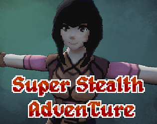
Let's see; decent gameplay (It progresses like a standard game; I liked it personally), the atmosphere feels like a PS1 game overall, nice color mix, character controller is good (thanks to UE4) and oh my god your character looks very nice! For a one week jam you've put so much into Airi and she's absolutely beautiful. You're a great artist!
Modifier
Putting a pixelation image effect and making everything low poly is a lazy way of making a game retro; but I can say that it is sort of good. You could make the main character more low poly and just lower texture resolutions instead of the image effect.
I enjoyed this game and the fighting system is amusing too. It would been better if there was a story to it like Airi was going to save her home from the bear that kept her family or something. Nice game overall, keep up the good work!
Airi is very cute btw :>
Woah, thanks for the long review! I'm afraid I'll not be able to respond to everything, but here goes:
Cup cake trees, hehe! I do hope I could do a better job with environment modeling if I took more time to do it (and with a different aim than this jam, obviously). I couldn't use a landscape because my PS1 simulation material wouldn't work with it, so I had to do things in a more oldschool and terrible way. The fox mask people are actually supposed to be Goblins, though I can kind of see where that comes from...
With things like "Huge uncomfortable polar bear", and the sound descriptions your review was quite funny to read! :D
Nice, you got ending 1! I doubt many people will feel like trying to get the other two, somehow.
I must confess that I never actually owned a PS1, I think good PS1 games definitely looked better than this by far. I'd imagine there were some around that had this type of environment, though. Especially straight, flat, treeline walls seem like something I remember from quite a lot of old games!
I would have liked to make lower polygon models, but I somehow feel like that would've actually taken a lot MORE effort than their current state. The people making PS1 era models must have been really good to get away with so few polygons! I did use very small texture samples for everything except the skybox, but I think it's less evident because of the higher polygon count and pixellization.
Oh, and I definitely wanted that simulation of affine texture mapping. While people thankfully made tutorials about how to do it in UE4, it still took me a while to actually get it to work on my end.
Thanks for all your praise about Airi! I don't know if it's "cheating", but her concept actually exists for over a year now and she's my most fleshed out character. The actual content itself was all made during the jam though, in fact the entire project basically started with the thought of "Hm, the modifier is 'retro'. It'd be a bit boring to use 2D pixel art since I already use that a lot for other games, and my Construct 3 license expired anyway. I could try to make a 3D model of Airi in a PS1 era style...".
And so I learned how to use Blender to rig her and tried to build a game around her. If you actually like her enough, she does feature in my short visual novel over here: https://cubehero.itch.io/radiant-sun-academy , although I'd rewrite some parts of her story in there if I did it again now. Also her initial concept art because you had so many positive comments about her (She doesn't even have a sap on her sheet, but ended up fighting almost exclusively with that):
That's very nice! Like I said, the game is fine by me; but I recommend you to switch to unity, it has a better UI system, it's free (no expired subscriptions hehe), and the documentation makes the learning easy; also its community is huge and it has better cross-platform support!
If using older content made by yourself was cheating, I would have to remove my entry entirely!
Of course I liked her enough :D I'll give your visual novel a shot soon. Keep up the good work!
Hmm, maybe one day, though I'd have to relearn so much stuff that I'm starting to understand in Unreal and Construct that it's not a good feeling.
Yeah, I guess the "rules" on older content aren't as strict, and all the assets are new!
I'd be happy if you do! It's not very long and I think I got a bit better with writing since then (and would change some stuff about both story paths), but I hope you enjoy it if you play it!
This is probably the best looking game of the jam, might have done the modifier the best, and is probably one of the more coherent.
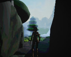
It definitely has the look of a PS1 (or, to me, more like early Glide) game. Low res, limited palette, no filtering and awful draw distance, check. Well... almost. I don't know if it's a bug or I just didn't notice it the first time, but the second time I fired up the game the facade dropped a bit. It had very modern looking motion blur and I could tell that the pixels were done with a postprocessing effect. Kind of a shame, too, because the first time I played it I was blown away by how retro it really looked.
The framerate also varied a lot. That might be my computer's fault; I'm not sure if it's actually running on the dGPU or not.
The stealth music feels really out of place. I don't know if it's a reference to a specific game, but it really threw me off.
The gameplay is eh. It's rough but it (mostly) works. Normally I'd say that it's off to a good start but for this jam I think it's probably the worst place to be. My favourite games in previous years were the ones that played well but were awful in other ways, or had horrendously weird and awful gameplay but were still somehow fun.
With no HUD, no menus, no pause, and no checkpoints, it felt really incomplete, like a prototype. I'm not sure if that's a good thing or a bad thing for this jam. I did find having to start from the beginning every time very frustrating, and never reached the end.
I don't know. I think it's actually really well done, especially in terms of being a retro game, but I found it kind of boring to be honest.
Thanks, I'll take that a positive, even if I never know if that's the case with this jam!
This is actually made on Unreal Engine 4, I spent a decent bit of time figuring out how to downgrade the graphics in the engine to get close to that look! Especially the simulation of affine texture mapping took me a while to integrate because I missed a step (more like a tiny label on screenshots) in the tutorials people had written about it, another thing learned about UE4. D:
I'm surprised there are framerate problems with the low polygon (I think? By today's standards, at least) models and aggressive culling distance, but you're not the only person to report it. I wonder what's going on, there.
The stealth music was a random idea I had because I felt the game was still a bit too "earnest" for the jam and wanted to put some more jank into it. I tried it out, saw that my stealth walk animation actually somewhat matched the beat, and just kept it in.
It's weird how the three times I joined this jam, I had different project themes every time. The first one was just as much meme as I could put into it, the second a super overscoped game that was mostly based around making a "lame" concept out of a cool setting, and now this one was mainly just "I kind of feel like trying to animate my own 3D character". I actually got enough Blender knowledge to do that during the time of the jam, so while I do kind of agree that the meme/jank level could be a lot higher and more fun, I at least learned a lot! I do kind of want to go back to just making a huge meme game if (hopefully when) there's an SBIG 2020.
That also goes into the other point of no menus and UI, I basically just decided to put the time elsewhere since I'm still not super comfortable with UMG widgets and stuff. I should go through a coherent Unreal Engine course some time so UIs aren't arcane magic anymore.
I'm a bit sad you found it boring, but I guess not all games are for everyone! With more time (maybe) resulting in a better level and more enemy types, it might have been more fun, too.
While the faux-retro isn't perfect, it's fine for a jam game. Getting a perfect look takes a lot of time, and this was a one-week jam. Downgrading graphics can be difficult. I'm quite familiar with Unity and I wasn't able to get Beach Defend 2000 to look quite the way I wanted it in the time I had.
I tend to like really bizarre, weird games, especially in this jam. The epitome of a "so bad it's good" game, in my mind, is one that makes me go "WTF did I just play" but also "let's do that again". I actually feel that every game I've made for SBIG Jam, including this year's entry, has been too conventional. I think next year I'll try to do something really weird.
How is Unreal's UI system? I have mixed feelings about the one in Unity.
I imagine look-wise it might be better to just go for older engines from the start, but most of those are so unwieldy, inefficient and sometimes just straight up horrible to use. I actually tried manually setting a low resolution in UE4 first, but since that always screws with monitor layouts and the like when fullscreen, I thought the postprocessing option was preferable.
Yeah... I still fondly remember things like "I am the Intergalactic Wizards", just really bizarre stuff. I'd currently like to try something more out there for 2020, but who knows how I'm feeling next time the jam hopefully rolls around. While I learned a ton both with Cyberpunk Helpdesk and this game, it should be an interesting experience to just try to do something as weird as we can muster.
I have little Unity experience and don't actually know how to even do a healthbar in Unreal without looking it up, but from what I've seen, the UI system in Unreal actually seemed pretty robust. I've just not learned how to use it yet, which made me skip a UI entirely!
I've built some games in GZDoom (my entry last year, TWAT, was one of them) but I'm moving away from that engine for exactly that reason. What I've found is that with retro engines, there are hard limits on what you can do, at least while maintaining your sanity. GZDoom is about as flexible as it gets, but it still doesn't support (for example) skeletal animation, video playback, or a robust custom GUI (ZScript might have changed the last one). If you need any of those you're straight up out of luck. It could be an interesting challenge but it's not my thing.
Oh yes, I remember TWAT, I played it and the final boss killed me as I ran out of ammo (it must have been very close to death itself). :D
I also experienced older engines to be a lot more prone to parts of your project just disintegrating (map data, mostly), kind of, or simple things taking forever to do. Though using something like the Build engine (if there's even a "generic" version of that around, I haven't looked) for a jam game might be a fun change some time!