Play game
Testing Commence's itch.io pageResults
| Criteria | Rank | Score* | Raw Score |
| Sound | #11 | 3.474 | 3.474 |
| Aesthetics | #12 | 4.000 | 4.000 |
| Overall | #15 | 3.526 | 3.526 |
| Theme | #19 | 3.737 | 3.737 |
| Gameplay | #34 | 2.895 | 2.895 |
Ranked from 19 ratings. Score is adjusted from raw score by the median number of ratings per game in the jam.
Leave a comment
Log in with itch.io to leave a comment.


Comments
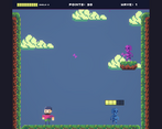
Great artstyle and music! It feels polished.
On the gameplay side, it’s a bit hard to dodge because of how big the character is compared to the projectile and the world. Also the skeleton you’re trying to doge is moving pretty fast. I would love to see some visual cues that the skeleton will move in my direction.
I found that buying a second skeleton in wave 2 was not effective as the projectiles were often canceling each other!
Oh also, I would have liked to see my health!
Overall pretty good, congrats for your entry!
Maaaaaan that artstyle and that music slaps!!! Great Job! :D
Nice graphics and music ! Rated !
Pls check mine too :)
Aesthetically pleasing game, good music. Gameplay wise also very good. I liked the game, so I'm gonna be a little bit more critical than for a few others and say that you could the dodging theme a little bit more perhaps. But otherwise, I really liked the game.
this was a really cool idea, the graphics are nice, music is good, fits the theme well, the only thing was that the gameplay was a bit meh but other tha that good game.
Nice concept! Aesthetics and sound pretty good as well. Nice retro style.
As for the gameplay - it's pretty interesting, and could be even better, if you'll simplify rules somehow.
It's sure something to think about heh, thank you for trying it out and the feedback.
Love the art, sooo good! I think you could give the player a little more control over the game. It's quite hard to get the boss to line up with the skeleton bullets. I love the shop idea though, really gives you a sense of progression. Overall great job!
Thank you for checking it out! Yea I agree on the control part as well, thanks for the feedback.
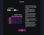
Wow, when you understand the mechanics the gameplay get more impressive. I liked your game. You could try to add the rules during the gameplay in future improvements, it's better than read a long text.
I am glad you liked it, thx for trying it out and thx for the feedback.
Nice work dude!
May you rate my game too?
The mechanics of this game are very clever, at the beginning it was a bit difficult to understand exactly how everything works but in the end it was very friendly, graphics are simple and nice. I love the retro style and the skeletons sprites. really nice entry!
Thank you for the feedback and checking the game out, I am glad you liked it!
Fun game, enjoyed the art and gameplay. Although it was a bit hard jumping over the enemy consistently.
Thank you for playing
I like the art and music. The concept is fun. the projectiles can be somewhat hard to see though.
Thanks, will keep in mind if I ever revisit it
Fun idea! I couldn't remember any of the combos though. I also wish your squad of purchases skeletons had some level of persistence. Maybe they can be damaged too, or last X waves? It also took me embarrassingly long to figure out where my health was.
Thank you!
Very interesting take heh, I may implement something like that if I ever revisit it, some more clarity in UI and gameplay would be nice
Game has a very unique idea. The risk/reward of buying more enemys to dodge in order to do more damage is great! I like the different elements but I can't remember what does damage to what, so perhaps add a window in the shopping menu to remind players. Also consider making the User Experience better by telegraphing where the boss is moving before he moves, and it feels at times that the players jump is just a little too short. The UI is also hard to read when trying to dodge 5 bones on the screen so maybe consider some revisions to that if you go back to this project. Fantastic game and a great implementation of the theme. It has a lot of potential to be a well polished game if you revisit it!
Thanks for playing and detailed feedback!
Yeah I agree, if I do revisit it I will surely make more clarifications in systems and UI. I am glad you liked it