Play game
.Red's itch.io pageResults
| Criteria | Rank | Score* | Raw Score |
| Aesthetics | #222 | 3.077 | 3.077 |
| Enjoyment (Best Game) | #257 | 2.462 | 2.462 |
| Sound Design | #267 | 2.462 | 2.462 |
| Horror | #290 | 2.154 | 2.154 |
| Story | #347 | 1.615 | 1.615 |
Ranked from 13 ratings. Score is adjusted from raw score by the median number of ratings per game in the jam.
Leave a comment
Log in with itch.io to leave a comment.


Comments
Hey .Red Team!
Very cool experience you have created!! I definitely experience the anxiety of being chased and loved the retro aesthetic.
Some notes after playing:
What I liked:
I would love to see this developed more with some added monsters and some easter eggs to truly capture the Adventure vibes. Overall though, fantastic job! Loved it so much.
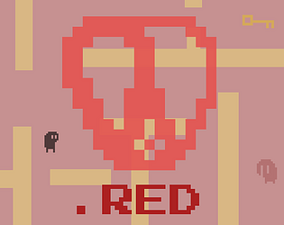
Wow i ran in a circle far too long :D. Nice little game. I like the Atari game style. And is the moster a cutlet? :D
really liked the minimalistic visuals and the fitting music. I had issues to find out where can I go and where not, because I had to walk out of the screen in both cases. Nice entry!
Fun little maze-type game, the way the camera was used made for some interesting gameplay in seeing threats nearby and potentially other routes but not always being able to get to them so easily. One of those games where you start to make a map in your mind for sure.
Nice old-school vibes in this one. I especially like the chase music when a monster is nearby. One thing I would appreciate is some sort of feedback to the player when they pick up a key, especially when they pick up the last key. But overall, nice work!
Fun game! You weren't lying when you said it was a labyrinth I got lost few times, I liked the chasing music and the game does have that Atari feel, Nice game.
I think I got lost and couldn't find the door :D It was fun but I had to scaled down my browser to see where the walls are. Well done!
The sounds were well done, the art was a little underwhelming, overall good job!
Thanks for the feedback! None of us on the team were artists (we were all teams of coders) so we decided to go with very very simple atari-style graphics to still create a somewhat visually interesting game while still putting most resources on the coding.
Atari homage was pretty fun, nice looming sound effects as well.
Enjoyed the game, the Atari style was accomplished well and I liked the strange eldritch shapes for the creatures. I agree with the things you noted (UI/sound/fill up the rooms) would help improve the experience but I think the core is solid.
Fun game; the map felt quite empty which helped in getting me lost, but I feel some small props sitting around would help liven up the space. The color scheme is a bit bright for a horror game maybe some darker colors and a small area light around the player character to give a more spooky feeling to the game would help. I like the camera usage with having the enemies continuously following the player as you move through different areas. Though some of the walls I couldn't see from separate areas, which made it a bit harder due to running into walls thinking I would move into the next section, but instead having to move along it to find the entry way into the next room. So making sure the walls are shown in each connecting room would be nice just to know where the entry way is. Some rooms have it others don't on certain parts just making sure they all do would be nice. All these suggestions are just that suggestions taken them or leave them they're just my thoughts on how it could be improved, I enjoyed the game none the less, well done.
Thanks for the feedback! Originally there were plans to give a CRT filter making the game a bit darker and we were trying to adjust the maps to be more visually clear but due to the time limit we weren't able to implement it. We may try to release a new version with these changes to add to the overall aesthetic to the game and improve the UI/add more sounds/fill up rooms a little more to create more immersion.
it's like the backrooms but good