Play game
Scary!'s itch.io pageResults
| Criteria | Rank | Score* | Raw Score |
| Aesthetics | #306 | 2.688 | 2.688 |
| Sound Design | #357 | 1.938 | 1.938 |
| Horror | #359 | 1.750 | 1.750 |
| Enjoyment (Best Game) | #386 | 1.750 | 1.750 |
| Story | #462 | 1.063 | 1.063 |
Ranked from 16 ratings. Score is adjusted from raw score by the median number of ratings per game in the jam.
Do you allow SCREAM ZONE to promote your game via social media?
Yes
Which engine did you use to create this game?
Godot
Leave a comment
Log in with itch.io to leave a comment.


Comments
Good prototype, but not much in gameplay. Your 3d style may serve you well in the future.
WOW! I really loved the ambiance. A couple of jumpscares also got to me! I'm looking forward to your future projects!
P.S. I made a video where I played a couple of Scream Jam games and yours is in it!
Links don't seem to be working, so my channel name is: SkriptenBlu, you'll see it!
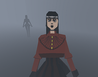
The character design and audio were well done.
The ghosts are just fast enough.
The simple environment adds a dreamlike quality to the world, but could need a bit texture to not be too sameish, f.e. the blue lights at the exit were a nice touch.
SCARY!
The general ambience was good , loved the model, for a prototype is really good, expecting the full game!""
The character model is well done. But the game itself is a prototype. There's not much to do there.
This reminded me of those dreams where movement is all funky and you forget how to run haha. The characters looked good but like others have said having a little more in there would be nice
The character model was nice and the foggy environment is always a plus. I also think it would have been cool to have more things in the environment, lighting and stuff, but simplicity works too. As labyrinths do, it still got that nice tension of what is behind the next corner, but I do wish the enemies were bit more tricky to handle. Regardless, good work.
I really like the low poly theme, if only there was more decoration.