Play game
The Deal's itch.io pageResults
| Criteria | Rank | Score* | Raw Score |
| Fun | #26 | 1.895 | 1.895 |
| Theme | #29 | 1.842 | 1.842 |
| Overall | #31 | 1.987 | 1.987 |
| Art | #31 | 2.053 | 2.053 |
| Creativity | #32 | 2.158 | 2.158 |
Ranked from 19 ratings. Score is adjusted from raw score by the median number of ratings per game in the jam.
Leave a comment
Log in with itch.io to leave a comment.


Comments
I like the vibe and the introductory paragraph is very fun and adds to the atmosphere (:
the hitboxes and random arrows are definitely pretty finnicky, but overall nice level design!
my rating: 97 casks of amontillado out of 1
I wasn't able to beat it - the random arrows are really unfair and it would really go a long way if you saw a short visual cue before an arrow hole fired. Also, if you slide along a wall and the wall ends, you can't move in the direction the wall was prohibiting you from moving in until you stop moving altogether. Definitely fix that, but otherwise neat submission!
It's always nice to see a unique art style even it's a simple one like just using black and white. Arrows being random was a bad idea tbh. Usually the deal with that sort of trap is watching the pattern and waiting for an opening, in this game it's basically just luck.
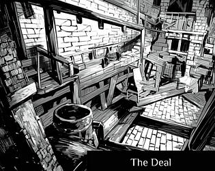
Also - where is your cover from? I'm a bit suspicious that it could be stolen or an AI image, but if it's photography with a filter or an art piece of yours that's cool.
The arrows do seem to be a bit unfair, and this game is really tough. Adding checkpoints or something would really help it a lot.
For a first game and first time using flowlab, this is pretty good!
Only thing that was a bit odd is that the arrows seem to be 100% random with when they shoot and how many are shot, which was pretty frustrating since there was no pattern to recognize (i.e. they felt unfair).
But the sounds and music and art were good, and the game felt fairly good controls-wise.
From now on you should try and keep all the art in your games the same pixel size, also consider making the walls look like one smooth object since right now it looks a bit ugly.