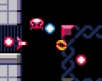
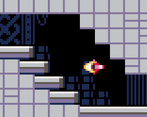
There's not much here to dislike. The old-school aesthetic is nice, the game plays super well, the controls are simplistic, and although it isn't strictly a metroidvania, I do love the interconnected rooms that make this feel more like a dungeon crawler. If there is one change I would make it would be to make it more metroidvania-esque. If anything, I'd recommend using Mark Brown's Dungeon Graph to plan it out.
Play game
ScytheHeart: Switch Strike's itch.io pageResults
| Criteria | Rank | Score* | Raw Score |
| Overall | #1 | 4.556 | 4.556 |
| Innovation | #1 | 4.556 | 4.556 |
| Gameplay | #1 | 4.556 | 4.556 |
| Overall | #1 | 4.556 | 4.556 |
Ranked from 18 ratings. Score is adjusted from raw score by the median number of ratings per game in the jam.
Comments
Nice art, gameplay and music! Everything seems to be in place here, good job!
Awesome examples of screenshots and a video, most people seem to be forgetting this, it does give a good idea as to what to expect from the game.
I'm rather impressed by this game, I feel all of the components blend together really well, music, sound effects, art style and concept all come together to make a really, really nice retro sci-fi game.
It's difficult to point out a negative to this well-polished game, I can appreciate the extra detail to feedback for the player though, like when you hit a wall.
Amazing game!!! The audio was honestly perfect for the game and was kinda catchy aha. The gameplay itself was complex enough with the colour changes to be challenging but also had elements such as the health packs which made the game more forgiving which is awesome. The visuals were crisp and nice and the game on the whole is so so so good. Everyone on the team should be super happy :))))
This is extremely well polished with a unique mechanic and engaging, responsive gameplay. It could easily be the first level of a professional release, everything from the sprites and sound effects to the level design shows a high attention to detail. If I had to make a critique it would be to indicate the objective more to the player but this is a real nitpick. I'd really love to see you take this further, this would 100% be something I'd spend money on. Congrats to the whole team!
A solid submission, I loved how you had a retro type style to this with the 8 bit music really making this stand out and the sound effects I felt were spot on, the retro styles combined made this game make me want to play for longer durations and by having different paths made me want to explore every area and find the correct path to beat the game, I loved how you had a control for changing colour which could then be used to open areas as well and another for shooting and even within the pause screen a restart cart which made this even more retro. You should all be proud of this submission its hard to spot a negative for this, well done!
Loving the retro GBA artstyle in this game it looks great and paired with the overall theme of the game and 8 bit music fits it plays real well. The colour shifting mechanic is a good touch and adds a nice extra layer of gameplay in the game. Really nice that this game has a tutorial intergrated into the level and that the level itself has multiple different plaths to take. Great game, job well done.


Leave a comment
Log in with itch.io to leave a comment.