Play game
Suika Is Drunk's itch.io pageResults
| Criteria | Rank | Score* | Raw Score |
| Story/Writing | #13 | 3.316 | 3.316 |
| Audio | #14 | 3.816 | 3.816 |
| Visuals | #19 | 3.974 | 3.974 |
| Concept | #32 | 3.632 | 3.632 |
| Overall | #34 | 3.132 | 3.132 |
| Challenge | #48 | 2.184 | 2.184 |
| Gameplay | #49 | 2.526 | 2.526 |
| Use of Theme | #50 | 2.158 | 2.158 |
Ranked from 38 ratings. Score is adjusted from raw score by the median number of ratings per game in the jam.
Team Members
joshlynn, pixitales, ASARI, dosei, Blood-Jackal23
Leave a comment
Log in with itch.io to leave a comment.


Comments
Suuuuiiikaaaa whatcha dooooin'? ROFL
It's fun and WTF-inducing and leans quite a way into the easy side challenge-wise. Although Suika tumbling to punch is funny as heck, the hit detection could use more work. There's nothing as frustrating as being in range, clearly touching the enemy visually and actually not hitting.
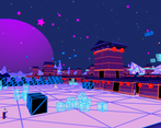
It's pretty chill with the BGM and visuals. Is vaporwave vision a thing when you're drunk? I've never been drunk so I'm curious.
I featured this game in my Touhou Game Jam video!
https://youtu.be/PoWrHcmGjbU?t=4749
Pretty art, a neat environment, VOICE ACTING! Gameplay is simple. Could be expanded on.
Good in many ways, but unfortunately not in gameplay.
Music is very good.
Japanese VO is a very good touch with the addition of the subtitles.
The conceptually I see where you are going at for a combo brawler.
The story interestingly was that I expect from touhou so I give a 4 star, but not 5 for something actually substantial.
The fact that it's a complete game from beginning to end is always good thing in my book so bonus for that.
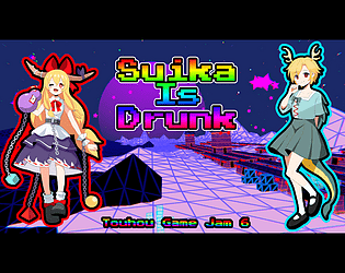
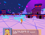
Oh lets not forget that the art is beautiful, and the presentation actually makes up for the lack of gameplay and story. The Neon streets, and pixal art UI had a strong vibe. And those blocks although useless gave a nice ascetic touch. Probably not mentioned often was the use of game cam while not in control of the player it could be argued that there was a narrative purpose as well as giving a unique view of the setting and combat , it's actually refreshing.
You should be proud.
I would really like to give this a higher score, but the camera is just not right, its very hard to see where you are at the beginning, I had a hard time finding the start point.
The volume was also a problem, sorta, the voices are too low, but the music was too high, balancing both should do it.
The battle system was funny, hitting a foe was like doing the Michael jackson pose xD.
Even if it was a mistake, I liked that, was like the drunken fist style or something xD.
This has an interesting story, but I was kinda confused because I thought this was the lunar capital xD.
Very Aestetic vives on the background tho, approved.
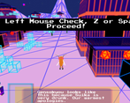
It's very unclear, when Suika's punch does anything, I'd like to hear something or see something, when it connects. Also, the first area is a bit confusing. But I do like the visuals and I adore the usage of TTS for the voice acting. It adds a lot of charm.
Visuals are so cool stylistically, it's really something! The story is short but very funny. If obly it was less buggy and the combo concept was implemented, it would be a really great game. I also want to give credits to the art in meny, it's really cute.
The camera makes it really hard to see what I'm doing in the first section, maybe my screen is too big? Suika's really tiny and there are many points where I just can't see her. Beating stuff up is fun though, and it fixes when I get to the main area
I really like the art style and the vaporwave hell is a nice aesthetic too
Thanks for the comment! the first camera is supposed to give an overall view, but you're right that it's a bit difficult to see, we did not account for someone exploring that area (not enough time to playtest much!). Glad to hear you find it fun and like the style!
Well, this was an experience. Every part of the visuals were great: the vaporwave aesthetic, the characters sprites and portraits, even the blocky models. The writing was also kinda funny (TTS? voice acting was a nice touch), and the music was groovy. My only critique would be the gameplay: combat was admittedly pretty flat feeling, and some of the camera angles were a little weird.
camera and ending kinda weird but damn 3d environments with a neat purple aesthetic, as well as art on the title screen and pixels for talksprites? visuals are great
the punch is kind of ??? for when it hits or not but it gets the job done against the not-very-mobile enemies
This certainly was a treat for the eyes (and ears). Also the first one I've encountered with actual voice acting :O Given more complexity in gameplay, this would've been something I'd expect from a high production value.
Fun concept--I agree with others re: wanting a little more feedback on hitting things, but otherwise I'm feeling the aesthetic. I wish this was how everything looked when I'm drunk, but then I guess we can't all be Suika, unfortunately.
To be honest, it's real rough this one (Understandable for a gamejam though)
The main issue is that the core mechanic of melee just doesn't have any game feel and is very overtly broken. You used a literal rotation for the player rather than having the animation itself rotate, so she constantly clips through the ground. And there's no feedback from punching anything which doesn't feel at all rewarding. No hitstun, no effects, nothing.
And for a brawler, it's very very simple. I'd like some alternative attacks at least.
Visually, The area itself is nice, I enjoy the excuse too, (I mean the land is literally moving under her so it does feel trippy)
But the models, man the character models are the roughest things I've seen in a long time. They need clean up especially texture work wise. I know it's a game jam but man, I'm a 3D modeller and this just isn't a good standard for a character model even as a placeholder. (I do enjoy the goofy references in the models, but the texture work itself needs polish)
The concept itself is a fun idea. And I find the goofy writing to be fun too, but this game needs more fleshing out. I'd be curious to see how it grows though. It could become something good and I'd like to see you guys try to make it shine.
Thank you for taking the time to review our game. There's definitely a lot of work to do here
We will take your feedback into consideration. thanks
You're welcome mate, I am curious to see what happens from here. Let me know :D
Love the aesthetic (and the excuse for it!) and running around as Suika fighting the mt. dew faries is really fun. Enjoyed my time with this game, thanks for making!
The combat isn't super responsive, and the camera starts out really bad (though I think the fixed angles after the starting area work really well, aside from the end where I ended up going over the mountains OoB instead of to the boss)
Thank you for the feedback! To be honest I was playtesting and noticed the out of bounds thing too. But... I like when I go out of bounds in games so I pretended not to notice and left it unblocked (in the team I was in charge of blocking out the level) lol in fact I left a couple other escape routes in
Very Very Cuuuuuuuuuuuuuuuute~
Cute and interesting game. Love the art. I wish the enemiess could put up a better fight. Had no trouble beating the game.