Play game
Phantom Dream's itch.io pageResults
| Criteria | Rank | Score* | Raw Score |
| Visuals | #35 | 3.240 | 3.500 |
| Audio | #39 | 2.469 | 2.667 |
| Gameplay | #40 | 2.893 | 3.125 |
| Challenge | #42 | 2.507 | 2.708 |
| Story/Writing | #42 | 1.659 | 1.792 |
| Overall | #45 | 2.662 | 2.875 |
| Concept | #48 | 2.932 | 3.167 |
| Use of Theme | #52 | 1.967 | 2.125 |
Ranked from 24 ratings. Score is adjusted from raw score by the median number of ratings per game in the jam.
Team Members
Mystialic
Leave a comment
Log in with itch.io to leave a comment.



Comments
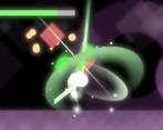
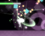
It's looking clean, though I'm not sure how to interpret the things in there (except for the trademark green-slash ghost).
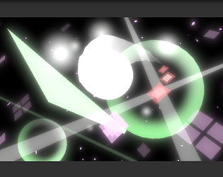
I really appreciated the sound of slices and other feedback sounds and the minimalistic aesthetic is neat.
Though I didn't enjoy the gameplay much. To me the boss fight looked like a quickly made-up cluster of bullet patterns, and the level (with enemies) isn't interesting - it's just a straight line and the enemies are all in a line.
I featured this game in my Touhou Game Jam showcase video:
https://youtu.be/PoWrHcmGjbU?t=5285
Myon stars in a small SHMUP.
This is a good concept but it could be better, chasing enemies is good enough and erasing their bullets is good too, but there's the issue where you can just walk to the exit without attacking anyone xD, also, fighting squares is kinda boring.
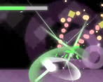
Final boss is quite simple, but it's obvious you focused on visuals, so it was a nice experience as well.
PD: I couldn't run this well enough on chrome, its very laggy, I had to run it on firefox so it could run well.
Really cool concept!
Curious to see how this can be later iterated on!
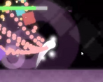
The visuals are really pleasant. I wasn't sure if there was a way to properly deal with the overwhelming spam of bullets aimed directly at me.
The dream-like atmosphere is very cool, and the action feels nice and satisfying, if I had a suggestion it would be to jump higher and dash further
A cool concept, and cool how my first thought upon seeing a bunch of basic shapes was "surreal and minimalist" due to how they were accented. Very good proof of concept!
Cool concept that I think has some potential for storytelling in terms of the minimalist presentation. I think one thing that would've been cool for the jam build specifically is a timer; then people could've compared best times with each other.
Interesting idea, adds more goals, and interaction between players. Thanks for the feedback!
the game looks really good with the minimalism and the glow, and the slash looks particularly rad with some nice hitstun to boot
both the dash and the slash feel a bit stilted since instead of putting you in a state you cant do anything after using it you just can't do that particular move for a second. more like a cooldown than the space between combos
a lot of the bullets seem to not just be aimed but homing though, and you kinda just have to constantly be swinging the sword or you take damage. because of that, you also don't need to dodge much. boss is just hold up and mash x
also i probably wouldn't even know it was touhou if it wasn't for the description, but i guess abstract stuff is cool sometimes. good game
Thank you for the insights.
Maybe I'll try to reduce the time between the last hit and the first hit to make it feels less like a cooldown.
There was supposed to be a melee attack for the enemies to add more depth to the strategy. Also, the original design was actually Youmu slicing Kedamas in Hakugyokurou, too bad I ran out of time.
Very pretty, with satisfying gameplay. Even though most things are simple shapes, the way they were color coded and have added effects (cherry blossoms, bloom, background) give it charm. While the bullets can feel a little overwhelming at times, having a dodge and strikeable bullets gives it strategy on its own and feels solid.
Thank you for playing!