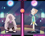
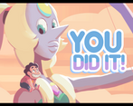
Play game
Gem jam's itch.io pageResults
| Criteria | Rank | Score* | Raw Score |
| Visuals | #3 | 4.577 | 4.577 |
| Audio | #7 | 3.808 | 3.808 |
| Overall | #21 | 3.538 | 3.538 |
| Interpretation | #23 | 3.885 | 3.885 |
| Fun | #33 | 3.077 | 3.077 |
| Gameplay Innovation | #42 | 2.769 | 2.769 |
Ranked from 26 ratings. Score is adjusted from raw score by the median number of ratings per game in the jam.
Spoiler Level
TV Show Name/Season/Episode
Steven universe, Season 1, Episode 12
IMDb link to episode
https://www.imdb.com/title/tt3642464/?ref_=ttep_ep13
Episode description
basically this part. from minute 2:30 - https://www.youtube.com/watch?v=JD53UqgdMZU
Please list any pre-made art/music/other assets that you used.
all art and music was done during the jam.
How many members in your team?
List your team's social media / website links!
art - https://www.behance.net/gallery/33124505/PORTFOLIO-2015
sound - https://www.carminmusic.com
Anything you want to say to players before they play?
a simple rythem game done in a week. we kept the art style pretty close to the real thing because "if it aint broke..." :)
* since a lot of ppl are having a hard time with finding the rythem i've added a small gif in the game section that shows when to tap. if you keep missing the beat maybe it'll help you.
Leave a comment
Log in with itch.io to leave a comment.


Comments
Liked the art, animation and music. The gameplay was fun and a good difficulty. The only problem I had was the placement of the arrow you need to copy. It made my focus on the top right of the screen, making me miss the rest of the game screen.
glad you enjoyed that game.
and yes i got that comment quite a bit :) i definitely could've designed that better.
thanks fir commenting and playing the game :)
I played this and enjoyed it, and was able to "beat" it once I figured out the timing. The art is lovely, the sound is nice, and everything works as I'm assuming it's meant to. The only real issue I have with it is that it doesn't really follow the game jam rules. It's not a game "inspired by" SU. It's IS an SU game and breaks the copyright rules. Sadly that detracts a lot away from this for me. :(
hmmm i didnt think of it that way but its a fair comment. i thought of it before i started but changing the character names or color or hairstyle just to fit some legal technicality felt silly and kinda meaningless.
though copyright is an important issue and i do believe that giving the creators credit and not making money of the game is a must.
thanks for playing and commenting. :)
The game is fun, and the art is beautiful. Although I have not been able to appreciate the movement of the characters due to the location of the arrows. The contrast of the arrows at the moment of typing could also be improved. Good job!
been getting that note quite a bit :) ur totally right. this game wont be revamped but i definitely learned something for next time.
thanks for playing!
Amazing lively music, and slick visuals :) The game play is quite fun; I'm always fixated on that little arrow indicator.. perhaps having the arrows around the dancer would help the player see more of the action :) Well done on an excellent game!
yup, got that comment quite a bit :)
ur totaly right, it was a quick fix solution and i would've definitely made the arrows more in-game if i had more time. thanks for playing!
I love the artwork!!! cannot comment on music since i only review games at my work place xD
hi indian man! glad u liked it ^_^
Amazing art and music! I didn't have much of an issue with the music not quite syncing up, kind of got used to it after a minute. But as others have said I wish I could admire the artwork more while I'm playing it. Pretty impressive entry for the time given, great job!
glad u liked it! thanks for taking the time to play and comment :)
Well, this is a nice little game, with cute design, and simple idea. One problem tho (besides not being very replayable, which is understandable for a jam game), you don't see the beatuful part of the game. All you see is that damn circle with arrows popping up.
lol, yea. i chose an obvious ui design that worked "on paper" to keep things simple for the group but in the end it backfired and we didnt have the time to come up with a better solution, which i guess is also understandle im game jams, huh?... thanks for playing! :)
Nice game. Maybe try to sync the time window with the beat more?
yea, the syncing was more difficult than we originally thought. this was the best we could do in the time we had but thank you for playing :)
Fantastic art and sound. Couldnt get the gameplay too much, wasnt sure if i was doing things correct or not (maybe more positive feedback)? Maybe i was just aweful at it, i dont know.
well, its a challenging game and not as intuitive as we hoped. if you're still interested in giving it a try i added a little demo gif in the game page that might help u out with the timing. in any case thanks for playing :)
Gif was a great idea, I watched it, then played again and was able to pass the level! I might suggest that the left arrow is unnecessary as my eyes were glued to the one on the right (as that is the one I'm supposed to match i think). Might be less confusing if you simply hid the left arrow icon/bubble thing. Additionally you could include some pop-up text next to that bubble to indicate success fail, something like too fast or too slow, or Perfect to give user feedback.
A little too short but what was there was thoroughly polished and oozing with great production values! Would be better if the beats and the music matched up and if you could actually take a breather to watch the superbly done animation.
thanks :) and yes you're quite right. we spent about 2-3 days of work to try and sync up the sound before we decided to let it go and it kinda ate up time for stuff that were more than the basics. as it is with jams :)
Art is terrific and audio is great, but it's very frustrating to keep an eye on the top and now knowing when the arrows will fit, i decided stop playing and just enjoy the animations.
yea, ur not the first one to say that :) i chose a simple ui solution since we didnt have much time to work on the game and i wanted something i could easily edit if it didnt playtest well (which it didnt btw so it was a good choice time-wise) but in the end it fired back on us since it took too much focus. i'll be wiser next time :)
Anyway i loved the graphics and art, and i think this is the strongest points on your game.
Great audio and visuals! As others have mentioned, it was difficult to know when to hit the arrow keys because the visuals and the audio don't sync exactly, but it was a fun experience! The animations in particular were very cool.
For feedback, you could try moving the arrow keys more central and lower, rather than at the top of the screen. for me at least I couldn't enjoy the visuals at all because my eyes were always up top. Also, I seemed to be hitting the arrows right after the other one disappeared because of the music. That or I'm just bad at rhythm games (which is also true... :)
Nicely done!
thanks you for the notes :) and yes, the arrow was a late addition and could've definitly been better executed. i doubt if we'll ever return to polish the game but there were defintly lessons learned :)
The game is very beautiful, and the music works well!
It was a bit confusing the relationship with the Beats, but i still enjoyed. Maybe increasing the contrast of the arrows would help.
thanks :) and yes, i agree with your note, there's definetly room for improvment there :)
I love the style, it looks great! The game is quite hard or maybe just my reflexes are bad XD
thank you. and yea, im afraid it's not clear enough whem to press the key. i've added a little example gif in the game page that might help you a little with that.
Nice art but I wish there was more game
thanks. sounds like you're one of the few ppl that got the rythem right :)
I thought this was brilliant, major kudos to the team! Very well done. Sometimes the sync with my key press didn't work when I swore it did, but aside from this I could totally see it being a flash game on Cartoon Network's site or something!
thanks! and yea, the sync thing is unfortunate, we would've liked more time to figure it out but it didnt work out.
Ok... At some point I just stopped playing to admire the visuals. Really well done devs!
heh, thanks. glad you liked it! :)
Very professional looking, but my god ... my reflexes must be shot. I feel I need to be a little psychic to react in time.
lol, it does need some concentration but no need for psychic abilities :)
there's a time window you should aim for - it's not the exact moment the arrow appears but the pulse ring moment after that. try to use the music as a timing guide.
though i agree that another day or 2 to tweak the mechanics would've been nice...
I think the mechanics are really very tight and nice. They probably don't need much tweaking. Its just my reflexes that needs the tweaking.