Play game
Ghastly's itch.io pageResults
| Criteria | Rank | Score* | Raw Score |
| Topic | #125 | 3.859 | 3.859 |
| WOWIE! | #247 | 3.326 | 3.326 |
| Creativity | #249 | 3.543 | 3.543 |
| Fun | #296 | 3.304 | 3.304 |
| Visuals | #301 | 3.446 | 3.446 |
| Sound | #474 | 2.826 | 2.826 |
| Simplicity | #600 | 3.141 | 3.141 |
Ranked from 92 ratings. Score is adjusted from raw score by the median number of ratings per game in the jam.
Music Source
Music links are available in the game's credit screen with buttons that take you to the link.
Credits
Use the 3 usernames in the credits scene, VeritasViii, Hozefish, and Couchlyntt. Alternatively, our working team name is Losersoft.
Leave a comment
Log in with itch.io to leave a comment.


Comments
The rocket launcher is a cool addition.
The platforming is a little off, I kept bumping my head on the section with 2 spikes and 2 switches and dying which caused my ghost to undo all my work.
I found it a bit strange that I had to die at the end, but it made it more unique
Hi! I've put together a list of my top games from the jam and before I post them on the community section, I'm just checking that you are okay having your game's link on the list?
Yes!!! TYSM this makes my day 🙂
This game has a neat core mechanic, and my favorite part is the visual design surrounding it (i.e. your character, the dungeon theme, and especially the ghost). Rocket jumping was a fun twist to the usual puzzle-style game.
Although I liked the ghost mechanic, it felt like every level followed the same method. Grab box -> set box on button -> stand on another button -> die -> run to end while ghost does the work. My favorite level was the one with no spikes, because instead of immediately killing the bat, it forced me to avoid it long enough to press the buttons and then purposefully jump into it. Little variations like that keep levels fresh in this sort of game. However, to keep things interesting I think you need to introduce new mechanics. Maybe there is a "holy light" the ghost can't enter, which forces you to do part of the puzzle in human form? (This idea is shamelessly stolen from this game, which has a similar theme: https://itch.io/jam/wowie-jam-3/rate/939818)
The movement felt a little awkward because you move so slowly horizontally, but when you jump you move up so fast. I think bringing the two speeds closer together would make the controls feel more natural.
Overall, this game is based on a great idea with lots of potential, and it has nice visuals. Great job!
Yeah I agree with that statement, 8 levels with this basic set of mechanics was pushing it. Thanks for the idea, I'll look into it. Feedback is appreciated 😄
Really nice creative interpretation of the topic which made for some great puzzles, well done!
Thank you so much!
Cool game! It's very creative, I really like the idea of your actions being sort of 'recorded' and replayed when you fail. The pixel art is really nice, reminds me of retro games, and it's very fun to play. It just feels fresh to be trying a new concept like this. Keep up the great work!
Thank you :)
I really liked the pixel art and the gun sound effect worked very well! The concept was outstanding and worked very well and having the ability for previous ghosts to shoot your present self added a lot of depth to the gameplay, and the addition of the boxes also helped to make some really good puzzles!
There were some minor things that could be changed however (not bad things just little quality of life improvements) like changing where the restart button is and masking the gam fullscreen. The spikes could have also done with standing out more maybe.
Other than these extremely minor complaints the game had some incredible puzzle design and seemed very polished mechanic-wise, overall I really enjoyed playing!
really nice game the art is amazing i like the concept but it can be improved:
1- maybe adding variable jump height
2- the spikes are impossible to see
3- sometime the bat dies even tho the rocket is far from him
1. This is in the game, sorry if it wasn't noticeable
2. Yeah.
3. Yeah.
Thanks for the feedback, I'll work on getting #1 more noticeable and fixing 2 and 3.
Thanks :)
haha rocket launcher in historic old mansion with alien gargoyles go brrrr!!
10/10
I kept dying and couldn't figure out why before I realized that there were spikes right before I gave up out of frustration -- the spikes blend in SO much, they really need to be a brighter color. The mechanics were also a bit confusing -- I couldn't tell what the rules were for when the ghost could or couldn't pick up the box, and sometimes I would press a button and the level would restart with a ghost but I didn't see a spike where I was -- is there some rule about "You die if all buttons are pushed and you can't get to the exit" or something like that?
I liked the art and I think the concept has some potential.
I did a poor job making dart traps noticeable, that was what was killing you.
Honestly? Thank you for the feedback, this is refreshing and I am taking notes :)
Ghosts not picking up boxes was... a bug. There were lots of those and not enough time to fix them 😅.
Internally for the full release, we've already changed the colors of the spikes based on feedback.
If you would like to discuss further please contact my discord couchlyntt#0348
Glad to hear the feedback is helpful! Good luck with the full release :)
Hello everyone giving feedback in the comments, I would love to discuss your feedback more since we are doing a full release. If you want to discuss more about the game with me and have better feedback discussion, my discord is couchlyntt#0348
The audio and visuals are great. However, I got extremely confused on level 2 because I could not figure out what was going on although I did finish it. Great game just a little feedback or instruction would be nice. have a great day :D.
This game is pretty cool, I like the graphics and the gameplay concept of having the ghost repeat your actions.
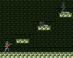
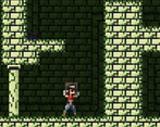
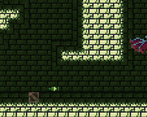
However, this game has a major issue with readability. Even in the first room this was an issue, where the button was impossible to see, as was the arrow trap. The arrow was also really tiny and hard to see. It made it hard to tell what I was doing was affecting the level, like was it the box that was opening the door, or was it me standing on a switch, or was it my ghost standing on a switch? I couldn't even really tell if there was a button I was standing on since it kinda blended into the ground.
To make the stuff in the level more readable, I suggest either changing its color or increasing its size (i.e. there's a big square button that presses down when you stand on it). Also for the tutorial section, anything you make the player read should be utilized in that room, or else the player will forget it. (for me it was the shooting mechanic, I had to replay the game to figure out how to shoot)
Overall I can tell this game had a lot of love put in it and it has so many things going for it, such as the amazing graphics. But for players to be able to experience it, you need to work on making the players understand the game from your perspective!
Thanks, but idk what you're saying about the the buttons not sticking out, blue is a very different color than teal. I'll look into it anyway.
I will use your feedback. Yeah I do agree the tutorial needed work, but it was added seconds before it was submitted and I was tired 😅
We are planning on making a full release so feedback like this is greatly appreciated 🙂.
Okay so I went back and gave the game another try to figure out why I couldn't see the button. Now I see that there is a thin blue line that signifies the button is there. I also got to some of the levels with the spikes, and I think I can sum up the issue with readability with the contrast. The blue on the button is very dark and blends in with the background, and so do the spikes. I think it might also be an issue of the background being too detailed for how small the foreground elements are, so they kind of drown out the foreground elements. I think if you lowered the contrast in the background that would solve that part of the issue.
A trick I like to do to make sure that my pixel art has enough contrast is start with a greyscale palette with the colors having evenly spaced value (basically how light/dark a color is), and making sure there is enough contrast to see everything clearly there. Then I add the color on top (there is a feature in the pixel art program I use, Aseprite, where you can paint over a layer with a certain hue but keep the value of the layer underneath it). Let me know if you want any more info on how this works, I'd be happy to help
Also I got to mess around with the rocket jumping a bit this time and that was very fun! So kudos for that
Alright!
I thought I fixed the contrast issue but I didn't do it enough (I got used to it in dev) by modulating the original background with a darker color... but by not that big of a number.
I'd love to hear more of your feedback, if you have any more or want to discuss more please contact me on Discord (couchlyntt#0348)
okay, if I think of any more feedback I'll send it your way!
I really love the creativity behind this one! The only gripe I had was that it was nearly impossible for me to see the spikes.
Clever mechanic, I like how the ghosts basically replays everything you did! Puzzles are clever and rocket jump mechanic is great. The art style was awesome, it made me feel like I was playing a classic SNES game :)
I only wish the jump was a little lower, it felt too high to me, but overall great job, and amazing idea!
Please consider playing and rating my game if you have the chance :)
The game is pretty good overall, but I had a few issues with it nonetheless.
1. The spikes were very hard to spot. I was confused and frustrated for 2 levels before starting to be able to spot them. Even if it was intentional, that's not a feeling you want to give to your players.
2. A fast forward button for the ghost would feed great, instead of having to reset every time you take too long.
But the strength of the game are as follows:
1. Nostalgically gorgeous 8-bit art.
2. A great concept that works well both on paper and in reality.
Nice take on the theme, controls are a bit weird imo and I did not understand why pushing the second blue button made me die so it took me some time to figure out what I had to do. But after that, it was fun.
It all works great, I like the idea, but it's unclear when and why I die. overall that was an interesting game, controls were comfortable.
One of the more creative takes on the theme I've played.
Some of the rooms had me scratching my head for a little while before finally getting it.
I love this game. The theme is spot on and i loved the level design. Good job guys!!
10/10
It workes fine and the mechanics are cool, but right now it lacks feedback when you die, it happens so fast it got me confused some times, I didn't know I had died and didn't understand whay the level was reseting. It took me some time to notice the spikes, maybe make them stand out mor from the background, with brighter colors. well done