Indie game storeFree gamesFun gamesHorror games
Game developmentAssetsComics
SalesBundles
Jobs
TagsGame Engines

Aaron Harman

37
Posts
5
Followers
3
Following
A member registered Jun 10, 2020 · View creator page →

Creator of

Recent community posts

Managed to beat it with 100 seconds left but it still felt down to the wire! Love the concept of rushing around to figure out these puzzles before the machine shuts off.  I think the riddles were a good difficulty, but I do wish I had a bit more of an idea of where to look for the objects once I knew what I was looking for. The surreal vibe was great but it led to me basically stumbling around until I saw an option for the object I wanted. Well done!

I also experienced the bug where the images didn't show up, but I rated it as if I was seeing the screenshots you've posted.

I'm not sure what flavor that soda is, but I want to drink it. Great concept.

NOTE: If this game appears to crash, we encourage you to keep playing. Trust us.

Funnily enough, I actually did use a color palette. I think because the palette was a bit bigger, and I only used 2 colors per sprite, the visuals still didn't get the coherency that a palette usually helps with. I also would have liked to have included music in the levels, but I feared that it might cover up being able to hear a switch being pressed off-screen, and that wasn't a problem I expected to have the time to find a solution for. If/When I continue development, I'll have to see if that does become an issue with level music, and maybe implement some sort of visual indicator to make up for it.

Thanks for your feedback!

I tried to play your game, but all I got was a black screen with my money shown in the top left. I could hear that things were going on, but I couldn't see anything.

I'm using Firefox on Linux, so I'm assuming the Unity export just doesn't like that combination for some reason.

Compared to other games in the jam I've played that have a die that controls many aspects of the game, this one seems implemented pretty well. None of the things it influences can make or ruin your experience, it just makes you change your strategy. The idea of also linking that to a time limit was clever. Also being able to see while in a battle whether the die has changed and prevented you from getting in the door you were headed to is a nice way of adding a little extra pressure to battles.

As a music guy myself, I enjoy that the exploration music and the battle music both use the same leitmotif to tie them together. Overall, the music and graphics are quite appealing and definitely make the game more enjoyable.

My only real complaint is that overworld navigation is a bit of a chore. It has the problem shared by many top-down navigation games that it's very finicky to fit into one-tile wide gaps. The spikes on the overworld are also more annoying than they should be due to the same problem. Altogether, despite its bugs, I quite enjoyed your game. Great work!

The general things I found were that you needed to have some shield/heal, especially for the later enemies. Going in guns blazing would not do any good if the Crazy gets a +200 on you first turn. The physics/wind/water combo is probably second-best imo, but I usually opted for Archer/Druid/Paladin if I went that route, just so I didn't die immediately.

At least from my experience, it seemed the reason fire/thunder was so good was because it has the potential to do huge bursts of damage compared to the other combinations (although its fully possible I just never got lucky with other lineups)

It's funny that you call it an ear. It's supposed to be a snake, but now that you mention it definitely does kinda look like an ear. Glad you had fun with it!

I very much enjoyed the approach of reigning-in the randomness so that even though the platforms are scattered, you as the level designer can still choose approximately where they will be. In a way, some of the randomness is all a ruse, since no matter where they go they can still serve the same purpose. I do not mean this in a negative way; it's a very clever approach to make it feel random, while being much less random than it seems.

This game was so much fun. I beat everyone, including the Crazy. My go-to lineup was Explorer, Mercenary, Fire Mage, because it would pull out Inferno Shock pretty frequently. I have a lot of good things to say, but I don't think I could fit them all in one comment. Maybe I'll come back and reply under this if I can boil it down to a few points. :)

Honestly, with a bit more put into the presentation, I'd pay money for this game. Really solid game you've put together, and I had a lot of fun with it!

This game's navigation reminds me a lot of the original Metroid. I like using the die to attack, and giving you a random bonus on the way to each switch was a neat idea. My main complaint is that the sludge monsters fire with deadly accuracy as soon as they see you. Even if you don't see it yet, you will almost immediately lose a heart once you're in its line of sight. This definitely killed me multiple times on the way to the boss.

Overall the game looks and plays quite well. Great work!

Yep! Sorry if I was unclear, I was trying to say that I found that option and was happy to see it in your game, since I hadn't seen it in other similar games

I've played a lot of similar dice rolling puzzle games in this jam, but this one is by far my favorite. The combination of shifters and rollers with the puzzles lead to some very thoughtful puzzle solving. I would sometimes sit on the button and retrace my steps to see which face needed to be a certain number.

Also. I greatly appreciated having the option of seeing what is on each side of the die, instead of just what face would be on top if you rolled in that direction. I find the former much more intuitive, but many other similar games have lacked this option. Overall, it's a wonderful little game.

(1 edit)

If/When I expand on this, I'd certainly add some more different enemies. I focused on six for the jam to keep the scope manageable. You'll notice the selection in the last level has each enemy's colors match up with the side of the die they correspond with.

Plus I'm glad you could get some use out of the Linux build! I just included it because I developed it on Linux, so I had it around anyway.

Darn. I was considering posting a Mac build, but I had no way to test that it would actually run :( Sorry!

Solid puzzles, but a lot of them can be brute-forced by just rolling in circles until you are oriented correctly to step on a button. The rooms with the dice you could roll around could also benefit from a tile that your die can sit on but the others cannot, so you can get them off of walls and corners without needing to reset.

This game looks and sounds like nothing I've played before. However, it does seem like the dice is kind of shoehorned in. That's not to take anything away from the game itself, I really enjoyed it!

I like the concept, and the idea of your previous run affecting your next is cool. I also think the art has a really cool style to it, and the idea of a boss that's a construct of dice is also very creative.

I'd like to see where this could go with more time and more polish. It definitely seems like a concept with potential. (As a note, I also had web version issues, but the Linux version ran just fine :) )

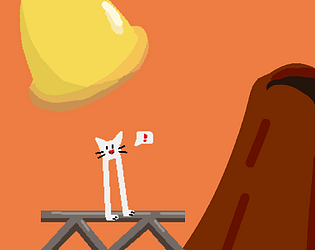
I don't know what the player character is but I want to hug it.

I found the mechanics pretty easy to figure out, even though the game doesn't explain much to you. It really helped that for example "locking" a room's number shows an actual lock on the action and you use a key to do it. It's very intuitive

The only thing I wish I knew, but I don't know how you'd convey this, is that the hammer guys who can reroll the numbers on rooms can be used again as long as they are not the last one you used. At first I thought if I didn't get the numbers right after using them all I was toast.

I had considered making the player faster, but with the way I had implemented things I wasn't able to in the time limit. Both the player and the enemies have to wait for the other's animation to finish before they can begin moving, and making the animations too much faster than they currently are would have made it harder to see how the enemies were moving. Thanks for your input! :)

This is an extremely silly idea executed very well. I thought that once I messed up the chopping part, I'd just have to retry it, but nope. You just have to bowl with a "bad head." I'm not sure if it means there's something wrong with me, but I found this very funny.

The absurdity of it all had me giggling like an idiot. I'd give it a Good Head/10.

I think this is my favorite game I've played so far in this jam. The die being mirrored definitely helps keep things simple enough to understand, but it is still complex enough to get you stuck in interesting ways. Also the 45 degree camera angle was a great choice, as it makes clear at all times what the other two sides of the die are.

My only slight nitpick is that until you know what it does, the icon for the shield doesn't look much like a shield. I wasn't sure at first how I was supposed to activate my shield to deflect the flames.

It's a little touch, but I really enjoy how when you start again after losing, the little guy gets up right where he left off instead of having a loading screen.

Smart  idea to have branching paths in the levels. Even when you get a level for a second time, you can try a different path through it. I wish the attack range was a little longer, but I got in the hang of doing a quick attack-turnaround to attack enemies while avoiding being hit.

Definitely fun. It seems the main complaint has been with the controls. I had issues adjusting to clicking being the dash, but other than that they seemed fine. Wall jumps were a little underpowered, but I'd assume that's to keep the dashes as your main form of significant vertical movement.

It is very funny to me that people are sending you videos of speedruns. Definitely a sign that your game is clicking with people, though!

Big fan of the artstyle. Everything looks super clean. I didn't realize until a few checkpoints in that you have to get the heart in order to get the checkpoint. Maybe including a heart before the first checkpoint instead of starting with 2 hearts could help prevent that confusion?

I think some information on controls would be helpful on your game's page. I couldn't figure out how to do the rolling mechanic.

I can't believe nobody has rated or commented on this yet. I had a blast!

Very creative idea of accumulating cannons along whatever side you roll on to them. I enjoyed getting a single side of my die loaded up and then sniping one of the enemies from across the map. The art also looks super cool, it has a very distinct style to it. Overall just a very well-executed game.

One bug I spotted was that your score does not reset when you reset the level. Not a big deal, but I thought I'd let you know.

I wish there was more feedback to the player's actions. For example, I couldn't tell if I was hitting enemies or activating some abilities because there was no audio or visual feedback. The flamethrower is also super busted, that thing rips through enemies.

I like how some of the stats have both positives and negatives to choosing a high number for them. I wish all the stats were like that, so things like health were not something you always prioritize a high number for.

The lighting attack was very fun to pull off, but I found the spear attack underwhelming. Definitely a fun take on using dice to attack.

Came for the meme, stayed for the gameplay. Reminds me a lot of Lemmings, especially how your villagers run directly into a pit of lava unless you tell them not to. I had gotten so attached to the little guys that I felt a real desire to stop the tank before it crushed them. Definitely a creative concept.

There seem to be some bugs in your game, but they are very stylized and cool-looking. I agree with the other commenters that I would like to be able to play this game against other people.

Dice!

Smart idea to balance out that you can only give randomly chosen orders by forcing you to see which three orders you will be able to give that turn first. It allows the player to make an informed decision of what they will do that turn, once they already know what moves are available to them.

My only frustration was that locking movement behind chance sometimes leaves you in a spot where you can't put your bug in the correct spot and lose without anything you could do about it.

Definitely enjoyable. One small note - the icon for the magnet fizzler, to steal a Portal term, reads to me as a smiley face, and I did not realize what it was supposed to signify until I walked through it like 3 times.

Controls feel pretty nice. Aiming felt like it was snapping to predetermined paths on controller, but that may have been a result of running the windows version through Wine to play it on Linux.

I want to hug Bunflower