No problem. Thanks for playing again and checking out those checkpoints.
Arroslin
Creator of
Recent community posts
Thank you for the feedback. Very much appreciated.
Simply because of easy the overall game play was the checkpoints pretty much didn't play any function in the game.
The checkpoints in this game are the doors so whenever the player dies the player respawns from the last exited door.
Thanks for playing it. Glad you enjoyed it.
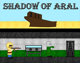
We also noticed that and was because we forgot to include the code to clear that text once the player pickups the ammo.
We tried to make it similar to the 2d shooter platformer flash games but it proved to be a bit too much for the jam.
Still thanks for playing and pointing out the bug. Always good to have feedback.
A pretty cool design idea. And a well designed puzzle game to think about.
At first was a bit confused what to do but later got the hang of it. Some levels are tricky and in others you can get stuck in an infinite loop of death. Took some time to figure out how to get out of the never ending death loop. Here are some images of what that looks like,
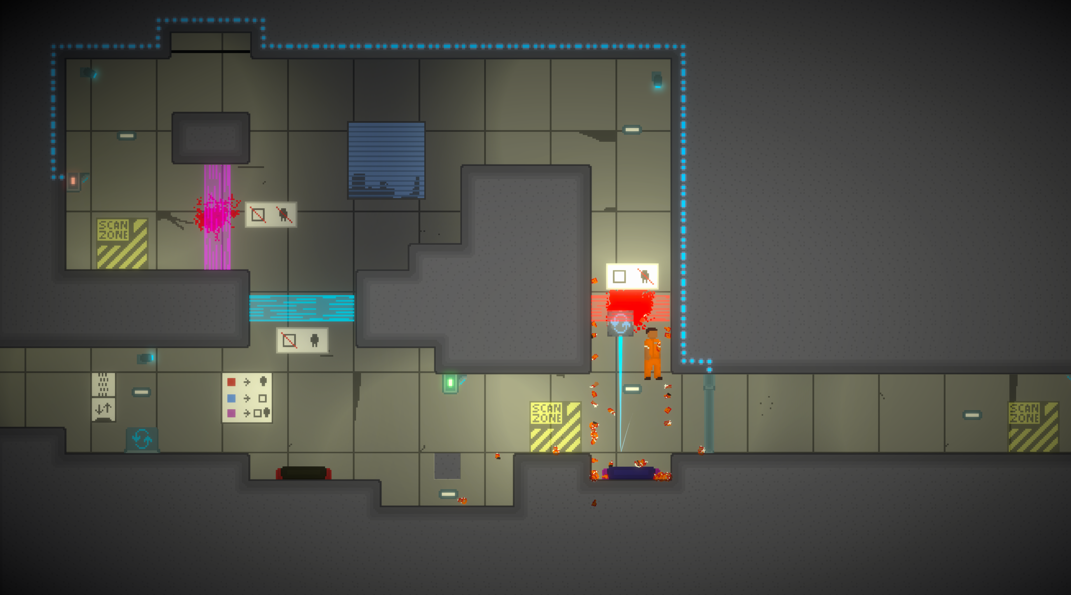
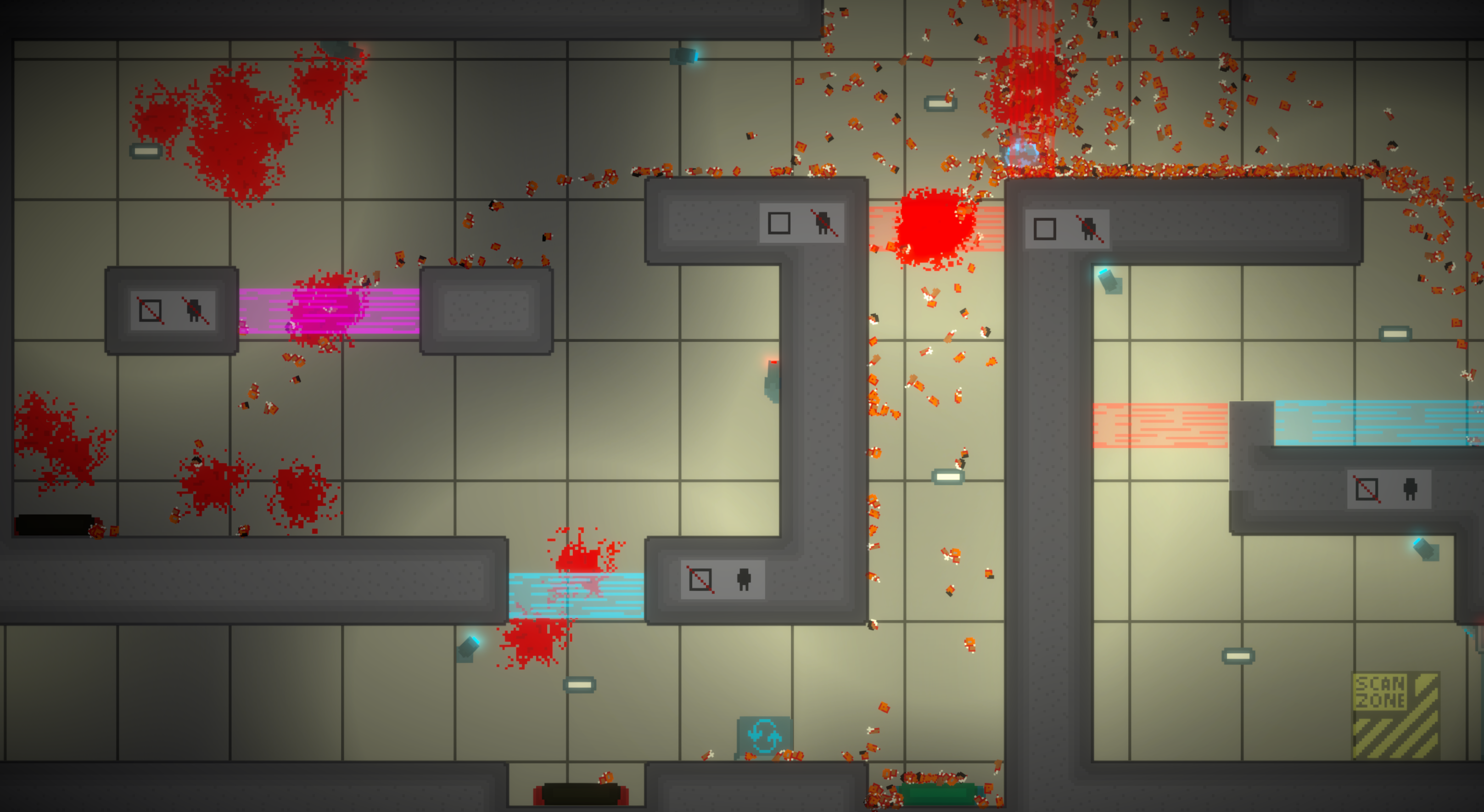
But overall a pretty fun puzzle game. A job well done and executed.
Thank you for the feedback. The lighting is new to us so we played around with it to try and see what we could do with it.
Because we made the game too easy the checkpoints pretty much didn't get noticed by players which are the doors. So if the player died you would respawn at the last door from which you exited from instead of restarting the level.
Thanks for playing and taking your time to point this out.
The checkpoints are the doors so if the player dies you respawn at the door instead of having to restart the entire level. We’ve kept the level design to be as simple as possible so that the player doesn’t become frustrated with clearing the level.
So at some point in the design we have made the game too easy where the checkpoints were unnecessary.
But thanks for the feedback and playing the game. Glad you enjoyed it.
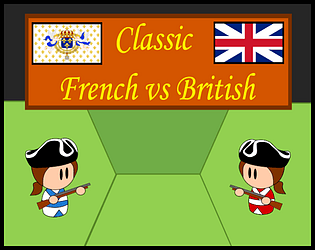
For both the French and British Campaigns Level 1 your unit must be the first one to open fire. Both of those Level 1 start of the same way where the player unit can get 2 shots off on the first enemy unit.
The second enemy unit will be close and approaching you on Turn 3 at this point you must retreat. See the attached images to see where you must retreat to and end turn. An example below illustrates the French Campaign Level 1.
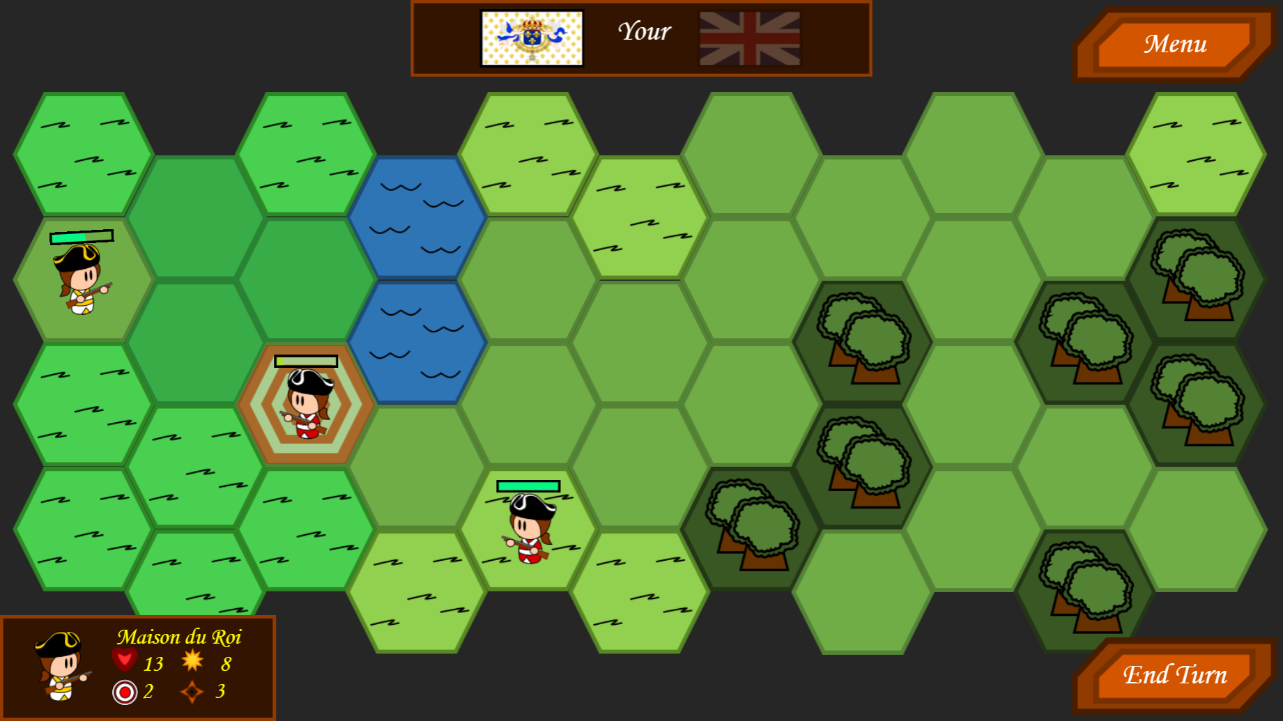
At this point you should be able to kill the first enemy unit while the second enemy unit will waste two moves to get to you. Once again when it is your turn open fire on the enemy unit and repeat until you win
Fun, simple, straight to the point, takes time to learn, difficulty curve rises at an appropriate rate makes you want to try again each time differently.
Only issue found was in the system response of item pick up. Item becomes highlight pressed space bar multiple time for the pick up to register. Tuning that mechanic to become more responsive would allow the game to grow at an appropriate rate becoming near the end fast passed and intense.
Overall, well done polished, working, and fun to play!
A well-designed game core mechanic of a strategy defense game. Not intuitive as to what happens with your troops at first so adding a morale bar would help clear up the confusion. And also a health bar for enemies to turn on once they take damage.
Characters on screen compared to the overall screen size are small so adjusting their size could improve player’s focus on the gameplay. Along with adjusting the amount of unused screen space (skies) to further, improve the attention to the game.
Overall, an excellent thought out idea and implemented. The gameplay is fun and choice selection of order execution to obtain most cost-effective solution in game feels rewarding. Well done!
Game core mechanics are executed fantastically and everything works well. The main element missing is the incentive for the player to move anywhere since there is no in game benefit for the player of doing that.
Otherwise to spice up the overall gameplay designing a goal like player collects parts to fix his ship to escape the aliens would give the incentive for the player to move around the map to explore and collect items to achieve the given goal.
Overall, the gameplay is solid and fixed with an understandable amount of complexity in your implemented game mechanics.
Well-designed puzzle game with built in tutorial through playing the game teaching the player what to do without giving direct instructions.
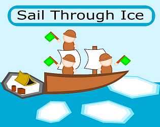
The movement is really the only thing that requires tuning to make the game play feel smoother. Alongside with that some polishing of the UI like showing the player is freezing by changing the borders of the screen turning into ice.
Overall, short and simple gets the point across straight away.
Simple and fun game with intuitive controls.
Adding additional enemies such as small and fast with big and strong aliens would make the gameplay a little more diverse. Which would then lead to a possible additional game mechanic design with allowing player to choose between additional abilities. Such as quick dash, explosive damage, or anything that would be easiest to make and test.
Overall, satisfying gameplay with a recognizable game structure. Well done.
Not badly done for a first game.
You did not over scope, which is crucial in game design.
Minor improvement left mouse button hold to shoot (at a fixed rate) instead of constantly clicking to shoot. This will prevent player from fatigue of repeatedly left clicking.
Overall, a well retained scope of the game design.
Very well planned and executed.
Intuitive gameplay that gets adjust based on gained abilities. The levels (or stages) are well designed that is based on initial selection of ability the player can play through the game with a breeze and each time differently.
Minor improvement would be to add some texture in the background to make the differentiation between stages easier (dotted, brick, strip, etc. backgrounds), because at some point I would lose track of who is who and who is where. Nevertheless, this is not a crucial component of gameplay but just for visual identification of game elements.
Overall, fun to play around the levels each time differently.
Thank you Marcus Himself for playing the game.
What we tried implementing in this game was the text-based game mechanic like in Echo Bazzar (now called Fallen London) or Sunless Sea (similar to FTL) but more with visual interaction. Turned out that an interactive visual story is more difficult to make than a simple read the text mechanic.
Again thank you for playing and providing the constructive feedback.
Thank you FllingWallGames for playing and the feedback.
Question: The one time you couldn't get the game started did restarting the game by pressing spacebar work or not? In addition, did the buttons display as an empty box after that?
With adding, more detail on what occurs during the player's encounter does sounds like a good idea. Since in text-based games that can improve player’s engagement with the game. But that depends on the game core structure.
Again thank you for playing and the feedback.
Next time when you design a game similar to this one focus on;
Enemy Wave Spawn - Avoid spawning too many enemies because the game began to glitch and slow down.
Use of screen space - Around 80% of the screen is blank and not used. In the case of your game design you could zoom in onto the player a bit more (having around 50% or less of the screen dark).
Level Design - Make the level layout smaller in size to have the player not feel they are running in the middle of nowhere forever.
Overall, not a bad use of fog of war element along with the pick and drop mechanics of items.
Yeah that would require some planning and executing to make the game complete. But hopefully over time of playing the game I will observe the puzzle game mechanic you have designed in your game so that I can provide a more technical feedback on your game from a players perspective that can be constructive.
But overall the game is not badly done.
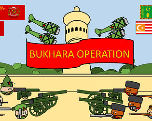
Not badly done just that by choosing to make a turn based strategy (TBS) game you choose a high level of difficulty to complete. Since in TBS games the design can become very complicated in a very short period time of development. When making TBS you should try to keep the game mechanics at its most primative level of structure as over time with addition of AI and game rules the game mechanic will begin to vary drastically.
But never the less the gameplay is interesting one problem was when scrolling in you zoom out and just a little bit of too much content introduced to the player at once. Graphics fit the overall game design along with the audio.
Overall nicely done and when in future you design TBS games is concentrate on creating smaller elements of the TBS genre (player controls, AI decision, game space) and then combine those small elements to see the overall affect. All in all the game you made is well done.
It seem that you have over scoped in your project design. It would benefit more from simplifying the game mechanics being introduced to the player over time with the overall complexity. Basically start small from the core which is your basic game concept. Then add changes to your initial game design and observe the affects it has on the gameplay (through user feedback).
Overall interesting turn based strategy game mechanic to investigate. Well done.
The UI design we completely left it out but yes a lot of work is needed there to be done so that it integrates well with the game graphics and provides necessary information to know about. And as for the Player we initially thought of adding the option to choose which side to fight for along with character choice but due to time cutting short scrapped that idea out.
But thank you for playing and the constructive feedback. Hopefully in the future when time allows we will tweak and polish the game until the desired end result is achieved.


