Indie game storeFree gamesFun gamesHorror games
Game developmentAssetsComics
SalesBundles
Jobs
TagsGame Engines

Bitpro

87
Posts
4
Followers
A member registered Mar 02, 2023 · View creator page →

Creator of

Recent community posts

First of all thanks for the giant great review:) About your notes in order:

  • The enemies apart from turrets actually have a lot more bulletspread than the player. Ig all of the enemies only shoot so close to the player that their spread is unnoticeable. They also just snap onto the player, and the bullets are so fast that it's hard to dodge anything. I wanted to make the giant turret have basically 0 inaccuracy because otherwise the player could just "run" past, but ig that change got carried to all of the other turrets as well... I didnt really spend any time thinking about the bulletspread, but ig if the player can clearly see that they are missing just because of rng, they will just get annoyed:D
  • The explosive enemies were basically the last thing i made (i made this game from end to start), so i didnt really polish them that much and they just ended up as one more enemy that snaps onto you.
  • The rockets start with an initial velocity and get some forward acceleration on the way, i struggled with finding a good balance of those values where the rocket isnt too fast but also doesnt fall into the ground instantly... I should have just made it accelerate upwards a bit so that it can fly slowly and still not fall instantly.
  • The reload speeds just comes from how i animated them, thats just the speed the animations ended up with, i didnt think about it at all:D When writing the gun script i thought that i need to implement an autoreload toggle for the ai, of course i thought that if the ai auto reloads, then the player has to naturally reload themselves...
  • The way you can pick up health whilst moving at fullspeed in the first roller fight was pretty cool, i should have had more of that. When making baby mode i had a small hope that the game was too difficult, just so everyone had to listen to a baby crying. I guess my wish was fulfilled:D
  • Some smoke/sparks for the enemies would have been cool, i did make the rollers start smoking but i didnt expand that idea to all of the enemies
  • I should have put all of the controls into the pause menu or smthing. That screenshot is golden, thats what i assumed would happen but never did when i playtested:D

Thanks again for playing through the entire game, i should really start figuring out a way to make games that arent way too difficult... The awkward controls are probably the biggest reason why my games are so hard. I have no clue how i keep coming up with this garbage lol, i think if i ever join a game jam again i need to make a game where the controls are actually normal...

(also sorry for the word salad, i tried to clean it up a bit but its still ass:D)

You can beat the mega turret by just going into the other room and shutting of the power, im glad to hear that the design of this game has failed in another way:D Originally the player was just going to be walking around as normal, but somehow i decided to put the player in a wheelchair halfway through the jam. I would have probably made the chair turn faster if you are going slow, but i totally forgot

Ty for the detailed review:)

First of all, its really cool that you actually played this so thoroughly, ty very much:D 

Secondly about the difficulty, im starting to think that i should really get some people to playtest the shit i make, because i personally assumed that this game would be pretty easy... I really have no idea how all of the games that i make feel so easy to play for me, but i guess its basically just the fact that since i coded it, i know the exact behaviour of literally everything, whilst others have to figure all of that out themselves. Especially the rollers are pretty easy to deal with if you know exactly how they work, you can basically just spin in circles and they wont do anything since they "charge" right before they hit the player. I was going to make them charge a lot lot sooner, but i of course thought that would make it too easy:D And of course the player is supposed to know that i didnt bother to code the rocket explosions to work correctly, so they hit every hitbox that is in range around them (so it basically hits the rollers and tanks 2 times since they hit both normal hitbox and the weakspots). 

I did actually take actions to make it easier, originally there werent any health pickups after the checkpoint and i of course implemented baby mode (which i thought dying with accidentally would be pretty much impossible). Ig i should have deleted all of the enemies that come after the "super turret", i just put them there because i thought it would be awkward if the player would have to just roll through 3 empty rooms...

But ty once again for the long review, really appreciate it:)

(1 edit)

I can see how the gameplay might be a bit bad. You can close the "lores" by pressing tab or space bar, i would have made it esc but that would not work with webgl:( I should have just had an ui button that closes it, i only made the cursor become visible for 1 stupid joke:D Also some enemies have weakpoints (for the tanks its the body and rollers its the radiator) but i of course didnt display that anywhere...

Very unique game mechanics, nice job:)

Idk what is with this jam but every game ive played thus far is a fever dream, and this one is too:D I think a game with 11 (?) developers results in the pure epitome of what this game jam is about, this game is definitely terrible but also beatiful at the same time! I love how all of the card textures are just completely incoherent, and the sound design fits the modifier perfectly:)

From my tiny knowledge of scratch, being able to even put this thing together seems like a miracle...

Overall a great game (for this jam;D), hope all of you had fun working on it!

Just a tip about exporting to webgl: You can set the resolution in unity player settings (set it to 1920x1080 if you want normal resolution), Also change the presentation thingy to minimal and then just enable the fullscreen thingy in itchio (as you have already done) and it should look a bit better:)

About the game: what the fuck did i even play?? the artstyle is definitely so bad its good:D

It took me 5 seconds to forget all of the controls, i eventually discovered that they are displayed in the pause menu:D The entire concept of the game is really cool, i especially like the scene where you can hear all of the sound effects played over again

Throughout the game i thought it was a very well made game by 4 or so people, with everyone doing their part well. Until the credits came up and apparently this is made by just one person?? What the hell dude, how? :D This is extremely well made!

It wouldnt be a game made by me if it didnt have atleast 1 absurd control mechanic that makes the game unplayable for 50% of people:D And of course the player can eat a hundred bullets before dying

Biden calling me a loser was the theme song i didnt know i needed:D Also you need to calculate your normals outside to fix the invisible crap

yeah im guessing that the controls are really hard to grasp for some people, but when you understand them the levels shouldnt be impossible. I tried to make the score to beat pretty low, i havent had anyone saying that it is hard so im guessing it is ok:D 

Its nice to hear that someone actually finished it and saw the ending, ty for the review:)

My best score: 1388

Gameplay: 3

Pretty simple idea, not much to say

Theme: 5

Very creative idea, good job!

Aesthetics: 4

Some of the assets seem blurry, but its ok

Sound: 4

Perhaps it could have been a bit better, but all of the sound effects are there

Overall a cool idea with good execution, its just pretty simple gameplay wise:) Keep up the good work!

My best score: 51

Gameplay: 4

It was a really good idea, it took me a while to realize that the stats that are affected by a choice start blinking when hovering over that choice. Idk how score was collected, but im assuming it had something to do with having as much gold and health as possible

Theme: 5

You are very much escaping

Aesthetics: 4

Tbh some of the ui elements are a bit unpolished, but the drawings are perfect:D

Sound: 5

Nice original music and sound effects:)

Overall the best game ive played out of 32 so far, really solid job, it seems that you and everyone involved had fun making it:) Good job!

I updated the main page with some instructions on how to cheese the first level easily

Yeah the controls are supposed to have that endless acceleration to them because it works on other levels (kinda). Forcing the player to do high precision jumps at the very start when the controls are unclear was just a stupid idea... I think next jam i should ask for feedback during the development / work in a team because i suck at thinking on how actual players see my game, its pretty damn easy for me to know how to beat everything cuz i made it all:D But ty for the review:)

I designed the levels so that i dont find it too easy, but thats not a good way to design levels when im 10x better at my own game than others... The order of the levels was very much out there until the very end, only that particular level was about mostly bouncing, its just pretty bad level design:D I think there would have been better options for the first level, most notably one where theres no gaps at all, all you had to do was slide forward at high speeds and dodge pillars. Idk if i should make a short video once the jam ends that shows how i expected the game to be played :p

(1 edit)

skipping only works in the desktop version once you have seen the cutscene once, its a bit bad design now that i think about it:D

If you find the back and forth walls too difficult, you can just bounce higher and higher on the first jump pad by always holding space when moving downwards, then you can just fly over the entire stage. I was going to implement a cheat so that you could skip the hard levels if you want but didnt have time, id say that the third and fifth levels are easier than the first one. I think the levels felt easy to me cuz i know exactly how the mechanics work because i made them :p

edit: omg, i deleted the code for saving values and skipping the cutscene cuz i thought it wouldnt work in webgl, turns out it would have...

My best score: 2721~

Gameplay: 4

Very unique idea, it just felt extremely hard to keep many people alive at the same time, i first thought that you could control each one separately :D

Theme: 5

They do be running from the darkness

Aesthetics: 5

The entire tv concept is really cool and well put together:)

Sound: 3

The music is ok, i just feel like there should be more sound effects

Overall a really solid game, great job, i hope you guys had fun making it:)

My best score: 4150

Gameplay: 4

Simple idea with good execution:)  I like the pulse shot thingies, pretty cool

Theme: 3

Connection to the theme is mentioned in the desc but not inside the game, but its such a simple theme that it doesnt really matter:p

Aesthetics: 4

You have found some nice matching assets,, bullets are a bit hard to see against the background but its probably just my bad eyesight lol

Sound: 5

Music and sfx is great, especially if made specifically for this jam!

Excellent submission overall, keep up the great work all of you!

idk really what was happening, when i pressed play the first 3 times my chrome started to lag (mouse was moving slowly, inputs took 10 secs to register), i had to close the game page everytime, but for some reason on the 4th time it worked ¯\_(ツ)_/¯ Im guessing that its some webgl weirdness or something, all web games are a bit less stable

My best score: 27 secs survived

Gameplay: 3

I really couldnt make it that far since its based on luck, i just dont have enough houses spawn to survive for long:( Also the game kept freezing google, i guess the cold got to it too:D

Theme: 3

You are escaping from the cold ig

Aesthetics: 4

The sprites look nice, i really like how the house slowly stops glowing as it loses temperature:)

Sound: 3

just some ambience and footsteps, its ok

Overall its a nice submission, idk if there really is much of a strategy except luck tho. Its nice that you managed to combine 2 themes from 2 jams, i hope you had fun making it:)

My best score: 21800

Gameplay: 3

Kinda basic but i liked the ability to shoot fireballs:)

Theme: 5

You are escaping from a dinosaur

Aesthetics: 4

Im assuming none of the textures were made by you but the animations were, so its pretty good. The assets mostly fit each other:)

Sound: 3

Just some good music, not great not bad.

Overall its a ok submission, well done and keep up the great work:D

(1 edit)

My best score: 7500

Gameplay: 3

Its an ok game, it just has a lot of bugs. Trying to drive fast is fun:)

Theme: 2

You mentioned that it was originally gonna be a getaway game but turned into a taxi game, so the escape part is kinda missing:p

Aesthetics: 4

It looks great but i have to take a point off cuz none of the assets are made by you

Sound: 2

As you mentioned, the music player is completely broken. For some reason the music kinda plays when i switch tabs out of the game, so i could hear what you were going for.

Overall its a nice game, mostly compiled from existing assets but who am i to judge:) Keep up the great work, hope you had fun making it!

(1 edit)

My best score: ~3mins

Gameplay: 4

Had to download cuz the webgl was super laggy. It was an interesting idea, it just lacked some finishing touches, for example the game over was just the prisoners shoving me into a corner and then pushing me through the wall so that i fall into the void:D

Theme: 5

Them prisoners do be escaping

Aesthetics: 4

Textures are nice, the prisoners just run through the doors though

Sound: 4

Just some music and a couple of sound effects, nothing special

Overall it was a good submission, just lacking some polish:) Keep up the good work!

(1 edit)

My best score: -

Gameplay: 3

I feel like the pieces were there, but i just have no idea what to do, i can pick up (or discard?) scrolls that dont seem to do anything, i couldnt find the exit if it exists, webgl kept crashing cuz i double clicked the start button lol

Theme: 3

Im guessing that you could have escaped but i just didnt find where to go? idk really

Aesthetics: 4

The most solid part of this game, it just lacks a bit of polish, framerate felt low

Sound: 1

Cant hear anything, was there sound?

Overall it had good potential but all of the pieces just werent tied together yet, i hope you still had fun making it, keep up the great work:)

My best score: 80000~

Gameplay: 4

Its fun for a few minutes, really simple tho

Theme: 1

Nothing to do with escaping

Aesthetics: 5

Very solid artwork, reminds me of undertale:) I think the sword recharging animation is a nice touch

Sound: 4

Could use some kind of music, otherwise good.

Nice job, keep up the nice work!

My best score: 130 (?)

Gameplay: 3

It is a very good idea with a nice selection of enemies, i just feel that i die basically randomly, its hard to know in advance what will kill you and what will not.

Theme: 3

The game doesnt really feature escaping that much, its just mentioned on the game page but ig the theme is so simple that it works

Aesthetics: 4

The pixel sizes of the sprites are a bit all over the place, the sprites dont really match each other, some are shaded really well, others are not, but otherwise its good.

Sound: 4

Music is nice, sound does all it needs to but not much more, maybe some more variation in the effects?

Overall a nice submission, hope you had fun making it:) Keep up the great work!

yeah tested your resolution in the editor and it doesnt show, i didnt have time to test with other resolutions, sorry! I dont think theres an easy way to get the current build to work on a monitor of that size

(1 edit)

My best score: 2172

Gameplay: 4

Sadly i dont have the time to finish it but its a pretty solid platformer with ok mechanics, it just feels that i die every time when i dont know what something does or where stuff is, for example i wasnt expecting that one particular robot at the start of level 2 move at mach 10, after i figured that out the next time i just fell straight into the next electric beam:(

Theme: 5

I guess you are escaping from a lab, the gameplay mechanic of having to recollect your skills kinda reflects that along with the story.

Aesthetics: 4

Its very well done, maybe there could be a bit more variety in the tiles. I like how the background behaves when moving

Sound: 4

Some music and sound effect for dying, not bad not good. Voice acting was good even though its still pretty obviously ai.

Overall a very nice submission, keep up the good work!

(1 edit)

My best score: didnt check lol

Gameplay: 4

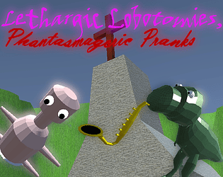
Unique game mechanics, am i understanding this right that im probing a frogs asshole in a musical rythm inorder to get it to shit me out? :D

Theme: 5+

Probably the best and most absurd interpretation of the theme in this jam, how did you come up with this ???

Aesthetics: 4

Its such a low amount of sprites that i would have expected something better tbh, The sprite pixel sizes are all over the place. Bumping to 4 just cuz it has nice beetle animations:)

Sound: 4

Music is great, i think there could be a bit more variety in the sounds that play when you hit the bubbles depending if its a perfect or something like that

An insane idea with a nice execution, well done! Keep up the great work all of you:)

My best score: 6

Gameplay: 2

There was potential for more, but its cool:) The doors remind me of the binding of isaac for some reason lol

Theme: 1

not escaping

Aesthetics: 1

just rough dev art:p

Sound: 1

No sound:(

It was ok, maybe try a longer game jam next time so you can do more:) I hope you had fun making it!

(1 edit)

My best score: 640

Gameplay: 4

Pretty cool concept, i like the shop system:) Only problem i had was that the controls feel a bit unresponsive

Theme: 4

you do indeed have to escape in time

Aesthetics: 5

Nice art, pixel art was a bit blurry sometimes i think but i'll just put that to being webgl's fault

Sound: 3

It's good, nothing special

Nice original and polished submission, good job:) Keep up the good work!

My best score: 6

Gameplay: 2

Its just simple math, red cubes are easy to avoid:p

Theme: 1

You arent escaping from anything

Aesthetics: 3

I guess its ok, the background is very pixelated. The waving fish tail is cool

Sound: 1

There is none:(

Not much to say since its so basic, its an ok submission, hope you had fun making it:)

(1 edit)

My best score: -

Gameplay: 2

Its kinda like google dino game with even less features, very short:p

Theme: 5

You are escaping indeed

Aesthetics: 2

The assets dont fit each other that much, pixel art is blurry

Sound: 1

There is none:(

I see that this is your first game, its definitely better than my first game :D Keep doing gamejams and you will eventually make something excellent! Hope you had fun making this and being in this jam:)

My best score: 176

Gameplay: 4

It was otherwise fun but it felt that i just constantly kept dying because i had a platform appear on top of me when jumping, i guess i just should have been lower:p The spinny wheel is a very nice touch!

Theme: 3

It took me a while to realize but the water level is technically rising and the player is moving up, i thought the water was staying still and the platforms were moving down:D The theme wasnt explained that well but im guessing you are escaping from the water

Aesthetics: 4

Art is very nice, the start menu ui feels a bit unpolished, there could be more effects when splashing into the water:)

Sound: 3

Music and 2 different sound effects, could be better. Maybe add noises to falling in the water / hitting a platform?

Overall a good submission, once i figured it out it was fun to play:) Keep up the good work!

My best score: 16

Gameplay: 4

 I love the dumb ways to die minigame style:) I just felt the rat minigame was way too difficult, i won once out of like 15 tries

Theme: 5

Minigames are nicely themed around escaping + youre stuck in an elevator lol

Aesthetics: 4

Nice original art, its just a bit all over the place, sometimes we are looking at a high res photo, sometimes the pixel art sizes are inconsistent

Sound: 5

The music is good for a jam game, the voice acting is a nice touch!

Overall a very good and interesting submission, keep up the good work both of you:)

There should be a "Continue" button that fades in after that in the bottom middle, after which the cursor is unlocked, is it not visible? are you playing on fullscreen 1920x1080 resolution?

My best score: 89

Gameplay: 4

The core endless runner concept with coins is pretty basic, but its a really solid execution, turning the ships feels nice!

Theme: 5

You are escaping from those darn dogs!

Aesthetics: 4

It looks very good, not much to comment on, maybe the ships and islands dissapearing could use some more effects?

Sound: 3

Music with some sound effects, if id have to suggest something id say that the ship colliding with things could make more noise:)

Overall its an excellent submission, i hope you had a lot of fun making this! Also the logo is really cool:) Keep up the good work!

My best score: 2045

Gameplay: 3

Its a pretty basic concept, had some problems regarding the graphics that made playing it harder:p

Theme: 5

Giant flesh monster chasing you, it fits!

Aesthetics: 2

Id say that if you capture a screenshot of the game you would say that its good, but theres just something about looking at this game moving that just makes my eyes hurt so much and i cant make out anything thats happening, i thinks its the blurry pixels shaking or something... The graphics are good but at the same make my eyes bleed and i cant put my finger on why...

Sound: 3

music and a funny screaming sound effect, not bad not good.

Overall its a good submission, keep up the good work! Hope you had fun making it:)

My best score: 17

Gameplay: 5

Holy shit, what were you smoking when you came up with this idea? This is so cool! Gameplay is fun, i tried to use chat gpt to come up with words:DD

Theme: 5

Its such a clever idea lol

Aesthetics: 4

Otherwise really good but the instructions menu is a bit basic and the game over screen is basically just default unity ui panel lol

Sound: 3

Nice music, i think you could have added some beeps and boops when getting score:)

Overall its a really really awesome idea, congrats on even coming up with that:P Great submission, keep up the good work!

My best score: 4

Gameplay: 4

Pretty interesting concept, i especially liked the minigame where you have to click on a random part of the screen even though it was confusing at first. Are there levels past 4?

Theme: 3

I mean you are collecting keys and opening gates, but does that count as escaping?

Aesthetics: 3

Artstyle is chaotic, for starters i think you should turn off filtering from the big sprites so they arent blurry. The sprites dont really match even with it off

Sound: 3

Sound does what it needs to, not great not bad

It was pretty fun,  hope you had fun making it:) Keep up the good work!