Oi.
Eu fiz besteira e deletei o arquivo achando que poderia enviar outro atualizado, mas a página só vai permitir que eu faça upload novamente após o fim do prazo de votação da Jam.
Então download só daqui uns 20 dias ^^"
Ciclope
Creator of
Recent community posts
Olá, pessoal.
Dúvida simples: Já upei o jogo, mas fiz uns pequenos ajustes nesse dia de hoje e gostaria de fazer o upload de uma versão mais atual do game.
NÃO me refiro a um novo upload para a Jam, mas sim apenas para página do game mesmo.
Queria saber se posso fazer isso, caso os jurados já tenham baixado a versão feita dentro do prazo.
Oi. Obrigado por comentar.
Acabei pegando mais o lado comédia da temática Slasher (influência de alguns filmes do Jason).
| Update:
- Tradução concluída;
- Link de download atualizado;
- Nova tela de título;
- Seleção de idiomas (EN-US / PT-BR).
English version ainda em progresso; já vi uns detalhezinhos gramaticais que deixei escapar. Já estão corrigidos no meu projeto aqui de casa, mas não quis fazer um upload tão em cima da deadline.
Hogpocalypse Sow, but with a flashlight in one hand and a gun in the other - and also a bit of exploration. I'm thinking survival horror, since The Consuming Shadow has really left a good impression on me. I'd really love to see something along these lines in the future.
Congratulations on the great work in all the twelve games. You've been an inspiration to me for a long time =)
Hi!
I'm six hours in, and from what I've seen so far, I guess I have a new favorite to my eternal RMXP Top 5 =D
As soon as I finish playing it, I'll be posting a more in depth comment, stating all the pros and cons. But let me tell you in advance that the work you have done, especially in regards to mapping and exploration is absolutely fantastic.
Okay, first of all, thank you so much for giving the game such a thorough analysis. We all love to see the general public's reaction to our work, but, personally, receiving reviews based on a more technical point of view is something that I found extremely rewarding.
And now, without further ado, let's go:
>>> Quote:
"... typos or awkward phrasing. I also wish there was more writing in some places to give the player more explanation about what to do (but more about that in the Gameplay section)."
I'll have to agree. All the three scenarios will be revisited in the future chapters, by the perspective of different characters (AKA: Laura and the dead friend himself), so the plan was to have a lot more dialogues in each map, but at the first visit, I ended up cutting a lot of the talking in order to keep the exploration at a faster pace. Now that I've been receiving feedback, I can see that a few more cutscenes are necessary, especially when the player enters the combat sections.
About the typos and awkward phrasing: I'm trying, aaaaa D=> Being a non-native English speaker makes it a bit harder to get the naturality of the language. I hope to improve on this aspect, since the story is the main element of the game. One thing I can say, is that I'm always reading the dialogues over and over, rearranging words, changing bits here and there, trying to improve them.
>>> Quote:
"Most of the mapping is great. The areas are well-laid out, look nice, and, when it comes to the drawing maps, very creative. The only detractor was the similarity of the drawing maps. You’ll see many of the same elements even though they’re supposed to be different drawings."
Good point. Unfortunately, we couldn't create a different Tileset for each drawing in time, but for the future, we're planning to rebuild the scenarios from scratch. There are two possible options we are testing: new hand drawn Tilesets or actual dioramas, photographed, edited and transformed into a kinda "Parallaxy" thing.
>>> Quote:
"On some screens, it was a little confusing to determine who was talking, so different colors of windows or names would have been helpful."
Got it! I'll probably use Faces for the diorama sections.
>>> Quote:
"If you’re familiar with RPG Maker games, you’ll also notice evidence of other plugins that help the game stand out as unique."
I'll take it as a compliment, since we didn't use any Scripts or Plugins =D (I believe RPG Maker XP doesn't even have Plugin support). In other words, it was all event based ^^
>>> Quote:
"The music that’s in the game sets the mood very well, but most of the game doesn’t have music. Normally, I would say that the lack of music makes a game seem empty, but not in this case. The story is so engaging that I hardly noticed the absence of music. In fact, the silence created the mood just as much as the music did."
Ow man, thanks a lot! We had the goal of creating all of the Game's resources, and since my wife and I are both into drawing and pixelart, the visual aspects of the game were done with ease.
But........... the music, oh boy! Considering the fact that we barely know the notes and scales, it makes me really happy to know that the one song I was able to make ended up contributing to the game's mood, instead of ruining it.
==//==
Once again, thank you so much for the Review. And I'm glad you had a good experience playing the Game.
=)
I still haven't checked out your game, but there's one thing I would like to say: I can't put into words how happy it makes me fell that Games made on older versions of RPG Maker still compete at the same level as the modern ones.
I absolutely love RPG Maker XP and 2003, and sometimes it hurts to think that these Engines may become obsolete and left behind someday. I'm glad to see that I'm wrong, I'm glad to see that the power of events can still compete against Scripts and Plug-ins, that a game can be as great as any other game, even without High resolution graphics or framerate and all of those things.
Congratulations, guys! I've just found you on social media, and I'm definitely going to follow your work from now on.
Hey! Thanks a lot for giving the game a shot!
Your thoughts on the game's elements will be of great help on future development - I'm used to opinions from people inside the "genre bubble", so it's interesting to learn from a different point of view, from people with different taste in games.
About the characters, you were spot on - they're not meant to be likeable, the focus is always on making them believable.
I'm gonna watch the video a couple more times and gather all information I can based on your reactions. Again, thanks a lot for your feedback o/
Finally finished the Demo. I'm not into Visual Novels, but if there's one thing that can hook me up, is the musical theme. Keep in mind that the following opinion, as well as the suggestions, come from a guy who never played VN before, at least not enough to fully understand the common structure of the genre.
Does that mean I didn't like it? Nope! I actually enjoyed it a LOT! I believe the most important element to create a good story is contrast - comfy scenes, light conversations and exposition, along with tension, mystery and even sadness.
Another mechanism that I'm a fan of: Indirect character building - basically, when the player gets to know a character only by dialogue from other characters. The Prince of Ice, while serving as a Mcguffin at first, has become one of the most, if not the most interesting character in the Game for me. I really liked the way you shifted his role in the story.
==//==
I like the way the Game progresses in tone. Not only that, the subtle changes from "waking up late" to "waking up earlier than expected" show how much thought was put in every small detail. I also have to mention that my favourite scenes were the ones at my bedroom, looking at the phone and talking to myself - I like monologues and inner thoughts - Also, the music helped a lot! Reminds me of Chrono Cross =)
Placeholder Backgrounds, oh man, I love it! I really do. I'm one of those kind of guy who watches 1 hour of speedpaint, but closes the video before the final result... So looking and analysing the Background Images was kind of a "guilty pleasure" (is this the right term? Ah, doesn't matter).
I could talk for hours about the Game Flow, story bits, but let's move on to the suggestions.
> Choices: We all know a game can't have real consequences for every choice the player makes... it simply wouldn't be worth the effort. So why not include a little bit more of "shallow choices"?
- Let the player choose his food at breakfast table;
- You woke up late? Do your hair; brush your teeth; find matching clothes. Only one choice: Go!
And last but not least, I'm always thinking about ways to insert gameplay bits amongst dialogue, and dialogue amongst Gameplay sequences... I know it's not a goal in VN, but why not some more simple "Reaction choices"?
For example: Oliver asks: bla bla bla?
Player:
> Polite answer
> Sarcastic answer
==//==
I believe this is it for now. The game's structure is really solid - you focused on what's important and despite the placeholder art, as mentioned before, you managed to create a strong identity. Congrats!
Hey, thanks for commenting!
By analytics, you mean number of downloads, views, etc? Last time I checked, we were at 1436 views and 274 downloads.
But I believe numbers can have different value.
To me, it was clear that 10 views from people who like narrative driven games would be better than 1000 views from people who don't.
Also, when it comes to RPG Maker, I love turn based high fantasy games, with swords, kingdoms, potions and all the cliches... but it's important to know what the public is looking for (I've never made contact with people from other countries before, but here in Brazil, Undertale and To the Moon are a huge sucess, at least on Youtube, so it was clear to us that a game focused on drama, Indie Visuals and unforgiving combat, could be a thing).
And last but not least - Why people play our games? Think about it this way: if you have a cool mechanic, the player will enjoy it; if you have a cool artstyle, the player will be immersed... but for how long? Narrative, on the other hand, may not be striking at first - it takes time to build up - but once the player wants to know the ending, the twist, the answer, he won't be able to obtain it from any other game.
But of course, this is just my personal opinion, it works for me because I'm a narrative guy - anyone could make the same arguments about other game elements and it would fit the same way. The point is... I like writing about games, because I learned a lot throughout the years by reading this kind of stuff, and I hope this wall text can help someone in some manner... There's no "How to win" formula... Honestly, it all depends on every player's state of spirit (Every single one of them)... Effort, competence, potential, timing, so many variables... the only thing I can say to everyone is: DON'T let a ranking define your work, the world is full of underrated artists, as well as overrated ones, like me yay =D
Hey, thanks a lot for commenting ^^
To be honest, I wouldn't recomend approaching people in real life. We did it out of naivety, thinking that people who work with games, around games, would actually like games and show interest in our work - Spoiler: most of them didn't, which is understandable... But then again, there's only one way of learning and we had to try... I managed to gain at least 1 vote per day, but the amount of "I'll take a look later", "I just work here, I don't play games", "Sure, give me the name of the game and I'll look it up when I get home"... it can really break one's spirit - you gotta be prepared to face rejection and find strength to keep going.
I had a Twitter account years ago, never actually used it for anything other than following Swery65 - Love his Games.
You can find us on Facebook, we created a Page dedicated to CreAPTIVE Heart - we're still small, but every Update will be posted in there (Only portuguese for now, sorry, we still haven't given social media the attention it needs). We are also thinking about building an website, but it may take a while.
https://www.facebook.com/Creaptive-Heart-504849526685404/
For the future, well, Chapters 2 and 3 (each one showing events by a different character's point of view) and a lot of improvements on visuals and sound =)
Hey, thanks ^^
I think a little bit of salt is always expected. If popular choice vote were measured by passion, everybody would win, because I believe all indie devs share the same feeling about their work. I mean, we do artwork, programming, sound, story, etc... But unfortunately, marketing is a big deal in our world - it can't be ignored.
Also, marketing is different from the Game's elements - we all can check out the graphics, mechanics and narrative by simply playing the game, but only the creator knows about the 50, 60, 70 E-mails sent and never replyed, all the failed attempts to find people on Youtube/Twitch to give the game a chance. Until the last minute, we too were thinking that it was all in vain, it's hard to get away from this feeling, also anxiety, also sleepless nights...
But we choose to follow this path, because when I saw the caliber of the games we were facing up to, I realised Degica's choice and Youtuber's choice were not for us.
==//==
Again, thanks a lot for your words. I also have to check out your game - We've been running almost 24/7, so I stopped playing the entries - maybe I can get back into it in a few days.
Also, happy New Year! ^^
The first stage of the Game was a disaster, I have to admit. I actually tryed to warn the player about the game-change with music (When the time comes to fight the Pigs, a Battle Theme plays on the arenas), BUT, I completely ignored the fact that the music starts with a huge delay, which will leave the player vulnerable for enough time to be killed.
Going into Spoiler territory, I'm thinking about changing Elisa's Attack from fire to a hammer strike - which would make a lot more sense considering what the Pigs represent. And by the time I make the changes, I'll definitely add cutscenes showing the rules - and change of rules - to the player.
Again, thanks a lot for your feedback =)
"Okay, HOW did a simple game like this got so many votes?"
Heart of the cards, you gotta believe in it! But seriously, though. I think it's important to keep in touch with the public, specially in cases like these, because I too felt discouraged when I saw my game with about 10 ratings, while others were at 50 or more - I was like "WHAT? Look at those marketing Gods!!! They're unbeatable!".
==//==
Journey started out slow, thanks to some health issues. We lost about a week, but then things started to pick up.
First of all, we'd like to thank Game Chinchila's Youtube Channel for streaming CreAPTIVE Heart, from beginning to end.
It was really fun to watch and the viewers were really supportive. If there's one thing we can say about the brazillian game community, is that -we are passionate-.
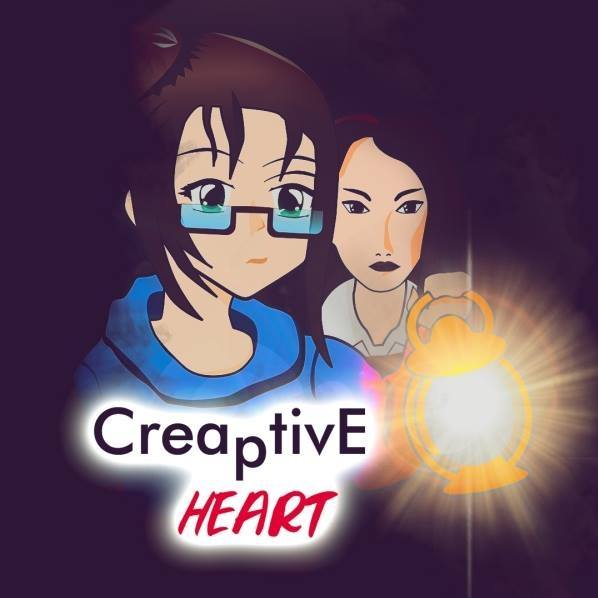
Second, we found people amongst our friends, family, neighbours, to help us promote the game. Got some FanArts:


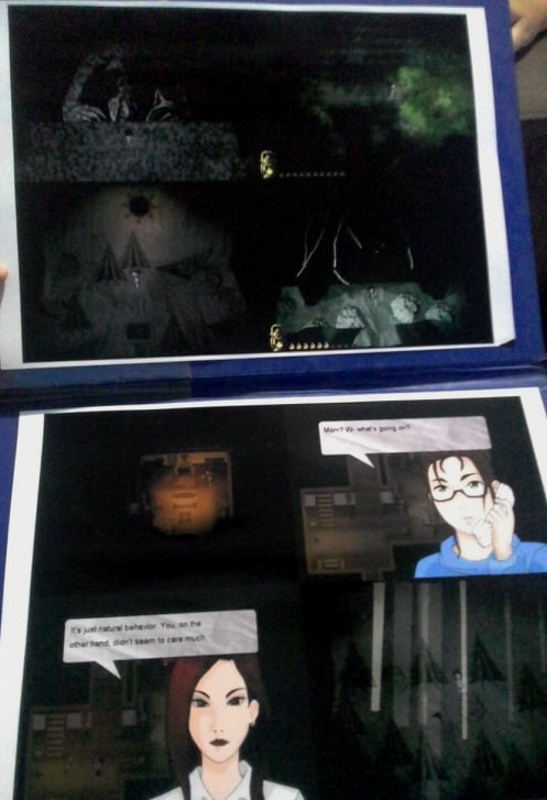
... and for the last two weeks, I've been visiting Game stores, Lan Houses (Don't know the term in other languages, but it's basically a place full of computers and people playing online games, mostly LoL)... got some votes, not a lot, but people showed at least some interest in the Game's concept. Also, if you never printed Screens from your games, please do - it's really cool:
==//==
I feel that people sometimes avoid talking about ratings, since there's always the risk of disqualification for one reason or another. For example, my uncle and aunt rated the game from the same computer; Also, got 3 votes from the LoL guys, but I believe computers have the same IP in places like these. And finally, my brother in law watched me play the game and rated from his cellphone... Those are the ones I've witnessed, I hope it's not against the rules...
Criticism? Oh, boy, we got a LOT! Bad Game Design choices, visuals, high difficulty, lack of tutorials and so and so... but the Game's strongest point remains: Narrative. Give it a try =)
Also, merry christmas, everyone o/
This is actually a really important matter to talk about.
When it comes to marketing campaigns, I believe most of us were not prepared at all - I, personally, thought that with votes and support from family, friends and the community that played my games for the past ten years, it would be enough to be at the first positions, at least in number of votes...
What a surprise it was, when I saw a lot of games jumping ahead... I thought about giving up, but I didn't. We all should expect a big challenge: some Devs work/study at places full of people with computers, some Devs know a lot of people, some have solid Fanbases and so and so on...
==//==
I believe transparency is a big deal, and now that the subject was brought up, I must say: I agree, the thought of bots and cheating upsets me sometimes, because, man, creating an actual marketing campaign is nervewrecking, we're running around almost 24/7 in order to promote the Game - not only in the Internet, we're doing it in the real world as well, and it's really frustrating, people don't care, not enough to actually download and vote, but what would be the point of giving up half way?
And we almost gave up for a lot of different reasons. We now regret the misspell in the Game's name: we thought it would be clever, but it just makes it harder for people finding the game; We regret not including a second language option (English is not our primary language, we lost a lot of people, potential voters, because of this)... We tried a more mature artstyle only to find out that most of the people we talk about prefer Anime style... The game's strongest point: narrative... probably one of the hardest elements to promote "Ah yes, our game looks rough and simple, but the ending is really good, you should play for an hour despite all the lack of visual appeal! It'll be worth it, you have my word, sir!" =D
If there's cheating, let's hope that the judges will see through it...
Hello, everyone.
First of all, we'd like to thank Game Chinchila's Youtube Channel for showing our work to a wider audience.
When you focus on storytelling, the visuals and mechanics of your game can become an obstacle - most of the people do judge the book by its cover, but we believe that the power of narrative can overcome the first impression. To the Moon and Undertale are good examples of that. I mention those two games because, even though we're not at the same level, I like to believe that Creaptive Heart belongs, at least, to the same "class" as them.
==//==
Second: we received a Gameplay/Review video by Silversatyr, which I'm really grateful for. Not kidding, we actually like heavy criticism, because mechanics and tutorials can be easily adjusted, but in order to do so, we need people with different perspectives to point out where the game fails at delivering its message.
Let's talk about the apples: To me, in games, apples are food and food is Health - the fact that you can't pick'em up implies this, given the fact that you start the game with full health. That being said, the power of narrative can twist the player's point of view, as stated by Silversatyr in the video. There was a failure in communication, when the mysterious character said that you, player, had to feed the pigs before killing them - When going into Spoiler territory, I could explain the meaning of "Feed", but to the player, at that moment, it could only mean that getting the Apples would be the focus. And, of course, by doing so, the game leads the player to death.
This alone shows how important is to receive feedback from people that are ready to tear you down if they need to. But I admit that it kinda frustrated me seeing the end of review after the first death. Silversatyr, if you're reading this, I'd really appreciate seeing this kind of true criticism towards the story element - it's always been our main focus, but of course, the decision is up to you.
The testers had no problem in the combat sections, also, when we see people beating Souls games with no gear, for example, we tend to think "Okay, we could raise the difficulty a bit", but I ignored a big detail: our testers were Developers, people used to the action combat in RPG Maker, they know my style because they know me, and that blinded me to the fact that Creaptive Heart doesn't feel like a game in which the player should be always on alert - but it is. Now it's up to me finding a way to show that to the player, and I promise I will do my best.
Thanks a lot for giving the game a try. We've been developing turn based games for a long time, but all the Action based stuff is new to us - we're aware of all the mechanical problems present in the current version - they're being improved since the release to give a more intuitive feel to the player.
We sometimes try to give the player the chance of discovering things by themselves - the fire key, for example. We follow the rule of "The less tutorials, the better", it's risky, but also helps us improve our skills in "Show, don't tell". But, of course, it's hit or miss in most of the cases. I'm sorry that your first experience with the game didn't go well - we'll definitely take into account every design choice that we've made in the wrong direction and try our best to improve them.
==//==
Again, thanks a lot for your feedback =)
YES! This is why I make games - wall texts <3
> About the art in general - I'll have to agree. My main focus was always the storytelling. I consider myself good at "concepts" but not so at "execution". Everything that you've pointed out was a concern during the development period, but we decided to focus on the core and let the result of the contest decide for us, whether or not we're going to spend time (and possibly money hiring someone) to improve the visuals.
> The portraits' color, yeah, we sometimes try to keep the "VideoGame" look to keep the player's guard down. In other words, a serious story can hit even harder when the player doesn't expect it from a colorful and simple game. But sometimes it can be bad to try getting the best from both worlds - we'll definitely make some changes adjusting the visuals to fit in the game's tone. Thanks a lot for pointing it out.
> Audio: I was kinda afraid to use music and SEs, due to the dangers of copyright infringement (Most of the SE sites make it hard to understand their policies about the use of resources) - I really thought the contest would reward original resources, that's why I didn't use Scripts or SEs that I use in my main project. Making music was painful and the result wasn't satisfactory at all. Improvements on sound in general are definitely a priority for the future.
> I'll have to go into Spoiler territory, but don't worry: You're right, I focused on story and only one type of mechanic per Stage, thanks to the fact that every Stage will be revisited when Dr. Laura "joins the team". She, as a psychiatrist, will be the one solving puzzles to help Elisa understand the real meaning of every clue/character that she had interacted with.
Color clues: well, the Red Moon is Laura, so that kinda emplies that she already went through all the drawing with Elisa before.
Blue Moon is Elisa's Denial mechanism giving you health so you can keep your delusions - unfortunately, the story process didn't allow me to show these details so early in the game. I could do it, but it would be forced, so I decided to wait for the right timing.
> Gawd damn those candles... I'm gonna put a thousand arrows pointing to the basement =D
> Characters: They were inspired by real people. I think this is the best way to connect with the player. We all went through similar paths in our lives, I guess, and I'm glad to know some of the characters managed to bring you memories from real people - it's always my goal.
>The mother is... basically my mother =D It's really hard to flesh out a "binary" character, as I call it. Every conversation has its goal, but it's easy to get off the rails when portraying a complex character in simple dialogue. I'll definitely study her persona and try to show her colors in a more effective way to the player.
> You're absolutely right about Dr. Laura. The Psychology element wasn't well portrayed at all, but there's a reason. Think about it this way: Laura is not talking to Elisa, she's trying to break her delusions created by Denial, guilt and defence mechanisms. After the last scene, she'll calm down and talk to the real Elisa, because they've been through all that before.
BUT, yeah, I'll study/read a little bit more when the time comes to portray an actual psychiatrist. I've tried to watch movies about it, but they too tend to exaggerate things a bit for the purpose of entertainment.
> Short scenes: they'll be revisited from Laura's point of view, don't worry o/
> Water Stage: the mysterious NPC is the Red Moon =D The stage was shorter given the fact that Elisa was running against time, also... I was running against time in the game development - kinda meta, one could say, tee hee - But yeah, I agree it was a shallow stage...
> You got it right about the Ending. It' more like "Elisa was twisting some of the clues and interpretations in order to fit in her own version of the story". There was a discarded scene in which the player sees Elisa going to the basement and picking up the box - I'm gonna add it as soon as I return to the Dev process.
==//==
Abso-f*cking-lutely. That's exactly how one develops, and I really appreciate true criticism. I'll definetely read your text along the Dev process to make sure everything is receiving the attention it needs.
Thanks a LOT for your comment! And I'm glad you enjoyed the game despite its flaws.
Véi, quem são vcs e por que eu não tô seguindo vcs ainda? Que cenários fodas - me trouxeram aquela vibe de FFIX, que foi minha primeira grande experiência no mundo dos RPGs, então imagina a nostalgia hehe! Minha conexão por vezes me deixa na mão em downloads mais pesados, mas vou tentar novamente assim que possível. No mais, parabéns pelo trabalho - visualmente falando, está impecável.
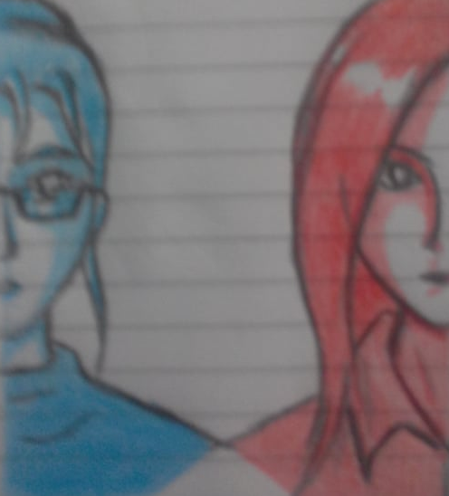
Just doing some Art Work, hope y'all like it. It was too late when I realised I was drawing in a note pad, so, yeah, lines, lines, lines...
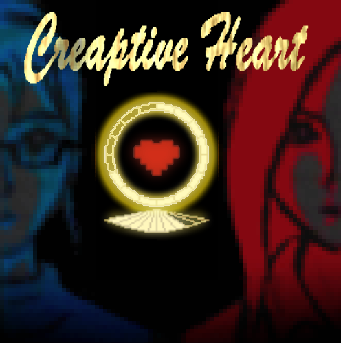
1000 Filters later, lines are gone, And then I realised the hand drawn/amateur/note pad style would fit perfectly the tone of the game - one of those happy coincidences.
The symbol in the middle of the Screen is a fusion of two HUDs which the player should recognize from the Demo. Together, they form what seems to be an inverted diamond ring (because symbolism, I like it, you like it, we all like it!) - And yes, this will be a really important piece, should the future chapters come to life.
Give it a try: https://itch.io/jam/igmc2018/rate/333239
The candles can be found at the basement. There are 3 spots in which you must look, and the candles will be at the last one (One of those classic nasty Dev tricks, sorry ^^")
Thanks a lot for playing and commenting.
Haha! Yep, Elisa is not a nice girl at all - I hope to show more of her true self in the next chapters, if public reception goes well ^^
What an awesome experience. Movement feels heavy, but perfectly balanced. The layout is intuitive, the inventory limitation makes the resource management a big deal, but not to the point of being frustrating.
Really liked the way the game flows, we never feel lost or bored - it's a kinda short game, but shows everything that needs to be shown.
I don't like Card Games, but I love Yu-gi-Oh Forbidden Memories; I don't like Dungeon Crawlers, but I liked your game. I guess there's a certain charm in simplicity, at least for me.
Gameplay is really satisfying, the Attack animation and sound, the dice rolling, each small detail happened to fit perfectly to create an inviting experience - even when the game becomes just "roll dice: nothing, roll again: nothing", you still wanna keep going.
For the future, I would suggest a mini map, with different paths to follow, maybe add some terrain stuff, like a path with traps but also powerfull weapons to get...
==//==
Really liked the game's balance. We feel the danger, but there's always hope of overcoming every challenge, and most of the times, we manage to survive and get a real sense of acomplishment.
Yo! After the first conversation with Poppy, I touched the crystal, I talked to the Professor, but when I try to walk out of the map, the game crashes. Sorry, I didn't took a Screen Shot, but it's something like "Type error Failed to execute "GetprogramParameter" on WebGLblablabla".
Maybe it's just my computer, but it's worth checking out - I guess you can fix it before the submission time runs out.
Okay, let me begin by saying that I've found two minor problems in the game:
- Navigation is kinda uncomfortable thanks to the 8 direction movement system, not to mention a lot of objects which I could walk through (Piano on the church and part of the counter on the INN are some of the examples. Not to mention a lot of the mountain Tiles in the southwest part of the map;
- The information displayed in the battle system is a little bit chaotic. We have text on top of the screen, also buffs and stats poping up faster than we can read'em.
But those details are NOTHING! The writing in your game, sir, is probably the best thing I've EVER seen in ANY game, I'm dead serious. You managed to turn a simple concept of "Amnesic hero slaying beasts" into a fantastic and immersive experience, and that is amazing.
It's really impressive when we see what can be done with the power of words. The narrative style helps a lot in the character and world building, which wouldn't be as effective if we had only character dialogue.
Also, the battle system is really fun. The way it was built makes the player cicle through the options and rewards him for doing so, which is a sign of good balancement.
Since The Walking Dead and Deadly Premonition, I've been stating that "Starting a game with a conversation in a moving car is great!" Really liked the first interaction between the characters. Caitlyn(Kaitlyn? Sorry, bad memory here) is a really interesting character, well fleshed out, as any good character should be.
The transition from "Car scene" to "Next scene" was kinda odd to me. It's hard to understand what happened by the Sound Effects that play in the black Screen, but if your intention was to actually make it a mystery, then it's fine.
==//==
Gameplay wise, it follows the survival horror book, but it's not a bad thing if you manage to create an engaging experience. And that's the case here. Really liked exploring the rooms. The mechanics fit elegantly, search and reward are well ballanced and the layout of the building is really intuitive - you never feel lost or confused.
Also, a good amount of open doors (sounds like a simple element, but a lot of devs make their games frustrating by ignoring these tiny factors: A locked door is an enemy, and if the reward for unlocking it is just... the fact that you've unlocked it, it's like a boss that doesn't give EXP or gold... Why? Right?).
Anyway, back to the game: Unfortunately, Survival Horror is not my thing, so the first "Danger moment" kinda threw me off. I felt it was a little too much for no reason, and also, I couldn't tell if I was dealing damage or losing HP and then I died... Okay, maybe I just panicked, but the game could be improved with a smoother learning curve...


