Indie game storeFree gamesFun gamesHorror games
Game developmentAssetsComics
SalesBundles
Jobs
TagsGame Engines

cleoh

48
Posts
4
Followers
10
Following
A member registered Feb 19, 2022 · View creator page →

Creator of

Recent community posts

Interesting project, i liked the athmosphere and the music. I also liked how weird it felt to move the camera around, i don't know if it's just the fish eye lense but it felt unique. 

I just wish the dialogues sometimes required me to ineract with the appartment. Also the buttons have funky hitboxes, maybe linked to screen resolution since not everyone seems to have that issue?

This was a really fun experience! I love how it slowly gets darker, and the gameplay is simple but well executed. I like how risky it gets to collect droplets. Also that is indeed a weird way to hold a bow lol

A few things I noticed: the droplets collide with arrows, so they act as some kind of shield for monsters. And the range from wich we can pick them up feels too small, they can be quite hard to even pick up with the speed upgrades. Also on the last level it feels like i cant do anything apprt from standing still and firing down and right, i don't know if this was intentional.

Good job, overall it's a fun project and i could definitely imagine spending more time on it if there was some kind of planning phase where you can prepare for the attack.

Wonderful game, it's impressive that you could do that in a week! I love how the oxygen pipes work, and it feels like the oxygen decay is tuned just right. The process of searching for more ores in the dark is fun, but doing it while managing the oxygen and the worms, it's very entertaining.

About the things that could be improved : pausing the game while the shop is open would make the player's life a lot easier, and having the shops be actually visible like the first town would help a lot. Also it wasn't clear at first that i could scroll down in the shop, which is too bad since vision distance, jet speed and ore yield seem like the most powerful upgrades. Also it's not clear that the worms can be killed, i spent my time just avoiding them lol.

Overall this gives me the same feeling as those cool flash games that would hook me up for hours as a kid, which is very nice. Once again, congrats on making such a game in just a week

Fun little concept, I love how the main menu is done. But there are some stuff that seem to get in the way of the fun : mainly having to put the weapons back on the wall all the time. Anyway, this could honestly turn into a cool game with more weapons and sub-objectives, if you want to expand on it!

Heyy, we're a team of two (an artist and a developer) and we think it would be cool to work with you! We're not sure what genre we'll want yet, but that doesn't seem to be an issue for you. Should we talk on discord or do you have another prefered way to talk?

It's a really cool project, the aestethic is masterfully done and the audio is really cool too. The games were interesting even tho the tank one was really easy and quick compared to the others. I also really like the fake box cover you did, the whole idea with the standard sellout description creates an uncanny feeling, even without the "let them decay" and the dark bits in the games, because it feels like it's from an alternate universe or something. Congrats!

Really cool concept, i'm hyped to see how it evolves after the jam!

I love the concept, it's really creative and fun, and there's a lot of different tricks to explore and master. 

I think the main problem i have with the game is that there is an imbalance between colors, shapes and rotation : colors and shapes have three  states, but rotation has 8, so i spent most of my time trying to get the rotation right, and it honestly felt frustrating when i had to make an almost full rotation when i didn't have a lot of space to begin with. The only other issue in my opinion is that the boundaries for where the circles can be placed are unclear, it doesn't feel right that you have to guess this in a game so fast paced. 

I hope you can turn this into a full game, because there's truly a lot of potential in this idea!

It's a cute game, wich suits well the theme,  i think the sad part is rendered quite well.  However, the happy scene could have been a bit more "dream-like" in my opinion. 

Thanks a lot! 

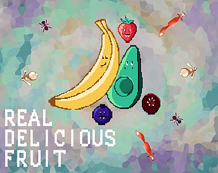
The fake animals is a great idea indeed. At first the fake fruit thing was part of the gameplay : if you stop moving, animals will think you're food and will try to eat you even if you're bigger. However, it didn't prove to be really useful with the kind of game it turned out to be, so i didn't even mention it in the tutorial. ^^'

The difficulty is my main regret with this game, especially for the strawberry, but yeah, the stamina bar being the main danger was on purpose, to avoid a "spammy" gameplay.

I love the graphics, and the concept. I was pretty far in (next upgrade tier was at $800) when a meteorite hit me.. Can you at least tell me if aliens are real? 

Also, the W and S keys both tilt the rover to the same direction.

I like the graphics, it reminds me of Paint the town red. I think the randomised treasure hunt is a good way to give an objective to the player, and i like that bullets are projectiles, hitscan is boring. It seems like the muzzle flash effect is not always aligned with the gun. 

Anyway, for a jam game, this is really cool!

Really good and original concept, pleasant aesthetically, and the music is fitting. My only complaint is that the platforms could move a bit faster without compromising the chill ambiance

A really solid concept gameplay-wise, none of the assets feel out of place, the audio is convincing too (apart from the footsteps bug), and the visual effect when you rest are really cool. As said by others, the learning curve is really smooth for the puzzles, however, i think you should have teached the dash, and even the basic movement, in a safer environment, but it's a nitpick really. The controls are really not ideal, the dash and the attack should be relocated, preferably on the other hand. 

The movement feels really fluid and responsive (maybe the dash is a bit too "smooth", some pause in the player's movement before or after the dash could make it a little more impactful, or even a micro-pause in the game's time). Also, the round bottom of the player's collider has a tendency to slip off ledges, it's not that annoying now but it could be for more tricky platforming sections. I like how you explored the main mechanic, and i think it has a lot of potential, i especially liked when i had to rest twice in a row to use the door opened by my first "ghost"; it felt a bit like inception lol, maybe you could have special benches for the "ghost" to create another "ghost" of himself? 

Bonus point for the flag noises and the visible prop behind the last door, it's a subtle and organic way to motivate players. Same for the text going progressively from tutorials to hints to questioning life. Also, the souls vibe is pleasant.

In conclusion, i am eager to see what you will do with it in the future!

Yeah, no wonder they keep the doctor away!

Thanks a lot for the kind words, I'm really glad you liked the tutorial, same for the sprites : they were made by my gf and i'm proud of how talented she is.

That's a nice way to test games, i think i'll do the same from here on out, it seems like this will create more memorable experiences

Honestly this is the best game i've played in this jam so far. The UI is clear and pretty, the music is really cool, the graphics are clean and fitting, and the concept is both creative and well executed. 

I guess you didn't really have time for that, but a way to select levels would have been nice, especially since escape sends the player back at the main menu without a warning. Also, people are complaining about difficulty for the last levels, but i would argue the levels are fine, it's the margin of error which is too slim : it doesn't feel right to die because the very tip of my hat touched the wall, sometimes by just a pixel.

The timer is a good idea, it's always cool to promote speedrunning, and the audio settings are always nice too in a jam game. I think you could turn this into a full game if you find a couple of interesting mechanics to mix with what you already have, maybe some side-scrolling levels, or at least bigger ones, could be a good idea for exemple. 

I enjoyed the tension each time i blinked, and redoing the early levels in one go after getting used to the game was really satisfying (that's where the side-scrolling levels idea comes from). Congrats!

The "story" is cool and very creative! And the game achieves what it sets out to do, so congrats! I really like the that we start in the car and the game wait for our input to start really playing

About the sluggish jump mentionned in the other comment, i think it's because generally you don't want a jump to feel "linear", you want the ascension to be somewhat quick, the top of the curve to be "floaty" and the fall to be quicker than the ascension. When i made a platformer i changed the gravity for my player depending on if they're goind up or down, but it's just one way to do it. Another critique i would have is that to give more diversity to the patterns of the birds, you could make a "mario" jump, where taping the space bar will make a small jump, and holding it will make a big one; this would allow you to diversify the patterns a bit more.

Thank you!

(3 edits)

Really fun game, i like the concept but i like the execution even more. I don't really know how this would transfer to a full game, but for a small project it was totally fine. The wacky/meme theme is funny without feeling too forced, and the movement feels surprisingly good, apart from the jumps sometimes not happening (if i had to guess i would say it's because something isn't right in the ground detection?). There is not a lot of levels but each one felt like it really had its place in the game, i would even argue that they deserve a bit more time and/or space, becauseeach time i just started to feel used to play by the new rules, i had already collected most stuff from the level. As the core of the fun clearly comes from discovering the new rules each time, i look forward to see more levels after the jam if you intend on doing that.

Some technical problems : i had to restart the game because taping the "rules" button while the "opening rules" animation is still playing will lock the player in place; the FOV effect for the sprint seems to stay on the screen if i just tap shift; and the trigger to pick up trees seems a bit small, but maybe not that much idk. Finally, as pointed out by the other comment, there's a lack of direction in the first level, maybe putting a face on the big tree or something to compel players to investigate would fix that.

(Also congrats, that's the closest submission time i saw so far lol)

(Also also itch gave me a warning when downloading, about the game potentially being a virus? i don't really know why, maybe that's because it's a .7z and not a regular .zip? idk the difference so yeah)

Thank you! It is indeed quite hard, at least harder than what i was aiming for

Thanks! I'm glad you could get past the not so well balanced difficulty

Yeah i had a hard time balancing it. I totally agree for the sound ^^'

That's some good ideas, it would be even better if those power ups were special animals like a golden bunny or something. I didn't even think about this game beyond the jam, so thanks for your ideas, idk if i will end up working more time on this game, but it was fun to realize i can now imagine what i could add beyond the initial scope of the game. Thanks for your feedback!

Thanks! And yeah, that was pretty stressful lol

Thanks, it means a lot!

Thanks a lot! I'm glad you liked it

Hilarious. As a french, le man is a perfectly accurate depiction of the average parisian lol. The patterns of john lemon seem fine. His attacks being destructible is a good idea, if the rng screws you over or you made a mistake, it still gives you a chance to recover untouched. I feel the two main problems are 1- the balance of the player's damage : with the normal attacks, it seems like it will take ages to kill him, but when i got a power up, i got him to half health in litteraly 20 seconds, it feels like there's almost no point in trying to aim as long as i don't have a power up. 2- as pointed out by others, the jump mechanic isn't really clear. I like the idea, it's an interesting alternative to the mario jump, but it clearly needs some explanation for beginners, and some visual feedback. The voicelines add a lot of rythm to the experience, and help the humourous tone to last much longer than the initial fun of some wacky sprites. The main menu is really nice, and having a sound setting on a jam game feels like a blessing. I really like that the fight seems to be made to feel like a war of attrition, a long endurance test, it reminds me somehow of the old monster hunter games design philosophy about combat. Finally, it's funny to see you also were really close to the deadline.

The player character is hilarious, both his design and his walk. The concept is really cool and has a lot of potential, but the punishing fall damage feels quite unnecessary, and the way taking platforms works doesn't feel good : the reach in a bit short, wich means any small mistake will often force you to restart the level. There is also no feedback until the plaform is taken, i think outlining the one about to be picked up could be a huge help to anyone who isn't familiar with the game.

Really cute graphics, nice concept, and good execution. The level design is so on point with the timer that on my first try i finished 2 seconds away from the limit lol. As everyone else already said, it just lacks some audio. Honestly if you feel like making more levels, maybe adding a new component each time, this could be a nice little finished game.

Nice concept, and the little troll at the end was funny. My only complaint is that it felt a bit arbitrary to be able to traverse some brown platforms and not others. I know you just switched their direction, but if you put yourself in an average player's shoes, it's not obvious at all. Also, you may think your level design was bad, but if you don't add a 3rd color or another mechanic, there's not much else to do, so it's fine like this. Finally, you shouldn't apologise. You can say that you're a beginner, you can explain you didn't have time to fix this or that, but don't apologise. We all had to begin somewhere, if you're not proud of your game, at least realise that this is YOUR game, nobody is entitled to anything from it, you have the right to make games with flaws, or bad games, because it's inevitable anyway, it happens to all of us. 

The art is really cool, especially the main character and their animations. The music and sounds were really quiet so i couldn't hear them really well. The concept is fun, especially when you add platforming to the "combat". The only flaws i saw were some technical problems : if i aim with my mouse, it feels weird to have to tap A or D to change direction; sometimes the light seems to touch the ghost but it doesn't do anything (i think it's related to walls and angles, maybe you should get some more raycasts if that's what you used for hit detection); and finally, even when i aim to the left i have to keep the mouse to the right to be able to aim. I totally understand the troubles with the mouse aim, i had similar issues with a project of mine, and i clearly wouldn't have found a solution in just a week.

The game looks really nice, the concept is refreshing and has a lot of potential. I got stuck because i couldn't reach a gem in a wall, i assume it's a bug?


It's a fun game, and the leaderboard is a cool idea, but some of the riddles feel really arbitrary, and since there's no way to check the answer, it just doesn't feel right

The art style and the color palette are lovely, and trying to figure out what the customers are asking was fun. I usually don't like this kind of gameplay but i ended up playing the five days, i guess it means the game is really good!

Nice game, especially in 14h of work, feels a bit like Getting over it with the level design. The bouncy walls add a lot of freedom, and the double jump thing is pleasant to use. The only major complaint i would have is that the camera could have "in-between" states, because the view change mid-jump doesn't feel good. Also the sensibility of the jump strength is a bit extreme, but maybe that's because i played on PC.

A fun experience, it got some genuine laughs off me. Also i liked the pixelated graphics

The opening dialogue is funny, and the scuffed theme is clearly here lol. I wonder, is it possible to beat the princess? Because i couldn't even touch her. (Also, i noticed the player character got stuck in the ground sometimes, did you use a tilemap collider? If that's the case, i would advise you to use a composite collider with it to fix that problem)

The concept is quite fun, and the way the AI reacts to the player moving in a diagonal adds a lot to the gameplay. Adding different shapes in the later stages was a good idea too. I think one big problem is that restarting the audio at every death feels really spammy for the first minute or so, having like 5 seconds of silence at the start of the dialogue would prevent this. Also, i guess you just didn't have time, but the absence of a main menu and a button to exit the game at the end makes the experience hard to stick with for the average player.

It's a really fun game! The only downside i see is that sometimes the real aliens end up on a rock, forcing you to restart, but it didn't happen that often

Thank you fellow avocado enjoyer, i'm glad you liked it. I was really worried about the difficulty, so it's nice to hear you didn't give up on the strawberry!