cricketHunter
72
Posts
3
Topics
36
Followers
28
Following
A member registered Aug 05, 2019 · View creator page →
Creator of
Riffle through bags, pilfer riches and sell them to animals. Can you become the trash king?
Simulation
Play in browser
In this atmospheric puzzle adventure, every photo holds a secret waiting to be uncovered.
Adventure
Play in browser
The steaks have never been higher. Can you become the King of the Grill? Or will you leave the family BBQ in flames?
Play in browser
Recent community posts
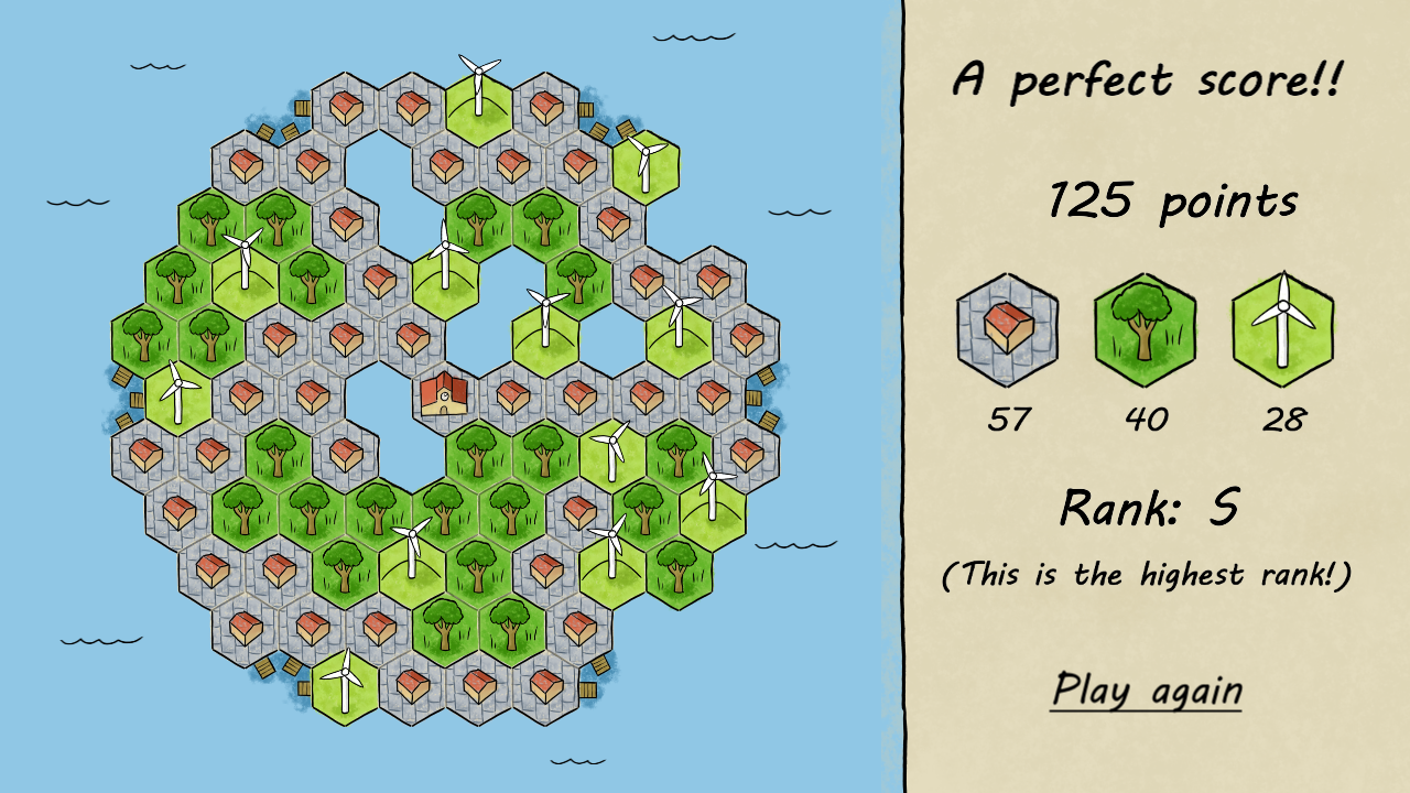
I love this game so much. Makes me honestly jealous how elegant it is.
One suggestion: for mobile, it would be nice if the drag area extended outside of the hex (maybe a zone encompassing the hexes that you could drag) so that you can see the placement of the hexes without your finger being in the way.
itch.io Community » itch.io » Questions & Support · Replied to hechelion in How are people downloading my game when no download is available?
itch.io Community » itch.io » Questions & Support · Created a new topic How are people downloading my game when no download is available?
I released an html5 game with my team:
https://crabbucketgames.itch.io/reduce-reuse-raccoon
As far as I can tell there is nothing available to download, yet I'm getting a dozen downloads a day. What's going on? Did I misconfigure the project or is there some other way people are downloading the project
Reduce, Reuse, Raccoon jam comments · Replied to NterpriseCEO in Reduce, Reuse, Raccoon jam comments
I have a tiny deploy script for my html5 games. It zips up the folders and then tells butler to push to the project:
remove-item "$FileName.zip"
Compress-Archive $FileName "$FileName.zip"
# Set the PATH environment variable temporarily
$env:Path += "path stuff that includes my name"
butler push "$FileName.zip" crabbucketgames/"$GameName":html5
This works great! Saved me so much time and then suddenly after one build:
A build for Reduce, Reuse, Raccoon failed to process 10h
Build html5 51 for Reduce, Reuse, Raccoon is now live 11h
Build html5 50 for Reduce, Reuse, Raccoon is now live 12h
And now no matter what I do I just get the failed to process message. Butler status doesn't show me anything weird. I can delete the butler upload and rerun butler, which works the first time but then goes back to failing after that:
A build for Reduce, Reuse, Raccoon failed to process 4m
Build html5 1 for Reduce, Reuse, Raccoon is now live 9h
A build for Reduce, Reuse, Raccoon failed to process 9h
What steps should I be taking to troubleshoot?
Unexpected Developments comments · Replied to Skewercide Studios in Unexpected Developments comments
I escaped!
Like the game feel, got jump scared by the monster more than once.
Agree with the other rate that you needed to separate the sprite bounding box from the hit box to allow me to move more naturally through the horizontal tunnels. I expect the hit box to only take up the lower half or quarter of the sprite in this sort of top down perspective.
Really like the lighting effects and music, and how the monster has it's own musical cue to let you know when it's close (but maybe still offscreen).
I had a real nice moment where the monster spawned on the other side of a doorway from me so I walked up and saw the monster behind the locked door. Went nope, going a different way, hit a dead end came back and the monster was gone.
Gave me a nice, oh crap, where did it go moment.
Would like a little more direction and sense of progression rather than randomly walking through similar looking corridors.
Thank you for the feedback. We made a list of "awkward" shapes and skewer was definitely on there. So it was kinda hard to decide if that meant it was a good or bad for the game.
I struggled with the right timing for cooking. I want it long enough that you can go, "nuts to this, let me rearrange everything on the grill!" and short enough that I'm not stuck just staring at the meat cooking as the hangry meter goes up. One of the things the game not so subtly rewards you for is optimally packing the grill, so I sort of wonder if we should have implemented something that made it better strategy to more actively rearrange meats in real time.
Oh well, when I feel conflicted I just remember:
Grill dad still believes in us!
Gun feels great, skeletons exploding feels great, even the rocket rollerblades feel cool, I just wish I could play longer than 8 seconds before dying.
I feel like there is an arrangement of these elements that will feel amazing, but the tiny arena and PUNISHING difficulty make them hard to appreciate. Please take these mechanics and make some sort of roller derby inspired skeleton shooting game, because I will play the crap out of it.
I love this concept!
However, I did want to feel like I was making tradeoffs earlier, the board was so big on those first couple levels.
It feels like the equipping mechanic would feel better if the board was smaller and the powerups (especially the core ones) just a little smaller. I had to spend a lot of time fiddling between enemy waves. I think a smaller board would keep the concept but be tedious when you get a nice big item you want to equip. That way the focus could squarely be on making the interesting strategic decisions of wanting to carry a key or not.
The "charms" could be a 1x1 on a smaller board and I feel like I'd be doing less "busy work" rearranging things.
There is a very nice core idea here, though! Would love to see it evolved!
We live on The Turtle - Tavern Game Jam`24 jam comments · Posted in We live on The Turtle - Tavern Game Jam`24 jam comments
itch.io Community » itch.io » Questions & Support · Replied to redonihunter in How to properly report untagged nsfw projects?
itch.io Community » itch.io » Questions & Support · Replied to redonihunter in How to properly report untagged nsfw projects?
itch.io Community » itch.io » Questions & Support · Replied to No Time To Play in How to properly report untagged nsfw projects?
itch.io Community » itch.io » Questions & Support · Created a new topic How to properly report untagged nsfw projects?
I want to make sure I'm using the right terms and reporting mechanism for this. For instance right now the top two responses on comics are straight up porn that are not tagged nsfw (https://itch.io/comics/new-and-popular).
When I go to report a project I get a form. The reporting form has the following categories:
Broken
Offensive material
Malacious software or virus
Uploader not authorized to distribute
Miscategorized
Spam
Other
...and a Description field.
What's the best way to fill this out so that moderators can quickly understand what the problem is and get the game properly tagged to not show up in the public feed.
Thank you. The music is from https://itch.io/profile/sethersson and I love his music, especially what he composed for our other game - Prototype Glitch.
Shout out for Phaser! Your game is really unique.
I really like the little mini-game at the beginning where you are looking for yourself. It's a really great concept, and fits into the theme of the game. I would like to see that highlighted better in game - although you do mention it in the game description.
The clover mechanic is very cool and very imaginative. Because it lasts for so short a time and starts automatically on collection I didn't feel I could use it strategically though, which feels like a missed opportunity.
One little question: am I supposed to go faster moving diagonally? If not I use this very simple code in my Phaser games to normalize movement speed:
let character_direction = new Phaser.Math.Vector2(0,0);
if (input.left) {
    character_direction.x -= 1;
}
if (input.right) {
    character_direction.x += 1;
}
if (input.up) {
    character_direction.y -= 1;
}
if (input.down) {
character_direction.y += 1;
}
character_direction.setLength(PLAYER_SPEED);
Game is HARD. Haven't finished it (yet). Keep getting caught by some c'thonic plant creatures or ghost squids before I can get all the photos!
Alright, back to this strange liminal space and time to collect more photos!
Nice game.
Chad Broski and the Great Bromine Crisis jam comments · Replied to Saturn91 in Chad Broski and the Great Bromine Crisis jam comments
I also wish there was a little more gameplay...
The problems with game jams is there is just so little time for course corrections. I wish I could have fixed some of the issues with the main game loop. Sigh.
Glad you liked the aesthetics - I think our artist and sound guy really hit this out of the park.
I found the controls counter-intuitive, but the core idea is so solid and I love how the baddies exploit the different parts of the combat system - very clever design for the enemies.
I wish the controls had been tighter, because this is very skill testing and I don't like having the option to blame the controls instead of my skill :)
Also the powerup selection was a little frustrating. I'd hop on an archer and they'd be the last enemy in the wave and instead of getting the health I'd desperately need I'd get +100 points. I like how you tried to integrate the power-up selection into the primary game loop, but I didn't like when I accidently didn't get what I wanted.
Overall cool concept that feels like the core of a good, fun, arcade game.


