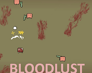
Hey there - we are releasing a new demo for Steam's Cerebral Puzzle Showcase on May 23rd! We'll have it up on both Steam & Itch, so if you want to check back then that would be awesome. Sorry it wasn't up when you were looking for it, we're just in the process of transitioning to the new demo.
Danga
Creator of
Recent community posts
I completed the mission and wrote some miscellaneous thoughts down while playing - feel free to take them or leave them
- Shooting feels really good in the game, I like the weapon variety and just how the guns feel
- In the apartment building with garbage bags blocking stairs going up, I accidentally found the stairs going down and didn't realize they were there, this is either a secret or needs to be more prominent
- Keybinds for 1, 2 weapon switching works, but once you pick up a third weapon you have to use scrollwheel
- Falling in a pit and dying/restarting didn't feel great, was just trying to explore and there was no indication of danger
- Pickups need to be more visually prominent with vfx, it's really hard to see what you can pickup. Also this made me unsure if I just missed one of the keycards or hadn't found the area for it yet. Turned out I just missed it, I was looking for the blue card for a long time but I'd been to that area several times already
- Since this is a movement shooter, it would be really fun if there were more projectiles to dodge instead of hitscan
Overall it was really well polished though, it felt like playing a better-feeling Time Splitters game, which I love
Overall quite good. At first I had no idea what the random pickups were, but later found out it was some ammo. Ammo seems pretty unnecessary honestly, I might get rid of it. I couldn't buy anything in the shop and had no idea how much things costed. Also I kept accidentally hitting play next level instead of increasing my stats on level up, so maybe force that interaction before moving on to the next level. The work you put into polish so far is definitely evident so really nice job there
Pretty cozy aesthetic, I like it. Like other comments, there's definitely some weirdness with a controller plugged in (0 deadzone on joystick causes constant spinning).
If you end up keeping stamina, it's a little weird that the UI vfx appears on the currently regenerating node when you jump/attack instead of the green nodes
Hey thanks a million for playing to the end! I've since updated the deactivating movement/walking effects after entering the exit door. I'll probably try some shaders for the arrow to see what I can do too. The arms are definitely a bit tricky, extending them to the body creates more work than you might expect (aligning the shoulders to where the body should be, etc). The arms implementation is honestly kind of hacky so I might just leave it as is since it's not the worst thing - maybe put a dithering shader or something though to fade out
First things first I actually really love this game, I was legit having a ton of fun building my character and figuring out how I like to play (axe + ice spike, bow for cheesing). I played for about an hour
There's a huge wall of miscellaneous thoughts I had while playing the game, feel free to take them or leave them
- - Immediately feels nice and moody in the main menu. Nice and polished menu
- After loading in it was surprising how much it felt like a legit ass game that I'd buy on steam today
- Item pickup sounds would be really nice, maybe like a separate sound for each item class (glug for potion, clink for metal/sword)
- Would also be nice to have some slight variation to the footstep sound
- killed an ogre through a door
- The main characters armor needs some shinyness/roughness
- On the same note, the ogres shinyness could probably be turned down to better match the rest of the environment/creatures
- It can be hard to tell where the current room ends with the walls being so invisible. Maybe a fresnel effect in a shader would work well here
- The map is awesome, really useful and well implemented
- Tutorial popups would go far for teaching people how to equip stuff and do the basic things
- The leather helmet is the brightest thing in the whole dungeon lol
- Need a solid like 80db quick thud sound when anything is hit to sell the impact. It was hard to tell when I got hit
- I really like the walls being made up of individual bricks, but the scale of the gritty texture feels off and like its too big
- Walking around the dungeon its not really clear what I'm trying to find. Intuitively I can guess it's a staircase because we're going up a tower, but hard to tell
- Balance is a bit tough, I think the first level needs a slightly easier ramp up (can be a short level) to get your bearings. Opening a door to 10 enemies is a little terrifying
- Some barrels are breakable, some are not
- On the map once you've explored a lot its hard to find the areas that you haven't explored. It would also be cool to click on the map to auto walk so it does that while I do inventory stuff
- Items on the ground need a little glow
- That guard fucker on level 2 has way too much health. It took like 10 mins of cheesing to finally beat him. Maybe he needs a healthbar too?
- Also he is easy to cheese with bow or even just go hit him once and walk away. It just takes forever
- All that aside, it was exciting to fight a boss and I really felt the tension of not wanting to die since ive come so far
- There needs to be a shop for all this miscellaneous gear I'm finding, let me buy some potions or spells
- It would be really nice if the inventory button was closer to WASD
- On the same note being able to quickswap weapons would make encounters a lot more dynamic (the process of opening inventory, swapping a weapon, and having to replace my old weapon in the inventory is super tough)
- Garlathan magicfeast got me good in the end on level 3
Overall really great game. I think the main critiques are all geared towards polish and quality of life features. Great job!
Thanks a ton for playing & the feedback! Honestly having some magma instead of the no-walk black blocks is a great idea. Level 8 definitely seems to be the pain point for most people so far so seems like it needs to be scaled back or moved to later in the game.
Also loved hopping on Jump Chat a few times today!
Thanks for playing! Yeah I've struggled a lot with making the mouselook feel good but it's been really tricky as your mouse is separated from your body forward direction. There is a sensitivity slider in the pause menu (esc) but that's not on the main menu so it was easily missed. Thanks again and can't wait to check out Necrovale!
Awesome game! I wrote down any thoughts I had while playing so hopefully there's something useful in here:
- Really nice intro screen, main menu, music, makes it feel professional
- Awesome tutorial levels and pacing for the difficulty ramp
- Love the level select screen design, feels very baba is you (which is good)
- Music in game is great
- Sound effects like footstep, poke, toad windup are slightly weak. They did grow on me though so not a huge priority
- The levers/blockade designs are a little weird, why a water droplet?
- Solved "under pressure" level accidentally when I fumbled my controls and switched back but the level is really cool. Somehow make this more intentional to solve (or maybe not since it was a good lesson anyway)
- Every level where you're teaching a new concept is really great at doing that, the overall level design is really solid
- Some of the tutorial images at the beginning of the levels are a little mushy, specifically the sidestep level. The faces don't really seem to match the bodies
- Though the 2nd image here of the fairy being punched is hilarious
- Last level of world 1 says you'll have plenty of time to act if you solve it correctly, and while I got it first try the timing was slightly tighter than I'd imagine
- The strong fairy throwing the other one gave me a laugh, also that running animation for the strong fairy is so good
- Personally I'd like to know how many levels are in an area, like maybe having they greyed out or an outline or something. Without this there's a slight feeling of anxiety instead of anticipation
- "Dreaming to fly" felt a little cluttered with the fairies in a tight space for the solution
- It would be nice if you could see the level name at the top (mostly for writing this feedback), but it's useful for if people want to talk about levels
- Jump pads could use a little polish & speed increase, but the first level with them has a good solution and misdirection on the first attempt
- Maybe the jump pad speed is just for longer ones since next level was fine
That's where I had to stop but really awesome game overall, you should be proud of what you've made. It's a really cute & soulful game with surprisingly great level design!
I like the game enough to the point where I'll come back and finish it when I get a little more time.


