Indie game storeFree gamesFun gamesHorror games
Game developmentAssetsComics
SalesBundles
Jobs
TagsGame Engines
A jam submission

He Who WatchesView game page

A spatial dungeon puzzler where you must crawl on every surface and discover secrets in order to escape.
Submitted by Danga (@bvanderaarde) — 2 days, 23 hours before the deadline
Add to collection

Play game

He Who Watches's itch.io page

Leave a comment

Log in with itch.io to leave a comment.

Comments

Really liked it, beat ~6-8 levels before i had to stop. Very hard to make a good puzzler but i think you got something here. it plays well into the whole Portal lane, its gonna live and fall on the gimmicks you can introduce in each chapter to keep it fresh.

I dont really have any feedback other than i wished that it was free-roam movement other than tile based. but i understand why you had to limit it, but might be worth exploring (which you probably already have).

Submitted

Finished 12lvs, didn't find the secrets ones.

Favorite gimmick: the green glass. 

I renew the compliments I did during the stream, great work. 

Two things:

- Once you enter the exit, deactive movement/walking effects

- A more "magical arrow" skin

- if you look downwards you see the end of the arms.

Beside that is perfect as it is, you just need a ton of new gimmicks. Good luck.

Developer(+1)

Hey thanks a million for playing to the end! I've since updated the deactivating movement/walking effects after entering the exit door. I'll probably try some shaders for the arrow to see what I can do too. The arms are definitely a bit tricky, extending them to the body creates more work than you might expect (aligning the shoulders to where the body should be, etc). The arms implementation is honestly kind of hacky so I might just leave it as is since it's not the worst thing - maybe put a dithering shader or something though to fade out

(1 edit)

Can't get past the loading screen, latest Windows version.

https://files.catbox.moe/xx13f4.mp4

Developer

Hey thanks for trying and sorry about the issue. I've only had 1 person have this issue before (gdesecrate streamer), but I thought I knew the problem and fixed it (which apparently I did not). There's a log file at He Who Watches_Data/ingame_log.txt, would you be able to upload that?

Sure, here it is.

https://files.catbox.moe/jk38on.txt

Developer

Got it, seems like it's having trouble parsing the map file. I put out a build that changes how I'm reading the map files so maybe we get lucky and that fixes it? Otherwise I'll try to reproduce the bug. Are you on Windows?

This was on the latest version, because I had deleted the old one. I'm on Windows 10, Swedish language.

Developer

Yep it seems like having the language set to Swedish was the cause because I can reproduce it now. The other person it happened to had their language set to Russian. Thanks a million for helping me track this down!

Developer

I've updated the build with a fix - again thanks for the help debugging this!

Submitted

I thought this game was genius. I've been trying to do a 6DOF dungeon crawler forever and you nailed it.

It's on par with Portal as a puzzle game imo, but this is kind of the Narbacular Drop phase.

My main critiques are that I found the camera disorienting at first, I think it'd be nicer if it was centered on a point when rotating rather than being on an arm. Once I stopped using the mouse though I was fine with it, I had a better time with the keyboard anyways. Maybe adding a keyboard button to fire would be good too so the user can forgo the mouse altogether.

I also found the collision of where I could and could not rotate/walk to be rather opaque at times. Particularly the metal didn't seem intuitive that it was unwalkable, I think they had this same issue in Portal which is why they made the contrast between metal and concrete basically black and white. I also found the grey edge pieces didn't always connect every wall I could walk on, sometimes there'd be none and I could still go up it. This was exacerbated once the moving cubes were added as I couldn't tell what edges I could walk on, it seemed like maybe only the surfaces with the arrows could be.

I thought the floor lights/glowing cubes were lava at first so I avoided them for awhile.

Levels 8 and 11 filtered me, but it was alright because you allowed alternate levels to let you progress. Really good idea there.

I had a really comfy time with this, I think it's the best I've played so far this DD and I can't wait to see more mechanics and levels. I think you have a really good one on your hands.

It would be interesting to see if shooting an arrow straight above you could unlock even more puzzle designs; really take advantage of the 6DOF.

Submitted

I know you are collecting analytics data, so just to clarify:

I am on linux, and wanted to check your game out. I tried it with Wine, and even thugh it launches, it does not look as it should.

first level I closed the game at

OBS also did not see it, but I assume it is to do with wine.

If you upload linux build, I can play it and hopefully finish the game and give feedback based on my own experience, if not I could just do it based on the stream, but it would be repeating a lot of feedback you already got.

Developer

Ah interesting, thanks for trying it. I'll try to export to Linux with unity but it'll be untested since I don't have a linux machine on hand! I'll reply to your comment again once it's uploaded (maybe in like an hour or so). 

Developer (1 edit)

Okay a linux build is uploaded. Again it's untested so I have no idea if it'll work. It does do some file reading for the maps & a web request for analytics which I'm not entirely sure if unity handles when building for another platform

Submitted

it seems to work as intended. I am probably record it before next weekend.

Submitted

Welp, I tried to play the game and record, but it did not go as expected

https://files.catbox.moe/f2dkot.mp4

My best guess is analytic break it when playing offline. Let me know if you figure it out. I look forward to trying out your puzzle game.

Submitted(+1)

I finished the 12 levels (but didn't find any of the secret ones)

I didn't notice any text or animation after finishing level 12, which makes me think I missed something. If it's working as intended, perhaps a "congrats you did it you beat the demo" message would be beneficial. Here's some of my feedback in a somewhat chronological order

>Incredibly stylish presentation and visuals. Consider doing the same with the loading screens, since that doesn't match the rest of the presentation. Even a difference in font will go a long way

>Rotation was jarring, but I sortofkindof got used to it. I think I don't like how the bow stays static when I look around without moving. I think perhaps more movement, where the bow slightly follows your cursor as you look around would help, but I'm not sure. 

>The walking sound reminded me of the Minecraft eating sound a bit too much, and I'd consider changing it just because some people might get the wrong impression since it's a popular sound in a juggernaut-tier game

>Accidentally pressing left click while the level-complete-crossout animation plays makes you replay a level. a "Are you sure you want to replay this level" prompt might be good.

>I don't like the timed/movement puzzles as much as static ones. Specifically the ones that ask you to shoot when you're moving, mostly due to the controls. The timed puzzle where you're not being moved by blocks are not as bad, though. For example in the later levels with the two green orbs, where you need to move on a timer are fine, since I don't feel like I need to prepare my shot or something. I guess also not knowing which block is going to get hit if I were to shoot while I'm moving is annoying. Perhaps a reticle (only when moving) that tells the player "this is the block you'll hit if you were to shoot now" would be good. If you don't intend on having many of these types of puzzles, then there wouldn't be a need for it. I think I only had one instance of this, so it's not a big deal overall

>Getting crushed by a block is hilarious and well executed

>I spent most of my time on level 7 and 11. Otherwise the puzzles were medium tier difficulty, which I like. I'm not a big puzzle guy so I can't compare the difficulty to other games. I'd say yours are harder than for example Poke All Toads, but they're not hard enough for me to get angry and give up or anything. 

>Starting a level is probably where I think you should put in more work. Right now, the level begins by placing you at  the start, and that's it. It's up to the player to locate the exit and the points of interest, which is ok in other games but having such limited vision/mobility makes this a chore. Something like a flyby, a map, or a screen zooming out of the exit would be the most beneficial. If I were to do this, I'd start the level zoomed in on the exit, then drag the camera backwards towards the player. This alone would tell me the general direction of my goal, which is more than enough. If this is too much, just a screen of highlighting important objects would help, since this mentally prepares the player to what's ahead, instead of it being a completely blank idea of the size/scale of the playingfield.

Otherwise, everything was very good. The visuals and style are top notch, the puzzle design is good and makes sense ( i didn't have a "oh come on, man!" moment of annoyance when solving a puzzle), the sound design is fine, the controls are good. The only thing I'd try and improve would be the controls, since I don't particularly like needing two inputs to execute the main feature (shooting arrows). But eventually I figured out why you kept it the way you did. I wouldn't know how to improve, but this is just a minor nitpick and theorycrafting.

I like the gravity manipulation puzzles a lot too, I think that was my favorite type of puzzle. Being blocked and forced to fall down by a pillar that was in my way was interesting, although at first I thought I somehow cheated and solved the puzzle in an unintended way. I think that's more on me, since it made sense in the next levels.

Anyway, this is a good game that only gets better. Keep it up

Submitted(+1)

As Hedgewizards says, this is a very solid game. I have no real complaints. It was a good test of spatial awareness and I could see it going on to be a successful little game.

Submitted(+1)

Great core gameplay very solid game.

Love the camera. works great. was dreading it but it works great

I think if I hadn’t seen your game before, I wouldn’t get that I could walk on a wall in level 1 without some sort of propmting

the “no walk” blocks are a little weirdly flavored. I think you’d be better off representing them with holes in the map or magma or some other kinda goopy material

one-way doors are a little weirdly flavored. sort of a lackluster design that doesn’t make it clear it’s one-way. i get it’s convenient instead of setting up a star eye every single time but maybe there’s a better way. also they block arrows

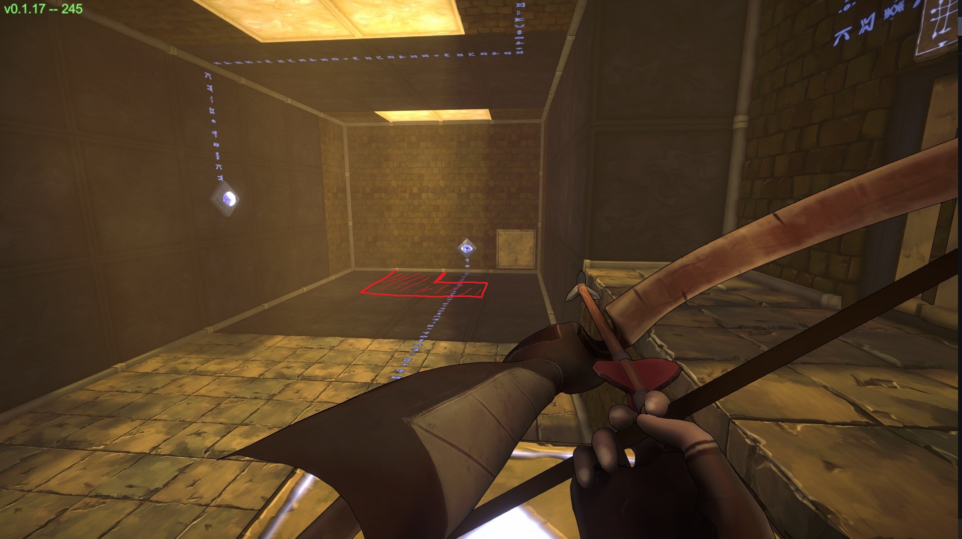
Level 5 has a soft lock here if you cross the gap then recall your arrow. If i’m wrong and missing something, I think you should still make the return path easier to spot. just paint these tiles as walkable and it fixes the puzzle

Gave up on level 8. I will play more another time

Developer

Thanks a ton for playing & the feedback! Honestly having some magma instead of the no-walk black blocks is a great idea.  Level 8 definitely seems to be the pain point for most people so far so seems like it needs to be scaled back or moved to later in the game.


Also loved hopping on Jump Chat a few times today!

(+1)

Very fun, nice work. I got through level 5. Puzzles were coming together nicely, I liked how there were only a few mechanics, but used in clever ways. 

Minor nitpicks

  • There was some "pull" in turning left or right that didn't feel great. I got a bit more used to it, but I felt like I was struggling against the controls in that regard a little bit. Especially when I wanted to look around.
  • A mouse sensitivity option is so important. I had about a 1 inch space in which I could move my mouse because the sensitivity was so high. It definitely hampered my experience.

The polish is great as well. Minimalistic but atmospheric. Great work.

Developer

Thanks for playing! Yeah I've struggled a lot with making the mouselook feel good but it's been really tricky as your mouse is separated from your body forward direction. There is a sensitivity slider in the pause menu (esc) but that's not on the main menu so it was easily missed. Thanks again and can't wait to check out Necrovale!

Just tried out the update, feels good. Turning no longer has that "sticking" feeling.

Submitted(+1)

-It's never too early for an options menu.

-Let me skip the typewriter text.

-Clicking should advance tutorials.

-Right Enter doesn't work

-Holding a movement key should make you move continuously.

-Why do you need two buttons to shoot the bow instead of having it draw and release with the same button?

-The FoV feels really narrow and makes it harder to get a good overview of the room.

-The camera and viewmodel are too far back inside the collision capsule.

-What's the point of the one-way doors that force you to redo puzzles if you go through them? Why would you ever want to backtrack?

-Gave up on level 8. There must be something I'm missing here, because I don't see how the yellow block is supposed to be helpful at all.

-The way the things that make the green bridges work isn't very intuitive. Since they're rooted in the ground and have a definite orientation, the obvious assumption to make is that the bridge is relative to it and not the player. Also, the third one on level 11 just disappears without doing anything and you're stuck in an empty room.

Submitted(+1)

Finished all 12 levels

I have no idea why I didn't try this game before, it is really unique and fun! The mechanic of using arrows to activate objects is very intuitive. The puzzles are nice and have a smooth progression, though sometimes the rooms are very visually noisy which made me get confused and take longer in certain rooms. The presentation is clean and I like the level select mood.

I didn't get used to the controls while playing, I always felt like I was fighting against them. Maybe thats because my head is used to the unrestricted movement and camera controls of regular FPS. Puzzle games require restricting the player movement, so I know it is not easy to fine tune the mouse/keys controls. 

Sometimes the black unpassable tiles blended in with the rest of the room and it was difficult to notice them. It is not clear why you can't walk over them.

I got stuck in a couple places that required me to restart from the menu.

One small trick that made me orientate myself better was turning corners sideways. It always felt right since the camera turned 90 degrees instead of going from a screen-wide wall to an open space.

I had fun playing this game, I hope you will be able to keep working on it!

Submitted(+1)

I like the feeling on the Main Menu / Level Select, and graphically its nice. The Debug Textbox doesn't fit tho, and I can move the Camera during it, allowing view of the Backends of the Arms.  I can also see those when I'm slowly panning to the left etc., so I'd recommend extend the Arm models a bit, to include the upper Arms aswell.

I can't hold to keep on moving. 

It was confusing initially to find my Way around, but you get used to it rather quickly. I like how you introduce Mechanics one after the other, but I got a bit confused again when I had to shoot an already closed Eye to re-open it in Level 4.

The Border Pieces around the Blocks don't connect quite fully together, theres a small black seam between them. They are also sometimes visible through the Ceiling, looking fully black and buggy.

I did not expect Gravity to actually change aswell, caused me to think for a bit in Level 10. Nice.

And with Level 11 making Good use of that right away to also showcase the Bridges, really nice.

Its nice to see the Features introduced in the early Levels to harmonize so well together in the later ones. Just a bit sad that there wasn't more after Level 12.

Gives me major Portal feelings, but needs a few Things. The loading Screens are horrid, I'm assuming Placeholders. The seperation into seperate Riddlerooms is nice, but while it looks nice, I don't think a level select like that is doing this justice. Slapping some kind of Story onto it, and connecting the Levels together more seamlessly (and then maybe keeping the Level select screen as an Option if you want to replay a specific Level / continue where you left of) might be better. Some of the Riddles, especially the early ones also were very linearly, you'd basically shoot whats right in front of you, then move into a clear Path and continue that Way. It gets a lot better in the later Levels, so maybe thats just the teaching rooms being simple. Which is not wrong.

Overall I had Fun playing it, even tho its pretty short. Seems to also be Bugfree and everything, I managed to kill myself ones, but thats also covered. Loading Screens are pretty long tho, and the respawning one after dying is just black. Which makes Sense if you're getting smushed by a Block I guess.

(+1)

Visuals: Game looks great, including models, textures, and shaderwork. A small exception when it comes to the obvious clipped look of the open part of the arm model and the outline shader sometimes looks bad at certain angles, like looking down some hallways and it catches the outlines of the stone wall. I also noticed further out the game looks grainy, unsure if this is a case of optimization or artistic vision.

Puzzles: Design seems about on point, it introduces concepts in a natural way that teaches the player what to do next if they're paying attention. The concepts are all well thought out and interesting to work with. One niggling thought is how one-way doors are used. They feel like windows sometimes and I couldn't tell at a glance whether it would open or not for me.  This caused me to waste some time walking around checking them at times, and once made me walk to the beginning of the level since I thought there was a purpose to going back through the one-way due to it's virtue of existing at all.  As an aside, I feel like your puzzles would be better if they had level names, though that's more a matter of taste I suppose.

Minor gripe is that the pause menu settings should probably be on the main menu.

Overall a fun 3D puzzle game. It took me about 45 minutes to an hour to beat it.