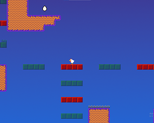
Nice game! Really loved the texture work. Excited to see whatever's next!
Evan Evers
Creator of
Recent community posts
What an interesting game! I'm impressed with how polished this is for a solo project. Great job!
Praises:
- Answering questions by microphone was surprisingly doable. I was expecting the AI to have a much more difficult time deciphering what I was saying, but it only messed up once in my entire time playing the game. Additionally, it always seemed to understand what I meant, which is pretty impressive.
- I like the game's artwork; the cabin I play the game within is very cozy.
- I really like how the fire grows over time. It gives a good sense of progression and really ramps up the tension as the game goes on.
- This is a very polished game - perhaps even the most polished game I've played so far in this jam.
Criticisms:
- Sometimes I had to repeat correct answers multiple times for Charlie to give me a green button, even though Charlie told me I got the answer correct.
- Not every question had a corresponding escape room element; I had to guess some of them, which was a lot less fun than looking around for a clue.
- Charlie can be a bit overly verbose at times. I wish there was an option to skip listening to her repeat a question I've already heard.
- The game feels a bit too much like a school assignment to me. I can imagine this would be a really solid teaching tool in school, but I wouldn't play something like this for fun. If you were trying to make a teaching tool though, you nailed it.
- The calm music and Charlie's calm demeanor don't feel like they match what's going on outside. I'm not sure if I'm supposed to feel calm or worried.
- The game suddenly hard-crashed on the last question. :( I don't know if this is because the fire caught up to the cabin or if this was a bug.
Overall your game is very impressive! Great job.
Congrats on making it to the end of the jam! Here's my thoughts on the game:
Praises:
- I like the low-poly models and water that the game has. It's a solid aesthetic.
- I like the music this game has! I do wish there was music within the gameplay sections, though.
- Your title screen splash artwork is fantastic!
Criticisms:
- The UI is a bit of a mess, and some elements don't properly fit on my screen. Using anchors, more consistent fonts, and changing all pixel art to be at the same scale would go a long way towards making it look better.
- I'm not a fan of small the ship's trash capacity is; it makes the second level pretty tedious.
- I wish I could collect trash simply by moving over it instead of having to press E near it.
- The ship feels very unresponsive and difficult to control. It either doesn't turn at all or turns way too fast.
- Some SFX are very loud compared to the volume level of the rest of the game. Additionally, the water ambience doesn't loop, meaning that it stops playing mid-level.
Good luck with your post-jam development!
I liked this game a lot! I appreciate your team going for such an experimental approach - I think it really paid off. Here's my thoughts on the game:
Praises:
- This game is very original. It almost feels like something I'd see in an interactive museum exhibit, but more fleshed-out and extensive.
- I like the game's visual aesthetic, and I particularly its use of real-life photographs. While it's a little rough, I think it has some real charm to it.
- The generative soundtrack is very cool! I really like all the speech babbles that NPCs emit when they speak.
- I appreciate how much progression there is, even within such a short time. I also appreciate that even though this is a very narrative-focused game, you're always giving the player interesting things to do.
Criticisms:
- It's difficult to distinguish background objects from foreground objects.
- The sharp black blocks that delineate playable space look very out-of-place and placeholder-esque. I liked what you were doing towards the end of the game, where kelp strands became the obstacles instead.
Overall I'm impressed with this project for its bold originality, unique aesthetic, and fun gameplay. Great job!
Congrats on create as much of this game as you did! I started teaching myself how to program games 4 years ago, and I know how difficult it can be to teach yourself game programming. I really like the approach your team took with this project: learning first, quality second is the best attitude to have when learning to make games. It's always rough to have to cut features and deviate from your original vision because of time and experience constraints, but I'm glad your team took the entire project as a learning experience first and foremost. If you keep that attitude going into post-release development and going into your next projects, you'll be sure to do well in the future.
Hello! Congrats on making a fully playable game! I played through your production demo and I definitely see some improvement here. Here's my thoughts on the game:
Praises:
- The map is a great quality of life addition. One of my biggest complaints about the production build was that I often felt lost, so it's really nice to see that problem addressed. (Quick note: bringing up the map on controller didn't work for me; it simply flashed on the screen for a split second and then disappeared every time I pressed the button.)
- Near-complete controller support is very much appreciated.
- Having a checklist of things to do is also a great QoL addition, and helps to feel like I always have an objective, instead of feeling like I'm aimlessly wandering around.
- I appreciate the walls becoming transparent when I'm near them so I can see myself. I do wish the buildings also did this, however.
- I like the post-bridge scene and the effort put into making the ending satisfying.
- The game's visual aesthetic is cohesive and interesting.
Criticisms:
- The game's writing still repeats a lot of information that can be easily visually discerned. When I pick up an item and the game displays a sprite of a newspaper article with a photograph, I don't need a whole sentence of the description to describe the contents of the photograph; I can already tell that from the sprite. I would have liked to have read more about things I can't visually discern, such as what's written in fine print on the poster, or how it feels or smells, or details too small for the sprite to display.
- The game's world still feels very large and empty. While I'm no longer getting lost the way that I used to, there's still not much to interact with in the world. Some puzzles or some more in-depth interactions with the security drones would have been nice.
- The game's sound and music still feel pretty undercooked. The music feels very empty and repetitive, and there's no sound for a lot of things I expected sound for, such as getting hit by a security drone or opening a door.
- A minor thing: there's no way to exit to the main menu or desktop once you beat the game.
Overall this team did a solid job. Good luck with your post-release development!
Hello! Congrats on finishing up as much as you did. Here's my thoughts on the game:
Praises:
- The music was my favorite part of this game. It was very atmospheric and reminded me of Hollow Knight in a good way.
- The game's level is impressively large.
- I enjoyed the writing and the integration of small cutscenes within the levels.
Criticisms:
- The foreground and background art assets are very mismatched; both use different pixel ratios, and the tileset uses nearest-neighbor filtering (ideal for pixel art - keeps things sharp), while the background uses linear filtering (usually doesn't work well with pixel art - makes it look fuzzy). I would have liked to see these assets in the same pixel ratio, with nearest-neighbor filtering applied to both.
- Controller support is limited - I couldn't attack or use menus with controller, and ultimately had to switch to keyboard to finish the game when I would have preferred to play with controller the whole time.
- Combat feels unresponsive, inconsistent and lifeless. Elements such as knockback on hit, hitflashes, stun animations when characters are hit, and a larger weapon hitbox would go a long way towards making combat more fun.
- Sometimes, falling off of a ledge caused me to respawn further back in the level than my last checkpoint, which was frustrating and didn't feel intentional.
- It would have been nice to have a button other than up for jumping, such as spacebar or the bottom face button on a controller.
- It would be nice to have a way to skip dialogue and/or get all text of a dialogue message on screen immediately.
I hope this feedback helps. Good luck with your post-release development!
Hello! I played the game for about 10 minutes. Here's my thoughts:
Positives:
- I love that there's an intro cutscene.
- Never ran into a bug.
- The art is charming.
Negatives:
- No audio.
- I don't know if I just didn't get far enough into the game, but I didn't encounter much variety in enemies. Things got pretty stale pretty quickly as a result.
- It would have been nice to have some kind of an in-game tutorial or guide.
Hello! I played for about 15 minutes, here's my thoughts:
Positives:
- This is definitely the most polished and complete entry I've played through so far. Nice job!
- The dynamic generative music is cool and gives clicking on buttons some nice juice.
- I like the action cooldown graphic, it looks very nice and polished.
Negatives:
- Mood costs of actions list themselves as +Mood; I thought at first that meant that I gained mood from doing them. It'd be nice if costs had a - sign instead and maybe were a different color in order to differentiate between Costs and Effects.
- It's hard to really feel the effects of my passive income, mood gain and Co2 saved. In fact I didn't even realize they were happening until I happened to glance over at my stats.
- Text on the buttons in the top right is hard to differentiate from the button backgrounds.
- The game's audio feels pretty empty when I'm reading things and not clicking on buttons; a quiet background drone in the key of the SFX might help with this.
Overall this is my favorite out of all the entries I've played so far. Great work!
Hello! Here's my thoughts on the game after about 5 minutes of playing:
Positives:
- The music is charming.
- I like the player character's visual design.
- I appreciate the info box in the top right and the succinct instructions on the game's itch.io page. This is the best submission I've seen this sprint in terms of communicating controls and the game's objective.
Negatives:
- Not much to do except wait around for coral to grow once you've harvested the initial coral.
- The camera is super sensitive on both mouse and controller. I don't like that the camera has momentum to it either; it makes it difficult to look where I want to look. I don't mind floaty character movement but I do mind a floaty camera.
- Very barebones visuals.
Good luck on the final sprint guys!
Hello! Here's some quick feedback:
Positives:
- Lots of great background art and some nice 3D models.
- Good music, fits the game's art well.
Negatives:
- The main character's walk speed feels very slow, especially when platforming.
- The art is very awkwardly integrated into the actual game environment. Currently it feels like props on a stage rather than an actual world.
- The camera being so offset from the player feels strange and makes it difficult to platform when moving to the left.
Good luck with the final sprint!
Positives:
- I really like how each stage of the game has its own deck. Creates a good sense of progression.
- Music is solid, although it does feel a bit negative and desperate for what seems to be a more inspiring game in tone.
- I like the card illustrations that are in the game so far.
- I think it's great that the card or card slots you can click on flash. It's a great visual indicator of what I should be doing.
Negatives:
- An in-engine explanation of the game's mechanics would be nice. Even just a screen with a little text explaining the conditions for winning and losing the game would go a long way.
- Some more direction on how turns work would be nice. A piece of text explaining what turn phase the player is in within the gameplay screen and what to do in it would be really helpful.
- The text in the bottom right info box is difficult to read against its background. A darker background for that box and some bolder and larger text would help a lot with readability.
I think this game has a lot of potential - it's already got a lot of nice QoL features that I really appreciate. I'm also working on a card game: https://itch.io/jam/climate-jam-2024-production/rate/2829261, and it was very helpful to check out this one. It's given me some ideas on how to improve our game. Good luck on the final sprint!
Hello! I played all the way through the production demo, here's my thoughts:
Positives:
- I like the visual design of the main character.
- I didn't run into any bugs while playing.
Negatives:
- I didn't find the gameplay very interesting. Walking around a large and mostly empty map looking for objects did not appeal to me much. Furthermore, the mechanics of being able to move and pick up boxes felt underutilized to me. If there were some puzzles that use these mechanics, such as a few switches on the ground that you have to weigh down with boxes to open a gate or get an item, the gameplay could get much more interesting.
- The music was repetitive and listless. I think being on such a short loop with so little instrumentation contributed to this.
- The writing often repeated pieces of information that were already abundantly evident. (e.g. Picking up a piece of paper and having the first sentence in the description be "This is a piece of paper".)
- Walls are claustrophobically close to the camera. It's also a bit hard to see the character in tight spaces because of this.
- Almost no SFX. Things like gibberish chatter during text scrolling, quiet whirring of the player character's rotorblades, and a nice satisfying sound when you pick things up would go a long way.
Good luck with the final week!
Very nice work! You've made an impressive amount of functionality in just a week.
Features I liked:
Being able to skip text scrolling by pressing F
Off-center camera so the player character isn't blocking where I want to look
Branching dialogue system
Minor gripes:
Look sensitivity feels very high; a slider would be nice.
It'd be nice to be able to select text options with F and progress dialogue by clicking.
The town takes a long time to traverse with the player character's default movement. I'd like to see the map get condensed down to at least 1/4 the size (if you intend for the whole map to all be playable space). It also feels a bit strange to see so much empty space between the houses.
Moving through the semi-transparent houses feels very strange.
Hello! Congrats on getting a playable demo up. I will say your ideation notes were a bit difficult to read, so I'm having a bit of a hard time understanding the concept here. It would have been nice to see some in-progress art and/or SFX, too. Still, nice job getting a prototype done before the deadline.
Here's our team members since I ran out of time before being able to officially add them to the page:
Tucker - https://tuckerkoepp.itch.io/
Cass - https://cracklycms.itch.io/
Simi - https://simishcj.itch.io/
Liv - https://itch.io/profile/majungasawrus
Hannah - https://hannahrose-art.itch.io/
Evan E - https://evan-evers.itch.io/
Hello! Your concept art looks lovely; I love the flowing shapes you have for all those different plants! I'm also very interested to see how you implement dynamic music in your concept. I have to say, after looking at your documentation I really didn't get a detailed idea of your game; I couldn't find any summaries of the gameplay. However, it seems like you all have a good idea of what you're trying to do. I'm excited to see how this project ends up!
Hello! This looks like a very solid concept to me; I'm impressed with how much you all have figured out already. I will say that I wish things were a bit less black and white with the divide between opportunists and environmentalists. There are sustainable ways to log and hunt, even if they are often ignored by corporations. However, I understand that you may have to make some simplifications to real-life situations in order to create an interesting game loop.


