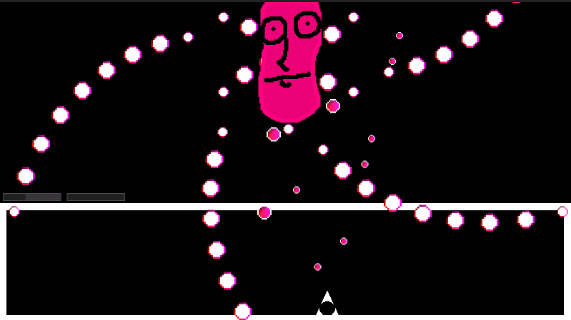
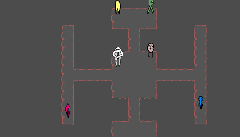
a small update with fixes
- camera should be more responsive now
- dialog box doesn't stay when you exit npc area
- text font is bigger
- fixed the gem that was leading people to die
- sound effect for taking dmg
- hitbox is now a square, should be less slippery
- no longer in debug mode
- projectile animated
- menu name fixed
thanks everyone for the comments
Ffof
Creator of
Recent community posts
- menu was hard to operate on keyboard, seemed locked at first for a time (while the music was playing?) and then inverted ("up" selecting bottom button and down selecting the top one)
- the controls for keyboard are kinda uncomfortable, i suggest jump with W, and use IJKL for the rest, possibly U and O. space is better used either as a menu or as a way to interact with the world
- bomb's default attack / bullets did barely any damage at all
other than that the game is great anon
- i muted the 1st song, but after a while another started playing and i couldn't mute it
- it's a little hard to talk to characters, seems you have to be right on top of them, maybe their talking area should be a little bigger
- would be better if spacebar continued dialog, or at least another keyboard key, i don't believe mouse is used for anything else, so to have to reach for it is a little strange
- hard to tell which hp bar belongs to player and which to boss at first. also it seemed more like it's filling up rather than emptying, idk why
- i wasn't doing the fights in any order, so i forgot which ones i did. maybe after beating a guy in his corridor some kinda checkmark thing should appear
- the weapons menu disappears kinda fast, i assume when you get used to it tho it's more convenient. the first weapon is strong enough to where i didn't feel the need to change it, tho i suspect the 3rd one with a direction change has the biggest potential (to cheese with)
- i accidentally managed to get one of the guys out of his corridor, pic, maybe they shouldn't be colliding with player, or maybe they should be restricted in their movement range- documentation says "clamp" should be able to do that , tho i haven't used it yet
position += velocity * delta
position.x = clamp(position.x, 0, screen_size.x)
position.y = clamp(position.y, 0, screen_size.y)
- also pic related i think is a sweetspot where it seems nothing can hit you on, but you can still hit the boss (at least with weapon 1)
either way, good job so far anon


>would you say the UI specifically is too small or everything is too small in general
everything is on the zoomed-out side, but i don't mind it (tho it would be nice if you could see the main character / enemies sprites up close, maybe as a menu background or during a visual novel style conversation / cutscene. to make them less (pun not intended) "distant")
the ui's size is the only one which is kinda bothersome to me, and even then mainly just the healthbar
yeap, no warning now
made it to the start of level 5
- i question the bullet system. are the drops random? (with a chance the player runs out, at no real fault of his own) or are they scripted? (meaning if the enemy takes, say, 3 shots to be killed, but then drops you 3 bullets, it's not like you're even gonna run out). it's not like you can "waste them" by missing, since you can't shoot when not targeting
- didn't see an exit button and had to alt+f4
- the ui was kinda small, was hard to tell when i got hit and how much hp i had left
- the projectiles and enemies were too similar in colour, making them a little hard to distinguish
other than that great job so far
yeap, nice
here's where i'm getting to now
- the screen resolution is too big for laptop screen, if there's any UI around the corners i'm not seeing it. a quick fix would be to set it to fullscreen mode by default (should be in project settings under display)
- no idea how to talk to the central guy
- num 0 makes character glow, but can't tell if num 1 is doing anything
game's actually nice, should add pictures
- jumping would have been nice
- don't know if hair colour was an option, but would be nice if it is
- i couldn't figure out what to do after parking the car (which took maybe 20 tries btw)
- file name says sunny-place, and zip/upload says graveyard
other than that great job so far
cool game
initial run:
21 drunk munk
4235 honor
- tho, sadly, i mainly died due to boredom. the enemies and their projectiles can use a speed boost, even the lvl 20 ones
- the mouse cursor was hard to use, sometimes i lost it, sometime it seemed like an enemy, and in the menu i assumed you click with the tip of the pan (top left) as opposed to with the center
- also the warning to leave to a harder zone should have happened maybe sooner, at 1000 honor i was thinking that's all there is to the game and planned on closing, but then i explored a little more and found the lvl10 enemies
- tier 2 priest didn't seem to get a space ability, not sure how to heal allies, especially in single player
other than that great job so far
- both characters control great in concept
- for the spider i feel it would be better if you never had to press up / down (it breaks momentum), but it would instead continue to move "forward" with left / right
- for the puppet(?), the wall jumping feels a little strange, tho can't quite put my finger on it
- sometimes it feels like the dialog is too frequent (interrupting controls)
- i didn't read that you have to get both characters to the sign, so i thought i was stuck, and nearly quit, but managed to figure it out
other than that, great job so far
(collected every egg i saw, but didn't unlock a 4th level after 3, must have missed one)- pixies could use a simple idle animation (like moving up and down)
- the green / blue screens of the options / credits stand out as 'unfinished' compared to the rest of the art
- would be nice if selecting a pixie was based on their proximity to you (ex: clicking left in the select screen selects the closest fairy to the left of your current one, same for up, etc), as opposed to the predetermined list, which can be a little hard to keep track of
- would be nice if you could see the path the frog's tongue is about to take before it fires, that way you could more strategically place a pixie in the way, and move on to other tasks
great job so far
- didn't run on my browser (waterfox). works on chrome tho
- i think the music is a little too upbeat / fast, for a game that encourages thinking your moves through - the enemies look cool, but are a little bit too random for me
- would be nice if the cards had frames to them
- it's hard to remember what all the effects are, and scrolling down every time isn't great. would be nice if there was like a show/hide button which lists them on the screen
- your early game energy is so high, and the enemies deal so little damage, that you just get into the habit of spamming all your cards without reading what you drew
- i couldn't find my way out of the options menu, and had to restart the game
- would have really helped if there was some kinda tutorial or if the controls were listed / pictured on the first screen
- i feel like there's too much momentum. small platforms can be hard to land on / jump from


