Indie game storeFree gamesFun gamesHorror games
Game developmentAssetsComics
SalesBundles
Jobs
TagsGame Engines

GingaaBread

228
Posts
38
Followers
A member registered Jul 29, 2017 Β· View creator page β†’

Creator of

Recent community posts

Cheers!

We didn't have time to implement the main character, but we have the concept art in the game description if you're interested!

As for the checkpoints, they reset when you die, but since there isn't a way for you to die in the demo except fall out of map, which isn't really bound to happen! We plan on adding obstacles and projectiles that can damage you though

Didn't expect such a puzzle game! Cool idea!

Also had the bug where the child disappeared, and those walls that you're not supposed to walk on are walkable I think

If you made the art, it's really really good!

The gameplay itself is very limited though, you do the same jump twenty times before escaping. But I do like the idea of being the hunted rather than the hunter in this jam theme

Ohh, very polished!

The parallax is really well done, just like the art and soundscape. All of this in this short amount of time is honestly insane, kudos. The animals look nice, the background does too, and the menu is clean as it should be. Nice!

If I would improve it's maybe adding a UI for the bow to see the progress of how it's drawn, maybe even a target sprite at the cursor position that remains when shooting, so you know where the arrow will land eventually. 

I was going to suggest a scoring system, but then I saw the screenshots and gave it a try again, and it seems the UI partly disappears on ultrawide. Not sure if that's a bug that is high-priority, but UI elements were also cut off a little. 

Overall, a very nice and polished entry with the funny premise that you're gonna go out demolishing an entire forest area just because you ran out of food for Easter :D

Hey players!

Our premise was to make a metroidvania puzzle platformer where you hunt for artefacts to gain new abilities that would allow you to visit new places. We didn't have time to implement the artefacts, so right now you just "hunt" for the exit :p

This is really more of a proof-of-concept for what the game could be eventually, it's very short and there's really not much to it, yet.

We didn't have time to implement the player character, but you can find the concept art in the game description if you're curious : )

Good to know ^^ Thanks

Hit the nail on the head, it's just kind of a proof of concept ^^

Playability might be a little too high!

It was definitely fun making it though, so who knows, maybe I'll keep working on the game. But if I did, I would rather tend to go into the automation direction. Anyway, thanks for the feedback :3 

Thanks for playing! :)

Yup, the game is really just a proof of concept and isn't very fun, especially since it doesn't have any containers like you mentioned. But the crash is new to me. Could you elaborate?

Thank you!

Thank you!

Thanks! :)

I'm sorry, but it's not really my cup of tea.

In the preview of your game, it showed that last screenshot, so I was really hyped up for a visual feast, but then once the game loaded... it showed the actual art style and I was very disappointed to be honest. Why do you use that last screenshot as your preview just to hype up potential players about amazing graphics when that is clearly not the used art style. It seems a bit click-baity to be honest.  Anyway, once ingame, the green scenery looks cool, but the rest is just decent, it all kind of lacks charm. I think you mentioned that nearly all art assets are AI generated, so it just lacks that human touch and feels loveless. To add to that feeling, there is that very strange AI voice. Now, I know it may seem like I'm just a big adversary of artificial intelligence, but that's really not the case: it has its place, but I was really not a fan of how it was utilised here. Potentially because I had such vast expectations of seeing the thumbnail screenshots.


Now to the positive: 

I love your camera controller. Movement felt smooth, rotation worked, too and it really felt like one of those city builders. Definitely a great job on the scripting side there.

The leaderboard was a nice touch and I admire how you set up and entire backend just for that service in a game jam entry! Honestly, I've seen a few entries in this jam that do this and it's quite remarkable. Do you use your own machine, do you buy a host somewhere or how do you utilise this service?

I also liked the scene transitions and the other "little things" that add liveliness to your game like the clouds' movement etc. It just adds that sense of charm to games in my opinion.

Finally, I want to mention the scales animator which is just awesome. Hovering over one button makes it scale from one side to the other, stopping the hover makes it return to its default state, etc. Very good job!


=> To sum up, I hope I didn't come off as a hater or anything like that. Judging from the other reviews here, nearly everyone seems to really enjoy the art. But I just have to be honest and say that I was not a big fan of it, which may be caused by the thumbnail screenshot that felt a bit like a clickbait to me. The game is made with love, that much is clear by the charming little things like animations, polish, leaderboard, smooth scripting and so on, but that love is sadly strongly diminished by the use of AI art assets

A bit too little paced for my liking. But the music UI was cool! Did you make the art yourself?

Very lovely!

I agree with the others that F feels a little awkward as an "interact" key. For me E would be a little more natural.

Agree with pretty much everything that's been mentioned here!

Game feels very charming but could use better controls and some polish here and there.

Also: for the burrows, you're using one scene that spawns the player from the left hand side, no matter if, in the overworld, the player entered the burrow from the left or right, therefore breaking the illusion. Consider checking the origin on a variable and then spawning the player entrance in the burrow scene based on that variable :)

Been a fan of your games since "In The Cards" and this was another really polished and cool game!

I just love the amount of little details that are totally unneccessary, but combined they definitely add up! For example, the little trace particles when dragging a card, the little pulse it does when focused, the curved-camera shake, the pitch dialogue variations, and so on and so on. Just absolutely phenomenal.

You've interpreted the theme perfectly with all those variations of "scale", and I love it.

The only concern I have is that this very similar to last year's entry. It feels a little like a re-skin of In The Cards, where you've changed the game to match the theme. That's obviously totally ok and you seem to have found your unique style, but I would love to play a game of you in the future that's vastly different.

But other than that, I can't think of a single thing to criticise! => 5*

Thank you! :)

Cool game!

Combat was fun and polished, and even though I'm not a big fan of this vampire survivors genre, it kept me entertained for a while!

I'm not gonna judge the art because it wasn't made by you, but it was assembled nicely and fits the theme for the most part. On my monitor the UI got cut off on fullscreen, but that was pretty much the only bug I found.

Cool!

I stopped playing once I maxed out everything, which was around 5 minutes into the game.

I played without moving btw. What does accuracy change?

Doesn't work

Really really cool idea! 

However, I don't really understand how the comparison works. Maybe there could be a title like "How much bigger is a [cucumber]?" or something like that. Because sadly, I've lost every single estimation :(

Now the positive: 

+ very very unique and innovative
+ very polished (transitions, music, etc
+ I love the measurement UI (I just love little things like that :) )

=> 4*, but I would absolutely give 5* if the game taught me what I "really" need to compare :)

It's not really related to this game jam's theme, but congrats for finishing it!

Seems like a rhythm game, but without music it is pretty lacklustre to be honest.

thank you:)

Thank you! :)

Yes, those numbers look amazing haha! :D  I think it's fair to say that seeing this screenshot, you've won ... by a margin! :D

Thanks! :)

Thank you very much!

Thank you! :)

That's not really our vision for the game, but thanks for playing! :)

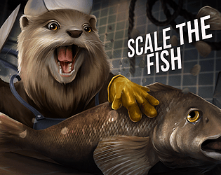
Btw you lose if you haven't scaled 50 fish in 20 turns

thanks!! :)

Thanks for the kind words! Yes we didn't have time to fix the card draw but, it was supposed to be responsive no matter how many hand cards exist

Thank you so much! :)

Thank you very much! :)

I would use left click for an attack. For accessibility I guess we could add a key which is usually "V" for melee :) 

Nice walking animation and the paralex effect is working really.

The combat could be way more polished, though, because right now you just pretty much spam the attack button. And J is kind of an awkward key for an attack action. But I like this entry, one can see you have spent a lot of time on it!

I love pinball! This was pretty fun, and I thought the leaderboard was a cool addition for a jam game. But I'll be honest, the theme felt a little forced. Camera was always steady, and I like that this is a somewhat larger pinball (machine?)  UI and art assets could be a more polished, but I like the sound choice. Nice entry! :)

Web version doesn't seem to work :(

Cool! I like the scale UI, I thought that was a really innovative idea.

The character controller is really awkward for a puzzle platformer, though. It feels like you're on ice when you're moving and on the moon when you're jumping. The puzzles were decently fun, but I would maybe swap some keys. I feel like E is more like an interact thing, for example. But congrats on this entry! 

I like that the stronger the enemies are the larger they are. I assume that's the idea of the theme, so cool idea! I will say though that the game is very large for a jam entry, so many people will probably not download and try it. Just as a general tip for future jams, it might be a good idea to include a web build :) but that's just my personal experience. Congrats on finishing your game!

Cool! Good art, I like that the music changes when you switch the character, and the switch generally is a cool idea. However, the controls are terribly sluggish and are way too awkward for a platformer. Sadly that severely dragged down my experience

Cool! I wish enemies had a better damage indicator and there was a message popup explaining how the distribution of units that can be placed works. Also I found this really difficult (but I'm not good at tower defence games anyhow). Not sure how this fits into the theme, though. But congrats on making this game! :)