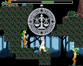
Play game
Justicar's Scales (fantasy forest adventure)'s itch.io pageResults
| Criteria | Rank | Score* | Raw Score |
| Innovation | #148 | 3.161 | 3.161 |
| Theme interpretation | #221 | 3.000 | 3.000 |
| Graphics | #225 | 3.097 | 3.097 |
| Audio | #226 | 2.839 | 2.839 |
| Overall | #236 | 2.935 | 2.935 |
| Gameplay | #263 | 2.645 | 2.645 |
Ranked from 31 ratings. Score is adjusted from raw score by the median number of ratings per game in the jam.
GitHub repository URL
https://github.com/matt-rule/justicars-scales
Leave a comment
Log in with itch.io to leave a comment.


Comments
Rate no. 25
The good stuff:
- Solid level design, maybe slightly too claustophobic imo
- Most of the sprites look great
- I had fun breaking the game (more on that later)
The stuff to improve:
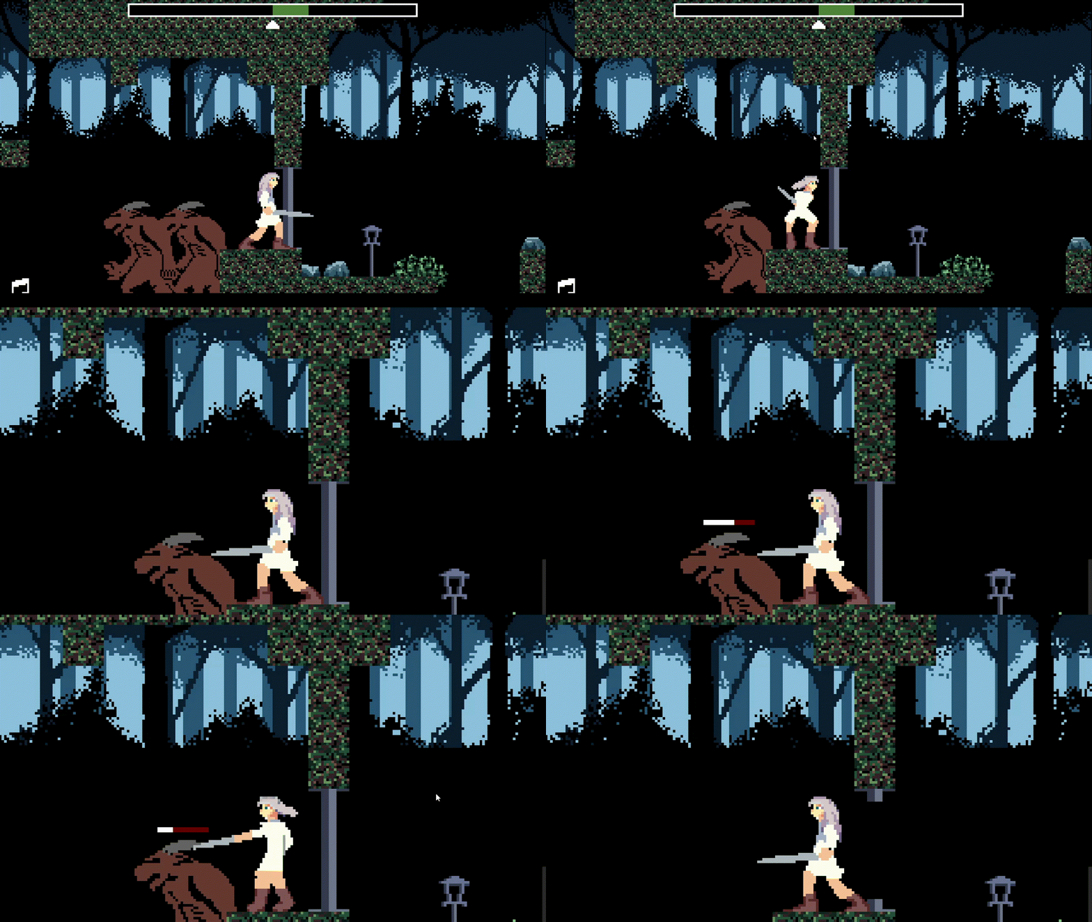
- Every minotaur (?) can be cheesed (look at cheese spot 1-2 screenshots)
- The last boss can be cheesed with the checkpoint next to it refilling your HP and just pressing R whenever they hit you (look at final boss cheese screenshot)
- You can jump over most of the enemies to skip fighting them
- I still don't quite understand the main mechanics, they seem really inconsistent; Is there an invisible cooldown between uses?
- Final boss is a bit anti-climactic as it uses the same attack as the other enemy; and it's really to dodge as well (attack 3 times, jump, repeat)
Graphics:
- There are some pixel art inconsistencies, some sprites have anti-aliasing, some don't.
- The grass/ground tile has a lot of detail and brings unnecessary focus on them, while the minotaur has a lot less detail, when it's supposed to get all the attention when you fight them. The same could be applied to the background as well but it's not as bad there as it's just one color really.
Overall, I had fun with the game, definetly has a lot of room for improvement.
Cheese spot 1. (can't attack me while I can attack them)
Cheese spot 2. (breaks the AI)
Final boss cheese: (checkpoint refill exploit
Really great game! Well-made and beautiful art :)
Beautiful game - love the art. The music went well with the game too. I thought the frequency of checkpoints was perfect and it was well balanced - challenging enough. The additional mechanics were interesting and I enjoyed the variety of enemies abilities. My only other thought was about combat indicators but I see others have made this comment :). Overall, I really enjoyed this game and found myself playing for a while so well done!
An interesting blend of theme and mechanics! I enjoyed being able to reset time when I would get hit one too many times but I was never fast enough to use it when falling into a bottomless pit. Art and backgrounds was great, Good Work!
Good job! This game has several interesting mechanics, and it certainly wasn't easy to create :) Just out of curiosity: are there features you had to cut due to time constraints or other limitations? I've opened a topic called "The Features Cemetery," and I'd love to hear about your experience. Anyway, I appreciate the effort!
Thank you! Yes, there were a lot of features that were left out due to not being MVP, they might appear in a future game, so I don't want to spoil :)
I really liked the time manipulation aspect, very cool, little confusing. The retro look and parallax were very well done!
I found the game very enjoyable to play! The scales + hourgalss mechanics are a bit confusing at first, but quite easy to figure out. I didn't have any issues with controls and didn't get stuck anywhere.
It's a bit weird that some enemies get their state reset with hourglass but some don't (maybe I missed something). I think hourglass could shine if there were moving or disappearing platforms, but as of right now, it's just for saving some health or as an alternative to scales when they're not ready.
Maybe a healing ability could replace the hourglass, and if you're using healing too much, some enemies could steal some of your healing? Think of enemy scales but not for damage, but for healing. Just sharing some ideas that I had while playing...
Overall, I liked the game! Great job!
Took some getting used to but was pretty easy otherwise. You could exploit it pretty easily.
The combat mechanic could have been a bit better, It definitely needs indicators when you take damage, and it needs some ui elements letting you know your abilities are ready.
Thank you for the feedback! Unfortunately the indicators didn't quite make it into the game but they would have helped so much. And yes there were lots of opportunities to cheese the enemies.
I will try your game tomorrow when I am able!
Took some getting used, challenging to master but once you do it's satisfying. The graphics are great and everything feels fluid, nice job
Thank you for the feedback! The combat is kind of janky, yes. The worst bit is the lack of indicators for ability cooldowns. I have a lot of useful feedback for next time I make a game like this.
Amazing game! I love the aesthetic. Great job!
Thank you! I will try your game tomorrow when I am able.
Good looking game mate! We already gave a sneak peek in the Discord of the Game Jam!
There are just some things about the movements of the character and his attack that do not convince us, but in the complex is a very good game.
An advice that we suggest is to use a different font for the tutorial parts and the dialogues. Probably a Sans Serif font will be the best
Thank you for the feedback! And congrats on performing so well in the jam!
Indeed, the font and resolution that were chosen don't work together at all. The font is large and blurry, and fixing one only makes the other worse. One solution is just to use a more suitable font, though it would ideally be serif because of the medieval gothic theme. An alternative is having two resolutions, one for the UI and one for the gameplay, like Celeste does.
There are two things I would change about the attack animation, I would make it a lot faster and also add an arc of light. The running animation seemed OK to me, though it should not play while jumping.
Nice platformer with good-looking aesthetics. Good job!
Thank you! I've played and rated your game too. It's really good!
the art is really good
Thank you! I will play and rate your game when I have time tomorrow.
thanks!
Cool use of the theme! I agree w/ Lanyard on the mechanics bit, takes a little trial & error to pick up what you were throwing down. Not a huge deal, though.
I love those parallax layers back there, but it's easy to lose appreciation for them with the character being fast-paced like that. This is not a negative, just something I noticed because I really like how the lighting effect was done in that background.
Regarding controls, just FYI, it didn't pick up my controller. It's a typical Logitech USB Playstation II-style. Keyboard was fine, I just mention this because the game explicitly mentioned controllers.
Only other thing is I noticed you don't have to press a jump button for each jump, holding it down will repeat the jump. Pretty minor, just slightly counter-intuitive to me.
And my favorite facet of a game, to the point I think it would make a good category--atmosphere =D. Awesome job there, 'nuff said!
Thank you for playing, and giving compliments and feedback!
Interesting to know about the controller. I tested it using an Xbox controller but not Dualshock, Godot seemed to think the key mappings would work fine for Dualshock, but I will need to actually buy one to test games in future.
I will play and rate your game but I have to do it on my laptop, so tomorrow.
Interesting implementation of the theme through the use of the scales. Solid art and good sound! My only nitpick would be that the scale/time mechanics were cool, but it wasn’t really required to use them in most places which led to me simply using the sword for most encounters. Great game, nice work!
Thank you for playing! Yes, it seems that players have found a lot of creative ways to get at enemies with the sword instead of using the abilities. The abilities synergise to let you quickly take down the big demons but not many people have got the knack of this, instead they prefer whittling away at the demons' health from -just- out of range!
I like your approach to pixel art. I thought the sword swing of the protagonist looked especially clean. The other characters were all distinct as well. I think you did well bringing your vision of this mystical forest to the screen.
It took me awhile to understand the mechanics behind the Scales. Some deliberately designed areas that teach exactly how they work in your game and forcing the players to use them there could help ease players into an unusual system. Not that there's anything wrong with an unusual system, it's at the heart of all innovation of course, I just think it needs to be taught with some consideration.
I think the combat needed a few more "Player Verbs" to feel complete. Some kind of dodge, roll, or block would've given me a better fighting chance with these grumpy forest denizens.
Thanks Canoparia! Keep on creating!
Thank you for the kind words and feedback! One of the early tutorials was meant to block progress until the player works out how to use the scales, but you can just skip it by attacking the dryad through the wall, which is not intended. I agree the combat system had a few bits lacking. A dodge or block was initially planned but I didn't have time to fit it in.
I'll check out your entry now :)
Nice submission! It gave me some classic Prince of Persia vibes :)
The dyrad spell is not that "visible," I think that you could make it more clear to the player :)
Good job!
I think that this game has room for improvement, but it's a good submission for a gamejam. The idea behind it is really good!
Thank you for the feedback! (your game is really good btw, everyone should play it!)
The idea could be solid and you already know the problems so I won't state them again. For these mechanics to work as a game your fighting system must be very very good. Like "Dead Cells" good.
I am not sure but I think you also waste a lot of time on key bindings. It is good to give those options but only if they don't take much time like the unity new input system.
I had many problems with these big guys and could not finish the game if there was not any bug in the game :)

I love this gif. I don't know why but to me it's delightful seeing the variety of creative cheese/exploits people have found, like attacking the first aggressive dryad through the walls instead of using the scales on her, or backtracking infinitely to restore health at the checkpoint.
The big demons are possible by using the scales + hourglass to reset onto the platform or just jumping on their heads after an attack.
Thank you for the feedback, I'll check out your game after work :)
"like attacking the first aggressive dryad"
I thought that was intended :P
enjoyed game , but maybe the key bind for jump and attack little bit hard to me but overall i enjoyed :D
Thank you for the feedback, I'll check out your game after work! :)