Play game
Scales of Aeon's itch.io pageResults
| Criteria | Rank | Score* | Raw Score |
| Theme interpretation | #117 | 3.565 | 3.565 |
| Graphics | #132 | 3.553 | 3.553 |
| Innovation | #152 | 3.141 | 3.141 |
| Audio | #183 | 3.035 | 3.035 |
| Overall | #211 | 3.071 | 3.071 |
| Gameplay | #268 | 2.635 | 2.635 |
Ranked from 85 ratings. Score is adjusted from raw score by the median number of ratings per game in the jam.
GitHub repository URL
https://github.com/GabrielAgrela/Scales-of-Aeon
Leave a comment
Log in with itch.io to leave a comment.


Comments
I'm often quite a fan of strategy games, but I felt a bit lost on this one. After some time, I was not sure what to do anymore. Also, I have to say that I'm not particularly big on the use of AI art.
The graphics are impressive but the gameplay is too simple. In a strategy game there is usually a large array of options but here there is only one - click left or right.
I wonder what faction is on the island, maybe some kind of "mousehover" could be good to investigate wich one is growing the most? Nice game, reminds me Timberborn and others of the genre.
Nice one. I only made it to day 5 as my best, but it feels like this could be even bigger. The way the AI art was used was interesting. I'd play it again.
the game has a really professional feel to it, good job.
Cool concept too but the gameplay seems a bit too simplistic to me.
The gameplay loop is basically 1) you make a choice and 2) examine the results visually (or lose if the last choice is the final bad one)
Judging from the effort you put into the game, I am sure you have prepared some intricacies with the questions and how the factions influence each other. It just doesn't come through to me as a player.
I appreciate the voice over though.
I think the game has potentials.
Very cool concept, it feels a bit like the groundwork for a great game was made. I played through a few times and kept losing on day 4, even though it looked like all of the factions are being well-enough satisfied, so I could never really tell what I was doing wrong. But the death sequence is really funny, so I didn't mind too much lol. If there is a way to just make it a bit clearer what needs to be done to progress, this is a great title!
Tiny note, I kept on getting stuck in cutscenes while fully zoomed out, so the dialogue would be covered up by the high atmosphere noise, which was a bummer since the storyboard was very awesome!
You got the foundation of something here! With a little more depth and smoothing out some of the edges, this can be a really cool and interesting experience.
Btw, I know it’s AI art, but man it was extra trippy.
Interesting and fun concept, needs more instructions. Couldn't beat day 4 but enjoyed playing.
My all-in on Communism playthrough proved to be a disaster for all of Geckokind. May history forgive my ill-fated 4 day reign as supreme monarch of the Sky Geckos.
Most successful communist regime
I actually kind of like this style of game, so I feel like I can provide some constructive feedback.
First off: The art was very nice! I think utilizing AI here was a great idea! 😄
However, the gameplay felt a bit lacking. For most playthroughs it was impossible to maintain balance, since a faction that came up exactly once in a choice revolted on day 4. So the only choice I had as a player was which faction was going to oust me. If I got lucky enough to get two events that affected two of the same factions, I would be able to maintain balance by increasing them once, and reducing them next time. However, I feel like it really shouldn’t be up to RNG whether the game is survivable past day 4.
I feel like this wouldn’t be that much of a problem if there was a way to quickly restart the game, skipping all animations.
That is not to say the animations are bad, they are actually very nice! It’s just that having the ability to skip them would cut down on the wait time for restarts.
Overall, I see a lot of potential with this game, and it is amazing how much you managed to accomplish in just 30 days! I feel like with a little bit of tweaking (making faction buffs and debuffs have less of an effect, and adding animation skip), this would be an experience I would come back to! 🙂
Thanks for the feedback.
Yeah you are right. We didn't playtest enough to balance the game, so we made it hard, making sure the players would witness the event animations and hopefully laugh at it.
The animations were quite funny, especially the people going off to the edge to party 😆
Not my style of game but definetly well made!
Great graphics and audio. It was hard to know how out of balance things are and therefore how close to a crisis you are. Took me a couple of plays to understand what faction each icon/color represented and even though I kept each faction cumulative buff/debuff level within +/-1, I still lost pretty quickly, so there must have been some other info I was missing. Btw, the people faction loss animation is hilarious!
Reminded me of Reigns, but with cute lizards instead
Had fun, even when I lost pretty quickly, didn't anticipate a meme ending
Camera feels so good to use and it's entertaining to see how they move
Congrats!
Thanks, the dilemma mechanic was indeed inspired on Reigns.
I'm sorry, but it's not really my cup of tea.
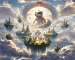
In the preview of your game, it showed that last screenshot, so I was really hyped up for a visual feast, but then once the game loaded... it showed the actual art style and I was very disappointed to be honest. Why do you use that last screenshot as your preview just to hype up potential players about amazing graphics when that is clearly not the used art style. It seems a bit click-baity to be honest. Anyway, once ingame, the green scenery looks cool, but the rest is just decent, it all kind of lacks charm. I think you mentioned that nearly all art assets are AI generated, so it just lacks that human touch and feels loveless. To add to that feeling, there is that very strange AI voice. Now, I know it may seem like I'm just a big adversary of artificial intelligence, but that's really not the case: it has its place, but I was really not a fan of how it was utilised here. Potentially because I had such vast expectations of seeing the thumbnail screenshots.
Now to the positive:
I love your camera controller. Movement felt smooth, rotation worked, too and it really felt like one of those city builders. Definitely a great job on the scripting side there.
The leaderboard was a nice touch and I admire how you set up and entire backend just for that service in a game jam entry! Honestly, I've seen a few entries in this jam that do this and it's quite remarkable. Do you use your own machine, do you buy a host somewhere or how do you utilise this service?
I also liked the scene transitions and the other "little things" that add liveliness to your game like the clouds' movement etc. It just adds that sense of charm to games in my opinion.
Finally, I want to mention the scales animator which is just awesome. Hovering over one button makes it scale from one side to the other, stopping the hover makes it return to its default state, etc. Very good job!
=> To sum up, I hope I didn't come off as a hater or anything like that. Judging from the other reviews here, nearly everyone seems to really enjoy the art. But I just have to be honest and say that I was not a big fan of it, which may be caused by the thumbnail screenshot that felt a bit like a clickbait to me. The game is made with love, that much is clear by the charming little things like animations, polish, leaderboard, smooth scripting and so on, but that love is sadly strongly diminished by the use of AI art assets
Thanks for the honest feedback.
I mean, I get the clickbait thing, but that's just the background for the login scene, it's fairly standard to exaggerate the splash art of a game in order to provoke a certain "feel", the obvious gamble here is that it can also provoke false expectations, like in your case.
Regarding usage of AI, which seems to be the basis of the negative part: This is mostly a proof of concept of what AI is capable (or rather, what can I develop with it, as a hobby, in 30 days), hence the honesty on what AI was used for. There is no way I would have developed enough narratives for the dilemmas, voices, models, art, etc without it, specially given I had 0 prior experience in blender and near 0 in the other arts.
But thanks for the thoroughly developed opinion.
I was shocked by the art of this game. I also like the gameplay. Hats off to your work.
Thank you!
I liked the overall look of the game and I think the core-concept for a game is there, but I wish there was more for me to consider when making choices. Good job!
For sure, thanks for playing!
Crazy detailed game world in this entry, models and colors looked great. AI-generated content was used to pretty good effect too, that title screen is awesome.
I think on top of making decisions to drive the game world, it would be nice to be able to interact with the playfield or pawns in some way, kind of in the spirit of "Black & White" or other games like that - feels a bit detached otherwise. Great job on the entry!
Thanks!
It's a really well polished game. Loved it! Congrats
Thanks!
Amazing job! I love how you integrated AI generated content and the clever idea behind the gameplay. Just a quick suggestion: it was not very clear from the start what I should do and maybe I could use some tutorial. Overall, a great job!
Yeah I agree, thanks!
Very impressive game, just simple enough to quickly understand and yet rich enough to keep me interested. Also, neat art style, although some of those generated images are a bit whacky :D Well done!
Thanks!