Hi, but where does the scavenger theme fit in a car racing game?
Gingerello
Creator of
Recent community posts
On the contrary, I really thank you for your feedback! :D
I thank you for explaining your gaming experience in detail.
I am sorry it turned out to be frustrating, I did not intend to create a rage game.
Certainly the feeling of punishment is legitimate, but not intended. Once the first invisible obstacle was encountered, I thought the player would be more cautious, let's say, towards all game elements. Warn him here in my opinion would have made the effect less, although I agree with you that it was too punishing.
I had initially tried to implement the same revealing splash mechanic at Trail, but realised that not being able to give him a Collider was impossible.
Perhaps I could give him a sort of aura, increasing in size with each death, which would have the same effect as the splash but follow the player and allow him to identify the nearest obstacle to reveal the danger? What do you think?
I'm really happy to have this kind of dialogue with you. :)
I mean the positioning of the platforms in relation to the squashing mechanics. There are points where it is difficult to get to and once you get there, the last thing on your mind is to throw yourself down to make the next ascent easier. Due to the layout of the platforms, there are points where you get stuck easily and it becomes frustrating, so it would be convenient to be able to commit suicide to make those points more accessible or change the layout to make the learning curve less steep right from the start.
However, I'm no expert in level design either, so take everything with a grain of salt. Probably, as was the case with my game, it would have been useful to have a little more time to test the game and balance some aspects of positioning.
If I'm not mistaken, you also published first, not bad for the time you gave yourself.
Oh my god, I love making little men fall over by throwing tomatoes at them!
Maybe the only thing in that context is that morally it's a little cruel... if a person fails at something in life, chasing him down to throw tomatoes at him isn't very interesting. I would have skipped that part of the narrative.
But the sensitivity of the mouse is excessive for me, it made the game even in easy mode much more complicated.
Very nice idea, graphically nice and well done in the programming part.
The thing that I perhaps liked least was the level design, in some points I got stuck without the possibility of dying to make it easier to get back up.
The dying mechanic to make that area "walkable" is truly brilliant!
In the game I made I brought a similar idea, but being a platformer I had to think of something different.
Consistent with the theme and the special object, I am pleasantly surprised.
At first I was hoping that the game would proceed with the cat, animated well and with satisfying environmental graphics.
Unfortunately the game then turned out to be completely detached from that introduction.
Speaking of the game within the game, nice, but I didn't quite understand the correlation with the theme.
Very nice idea.
I would have liked it if the character instead of just having lives had an A rating and by getting bad ratings his score would drop and by getting to F he would lose.
I would also have had the tomato shoot something more inherent to the theme, for example the player's current grade, so if he has an A he shoots a sprite with an A drawn on it and goes against an F for example, averaging it out mathematically.
Spectacular, I like the game mechanics, the music and the graphics!
However, I cannot find a strong connection with the theme of failure and the use of the special item is more part of the game narrative and background graphics rather than a key element in achieving the goal.
Could you explain it better to me?
I tried to replay it, but when I got to a room with 3 ‘bosses’, I couldn't defeat them in any way. It is possible that I was inflicting damage on them (or not) but the important thing would have been to give feedback to the player in real time.I realised on replaying it that neither the simplest enemies nor the ‘bosses’ actually damage me even if I meet their attacks, I don't know if this is intentional.
Graphically it's nice, you can tell it's handmade (that's good), as are the animations.
I'm a bit dubious about the level design, but I don't think I can speak as I'm neither a designer nor a design expert, quite the contrary. ;P
Exactly!
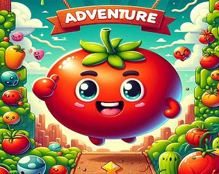
That is exactly the core-mechanic that ties in with the concept of failure: by dying from the various invisible elements you are able, thanks to the tomato stain, to see part of the obstacle in order to avoid it.
Thanks a lot for the feedback though, maybe I can work on recognising this mechanic from the beginning.
Hi, thanks for the feedback.
On many of the things you pointed out I agree with you, it's the most basic of prototypes, it's not a game yet and the polishing part I really skipped it, trying to focus on getting the game done in the time I had available (I had other weekend commitments).
All in all I'm glad you found some latent potential, it was a fun and important experience for me.
I hope you can try the game again with the addition of checkpoints (only in the browser version), they should make the gaming experience less frustrating.
Let me know!


