The resolution of the WebGL player doesn't allow me to see the whole game. Could you edit your game page and adjust the resolution?
A member registered Jun 15, 2021 · View creator page →
Creator of

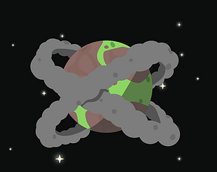
The "Milky Way Pirates” are yet again trying to pollute a planet!
Educational
Play in browser