Thank you very much for your kind words. I really appreciate it. I'm really happy about your feedback.
LarsSolozzo
Creator of
Recent community posts
I really appreciate that you played the game completely and that you liked the concept. Also, that the upgrade system works well. This has already accomplished what I wanted to achieve with this project.
I have an online high score system under development for another project of mine, if I succeed I will try to implement it in this game as well. Unfortunately, I have a habit of not finishing what I start.
Thank you very much for your feedback and playing!
Actually, the original concept was really a roguelike game, exactly as you imagined. But I realized I wouldn't have time to make it so I simplified it. Even then, I still didn't achieve my goals. The feedback and sound effects and the extra polish will come in a later update.
I'm really glad you liked my game!
Very well designed game!
The art, sounds and mechanics fit together perfectly. Congratulations on working out so many details! The tutorial video is fun, the mini games work well. And I see you had time to write a diary in the development log.
It took me quite a while to figure out what exactly the main goal was, but in the end I managed to complete the game by just focusing on entering directions and fixing the engine.
For some reason, the steam and smoke effects require too much performance for me. If they are not visible on the screen, the game runs at normal fps, otherwise it drops to 4 fps. (However, my device may be too weak.)
Overall, this is an impressive game!
Very good idea! I like the art design, it looks good that the game is 2D but the objects are 3D. And even though it's annoying that they rotate along the X and Y axes, I think it adds to the game experience. However, the launch mechanics still need to be improved so that the object in the hand does not get caught by other objects at the moment of launch.
This is a very cute and fun game. The game mechanics are well developed. I like that each customer has a different personality and that everyone reacts when I make a mistake. Even this is expressed in different ways. My favorite is the Fred Jones / Johnny Bravo character who pays with drawn money but demands a gift coupon.
Great game!
The art style of the game is really cute. I like the fence building mechanics. And also that there is a penalty for not planting the seedlings. However, it is too difficult to survive at the very beginning of the game, which takes away the desire to explore further parts. A progressively harder wave system could be developed, allowing the player to learn the rules.
This is a good base, keep it up!
Thank you for playing!
Yes, I will definitely work on it. I plan to have a more attractive menu, some configuration options, and an improved movement system. I might also change the structure of the levels in some places. If I succeed, I would later make a shorter metroidvania style game, maybe I will use elements from this game. (Of course, I keep saying this, but let's see if I can actually carry out my plan now.)
It's a game with a very calm atmosphere, the night is also ominously foreboding at just the right level. The graphics are very nice, well thought out. At first I thought the game was buggy. I didn't give money to the beggars, I spent everything on the map on equipment. And the barricade was not built. Then, on the second run, I realized that they had to be hired. After about 15 laps, too many unemployed people came to town and I ran out of money. The rats stole the archery equipment. I wonder what the expensive wreck is in the forest.
Wow! My 14-year-old mouse burned a hole in my desk. Very cleverly constructed game design. You managed to make a very addictive game. And I think you even completed the Make a game with only particle effects challenge.
The visuals are great. The level texts are funny. The upgrade system also worked well. I really like how the music dynamically adapts to the difficulty level. At first, it bothered me that the background music always started from the beginning and I couldn't listen to it all the way through. Because the cycles are only a few seconds long at the beginning of the game. But then I understood that this is part of the concept.
By the end, the game plays by itself. I also maxed out the upgrade tree.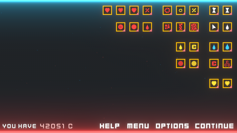
Great game!
I didn't think to try this. The last resource was drinking water, and I could only carry three on one ship at a time. And I was afraid that the ship would be destroyed on the way. That's why I unload the gold at the tower.
By the way, I really like the animation of the light of the big lighthouse. I came up with a similar concept, but I didn't have time to draw it and put it in the game.
I will try the patched version as well!
The graphics of the game are very nice. It's impressive that you wrote your own javaScript-based engine for it.
At the beginning, the first ship is a bit too slow, but later on, managing several ships requires a lot of attention. It's a bit confusing that it's too easy to accidentally drive the ship behind a city and then you can no longer select it.
I might have broken the game by the end. I think I got all the raw materials and gold, but there was no endgame.
So I hit the lighthouse with all my ships.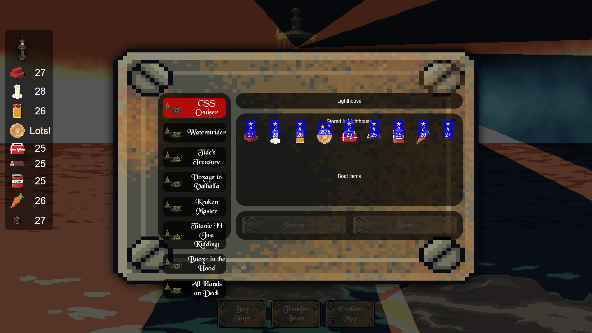
Anyway, it was so much fun!
A decently executed work. It's quite repetitive, especially the background music. Not much of a challenge. At level 16, I got a little bored. The ending is surprising, but I don't really feel the connection to the theme.
I have a technical comment. With the endless map, when I reach the edge, I can feel a little jitter on the screen. I suspect the character teleports to the wrong position.
In any case, a neat piece of work. Functional design.
Very cute game! The tiles and character art are nicely done. Something that could be improved to make the environment in the cave part more diverse, so that it would be easier to find your way around, because I kept getting lost. For example, a large stone that I will remember to turn left there. Also, the jump. It happened in several places that I wanted to jump from the very edge of the block while running, but the character did not jump. A 0.1 second tolerance would be good.
One more thing, I found a cheat. If I exit to the menu and back, I return to the starting point, but keep the objects I have taken. This can shorten the return journeys.
All in all, nice work. Keep it up!
Thank you for sharing your opinion!
Is the key assignment the problem with the controls, or is moving the character too complicated?
I originally planned the control from the keyboard with [z, x, c] and [arrow keys]. (Inspired by Hollow Knight). Then I realized that some keyboard types have [y] or [w] instead of the [z] key. That's why I do several key assignments. (Controller is also supported.) But it might confuse the player.
This will be solved if the keys can be modified within the game.
The empty areas are because of the loading gates, because I did dynamic level loading. Instead of empty backgrounds, I'll come up with something else. I will improve myself in this.
I will check your game too!
Thank you for your detailed feedback!
I will consider your advice. When creating a game design, it is hard to predict how difficult it will be for the player to find a solution to an obstacle, since I already know the solution. My goal is to have the difficulty level at the limit of the player's abilities. But maybe I will make the game easier at some points.
I really like the art style of the characters. Animations and feedback are well timed. It's great that the enemies interact with each other. Sometimes they weaken each other and sometimes they form an enemy complex with each other. The background music and effects are good. And the menu is good too.
Unfortunately, I haven't been able to pass the third wave yet.


