This is your best game yet! Gonna try speedrunning it later.
Play game
Tiny Storms's itch.io pageResults
| Criteria | Rank | Score* | Raw Score |
| Fun | #260 | 3.438 | 3.438 |
| Game Design | #298 | 3.375 | 3.375 |
| Graphics | #374 | 3.500 | 3.500 |
| Overall | #379 | 3.250 | 3.250 |
| Theme | #406 | 3.250 | 3.250 |
| Innovation | #514 | 2.938 | 2.938 |
| Audio | #515 | 3.000 | 3.000 |
Ranked from 16 ratings. Score is adjusted from raw score by the median number of ratings per game in the jam.
How does your game fit the theme?
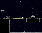
You have to continue along the road, where occasionally strong winds hinder or help you to move on.
Did you write all the code and made all the assets from scratch?
I wrote all the code and made all the assets from scratch, except Game-engine files.
Music by Sam Tozora.
SFX: freesound.org, zapslat.com
Comments
Very fun with high amounts of polish. The ONLY thing I didn't enjoy was the jump sound. Felt like it was way too loud compared to the music and there wasn't a menu to adjust it. Other than that, fantastic work. Looks great, plays great. Well done.
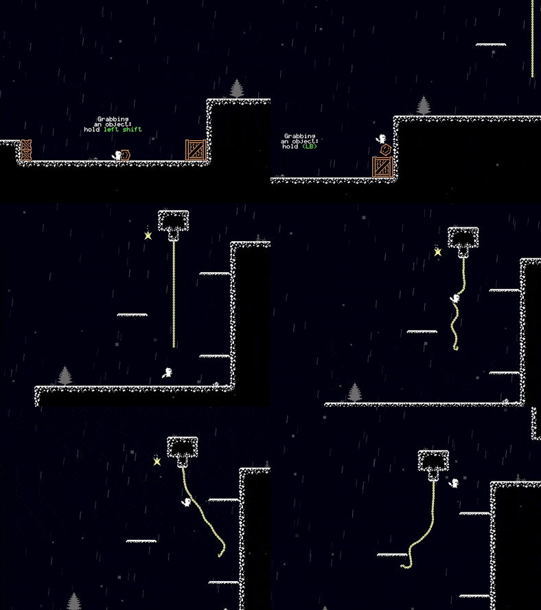
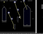
What a submission, good job! Climbing on the chains is clearly my nemesis hahaha I had so much difficulty. I guess I need more practice for thoses ^^'. I really like the puzzles, with the storm/wind aspect, you need to time your move correctly but it's not too punitive. You can still win even if you miss a storm cue. I really like this, do you plan on polishing it further more after the jam?
Thank you for playing!
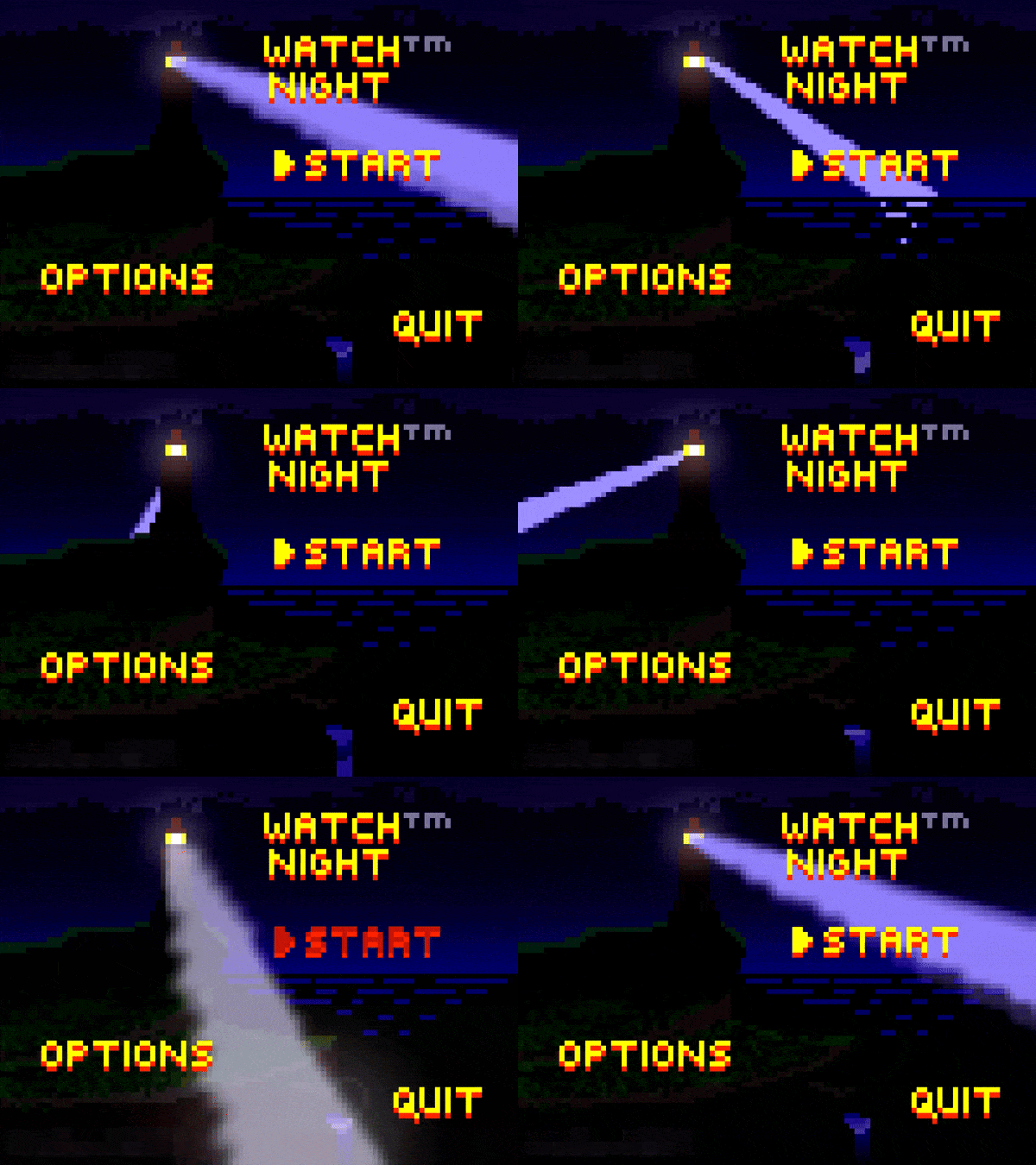
Yes, I will definitely work on it. I plan to have a more attractive menu, some configuration options, and an improved movement system. I might also change the structure of the levels in some places. If I succeed, I would later make a shorter metroidvania style game, maybe I will use elements from this game. (Of course, I keep saying this, but let's see if I can actually carry out my plan now.)
This small game is very polished for a jam title, only had slight troubles climbing ropes.
The wind mechanic reminds me of a few desert lvl's in mario bros, nicely done!
Walking can and do get annoying sometimes especially if we die often (which I did) but it I enjoyed the game regardless. Sound design, especially the music is choosen nicely.
Good level design and great art to support it. Music also blends well with the gamplay. The levels were designed carefully and it helps keep the lvl engaging and fun.
Kudos!! Made a great one. :D
Quite a fun little platformer. Not to be nit-picky but the tilemap was a little broken in some areas? (could be due to the camera scaling unintentionally on the web build, and the fact that some spots were overlooked and there was no single block sprite (damn now that i am looking at that it was really nit-picky, sorry)) Otherwise it was a great game
really impressive game for the time period. as others have said the controls can be a bit awkward but otherwise this is fantastically put together. the storm/wind mechanic was also really fun to play around with. visually the game is great but in several sections there's a lot of empty screen space that if nothing else could use a prettier background. otherwise again amazing work and thank you for sharing!!
Thank you for sharing your opinion!
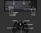
Is the key assignment the problem with the controls, or is moving the character too complicated?
I originally planned the control from the keyboard with [z, x, c] and [arrow keys]. (Inspired by Hollow Knight). Then I realized that some keyboard types have [y] or [w] instead of the [z] key. That's why I do several key assignments. (Controller is also supported.) But it might confuse the player.
This will be solved if the keys can be modified within the game.
The empty areas are because of the loading gates, because I did dynamic level loading. Instead of empty backgrounds, I'll come up with something else. I will improve myself in this.
I will check your game too!
This was a pretty cool game, the mechanics felt innovative and I was able to make it too the lighthouse and win (although I missed a few of those bonus stars). Honestly I think there is only one feedback I have and that is on the game design side. The area where you first introduce grabbing boxes you make it so that just the big box can't get you over the jump. You need to pull a small box on top of a big box. I think you should have an area where you only need to move one box to make the jump before you introduce that stacking mechanic. I also found it quite difficult to stack. Also there is a section where barrels roll around a suspension bridge and I was so bummed to get all the way to the end just to realize that I needed to take that box from the beginning with me (I assumed it was just for getting the bonus stars so I left it). I think having a player do backtracking like this can make some people loose interest so maybe having the box at the end already or having a sign saying "take this box" could help with that. My favorite part of the level design was the wind whipping the chains. It was very satisfying to fly off the chain using the wind to get to new areas. All around I would say a really solid game!
Thank you for your detailed feedback!
I will consider your advice. When creating a game design, it is hard to predict how difficult it will be for the player to find a solution to an obstacle, since I already know the solution. My goal is to have the difficulty level at the limit of the player's abilities. But maybe I will make the game easier at some points.
This was a fun game :), though the control keys were a bit too odd. Some mouse buttons wouldn't have hurt because they are not used at all.
Hope that you'll also rate mine https://itch.io/jam/brackeys-12/rate/2973690


Leave a comment
Log in with itch.io to leave a comment.