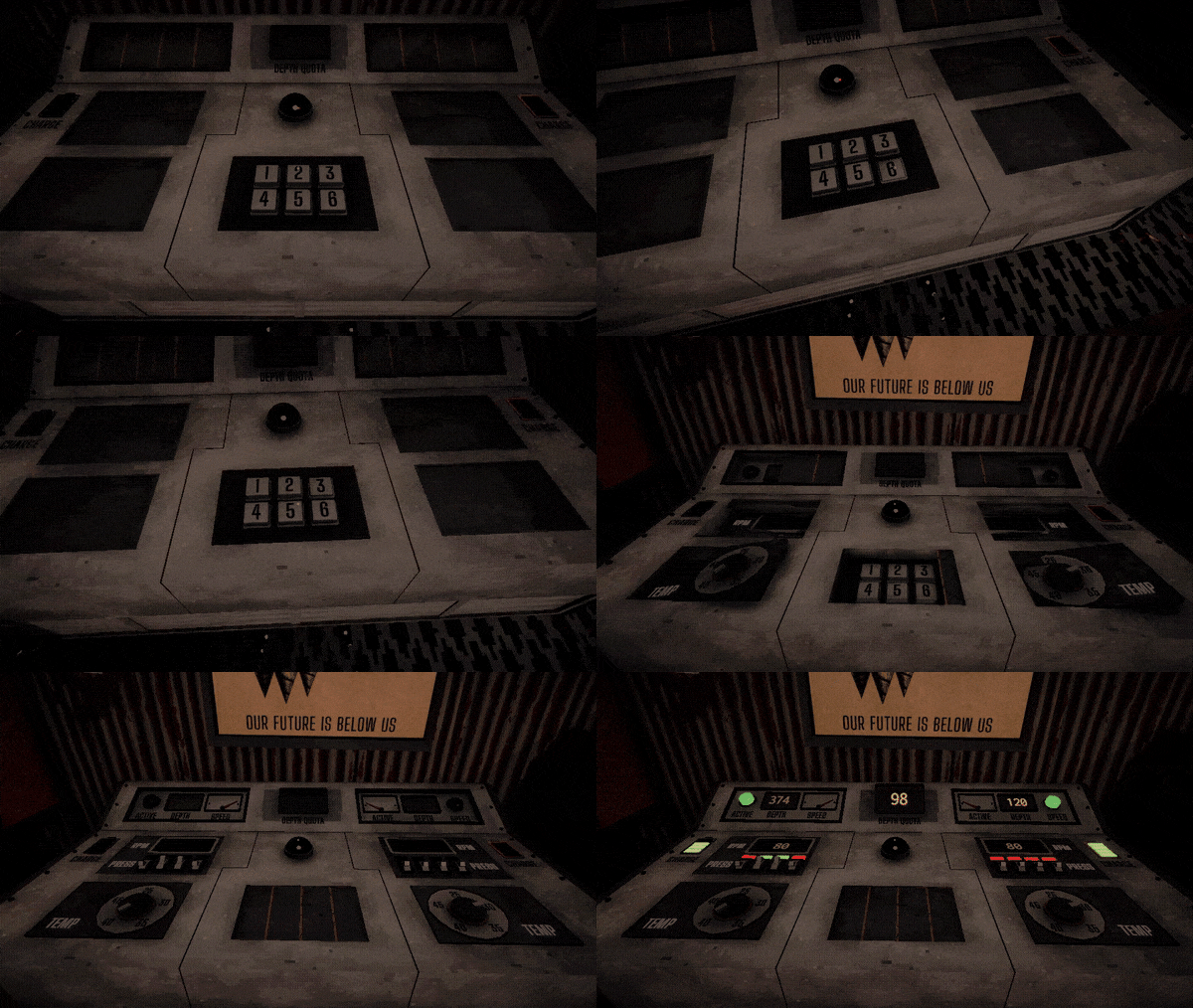
A difficult rule discovery game. Understand how the procedural world of machines works, and survive the fall.
Takes 10—30 minutes to beat. Hope you enjoy!
→ Play Here ←
leth
Creator of
Recent community posts
I don't like my idea about incentivizing using less pieces anymore after your explanation! It does sound way better to not overload the player with additional goals they would feel obligated to optimize for.
Choosing the next area thematically does sound like a good progression system, as well as limiting piece types in an area.
I also agree that Shortcut is strategically interesting, it just makes me sad that you essentially spend money to get less gameplay...
Also also went back and played a run as a Pawn, was way more hard and interesting, loved it! Had to make a lot of sacrifices, didn't have a ton of pieces and seeing the Reincarnation passive was awesome, hope there will be more synergies like that. Vampire just seems busted now compared to others, both as a class and a piece, it straight up solos multiple hard levels, would pick it over a queen any day and it's only $4 somehow :D
Now that I knew what differently colored pieces meant I liked them a lot, actually!
Also also also wish there was a free single-move undo like in ItB, was sad to lose money a few times due to a misclick.
Got around to properly play this (was a little overwhelmed my first time around). This is just straight up smurfing, how, how did you make it in two weeks? That's insane. It's so strategically deep and elegant—the par system, getting the first taken piece, naturally growing complexity; as a systems game designer, I'm both very inspired and very humbled. I've seen on your website that you was inspired by Into the Breach and Mosa Lina and as a big fan of both, you damn well nailed it. I loved the game, but the review is mostly critical (and fairly disordered).
I liked the melancholic main menu music, made for a very special, rare vibe; the rest of the music felt way less intriguing which is fine, just a taste thing. I loved the BADASSERY of the final sequence but the music was too active.
The last boss was kind of underwhelmingly easy, since there were like six completely blind spots for all of the enemy pieces; maybe in a true boss fashion the gigaking could randomly move one tile at a time to make the whole thing more exciting.
Didn't understand a lot of things even after beating the game. Why were some pieces green when I placed them? Why did some enemies previewed their movement as dots when they had crosses on the top-left scheme, and vice versa? How do I know if someone can leap over obstacles? Wish it was all explained better.
Some incentive to use as little pieces as possible would be nice, especially for the vampire class where I often got to win with very few pieces; just nice to be patted on the back when you feel like you did something smart.
The game generally felt too easy in the second half; levels took some thinking but I was never worried. I also never used like a third of my piece types. Makes me wonder if some semi-randomized limitations can work for the late game, like sometimes locking you out of your most used pieces or something. Also could be a smaller amount of obviously good safe spots, and enemies in harder to reach positions; in my winning run I only had to sacrifice a piece once or twice, and I wish the game forced me to tactically lure enemies out more. I only rocked the Vampire class yet so my gripes can be specific to it :)
My first run ended by a softlock where I couldn't reach any pieces and they couldn't reach me (and I ran out of money). Would like a "resign" button to at least see the death screen in such a case. Maybe the threefold repetition rule from chess can be a resign option :D
I wished for a little more sense of progression I guess, as in moving through the story and space. Swapping color palettes and showing N/6 counter are both nice tricks but for a full game I hope there's more—story tidbits, an overworld map, maybe short non-gameplay sequences and stuff like that.
"Shortcut" is an extremely sad ability, fundamentally hated it. The game is so insanely intrinsically fun, why would you make an ability that basically says that meta-progression is more important than actual gameplay? Also, a little odd that "passive income" costs the same as "+1 par", they basically do the same thing but the former is always better. Passives where generally hard to keep track of and I kept forgetting that I had them... Maybe "pins" that you can apply to a single piece type (and get a persistent visual indicator on that piece) would work better in that regard?
Various QoL that you probably know about but still worth mentioning:
- Shield could have an indicator;
- Would be nice if enemies previewed their possible movement over existing pieces as well, maybe with half the opacity or something;
- Diagonals can be hard to visually parse over gaps, a translucent grid over everything would be nice;
- Maybe would be better to keep consistent sorting for the pieces on the right so it's easier to find specific ones, since they can look samey;
- There was a small but noticeable buffer time after finishing a turn where nothing really happened but I couldn't move my pieces.
I had a blast playing this. You're a wizard and I refuse to believe otherwise. Great job!
Okay what the hell. I played a lot of games in the jam and this is very much my new favorite, and I'm not even a visual novel guy at all. First of all, great stylish UI, amazing art, awesome music. Loved the characters' sprites, had a lot of personality.
I liked the writing as well. Had a perfect balance between funny and serious; more importantly, it all had a coherent theme which is always nice to see. Was delighted when I got the option to sacrifice a rib-eye I bought with the Occultist. The characters are very, very well written, I got attached to them all impressively fast. Although I didn't get any good dialogue choices with the Teacher until day 16 which felt strange, basically knew nothing about her while being best friends with all others. Occultist was my favorite, she's fun to hang around and had a great ending. Engineer is the close second :)
Having money was a nice interactive element and I'm fine with it just being there as a thing to look at, but makes me wish there was anything to think about when spending money; maybe you have to waste a day to replenish it and there's some balancing act there.
My only complaint is that the pacing felt a little odd. It took me 18 days to get my first aberration and basically any meaningful agency over what I'm doing. It's nice to take the time to set up the stage but by day ~12 I felt like my actions don't really mean anything.
I'm a fan, thank you for making this, hope you have a nice life. Always make positive changes! :)
That was a puzzle all right. I liked the simple visuals and the controls were snappy. Also enjoyed the slightly vague button tutorials, wanna do something like that for one of my games now >:)
Having a save system was much appreciated. It sadly didn't help much in the later levels (where I needed it the most) since it didn't save the single-press buttons' states and broke buttons if saved with a box on them. Also would put the save and load buttons further from each other, it's very easy to mispress K instead of L and lose all your progress. The buttons (at least the reset button) didn't work when I switched to a different language keyboard layout.
Explicitly telling the player that they softlocked themselves was pretty odd? More then once it acted as a straight up hint, and when it didn't, I knew that I softlocked myself without the text anyway. Also the softlock notification didn't disappear upon loading a save.
The levels were extremely hard to parse visually, which is somewhat integral to the mechanic I guess. You could preview the next aberration state with like 30% opacity at all times, not sure it would look good and/or understandable though, just an idea. Buttons could have been different for when they need a box and a single press, that's probably the biggest easily fixable problem. Could have been some portal-style background lines to show which button activates what.
The person below provided very good criticisms which I agree with completely so I'll try to not repeat what they said too much. The mechanic you came up with is pretty elegant and provides plenty of depth, I liked it; I didn't like the levels very much. The way I enjoy puzzles the most is when they have a tiny space with a small amount of possible permutations, focused on a single cool mechanical idea that makes me go "aha!" when I figure it out. This game had me go "oh, finally" when I solved a level. Instead of letting me experience a cool consequence of a mechanic, the game added five layers of complexity on top of it, making me completely overwhelmed, especially with already being fundamentally hard to parse due to the core mechanic. If I was making it, I would try to make every level as small as possible while keeping the singular thing that I find fun about the level. There's a good GDC talk that describes that for a bit.
The last mechanic with invisible colors is smart and could be nice in theory but it didn't work out well for me in the game; I didn't understand it at all in the introductory level and the last level wasn't satisfying to solve, felt somewhat like a chore to figure out. Also it obviously adds to the problem of levels being hard to visually parse.
This review is very critical but I did play for one and a half hours and beat it so clearly the game did something right! It is clever and made me proud of solving it. I also liked the dog in the end. Great job and good luck with your future games!
The visuals and polish are outstanding here, you clearly know what you're doing very well. Great camera direction, solid music choices, tight controls; you could make a Switch trailer out of the in-game footage and no one would ever guess it's a jam game. I guess the sharks could move a little more fish-like (with a turn radius instead of just rotating), but that's a tiny nitpick.
I really enjoyed the little subversion of expectations when I first met the shark and it jump-ate me in the middle of the lake where I thought I'm safe, was a memorable moment and felt very intentional.
I never really got the gameplay parts though. I expected the gators to be stupid little guys that I'm supposed to outsmart in a puzzle-y way but ended up just outrunning them with no problems and even if they caught me they just politely let me go soon after. Same for the shark but with it there at least was an element with dodging at the right time (or just get lucky in one or two attempts). I guess the levels never felt like a rewarding display of skill or cleverness, but rather as a hurdle to get through; which was fine for most of the game since I could just quickly pass them and absorb the experience, but the big level just had me throwing myself at it without understanding that well how am I supposed to get good. I got softlocked in the big level sadly so couldn't see the end. :(
Also, changing colors for the last level to be a little less friendly was a nice touch. Incredible work overall!
This is just awesome. Badass setting beautifully drawn, cool idea perfectly on theme, great audio and overall just stellar vibes on this one. Very ambitious story structure for a jam game, almost missed the second ending. It's fairly short and made me wish there was a little more challenge to the gameplay—I would expect a timer for completing a task, more complicated instructions and some randomized monsters (by just mix-and-matching the same elements) if it was longer, but since it's a short complete experience I really have nothing to complain about. Incredible job!
You did a great job with making basic shapes look very pretty with good lighting and colors. The grain also adds a lot and the UI is well-designed (I also like the little cursor-responsive effect in the menu, that's a nice touch). I think the player character could use some squash-and-stretch when moving and falling for some extra juice though.
While the level design & character controller are well done, I didn't enjoy the main mechanic; it made the game hard in a frustrating and somewhat dizzying way and I think I would like the game more if it just had the level element switching based on the direction and no screen flipping, with some tighter platforming in exchange. The spacebar-for-flipping suggestion below also sounds good to me. I'm not a big platformer player though so it might be just me :)
I also wish the restarting after death was a bit quicker. Nice job overall though, it's very stylish and the gameplay has good potential.
Cool game. I liked the level design, the lighting, and the textures, got some nice vibes going for it. Cute cat too. It does lack some polish—could have used some sensitivity settings, a fail state when falling out of a map, a crosshair for weapons, and more of a direction of what's going on I guess. I did enjoy being in the environment though, so good job!
Well that was great. The raymarching effect looked awesome (and the game completely demolished my poor computer, so big thanks for including a settings menu. Also wtf how is the settings menu for a jam entry so polished). Very ethereal vibes and lovely tidbits of writing, really nothing more to desire on the presentation and pacing.
I liked the little conundrum the game threw at me when I was at the top of the last level and wasn't sure whether I should jump all the way down and potentially do platforming again or wait for something new to happen. Wish the game patted me on the back immediately after jumping down, would be a nicer "phew!" moment than trying to uncertainly roll away afterwards. Also wished for a little more ending-y ending, even if just a camera zoom out or something. Great job!
Went in knowing that people found it unintuitive, but turned out to be a very simple and elegant system. I really like it when deckbuilders use the fact that cards have two sides, so was happy to see it. Did take me a couple minutes to understand what's going on, but it's nothing an itch page description can't easily fix.
Multiple-weapon system is fun, but I don't think it's realistic to thoughtfully use multiple weapons in combat; after a few rounds the most effective strategy becomes just mashing them all as fast as possible. Makes me think it would be nicer to have the weapons just fire automatically; or maybe have a pin that applies to a weapon and fires it on a cooldown. I like that you can change weapon keys, that's nice quality of life.
Still don't know what the arrow pin means. The reverse pin is cool since it allows some damage control after you underpowered one of the sides, but it's hard to apply to the second round, since I don't know which enemy (whom I want to put into the first round) is under which card. Also could have been more pins dropping since they are very enjoyable to apply.
Aerial enemies can be hard to reach for all three weapons, would be nice to have an aerial-effective weapon (and then more of those enemies).
I got my HP boosts in percentages while enemies were just added one at a time without scaling their damage (at least it felt like it) so after a challenging start it eventually becomes hard to lose. Stopped my Burst god run at 927.
Enjoyed this one a lot despite the criticisms. I've played a bunch of power fantasy roguelike-ish games in jams and this was probably my favorite, had a blast. Great job!
This game looks exceptionally cool. I'm forever in love with the main displacement shader you made, and for the first ten minutes I was just taking screenshots of every new prop and thinking how I want to make something like this, too. It's genuinely magical how good it looks. I liked the models too, and the squiggly textures are just genius.
The echolocation mechanic is very imaginative but not very accessible; I don't live alone so it was very uncomfortable to use. I went to the menu and was happy to see a toggle for it, but then realized there's no alternative button or something else to use instead. Not sure how players are supposed to find the passcode if they don't have a mic. I do respect the creativity of the mechanic though!
Disappointingly, I spent the rest of my hour with the game very frustrated. I never got the mechanic of the enemies and just echolocated into them until they disappeared before moving forward, to eventually unexpectedly get killed from behind (which was very much a traditional jumpscare every time). The closest I got was getting everything but the keypad code and then coming to realize that the code is randomized, and its position is randomized as well (and then I proceeded to get killed from behind). Really tried my best to see the game to the end but just couldn't. It is so, so punishing and running around searching for randomized items just didn't feel rewarding at all.
Also, the water tank mini-game broke the immersion a bit, would have much preferred something physical and in-space, even if just a button.
I'm sorry for this being so critical. Just wanted to love this so bad because it might have the best-looking visual effect I've seen, like, ever. Looking forward to your future work.
EDIT: Took a break and tried again. Tried a new and advanced strategy of sprinting around the facility ignoring everyone who isn't a quest item. Beat the game this way, the ending effect was pretty cool. Was this the intended way of playing?.. Or was there a stealthy tactic that I didn't get? Am I supposed to just turn around from a place where I see eyes and come back later?
Thank you! While the extra cards are just a side effect of very straightforward level generation, I had similar things is mind when making it. The game is inspired by the brilliant Mosa Lina, which I love because it's about playing with the system itself and not with a designer. I tried to replicate that in a pure puzzle game.
I loved this! An aesthetic super up my alley and executed very well, great shader work, all the little interactions and animations were awesome. This is gonna sound a bit weird but the elevator going down with open doors for the first time made me feel insanely immersed and claustrophobic, way more then I would usually get from a game, so thank you for letting me experience it.
Very well-designed game! Takes a while to figure out and even longer to actually figure out (seeing as how I'm not even close yet). I really like games that combine systemic gameplay with a haptic mechanic and this game does it really well. Interacting with the pan-head-enemy for the first time was hilarious. The little introductory cutscene is very cool, too. Great job!
The game looks phenomenal, I love the art, it's very impressive how much great visual content there is. The music is nice too. I really appreciated the pacing—the scenes change often so it's hard to get bored. The main ending felt abrupt though, just as I was getting excited for the story it was over; but I understand that it's tough to make a long game with such a high level of quality. Very good job!
This game looks and sounds ridiculously good. Loved the music, and the art, and the effects, and the shakes, and the little letter shuffling in long texts—easiest 5 for presentation in my life. The dialogues are well-written. The puzzle took me a few attempts but I enjoyed it nevertheless, felt SIGNALIS vibes while solving it. The game crashed while I was talking to the bird, sadly; I can't tell if it's intended as a reality reset or is just really unfortunate. In any case, I enjoyed my time and this is a very strong entry. Good job!
This is a very clever game! I didn't beat the entire thing yet but will likely come back to it. Earlier puzzles made me feel like a lost kitten just stumbling around for an answer, but after the beginning I had a very good time finding solutions. I liked the puzzles with a small amount of elements the most, the big ones can be really overwhelming. Also, the game obviously looks and sounds brilliant. Very impressive work!
Very nice, I enjoyed my time and the puzzles were well-designed. I liked how immediately clear the "problem" of each level was for most of them. Wish Z would also undo (and arrows would also move), otherwise you're forced to use both hands when you really didn't have to. The folding effect is super cool. Good job!
Nice one! I appreciate the little interactive toy in the form of the lamp, but I wish clicking would have more of an effect. Having a table lamp to run to is a fun mechanic, but I didn't find it before the garage door first time around. Graphics are great and it's very on theme. Overall great vibes and a nice experience, good job!
Enjoyed this one a bunch, very nice polish for a jam game. The puzzles weren't difficult, but there definitely were fun ones; the difficulty curve of the puzzles feels great, and the concepts are well-explained. Actually enjoyed the random-labirynth-puzzle-thingy as a little interlude between other puzzles. Wish there was a proper sense of progression when playing—I think a simple filling level counter in the bottom of the screen would work wonders. Very well done overall!


