You're right, every game should have a skip button for dialogues, even if it's narrative-based. Thanks for giving it a try anyway!
Luca Oropallo
Creator of
Recent community posts
Hey, thank you for the deep feedback! I'm glad you liked the mix of narrative and Scrabble.
I'm on the same page with everything you said. We underestimated the initial difficulty thinking that everyone was familiar and comfortable with Scrabble, but translating it into a videogame probably adds a layer of complexity, making it a bit frustrating for the player.
There is space to improve and you pointed us in the right direction, thanks again 1000 times!
I used it in the initial cutscene of my recent game. It fits perfectly! check it out
This asset literally saved the game jam! It was perfect for my game and gave me the right environment.
The game is Scrabble with Narrative and in space (of course)
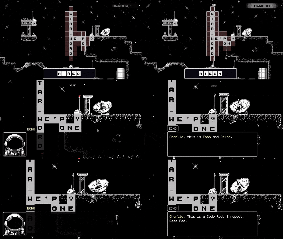
Awesome font! I used it in my last game for the whole dialogue part and it was a blast!
The game is a Scrabble-like game set in space and this font is perfect

Awesome font! I used it for my last project, a Scrabble-like game in space
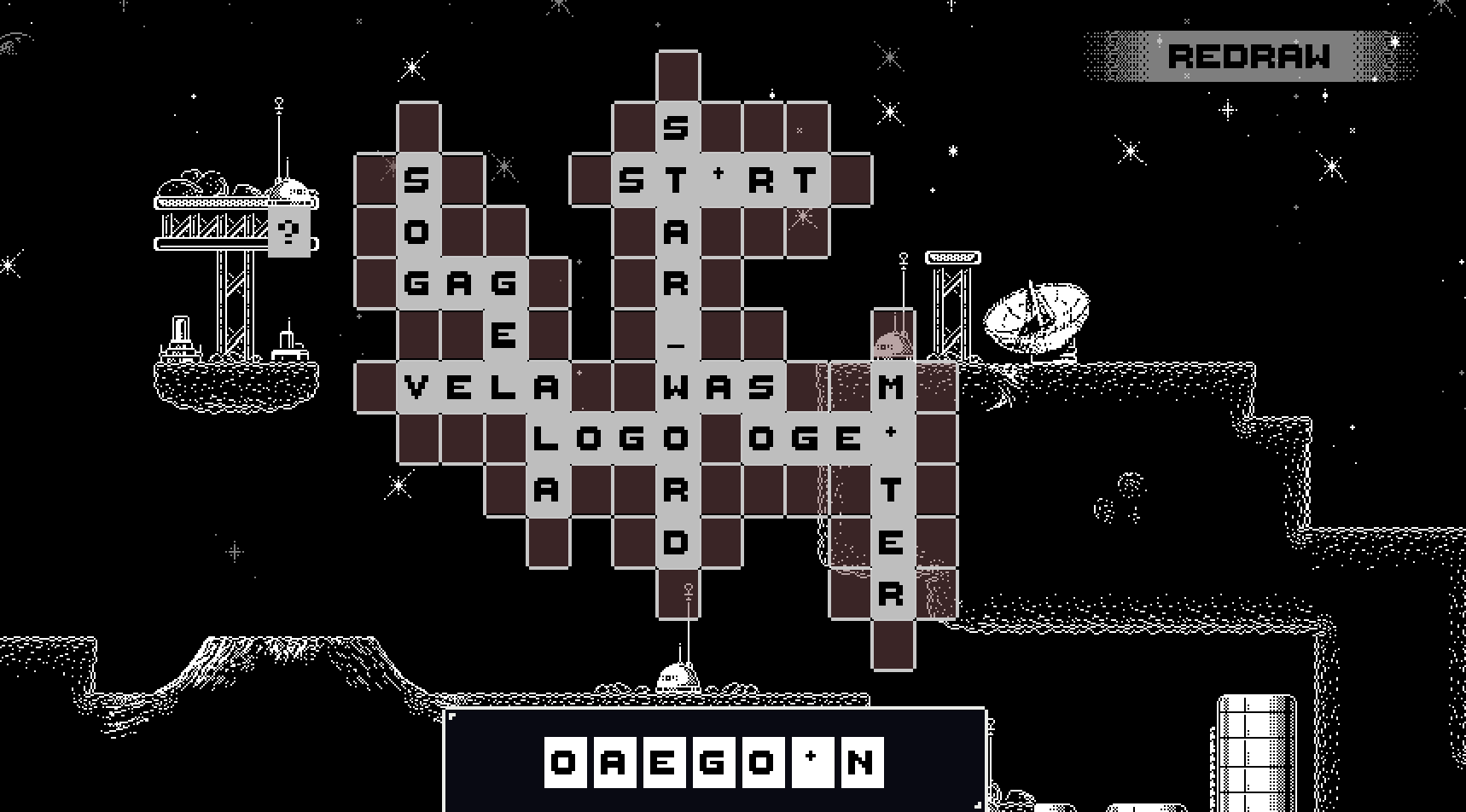
I saw Horizons: The End Of Words on the Itch's channel and it inspired my game, Star Word: a Scrabble-like Adventure on an alien planet.
I hope it can make it to Itch's YT channel too 🤞
Never underestimate the power of narrative, and you didn't! I read the description and just made the game 10 times better.
Buuuut also don't underestimate the sound too, a background music and a jump sound could make as much,
Jumping animation was neat, also the tree growing on the head was really cool when I noticed it. I only wish that it was growing bigger and bigger!
I think that it has a lot in common with Pac-Man! Overall it was a good experience.
Game Design: clever mechanic, perfectly in theme. I don't know if, in a full game, the fact that a missed flower makes the level harder is a good choice. It makes the players go for 100%, restarting when a flower is missed, which is less permissible for non-skilled players. But for a game jam is fine!
The 100% windows should be more permissive because the fact that the player understands the perfect route in the level is not enough to complete it at 100%, giving him frustration for repeating a level that he already mastered.
Level Design: it misses a real progression. You have to first introduce the mechanic in a super simple level, then build up difficulty level after level. The fact that the player is catapulted into the level with a timer, enemies, and QTEs is confusing and overwhelming.
You also should be aware of the second dynamic that you have that occurs when 2 flowers are blooming at the same time at a different speed. That is something that you have to teach too in a simple level.
So, for example, you should have:
1. tutorial - one flower only
2. simple level - enemy and 2 flowers
3. medium level
4. simple level with flowers that bloom at different speeds
5. medium level
6. hard level
Sound Design, Graphics, and Music are not my fields, but I find them pleasing
I don't think it's hard, I think it's unplayable.
Bullets are too fast to avoid them (no other bullet game matches this speed). When you get hit, the character rotates and shoots in a different direction from where you're aiming, making it impossible.
It's not clear how much damage a bullet does, I got 3 lives, but I can get a lot more shots.
Also, what is the character? Why am I fighting flowers? These questions would make you fit the theme more.
Overall graphic is really good, only people seems a little off with the environment.
I found it difficult to know how exactly the game works. First I avoided people to not cause allergy, then I used as much pollen as I could for every person, and then I tried to use only one pollen per person.
When I had no pollen left, I couldn't get how to have it back. I thought that I had to catch the leaves falling or the dandelions on the side of the street. I realized then that maybe it's just a matter of time.
So I would make changes in this direction. Make the player in full control of his pollen: make him reach for dandelions to recharge it and then rush back in the street to catch people, make him focus on precision trying to consume only one pollen at a time, show a clearer collision box with the people.
I can say that I've been bullied by a bunch of trippy mushrooms!
I tried many times, but I was not able to end the game. I reached the 4th stage. To me it was too difficult and not in my control but in the mushroom's RNG by the way they jump or where they spawn.
I would love to have the kick mechanics more integrated, I found it not useful compared to the attack. Maybe using the kick would make the mushrooms drop more healing, so I have to balance the kick and the attack to stay alive.
Also, the healing shrooms have a small hitbox that makes it hard to catch them while sprinting in the middle of the fight. Being high during the fight is fun and I would make it more possible to happen.
Flower's animation is neat. Seeing it blooming and growing bigger and bigger in the center of the screen is satisfying.
I found that the score is too big and distracting, mainly because it's not that important and because it covers a big chunk of the upper screen where I have to keep track of the falling drops. Probably it would be better to keep it at the bottom where you have plenty of empty space.
I was initially confused by the drops because they were too similar and didn't have clear feedback on which was good or bad. Using a different asset would be great, but if it was a matter of time, it would be better to use the color green for the bad one to associate it with acid.
I would also give the player more control by speeding up the character. It would better match the drop's speed and it would make it possible to avoid the bad ones at all. Maybe a sprint with a cooldown would add more agency.


