Thanks! I appreciate the review! Yeah, I scattered the money in pretty obvious places mostly because I was worried that the lighting would make it too hard to find most of it. There's a bit of a tactical decision to be made if you want the highest score, since the smaller bills will fill the same amount of inventory as the big bills, and the voodoo doll is worth more money than the slots it takes up, but otherwise it's pretty easy to rack up lots of money easy. Thanks for playing!
MeekoSoup
Creator of
Recent community posts
Haha, no it's got some goofy bugs and I didn't guide the player very well. There's an inventory you can access with TAB. You can press R to reload the flashlight. There's a key in a door handle somewhere, and that one key on the nightstand isn't supposed to be there. Oops!
Still, thank you so much for playing my game and making a video of it!
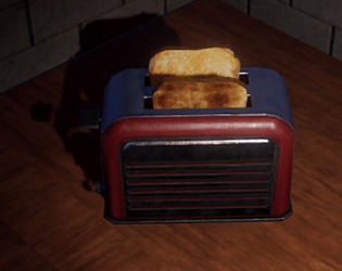
I spent hours on a toaster that had virtually nothing to do with the main game loop, so I totally get that. lol
I think I might reach out to the author of UHFPS and make some suggestions on certain things. There's a bug if you try to put a paper note on another interactive object which cases them to get their hotkeys mixed up, which is why the note of the front door in my game will sometimes say, "E" for examine instead of "Q". The localization and item creation process is still not very streamlined, and kind of a pain to work with, and my god trying to make a custom door open with the mouse almost had me late to submit! It just refuses to work well every time I try it!
I had to fix a lot of code directly, and scour a lot more just to get answers to things I thought would be pretty common questions.
You guys are such champs, thank you so much for spending so much of your valuable time playing my unpolished game! Since the theme of this Jam was, "it's been there the whole time" I put the front door key back into the door when it closes behind you. Unfortunately it's so small, and if your flashlight goes out there isn't much light to see it.
The flashlight can be reloaded with R, just like a gun, but there's a bug when you combine it in your inventory that consumes all your batteries at once, so that kind of broke the game a little.
I'm really sorry about that false key upstairs, I had no idea that was there. This is a good lesson in why it's better to build off of a blank scene rather than a demo scene. I removed so many items and rearranged quite a few things, but simply didn't know about so many of the "interesting" items there. Oh well, learning such lessons are what these Jams are for!
Again, thank you guys so much for playing, and I hope it was an enjoyable experience! I'll try to get to your submissions soon!
Oh no, the tooltip for the loading screen randomly went to one of the examples that came with UHFPS. Damn, there are so many things like that I completely missed.
And what the heck?! The note is asking you to press E for examine?? How did I miss that? It's Q for all other examinable objects... <_>;
Uh oh, looks like the flashlight is consuming too many batteries again. Dang, thought I caught that one too... And there's a useless key on the table??
Geez, I missed so many things. xD
Hey, sorry about that, I tried to hide it in plain sight, and I genuinely thought it would be too obvious, but I guess the dang key is just too small, or maybe the light doesn't pick up on it well. It's essentially "right where you left it." I hope this helps you find it, and if you make it out of the house, let me know how much sweet moolah you scored! :D
Hey, sorry for the late reply! So sorry I didn't do a good job guiding the player. One of the themes of this Jam is basically "it's been there all along" and so the key is right where you left it, albeit, magically appearing on the other side. I hope that gives you enough of a hint, and if you have any ideas on how I could improve guiding the player to those important objectives, I would love to hear them!
Also, I cannot thank you enough for posting a video of your playthrough! That information is invaluable, and just fun to watch! (even if it does hurt a little to see how dumb my design was. xD)
Pretty good horror experience. I went a similar route because I wanted to get straight to designing the horror and puzzles (and also to justify all those humble bundle asset purchases, lol). Working with UHFPS is tough because it's just documented enough to feel like it's fully documented... but there's still a lot of things that aren't explained, and no API to help. I sympathize with difficulties of learning how to use other people's assets; it's a challenge in of itself.
So, here's my feedback about the game:
- Great horror atmosphere and tension! I was nerve-wrecked most of the time!
- However, needs more ambient sound elements, and maybe some simple special effects like dust particles in the air, or lighting casting long shadows.
- The puzzles were kind of interesting, but felt a bit too "lifted." It would have been nice to you utilize some of the props you got outside of the UHFPS bundled assets. I get it, making those systems work with someone else's models isn't as straight forward as you might like, but it would help the game feel more "customized."
- Also the puzzles eventually got annoying enough for me to stop playing. I personally prefer it when I can solve one puzzle at a time, and then occasionally have one I have to backtrack for, but at one point too many puzzle pieces had added up and I started losing track of everything. Also, too much backtracking.
- A quick note on the AI generated stuff. It's mostly just that it's obvious and a little immersion breaking. I used it for some idea generation and a quick cover art piece since I couldn't come up with anything more clever, but it is pretty obvious and it can turn a lot of people off. I'm going to be searching for more ways to avoid using it, or at least use it in less obvious ways, but it's just a note on the aesthetics, mostly.
That's already a lot, I hope it doesn't discourage you from making games. I think you have some good ideas here, and with refinement, it could be an interesting game! Keep up the great work!
Well shoot, I spent almost half an hour trying to make that first bounce jump. No idea what I was doing wrong. I liked the aesthetics of the Portal-style game, and I'm impressed that you got actual character animations in there along with voice acting, but alas the gameplay experience was hard to enjoy. The sensitivity on the character's aiming, along with the odd, jerky movements almost made me motion sick (which rarely happens for me in video games). It felt like we had at least 2x gravity, which made it extra difficult to make the jump. Saddest of all, I never got to find out what the gun did. Lastly, I really didn't get much of a horror vibe. Maybe it comes along later, but it invoked more frustration than fear, but again I suspect that this game has more psychological horror.
It's still an impressive effort for under 7 days of development. If you get a chance to iron out some of those issues it might be a really fun experience. Keep it up!
I'm fascinated with your design philosophy for this game! The slow-burn was almost too much for me to bear, but it really added to the tension. I will say that many of the objectives felt like it took too long to see a resolution to them. I kept questioning what I was supposed to be doing, and while that also added to the tension, it was quite frustrating. Especially the first one. I almost quit the game because I couldn't find the noise in the backyard. The last little thing is the translation: it's pretty all over the place. I felt like I was trying to decipher a riddle with 90% of the text. I get it, localization of any kind is super tough, and many things don't translate well, but if you get the opportunity to improve on it, I think it will help the game a lot.
This game taught me a lot of tricks that I am normally opposed to doing because of how impatient I am, so I'm going to try and expand my toolbelt and try some of these strong tension building techniques.
I'm also impressed you guys did this all in under 7 days. I guess it really helps to have a team, but I can tell you're pretty experienced too. Great job to your team!
yeah, wow, that was something! Still not sure what's going, but my suspicion is dream demons or sleep paralysis? Interesting concept! The mechanics could use a little work. Indie games and early prototypes tend to always have very slow moving characters, and a lot of dialogue, just ends up getting pretty tedious quickly. I did like that I could play it in the browser! Points for that! And great job on the art, that's an area I'm pretty weak at.
Well done!
Interesting idea, but I guess I just wasn't able to find all the clues to get past the first room. It had me creeped out a bit. I think that players will need a bit more direction to fully enjoy the experience you crafted for them, but there's a lot of promise here, so I hope you get a chance to flesh it out more! Great job!
PS: UI/UX is incredibly important and can quickly take your game to the next level. Suggest in-game menus, sound control, and the ability to quit without using Alt+F4. Most of all, I suggest building out a set of simple, easy to use UI menus and win/loss scenes/screens before getting too far into your game dev project. This ensures you have the wrapping paper for whatever gift you intend to present. :3
Interesting idea! You have some challenging game mechanics and a lot of intricate level design, and the atmosphere is definitely a little tense!
I was pretty confused about the space flight part and what I was supposed to do. After I had died(?) a couple times I kinda got the idea but by then I was a little too impatient to continue.
Still, this game has a lot of promise! Great job getting this done in so little time!
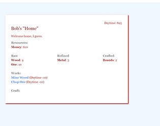
Haha, well thanks for giving the game a go! Yeah, right now I am dealing with technical issues in the Twine engine that make it exponentially difficult to add more content, so I am looking into ways of overcoming that.
As for the species and gender and stuff, that was kind of the first joke of the game was that character creation was a hoax. I would feel obligated to have statistical differences between the races, but unfortunately that adds a lot of complexity.
Believe it or not, even though there isn't much to do right now, it took me 8+ hrs just to make a "working" game-loop, so it might take me a bit of time before I can add more significant content.
But I hope to! Thanks again for trying out this silly experiment!
Hey Poseidon2015, thanks for replying! I totally agree, the controls, specifically the camera movement were pretty gross. The camera controls were one of the last things to get tacked on so they got the least love. I have made games that utilize a much more comfortable movement and camera control system, but didn't have the time to do it this time.
Unfortunately, due to complications, I ended up doing most of the work on this project, so what you're really seeing is a project designed for two people, where mostly only one guy worked on it.
Oh believe me I get it. My game has more holes in it than Swiss cheese. It almost seemed to fall apart upon submission! It's always a juggle between balancing mechanics and reworking systems, but especially for a Game Jam game, I think you guys did a great job!
Though I'm surprised there wasn't any jam-related menu items. ;3
Wow, you made this in two weeks?! This is very well done! It looks like it takes place within the Starbound universe. Very clean, and what feels like a complete game.
I did notice that sometimes the time it takes to prepare a dish is longer than the customer will wait, not sure if that's intended or not.
Otherwise, great game!