Indie game storeFree gamesFun gamesHorror games
Game developmentAssetsComics
SalesBundles
Jobs
TagsGame Engines

Mikeywalsh

24
Posts
A member registered Nov 06, 2016 · View creator page →

Creator of

Recent community posts

Cool game, I like the idea of customising the player character before you start a level, adds some depth! Only thing I would suggest is making the controls more intuitive - I would expect to be able to shoot and aim with my mouse.

Also, the sound effects you have are good, but some background music would have tied it all together nicely I think

Nice game! I particularly liked the effects, the 2d lightning, level change animation and screen shake really add a layer of polish to the game. Was a little annoying figuring out the solution and having to wait to move to the end - maybe faster player movement speed would be a nice addition?

Charming little game, reminds me of strategy games I used to play when I was growing up. I really like the dialogue and characters! Only thing I would improve is the awkward controls - I tried to click the arrow in the dialogue menu for quite a long time until I realised I was supposed to press the arrow button on the keyboard

Really good looking game, well done on the art and audio! The game crashed for me a few times after I got to wave 2 so I didn't get a chance to see future levels or if there were any extra mechanics, but from what I saw so far, this looks great for a game jam submission!

Nice game & cool concept! Only thing I would suggest is making controls a little more intuitive (jump with spacebar for example). Also more sound effects! Background music can really tie a game together :)

Cool concept! I like the art/sound. The game feels a little too punishing, maybe move the hourglass more when the player shoots it?

Really good. From first looks, I thought this was a really simple game just threw together by a beginner, but as soon as the glitchiness started happening and mechanics started changing it got really fun! Probably my favourite one I've played so far, good job!

Only thing I would recommend is adding some more sound effects apart from the background music and glitch effect.

Looks good/polished! I would recommend lowering the audio volume, or at least including a slider in the menu. Art style is also really chill/simple but I feel the car sprites are too detailed for the rest of the environment. Apart from this, good job!


(Also the game didn't run in chrome at all for me, the unity loading screen got to around 90% and then gave up, no idea why. Works fine on edge though!)

I really love the artstyle and how you managed to bring the shapes to life with a bit of animation. Also good job on introducing the mechanics to the player, it felt very intuitive.

The only thing I would change is that you seem to jump much higher when you're moving. I'm not sure if this was an intentional mechanic but it doesn't feel very intuitive. Apart from that, great game!

Really good game given we only had 3 days! Most impressed with the audio and sensitivity options and level of polish. AI seems solid too, no bugs when playing with the maximum team size. Only thing I would improve is the UI (adding a better font etc).

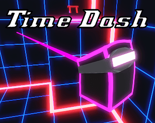
I'd say it's still roughly on-theme since we're still counting down! We did make this with the initial idea of only having 3 seconds, but as you can imagine this didn't leave any room at all for interesting puzzles or level design, so we adapted and made levels longer

And regarding the camera controls, definitely a mistake on our part. Would have loved to add a sensitivity option but we simply didn't have time. This was also made with playing with controller in mind so the mouse controls were a bit of an afterthought. We're going to be polishing up the game after the Jam though, so thanks for the honest feedback :) 

Alright makes sense, thanks for taking the time to give detailed feedback!

Cool game, I really like the hand-drawn artstyle! For some reason it bugged out for me the first time I died and clicked 'Try Again', and I couldn't move at all upon respawning and had to reset the game :(

Controls also bugged for me, but what I can glimpse from the first frame looked interesting! Also, a WebGL build would make a lot more people play your game!

Nice simple game! However the enemy players kept getting stuck on geometry for me, after I bumped into them, which made it very easy to get to the end. Maybe you're already using NavMesh, but make sure to also include the player as an obstacle so they can adjust paths accordingly

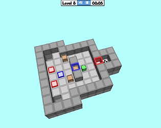
Thank you! Do you mind elaborating on the player movement comment? We know the camera movement is a tad too sensitive, but we thought the player movement was pretty solid with the exception of it being hard to push boxes if the camera is at an angle. Was there anything else in particular that felt clunky? We're always looking to improve!

Thanks, glad you enjoyed it!

Thank you! Yeah we would have loved to spend more time making more smooth level progression and more complex puzzles, but we only had one sleep-deprived day to come up with levels after finishing the technical implementation, and it was the first time I ever used probuilder haha

Glad you enjoyed it! And thanks for the art comment, we really just added an emission outline to everything haha, which was very easy given the simple geometry.  And yeah if this was ever a full game we'd have customisable camera speed etc, but we were in such a rush trying to make everything work in 3 days that we didn't have time to do it for the Jam!

Loving the pixel art shader on the robot guy. In-game, everything feels smooth and polished. Maybe a little room for improvement with the UI, but I had a lot of fun playing!

Fun base, lot of promise! Rotating with E and Q feels clunky, I feel like facing the mouse position would be nicer. Apart from that, I'd recommend playing with materials/shaders a little - you can add a lot of extra oomph to the game without changing any mechanics simply by making objects pop out a little more. This also applies to the UI!

Fun base, lot of promise! Rotating with E and Q feels clunky, I feel like facing the mouse position would be nicer. Apart from that, I'd recommend playing with materials/shaders a little - you can add a lot of extra oomph to the game without changing any mechanics simply by making objects pop out a little more. This also applies to the UI!

Really good approach to the theme! Very relaxing to play and feels smooth/well put together. Like some other commenters said, some extra mechanics would be cool, but very understandable that they weren't introduced, this is a game jam after all!