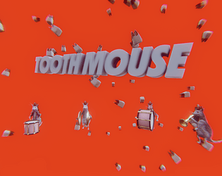
Enjoyed the minimalist styling. Gameplay had a nice difficulty curve where the tension ramped up but not too too fast. We enjoyed playing it. Three thumbs up
Natalie Cuthbert
Creator of
Recent community posts
Really great illustration, sound effects and overall aesthetic. I was a little confused by what the different states in the game actually meant though. I think it was explained in the introduction but I found the language a little opaque, despite being thematically appropriate. Despite not quite understanding, I did feel the sense of rising urgency, so well done on nailing the theme.
As other commentators have also raised, I think the characterization of the only female character in the office, which is clearly a hostile work environment for her, felt off. The fact that sexual harassment formed a big part of the story, but wasn't sufficiently addressed by the player character or the narrative felt like a missed opportunity.
I hugely enjoyed the humour in this experience. Some of the procrastination antics reminded me of my university years and trying to bang out assignments at the last moment.
I thought the fantasy story generator was a really nice touch, and fit the theme well. I was impressed by what you got done in the limited time.
The clock animations were also effective at conveying the sense of time and panic.
The experience felt quite unnerving, the falling effect was quite effective at conveying the vertigo you experience when you fall in real life. I thought the animation tech was also quite impressive for a jam game, the art style felt effective given the time constraints, and the music added to the experience. I may have been a tad impatient, as I felt like the difficulty spiked a tad quickly, as I fell a lot,
Art & writing were really great/clever! Gorgeous colour palette.
Found the controls/level design maybe a bit too challenging for me, so ultimately wasn't able to experience the whole game. The jumping was maybe a bit too twitchy, not sure.
Flirting with death was fun, but in terms of time got quite punishing due to the game resetting the level each time.
Really well executed art style. And the popup book effect really sold it. I loved that even the ground coverings were water color. In terms of time it probably was a stretch, but would love to see what enemies would look like rendered in this style.
Minor visual annoyance was the occasional z-fighting and that the player character felt like it was missing either a mesh or that the normals were flipped.
It was an interesting choice to create a tower defense in a single dimension. Think the design as it stands is a little tricky as there is very little incentive to move between nodes along the line, feels like the optimum strategy right now is to continue to expand the frontier. Maybe adding an additional dimension or branching would help solve the problem, or failing that, at least providing reasons to go back and forth between nodes. Dialing in the feeling that you're successfully spinning plates is where I'd imagine a lot of the design potential lies.
Just on controls, found it a bit frustrating that space serves a dual purpose, since sometimes radishes were too near towers and so I'd accidentally spend my hard earned radishes.
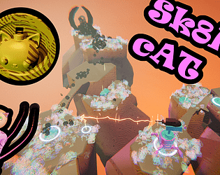
This was at the very least an interesting art/tech demo. I really also liked the idea of sort of training/interacting with a household pet that has opaque internal logic, kind of like Black and White if Molyneux thought in Tamagotchi scale.
The morphing animations of the character were great. And it was pretty funny that it turned out to be a literal cookie monster.
I'm curious to know whether you'd consider using clayxels for something bigger.
Really impressive effort. Felt a very complete game. Thought the gameplay was fun and interesting and really liked the tool system. Though I'm not 100% sure about the chanting mechanic. I ended up writing down a cheat sheet that mapped a given spell to the numbers I needed to press. I think with the time pressure, trying to remember spells is quite challenging, particularly if you don't have good short term memory. Perhaps with a more gradual tutorialization you'd be able to internalize the sequences.
I liked the design of the game. It was a lot of fun to be able to pull all these dynamic climbing moves off.
I wasn't a huge fan of the "hope" grip mechanic though, think it detracts a bit from the climbing experience.
The "Zone of Dispair" was a really nice (and stylish) touch and think also helped tutorialise the game when you inevitably fall the first time.
Tech wise, the ragdoll mostly worked well, though I'm not sure whether it was intentional that the character would occasionally explode if it got too twisted.
Well done! A solid jam game.


