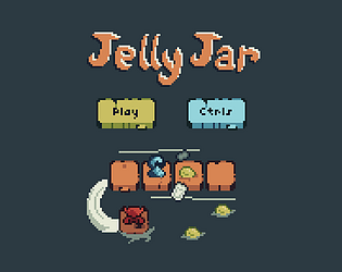
This was a pretty cool game! I liked the concept of having to build up a little army of monster dudes in preparation for a horde of void monsters attacking. I will note that the character movement felt a bit slippery. Really loved all the monster designs, they were really neat!
Nohrovuu
Creator of
Recent community posts
Fun game, pretty difficult.
Only real note I have is for the dialog text reveal/skip implementation. I wish pressing 'E' mid-dialog reveal would have revealed the remaining text instead of skipping forward to the next. Wanted to read faster than it was being revealed but had to choose between skipping it or reading slowly.
Super impressive for a game jam! Thought for sure the dungeon boss was the end until I found the broken wall. But this game has multiple zones with a bunch of encounters and upgrades. Great job getting all that in there!
A lot of good stuff in there, but there are a few things that could use a bit of polish. These are the two that stood out to me the most
- For combat the best strategy I found was to rush in and stagger-spam the enemy. Would be cool to see that get updated to require a bit more expression of player skill.
- The fireball attack picked up towards the end was too OP in combat, and was a pain to walk around with. I actually wanted to put it down, but couldn't figure out how.
Really liked the placements of enemies and places of interest. Being able to see the dungeon boss behind the bars, or the other greater demon on top of the tower gave me a goal to move towards and look forward too. And the enemies hidden around corners that swing at you the moment you enter a room or pass a barrel. Also, being able to climb up to a high place and see places of interest to go explore, whether that's interesting buildings or the distant glow of a new checkpoint. And then when I did go explore, I was rewarded with a cool upgrade or a heal and such.
Again, really impressive entry. Great job!
Really liked the concept of the game, can see a lot of potential. If you do go forward with this, these are the things I personally would like to see polished and refined.
The tileset was really busy and the character's didn't stand out from the environment all too well. Would love to see these two things improved on to increase visual clarity.
Beginning felt like a whole lot of mechanics being dumped onto me all at once. Would liked to have see something a bit more gradual with how they were introduced and taught to the player.
The box physics were very unpredictable. Changing the size of the box would move it out of position with no real options to move it back into place, and at one point even pushed my character out of the level completely.
The combat didn't feel that great. Seemed like I was getting hit by the enemies before their attack animation even started playing. Would love to see some more telegraphing in their attacks.
Really impressive entry for a game jam! Great job!
Pretty neat game. When the game paused for the "Click Here" prompt, I initially mistook it for a performance issue. Would probably recommend having the "Click Here" prompt pop up with the game pause to more closely tie those two events together in the player's eyes, with like an animated arrow, and then resume the game as soon as a click is detected in the prompted zone.
Cute art, but the space bar didn't seem to interact with anything, so was unable to do anything other that wander around the opening scene.
From a sound design perspective, would have preferred if the tension was gradually increased instead of diving straight into the super tense music right off the bat.
Trying to figure out how to get all 3 dimensions accurate, I would have to get one side to yellow, then make it red, then make a different side yellow, then put it back to red, then make the third side yellow, then go back and adjust the other two that I had intentionally made a bit off so I could use the yellow indicator on the other sides.
Felt a bit tedious since this was the only way to get all 3 sides (unless I missed something). Might not have felt so bad if there was a sensor upgrade that I saw I could work towards that would make detection the box scale less tedious.
Very cool game! Big fan of simple rules that are easy to pick up but still allow for thought and strategy. And the ramp of introducing new elements I think was well done.
The music and the room make me think the PC, after learning they only had 1 year to live, went to the club to distract themself and then this demon bunny girl coerced them into a back closet to gamble for their life.
As far as the overall atmosphere of the game, the narrative seemed to be going for a somewhat ominous tone, but the music as is seemed to undercut that a bit.
Found myself doing several playthroughs on this. Gameplay was well executed (and slightly addictive) and loved the art!
Really liked how increasing stats also increased % chance of upgrading rarity and upgrading rarity refreshed durability. Did a really good job of making me need to balance between stats and rarity.
Also, really juicy hammer animation/sfx!
The button interactions could use some improved UX. Not sure if the issue is the button sprite being too big or the custom cursor's hot spot not being where I assumed it to be, but there were times where I visually appeared to be clicking a button when I actually was not.
Took me a bit to realize I could complete an order without filling all the checkboxes. Also took me a bit to realize I could use the "Complete Order" button to reject/pass on an order that was do difficult without any penalty.
For buying luck and dex, maybe I missed it but I wish I could see more info on how/how much upgrading them helps me.
Great entry! Really enjoyed playing it!
Pretty interesting game! Really enjoyed the hand drawn art and appreciated the narrative build around it.
I did find one thing that's seemed to be a bit of an exploit. If I hit the "Serve" button while the scale is still swinging, as long as I hit it while the two sides are aligned it would register as the correct amount of scales.
Really great entry! Good job!
Really great entry! The visuals are really good, the music is nice and chill and the platforming via windows was interesting and well executed.
The level reset when a window overlaps the player seems a bit harsh as is. Potentially could update it to snap the window back instead of resetting the whole level? And/or a red outline around the player if the moving window is overlapping them?
Also the key in the last level was a bit finicky to grab. I'd get the player character fully overlapping it, but it seemed like having other windows too close prevented pickup detection
Aside from those two things, everything was really well executed. Great job!


