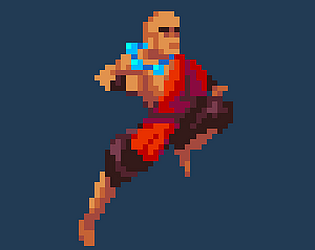
that's an impressive game, really polished! I liked the gameplay, but some animation are not that clear, such as the punch, and the FRANKIE BALLS OF FURY do not always go in the direction you shot them, but that's an impressive game nonetheless!
NuageRoue378723
Creator of
Recent community posts
That was great! Even though the plot twist was a bit predictable after the second night, I really enjoyed the gameplay shift. I loved the visuals, they really had a Game Boy vibe!
I think the investigation could have been a bit more fleshed out by allowing the player to do more things, but for a game jam project, it’s fantastic!
Very good game! I'm not usually a big fan of visual novels, but I enjoyed the story, and the graphic style was very cool. Maybe a few facial expressions could help convey the characters' emotions better, and slightly reducing the flashing of the neon lights in the background could make it less intense. Other than that, well done!
For a game jam project, this is impressive! I really enjoyed the atmosphere of the lab, and the Daleks were very cool ;)
I think the doors and keys should have matching colors to make it clearer which key opens which door. Also, enemy attacks could be a bit more noticeable (like adding screen shake or a red flash) to better convey when you’re being attacked.
Other than that, the project is really fantastic!
Thank you so much for your advice! A tutorial and sound effects are indeed the first things I’ll add to the final version of the game!
The visuals are hand-drawn, using pastels and paint, on paper and fabric (for the menu background). Here’s my friend’s Instagram account—he’s the one who handled the visual side of things!
the game is really fun, I liked how "arcady" it looked. like others I accidentally killed myself at the beginning, but I understood how to play on my second playthrough. Its pretty addictive to zap an entire mob X)
I think it would be better with more kind of humans with different behaviours, or if it was a bit harder (to accentuate the retro and arcade aspect of it).
The music is nice too, well done !
Impressive!
I really loved the aesthetics, black and white with glimps of color always looks nice, and those "blood" effects are really nice! The intro is awesome, but I think an option to skip it would be cool (when you play multiple times it can be a bit long)
On a gameplay perspective I liked it, it's really fun, it's varied enough to me as each levels I did introduced something new. My only complaint would be about the dash that always aims at the mouse even if you do not touch it, which is a bit confusing sometimes.
Overall it's a really good project, nice!
we used some arts from OpenGameArts, here are the links :
RPG GUI construction kit v1.0 | OpenGameArt.org
Pixel fonts by Pix3M | OpenGameArt.org
Antifarea's RPG sprite set 1, enlarged w/ transparent background | OpenGameArt.org
<a href="https://opengameart.org/content/lpc-house-interior-and-decorations" ]<lpc]="" house="" interior="" and="" decorations="" |="" opengameart.org<="" a="">[LPC] House interior and decorations | OpenGameArt.org</a>
But the vast majority is our own work, made during the jam!


