I really enjoyed the art for this game!
Play game
Less distraction, more focus!'s itch.io pageResults
| Criteria | Rank | Score* | Raw Score |
| VISUALS | #214 | 3.778 | 3.778 |
| SOUNDS | #245 | 3.167 | 3.167 |
| THEME | #286 | 3.278 | 3.278 |
| MUSIC | #307 | 3.111 | 3.111 |
| DESIGN | #412 | 3.000 | 3.000 |
| OVERALL | #422 | 3.111 | 3.111 |
| INNOVATION | #449 | 2.833 | 2.833 |
Ranked from 18 ratings. Score is adjusted from raw score by the median number of ratings per game in the jam.
Comments
A tiny yet quite fun game. I'm really impressed with the art and there are nice little sound effects too. The instructions on the title screen are unfortunately too small and scrunched down so that they're hard to read. They almost look like a nice border along the bottom rather than text. Additionally, once you press play, there isn't any way to go back to look at them if you missed them.
That's really my only criticism though. Overall, great job with the game. I love the character you control. It's walking is cute and the arm which comes out to punch is great. I also like this game as a metaphor for how to meditate.
Hey, Pope!
Thank you for playing the game and commenting on the page :)
Yeah, I got some complaints about the font, I chose it poorly, in the post-jam release we're looking to change it to a more smooth one.
And thank you for the compliment! Yeah, it is a metaphor for how to meditate, so happy you got it! In 2020 I got back with the practice - I guess the year 2020 is self explanatory of why -, and I really struggled with at the start.
Gonna check you game also (loved your avatar ;) )
Cheers!
Thank you. My avatar is actually a monster in the monster taming metroidvania Monster Sanctuary. The game had some design contests for community designs to get into the game and this design is what my fiance and I came up with. It won the contest by being chosen by the devs and this is the version drawn by the game's artist.
Great game! I loved the art style and the character was really fun to control. I think this game could benefit from adding a little more variety. I didn't really need to use any jumping when I played. Maybe you could have the thoughts spawn higher in the air or expand the level to add some platforming to give it a little more depth. Overall I think this is an awesome game, great job!
Hey, AnMoose!
Thanks for stopping by to play our game and giving some feedback :)
Yeah, we're thinking about adding some higher spawn points to make the player feel the need to jump. In the first protoype, it was more chaotic, with the thoughts bumping into each other and going bunkers. We were trying to find some balance, but opted to follow Noa's advice on the "29 game jam tips" video to tone down the difficulty. But we're looking to make it more challenging post jam ;)
Cheers!
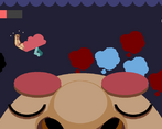
This is great! I absolutely love the artstyle as well as the visual of the giant fist coming out of the brain. It definitely gave me warioware vibes. Great job!
I love the visuals (the dude's face and the arm poppin out of the brain are great haha) and the music is super groovy. Also punching those thoughts is quite satisfying. I think it would be great to add some other mechanics to make the game more complex, since I found spamming space bar to be a pretty unbeatable strat. But still, I had fun :) Great job on your first game guys!
Thank you for playing the game and the feedback!
Yeah, I got this feedback from another from another person, I guess it would make the game more challenging, waiting for the thougths becoming red (dangerous) before punching them, so the player must punch carefully.
I'll look into it and try to implement in the post-jam version ;)
Cheers!
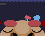
I like how cohesive the design is. The sound effects support the aesthetic, and the fist that breaks the general visual style got a chuckle out of me! On a technical side, walking on a curved surface like the character's head was done so well I almost didn't realize I should point out how good it is.
In terms of improvements, there really wasn't much of a challenge. If I walk from left to right, constantly punching, and then right to left, I couldn't really lose. The only thoughts that I'd miss were the ones that clipped out of bounds when another thought spawned inside of them. There was also little to no reason to ever jump since the enemies very consistently spawned near the head.
Overall I had a pretty fun time with the two minutes I spent with the game to clear it twice!
Thank you for commeting and the feedback, Iffi!
Glad you like the aesthetic, I really put some effort into it. The curved surface is functioning smoothly is all thanks to muichi ;).
And I get what you mean: I played more this weekend after receiving feedbacks. On the first prototype, it was too chaotic and difficult, we tried to make it so it was not that hard to complete, but it sure does need some balance, specially making the player feel the need to jump - on the prototype the thoughts would clash into eachother, making them fly near the ceiling, and that was why the jump was implemented in the first place.
Glad you enjoyed! I'll check your game also.
Cheers!
We added last minute a lower spawn rate in the first 10 seconds of the game to smooth out the experience to the player (so they could understand what's going on before getting overwhelmed with thoughts), but we definitely should have also steeped up the difficulty in the latter half of the game to make it more challenging. After you make sense of the gameplay in these 10s, the difficulty does not progress at all. Lesson learned!
Thanks IffiDev for the feedback!
I love it. The brains arm looks like its straight out of street fighter! And it looks so funny with the rest of the art - which is amazing btw. The artstyles so clean and nice. The gameplays a little simple, but I enjoyed it so that doesn't really matter. Great game :D
Hey, slimburger!
So glad you came to check it out!
The artstyle was something I really put effort in it, specially the brain's arm being "detached" for the rest of the game art! I was aiming at a WarioWare style of minigame, an you are right! I checked some SF clips to see punches animations before animating it :).
Thank you for stoping by and checking the game!
Support:
Good game! The mechanics are very straightforward, so it's really enjoyable!
I think the art work has been great, the dissolving effect of the thought clouds looks very smooth
Criticism:
I would have liked the person to change emotions on their face according to the distraction bar, but I will not lower points for that, it is just an idea.
--
I don't know if the music was made by you, can you tell me if that's the case?
Hey, StivArts!
Thank you for playing the game and commenting on the page :D
And I agree with your criticism: on our original plan, the face would change everytime you got "hit" by a distraction; but I wasn't able to include that on the deadline (we were focused - no pun inteded - on tweaking the game mechanic first).
And yes, i made the music beepbox.co from scratch :) It really helped me to get it done quickly for the jam.
Surprisingly addictive. Didn't get what the blue and red colors meant at first. I thought blue was for good thoughts and red for bad. The game has really cute animations and sounds. The concept is simple and well-executed. My only suggestion is a way to make the character move faster, maybe a sprint, to make the game more fast-paced.
Hi, glas!
Thank you for the time to check the game and the feedback. The visual indication that the toughts are about to explode could be more direct, i agree, maybe i'll change it after the jam. I'm really happy to know you liked the animations and sounds <3.
The first prototype of the game it was more fast-paced than the realeased built, but i thought it was too chaotic and hard for a jam submission (I was worried that people wouldn't be able to complete it). But I'll sure check the game after the jam to see if I can tweak and find a balance between casual and fast paced.
I'll check your entry also.
Cheers!


Leave a comment
Log in with itch.io to leave a comment.