Thanks for playing. This was one of the gamejams I did that I thought went decently well. For the most part, did a lot better when I kept it simple and focused on polish. Kinda funny seeing this pop up when I'm reworking glow in my current project.
QuietBenchZen
Creator of
Recent community posts
Everything about the shot is really satisfying to use, shot speed, bounce, impact particles all help with this. Grabbing and shooting worked great but one small nitpick is diagonal speed is faster than orthogonal speed which feels weird. This usually happens if you are moving move speed amount in both horizontal and vertical leading to a sum movement vector of greater distance than the intended move speed in component directions. This is a small issue though, overall it's a good submission. Satisfying core gameplay mechanic with a gradual increase of difficulty in using that mechanic.
I thought it was cool how this managed to introduce variations and slight differences in what originally appears to be a ultra simple mechanic. The destruction mechanic makes clicking the rocks out of the runner's way very satisfying. Slowmo was another nice touch that helped make breaking rocks feel even better. With regards to feedback of what could improved, I think just echo other notes here that a bit more audio would be a good place to start.
Immensely polished, really great looking. Animations everywhere and a great overall aesthetic. The levels were good but I kept running into an issue where I fell through the world which was pretty frustrating. I'm not sure what it's related to, it seemed to happen randomly. I was able to cheese down to get the one ingredient in the lower path that I otherwise would have had to switch and sneak along because I just fell through the platform. I don't want to focus too much on criticism though because I can't overstate how awesome this looks from end-to-end, it feels like every visual element went through some extra mile to look better.
The 1.0.2 zip doesn't run out of the box, but did run when I renamed the "fusion_Data" folder to "TowerRogue_Data" maybe there's some issue in unity setup there. Having 3d animation and shadows, effects, and some degree of pathfinding is pretty cool for gamejam . I liked the merging of towers but would have appreciated some UI to tell me how many towers of what level would be needed to get to the next level, that was a bit unclear. Also the UI was a bit tiny on 4k monitor, i'd recommend using a canvas scaler set to scale on screen size for your game UI. Oh, also I loved the background music, it was great.
Once it clicked that I was supposed to premake a bunch of stuff in the downtime, I was having a ton of fun frantically producing everything possible. Text animation and intro/outro cutscenes are a great polish touch , but I would recommend adding a way to speed up the text. Another note I'd have is either increase the pickup radius of stuff or have some indicator that I'm close enough to pick something up. A few times I thought I would pick something up and started walking away only to realize I wasn't close enough and didn't actually grab it. These are minor notes though, overall this manages to succeed on creating the core feeling of this sort of cooking/order prep genre to an impressive degree of polish for such a short game jam.
Great overall retro aesthetic in both visuals and sound. There were a number of level design touches I enjoyed, like gradual introduction of new mechanics and blocking off the path immediately in the final level to give you free time to review and plan your strategy. Man moves a little slow but I can see how some degree of that is necessary to give the player time to change the environment in the man's path. I liked it, it gave me mario vs donkey kong nostalgia.
The feeling of a factory is really good, I really liked how the menu was sort of integrated into the environment. I enjoyed trying to set up a full build of jewels ready to score a full combo but my jewel holders tended to drift such that the jewel would fall off the edge instead of being locked in. I think you should either go with this squishy drift and make it a bit wilder like peggle or pinball or if you're going for more of a puzzle game combo building thing make it more precise to the behavior is predictable and consistent. The visuals are good and contribute to the immersion, along with the funny on-brand game description employee briefing.
Good use of limitation, it almost feels like I'm playing one of those old tilt roller ball games. Visuals are great from the fancy background to the consistent theme to the little idle animations that make the game feel more alive. Audio is solid, good feedback. I really loved it when it felt analytic and puzzely but the things that were more based on reaction time than planning were sometimes frustrating. The main example of this is enemies that are off screen. Certain gates I would open up and go down a path that I could not have known before would contain an enemy. Also, I think I'd prefer having fewer lives but maintaining progress throughout the 20 levels rather than starting all over. Game was fun though, I restarted despite being knocked back to the beginning a few times because I really liked the aesthetic and it was pretty satisfying to blow around the enemies.
Great use of both theme and limitation. Good gradual introduction of mechanics. I appreciate that it eventually gets difficult enough that it took me a few tries to figure out. Liked the boss and different boss music. Two notes of feedback, I was seeing some slight tile tearing and jittering, usually that just requires messing with some tilemap properties to fix. Other thing is that I would recommend setting the music to play through multiple levels. Since the levels are pretty short I'm constantly hearing the first bit of the music rather than letting it loop all the way through. To do this, you just pass a game object playing music to DontDestroyOnLoad and manage its lifetime. But these are nitpicks, overall I really enjoyed this game. No major issues hampered my enjoyment and there was a solid amount of content for a game jam.
Really creative idea for the theme. Solid implementation of a classic game. I liked the particle trail on the ball and the 'score' being displayed via the planet.
I think I hit a soft lock though when I dropped the ball at a heavy horizontal angle. I think it might have went out to the side and missed a death detection box or something. I guess I can just restart but it's bit of a bummer I felt like I was doing pretty well. 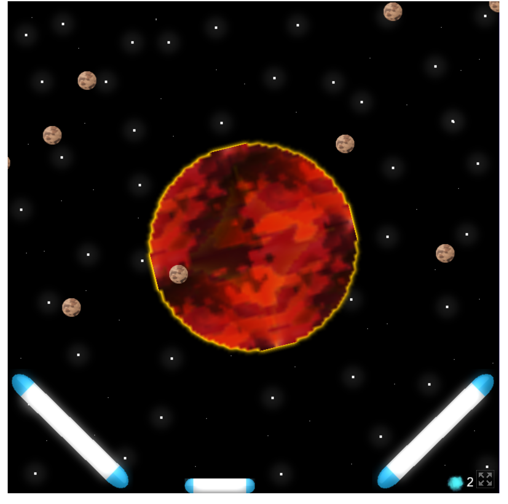
I love the animating planet bar at the top, looks great. Feedback is good, stuff like hit sound and changing enemy color on hit. Walk animation is nice polish. Good difficulty progression with increasingly dangerous enemies. One minor nitpick is the end level sound was a little comparatively loud but overall you did a great job.
Fun game, good use of the theme. Visuals and audio are both good, I love the background track. Various pieces of visual polish were nice like the little hover anim on the ufo, the eat/death anims on the plant, and the leaves growing out of the plant vine.
I would consider replacing the background rocks with some other distinct sprite. The game initially felt impossible to me because I assumed I also needed to move around the background rocks.
Fun game, I liked the power scaling. I always love when you can customize how your power up so you can try silly spiky glass cannon type builds. The early game is a little rough but when you start to power up and have a huge fleet you feel nearly invincible. But that hubris got me killed in the end.
Nice game. Drawn skids on road were nice and being able to see and race against my ghost made me want to play again a few times. Leaderboards are good for this replayability as well. Even after a bunch of tries I couldn't get close to those people in the 7's though, looks like people out there are much better at this than me.
One small issue I ran into is the accelerate sound kept playing when I went back to the previous menu. Also, connection to the theme is pretty indirect.
Outstanding entry, very fun. I played it quite a while to the point where the costs started getting ridiculous.
Only suggestions/points of feedback are on relatively minor things. It would have been nice to be able to remove/overwrite a tile and also a color change or some other indication of what tile I'm about to affect would be nice -a few times I placed a tile in an unintended spot.
I like use of the theme in that just using one element alone is pretty ineffective. The spray and on-hit visual effects look pretty good but in general I would have liked more feedback and insight into what's going on.
As an example, it seemed like there was an ammo system because my sprays eventually started slowing down but I couldn't tell any indication as to how much ammo I had left or how fast it was recharging or anything like that.
Animations and stuff like shadows look good. Good use of theme, I was interested to try out all the different spell combos. I might just be unskilled but I found the difficulty curve to be pretty tough. That first win took me a while to get then subsequent wins were a bit easier having elemental powers. The final boss is then a good challenge, i was too scared of starting over to actually fight head on - i just stayed safe at mid range and hit him with spells.
Visuals are great; beyond the stylized 3d look, things like the start screen and level switch animations were excellent. I only solved the first room but very satisfying when I thought to check the last place and everything fell into place. The discrete almost tile-based movement works really well for this because there are a finite amount of 'screens' the player has to check for clues.
Creative idea, I really appreciate that careful consideration produces much much better outcomes than mindlessly slamming down puzzle pieces that fit together. Default music volume is a bit loud, I had to turn down my browser volume.
Also very minor thing but just fyi seems to be some visual artifact on puzzle pieces in my placement option bar to the left maybe some scaling issue on 4k monitor. 
Nice! Yeah it's not set up very well now, it's just mindlessly increasing the amount of stuff it sends at you over time. And there's no winning/losing. I definitely plan to continue this project. At least get it to my original design including things like machines costing money, earning money, and smarter enemy spawning but I probably will continue to take it even further. I dunno, some future work for sure. I'll see how much it ends up being.
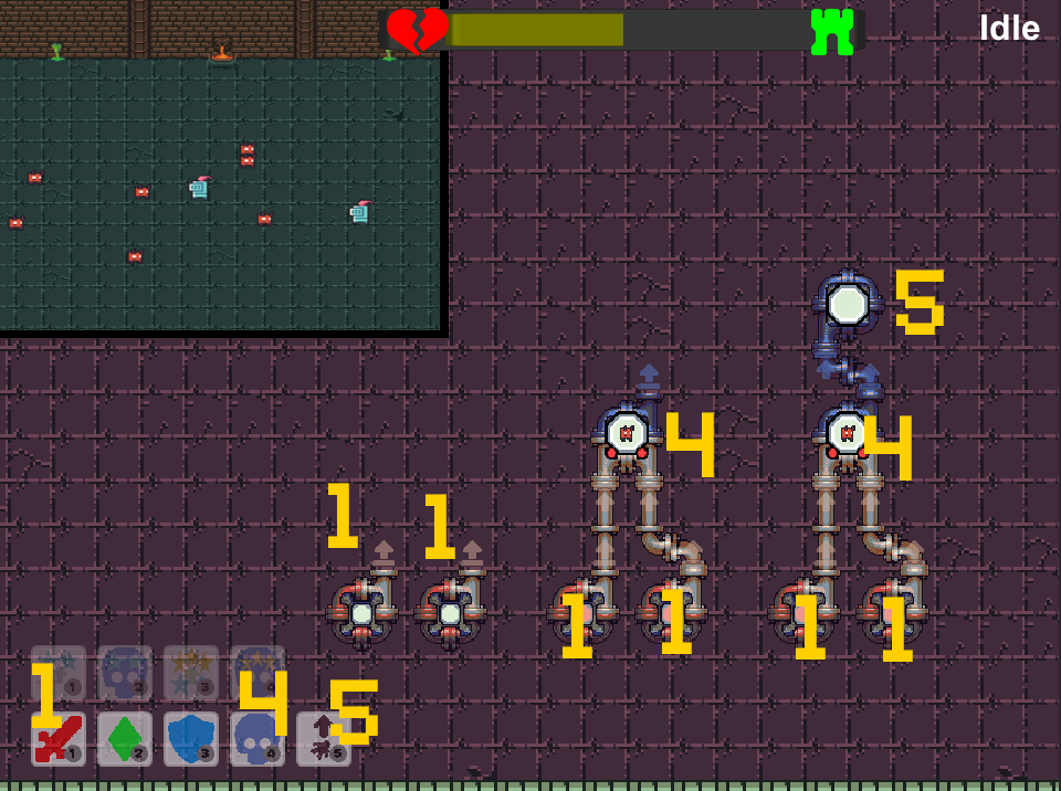
Thanks for giving it a shot, here's a screenshot that tries to explain most basic setup to send monsters, hope this helps. Would have liked to do a tutorial given game complexity but ran out of time unfortunately .
Press 1 to place down some essence machines and 4 to place down a combiner. Click the output ports on the essence machines to connect them to the input ports of the combiner. Then press 5 to place down a teleporter and connect the output port of the combiner to the input put of the teleporter. If you see a monster flickering in the teleporter, its working. Every flicker is sending a monster to the battlefield.