Thank you! :)
rainedoe
Creator of
Recent community posts
Thanks for the feedback! Part of the fun of the puzzle, in my opinion, is decrypting the vague instructions. Where I personally think trouble comes in is in which instructions the player should be focused on. The book was originally going to be chapter-locked, so the instructions would still be somewhat vague, but at least give a more clear idea of the instructions the player should be currently focused on.
None of the extra bits (the seal, the safe, the microwave) should have any effect on progression! They're just unwired bits that were originally going to be parts of the puzzle.
Thanks for playing!
Cute visuals! The game is really slow and I wasn't sure what to do about enemies. Not really understanding what the damage command does. I feel like the core mechanic could be pushed a little further. As another commenter said, queuing up commands and then running them could be a neat little gameplay loop. Right now it feels more like a platformer that I'm only technically controlling indirectly. Still, there's a lot of effort and charming visuals here. Overall good job!
Really cute game! Standard advice for pixel art games is that if you're doing pixel art, keep your pixels a uniform size. For the most part you do, with some exceptions in the UI buttons. Because the hero made it to the goal on the first level, I somehow got the impression that my goal was to get the hero to the end, not to stop them. Once I realized though, I quickly started to understand what I was doing and had an all-around good time! The only thing I could really complain about is that the pace is a little bit slow when it comes for waiting for the hero to travel. Other than that, good work! :)
Extremely charming little game! I really enjoy the visual style you were going for. In order to achieve a more uniform visual style, I'd highly recommend aiming to make all of your assets the same pixel density - As an example, the characters have pixels maybe ~5 times bigger than some of the background elements, and the crosshair has big chunky pixels the size of the tax collectors! Godot has some great tools for scaling your game up in resolution, so a good approach would be to build your game at a low resolution, then scale it 3-5x up (depending on what looks best and how high or low-res you want to make your assets), then work from there making everything a uniform size! This goes for fonts, buttons, UI, assets, the whole deal. The nice thing about this approach is that you can use those procedural lines that you have for the roads and they'll be appropriately chunky and pixelated.
The other commenters have brought up most all of the other critique I would give. Cool concept and fun execution!
Appreciated! Glad the influence shows. We were originally debating if we should even have it set on rooftops and make the lanes be different roofs that you could jump between! Would have been a bit bonkers to build and make look nice/natural, but it definitely had its' influence on the design. Thanks for the compliments on the art!
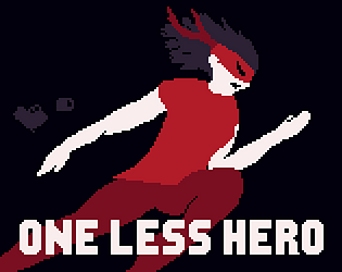
Oh, one last quick comment about your main menu: I think you did a solid job with the character pose, colors, and details, but consider giving your lighting/shading a little more love! Some details such as the shoulderpad and body armor come across as a little flat because of it. I think it could go a long ways in really improving the appeal of your design!
https://saint11.org/blog/pixel-art-tutorials/ As a general reference for learning more pixel art design concepts, I always highly recommend the tutorials of the wonderful Pedro Medeiros.
Best of luck and keep at it!
Very nice game, impressive scope for the length of the jam! I was impressed by the graphics, very consistently high-quality stuff with nothing that stood out as particularly bad at all. Your animations were especially nice! Great idle, jump and attacks for the main character, and the quality extends to every character and environment design in the game!
The levels got a little repetitive in the types of movement there was to do; Most of the moment-to-moment obstacles were either dash to a platform, fight (or run past in my case) an enemy, dodge a spinning axe, or jump a gap, with each screen being an ever-so-slight variation of the same few scenarios. Tough to say what could be done here; Feels like a quantity over quality issue, so perhaps focus on a tighter level design, introduce a unique movement mechanic of some sort that allows for more unique scenarios, or ensure there are less identical scenarios in the levels in general. It's a big challenge for a game jam for sure, and what is there is still perfectly serviceable.
It was somewhat strange flow-wise to be taken back to the main menu after each boss fight, instead of just moving on to the next level.
The last two boss fights in particular were kind of tedious, with them all feeling like they all needed to be cheesed in some way. Not too big a complaint there considering the fact that your game even had three separate bosses, with varied attacks and designs for each one! I think it's just something that requires more playtesting and time to develop workarounds to those issues.
Overall, your game is a a fun, well-polished project with a clean, effective visual style and an impressive amount of unique content for the time it was developed in. Great work!
At first I was slightly turned off by the graphical style, but it quickly 180'ed as I saw more of the world! It's extremely charming in a strange way, like a detailed, well-colored MS Paint drawing come to life. I would definitely be interested in coming back to explore this game some more or see it expanded on further!
The movement is a bit slow, perhaps a run could be beneficial here. It's also a little bit difficult to distinguish what is and isn't a platform that I can jump on. I'm also struggling to see what my exact goal in the world is. I very much enjoy just roaming around in this world though, lots of interesting animated details and eye candy. Overall, very unique game!
Onboarding would have definitely been nice to have. A player skill would be neat though! I actually added the gun breaking animation at the start specifically so that it wouldn't be implied that Red has that for the gameplay. Making me actually really feel a version of this where you could take down the hero could be interesting...
But alas, the jam has come and gone! It's on to the next project from here. :)
Thanks for the kind words, and thanks for playing!
Your game has a fun flow to it! It could have helped to have some way of displaying the hero's intent so that you could more effectively plan around them. It would also be cool to see more options for methods of blocking the hero, maybe letting the player place more varied types of obstacles! It's a pretty basic concept, but a neat idea for a puzzle.
Oh hey, you're the person that posted that super charming shopkeep gif in the discord a few days ago! You're really underselling yourselves with your thumbnail and game page, your artstyle is phenomenal and that low-res snippet is completely failing to sell that fact!
It took me a few minutes to figure out exactly what I was doing in your game, and for that purpose some sort of onboarding process with some dialog about what's going on could be helpful. Once I got going though, I found myself in a pretty satisfying flow state with your game.
Well done!
Oh, this is cute! Some great personality on display with this game, especially with the music and sound design. The relationship between the characters is really fun, I hate the knight in a love-to-hate kind of way. I really enjoy the looting/backpack idea as well! The one thing I found myself sort of wishing was that the inventory could be managed with keyboard instead of mouse. I think the concept has a lot of potential though, and I would love to see what your team had in mind for the full scope!
The color palette is fantastic and the art is super charming. You actually inspired me to make a new thumbnail for how eye-catching yours was!
The concept of the game itself is pretty fun, though the gameplay was a bit dull for the first few levels. It picked up in to a fun healing puzzle as new mechanics were introduced though! I also find myself running in to an issue where my spells stop working. Overall though, really well-executed and cute experience! Excited to see more games with art from you in the future!
P.S. Maybe do an HTML 5 embed in the future? Those tend to be the most accessible in my experience. (Won't affect my rating of your game though!) I'm mostly checking those out first, but I figured with your post in the Discord being pretty inviting I'd come and give it a fair shake!
This is really cute! The storyboard at the intro was super charming. The gameplay is really creative as well. I like that part of the difficulty comes from trying to even focus on your party to heal them. It's a little difficult to tell if I'm actually about to give focus to a character, and some of the spell icons can go off-screen at times. Those minor gripes aside, good take on the concept! :)
The monster adds some great tension, and the spatial audio really enhances it! Really enjoying the world-building as well. Needing to start all the way from the main menu when I die is a little tedious, but it's a small nitpick! Didn't get to finish the whole thing, but I'll likely be back before the end of the jam to give it a full shake. Overall a great experience, well done!
Oh, and the butt wiggle. Whoever put the butt wiggle on the main character is my MVP.
I like the idea! Something about the complexity of something so mundane like quest management is super charming. I'm finding myself really rushed though, and struggling to figure out exactly what I'm doing. I feel like with some more polish for user experience work, it could be a really interesting papers-please-esque experience!
Awesome! I could definitely see myself getting invested in a longer-form version of this game. Some polish definitely needed with the movement, especially with the wall-jumping, but the grapple hook has some great potential for interesting platforming! Beautiful concept, would love to see it expanded on.


