Play game
Only Down's itch.io pageResults
| Criteria | Rank | Score* | Raw Score |
| Theme | #65 | 4.000 | 4.000 |
| Graphics | #76 | 3.933 | 3.933 |
| Game Design | #104 | 3.567 | 3.567 |
| Overall | #115 | 3.456 | 3.456 |
| Fun | #121 | 3.467 | 3.467 |
| Innovation | #245 | 3.033 | 3.033 |
| Audio | #392 | 2.733 | 2.733 |
Ranked from 30 ratings. Score is adjusted from raw score by the median number of ratings per game in the jam.
How does your game fit the theme?
Only Down follows the Diving Deeper theme through digging downwards, towards the core of the earth.
Did you write all the code and made all the assets from scratch?
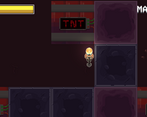
Yes I wrote the code, and did most of the sprite work, while my sister helped with the sound FX and the TNT sprite work. Everything was from scratch. :)
Leave a comment
Log in with itch.io to leave a comment.


Comments
Really polished and good game. The idea is great and works really well. The controls did feel a bit floaty but with a bit of practice I got the hand of it. But otherwise, the style is great and it feels really polished and fun to play, Good work
The game is pretty fun, especially when you get really fast and break many different blocks without fails, but I ended up quitting at the inner core level, it was too hard.
But, the best strategy ends up being pretty much just, hold down, chance tool, tank 1 dynamite, and dodge others, especially because you need to be so fast and that minimizes movement, and that's not as fun as planning.
Then there's way too little sounds, you should add: getting damaged, dying, maybe speeding up down, going really fast down (like wind or something), tool chance, retry and menu button click. Maybe there are others too, but those I could hear were missing.
Then some of the sound that you do have, have a lot of noise, so you should fix that by using for example Audacitys noise suppression, or something else if want, that's just what I use.
Then you are missing a lot of feedback for when getting damaged, that sound effect, camera shake, and maybe like a red flash of the screen.
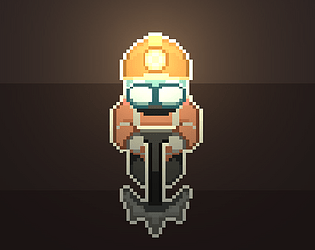
Then the art is really inconsistent, I can see you use assets, the ground and player have a very different style, also there's so many DIFFERENTLY SIZED PIXELS, please scale all pixel art the same size, it's gonna look 10x better, please just do it.
Also a trick that I tell everyone, please use post processing, bloom and vignette will make the game look so much better.
Good game
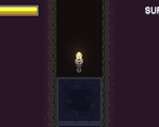
Switching tools depending on the block is a nice mechanic, the heatstroke mechanic is a great way to keep the pressure on the player to go quickly as well.
Some music would be a nice addition!
Great idea! Very fun to play
Fun game. Great graphics. Only wish there was a key to toggle tools on the keyboard.
fun game!
Pretty fun.
It's like the idea that i had for my game, only better!
Nice entry!, the player is too slippery and tool swap should have only been with the mouse
Very nice game overall. I wish it included BG music as well.
Ty! Yea... Music is smth I'm considering spending more time into!
This game was good. I honestly wasn't a big fan of it. The item switching mechanic felt to clunky and could have been just one button press to switch instead of two different buttons. I also felt the player was a bit to slippery for this type of game, I feel it would have been better if the player just snapped to the different rows of the mine. I honestly really like the idea but just the way it is in this game just felt not that good.
thanks for trying it out! The idea of making the player snap to different rows never came across my mind :0 It's honestly a really good idea. If I ever work on something similar in the future I'll be sure to experiment more on the player controller :)
Fun different idea. Nice graphics. Keep it up!
tyty! Definitely will!
Fun lil game, I loved the art and also the digging deeper mechanic was really well implemented. Having to switch between a spade and pickaxe was a nice touch.
ty! Glad you enjoyed the game! ^-^
Pretty nice game! Simple concept that works great and youve got some depth with it with the stamina, tool switching, and tnt. Something that definitely was missing was some music to jam to while playing but was fun to go through and had a nice level of challenge
Thank you for the in depth review! I really tried to focus on overall fun and challenge with this game jam so I greatly appreciate it :) music is definitely a feature I'll put more consideration into next time!
beautiful drawings
Thank you! I love to draw so it's a relief that it turned out well!
Good looking game and an interesting gameplay idea
Tyty, glad you enjoyed it ^-^
Pleasant Experience. Nice Game!
Pleasant Experience. Nice Game!
Ty for trying it!
Pleasant simple graphics and simple gameplay though there is a lack of music
haha yep, definitely something worth considering for future jams. Music is for sure one of my weaknesses x.x