Indie game storeFree gamesFun gamesHorror games
Game developmentAssetsComics
SalesBundles
Jobs
TagsGame Engines

Raychop

39
Posts
65
Followers
53
Following
A member registered Jun 14, 2019 · View creator page →

Creator of

Recent community posts

Hey Finn, first of all, thank you on behalf of all the team for your kind feedback !
To be honest with you, this project was made in one month as a student team.
If we had more time, we would've added some computer AI to the game, but sadly its unsure for now since we will be moving on some other game projects in the near future.
About the controls, we assume you talk about the keyboards configuration: they can sure be a little confusing, especially on a WASD keyboard !

Again, we are really glad you liked the game, it makes us proud of our work to see people enjoying the game and express it !

Old school manual was... hecking cool ! I love to see this kind of details.
The combat system is interesting. The use of dice kinda reminded me of Dicey Dungeon, even though they are using them in a different way than yours.

I think I didn't play enough to see all your work on the game, but I already think it has a great potential as becoming a really cool project !

My only gripe is that the full game is not totally in 64x64 (the character is not snapping to the grid, for example).

But that doesn't alter the experience at all.
So, count me in for future updates (if any) !

Really cooool ! I wish there was more, or maybe a boss, to conclude the adventure !
The grapple took me some time to learn, but it is definetly satisfying to use!
I loved pushing the enemies, it was a really cool touch to the game and made the whole universe more tangible.

I hope there will be updates post-jam, I will be here for sure !

Hi, thanks for playing the game, and for taking the time to review.

The gameplay is indeed the main flaw here, and I'm really glad you put your criticism were it needs to.
We are willing to improve the game, and comments like yours really help.

There is indeed an hidden stats system, as well as a priority system (which helps the AI deciding when 2 different target are in range), but the lack of other interactions make the game quite repetitive.
About the slow-pace of the game, we are definitely reducing the time each IA turn takes in the new builds. And about the diagonal movement, its something we though about but I still need to discuss it with my team : it would change quite radically how the whole game is played.

Like you said, in 48 hours, we really had no time to fix the IA or to add more interactions.
We are currently working on a new IA and special abilities for differents minions and adventurers, as well as the ability to upgrade and evolve our minions.

Anyway, thanks a lot for being impartial as well.
After some major update, I would love some criticism from first version players, I hope to see you around when the time comes :) !

Super cool !

I really like the fact that you took the time of implementing the discord-inviting tool!!!

Loved all the super-powers. Like all reworked-chess games, it sure needs some balancing but it is already pretty cool and enjoyable.

Quick question : does the checkmate take in account the powers effect ? It's quite hard to do IMO : I already done a reworked chess game and it was a pain. I would be amaze if that's the case !

Really cool ! Good job on the atmopshere and pixel art.
I still think less ingredients per recipe and/or less recipe per floor will lead to a more enjoyable learning curve of the game : actually it's kinda rough.
IMO, icons on the crates will not only smooth the curve, but will also change the whole challenge of the game quite significantly : I though of memorizing the ingredients as a part of the gameplay.

It's up to you to decide on the modifications post-jam, but I will definetely give it a new try after a few updates (if you plan to do so !).

Well done !

Thanks for your kind comment, really appreciated! 

Yes, we made the game during the last week-end only, but we are quite experienced jammers and we were using some optimized-for-jam tools our main programmer Mahjoub is developing. 

I also participated to the last LOWREZJAM, so I knew in advance how to initialize quite a few things needed for this jam.

This whole setup really helped us a lot in speeding the whole process. 

(2 edits)

Nice game with a simplicity that defy everything while doing the job.
Like many other player, I think a mini-map and at least a probability to dodge some encounters could be a really cool addition to the game. Because you made some "stronger" mobs than the other, maybe giving to the player the ability to evade the fight with weaker foes could be cool (obtained after a few first fights).

Thumbsup for the technologies used as well !

Really cool. A lot more contents than I expected at first, it was a nice surprise to me.
Love the system of "The enemy move after you move". Reminded me of Pixel Dungeon.
We tried this kind of system before obtaining the final Turn-By-Turn system of Monster Master.

Great work (and bonus point for using pico-8 ^^)!

Nice game ! The less-or-more trash behavior of everybody in this game (including the player) as well as the "Office theme" and the pixel art scale of all characters kinda reminded me of Bitmuch, a really trashtalking french web serie with quite a special (but hilarious) mood ahah ^^ ! (sadly, there is only a french version, but maybe the visuals can get you an idea ahah)

Everything worked pretty well : every pickup is intuitive to find and the beginning of the story is pretty straightforward, but it's what you want considering you can't have too many text.

Also, more important, the story have a nice little ending like I expected from a story involving time travel !

No apparent bug, well polished and functionnal game. Pixel art was on point.


I think you expected that, but my only criticism is the absence of sound effects. Point-and-click games with FX tend to be more immersive, and you can use it in your LD to guide your players in many ways.
It could be a nice addition post jam !

Great game man. Impressive for a solo project, really. Be proud !

(3 edits)

First : this comment is what sold me the game
 
Second : I successfully inserted the sausage in every bun. I'm glad your game gave me the occasion to say this wonderful sentence by the way.

Third : this game is absolute genius. Taking this optional theme and turning it into a refreshing little game with a lot of Game and Level Design skills involved : I'm simply amazed ! Even tho I feel like you maybe could have put more details into the sprites, letting the player imagination interprets all of this may have made this even more disturbing ahah.

Great polish. Will remember the LD for sure.
Cheers to all the people involved, be proud of your work!

Great game ahah, some real addictive potential ! The sound design really added something. Especially the "YAAAAAAY" ahah. Caught me off-guard the first time xD

My only and very little criticism is that, even tho the music is really awesome, it is quite erased beside the general sound effects. Hopefully, you had an option to desactivate SFX :) ! Appreciate this kind of little details.

I was waiting for an easter egg if we try to go in space by ourself directly from the position of the spaceship ahah. Or maybe I didn't go high enough ^^

Even tho this game is about going inside the earth, the spaceship and the color used reminded me of the old "Into Space !" flash game.

Good submission !

Magical, already one of my reference for this jam.
Usually I try to give some advice with the little knowledge that I have, but I'm speechless here.
Great experience, less pixels than most of the other games but can tell a lot. Every detail immerse us in the story as well as making the imagination working.
Wonderful game.

(1 edit)

This game is really really cool !! Maybe one of my favorite for now.

Easy to learn mechanics, but not forgiving in any ways. A few colors, but well choosen and well used to convey the correct ideas at the right time. A sound design with a consistent quality : conveying the information quickly, that's all you want here. Great music !

I love this kind of challenging game and without arrogance I think I'm not bad at boss rushes in general. But here I really think the difficulty come primarly from the blocking-movement blocks spawning at the same time as a really wide attack. If you coded some pattern to come randomly or semi-controlled (random patterns coming by pairs), it is definetely causing some problems sometimes.


Boss 1 is no real difficulty, and I've beat it after 2 attempts. A really good intro.
The skeleton is just a matter of playing safe, but really cool mechanics that challenge the player's greediness ahah !
Boss 3, is for me, a real big deal. The problem I evoked earlier happened to me every time even tho I played as safe as possible : never taking the attack unless it was 1 block away. I kept getting stuck in a 1 -tile way while the really wide attack of the boss arrived (the one with only one column staying safe).
Of course, I think a lot more people could have beat the game with more training on it, but not everybody has the time, especially in jam and with so many games to test.

I guess this scaling of difficulty was wanted, but you have to answer yourself one question (if you haven't yet ahah) : do you want a lot more people to go through the whole game and see the result of all your hard work most of the time, or do you want people to stay on your game, trying to overcome the challenge and loving the game through "the wall" it represents ? I think both strats are good, it depends on your objective.

If this difficulty was not wanted and you realized it by the feedbacks the players are giving you now, then you have made something everybody (including myself) can make : playing your game over and over while developing it, thinking it's "quite easy" at the end and overestimating how you step-upped in your own game all this time. I made this mistake last year while level-designing Periapsis for LOWREZJAM 2019, and the submission comments can attest ahah ^^.

Again, sorry if all of this was obvious for you, but seeing it was your first finished game I tried to make a contribution ^^. I didn't try to sound arrogant or what so ever, and I have not many years of experience in GD. I only hope all of this could be useful to you.

To finish, here is an idea of mine to engage the players at overcoming the challenge : when you die, the game propose you to make/generate a screenshot of were you died, and your score. It's sometime seen in little boss rush games, and it is engaging people in sharing their scores !

Great game, be proud of you !

Wow, thanks a lot for your warming comment. I'm so glad you found, played and liked the game and I'm relieved that our project can be appealing to some people outside the jam!

After the notation period of the jam, we will definetly add more contents to the game (minions, minions upgrade and more adventurers, as well as maybe bosses) and improve the IA.

Adding some cinematics to replace simple texts will also surely be on our list at some point.

I will post some proper devlogs each time we are updating. If you are interested in playing it again when there is more content, please consider following : having some criticism from first version's players will be quite cool! 

Cool game! I love playing games that risks the challenge of using 3D in Low Rez Jam. 

Really cool idea, no game breaking bug and good art! 

I did have some struggles with the UI at the beginning. 

At some point, I didn't know what to do next as everything was stabilized, so I just watched the cctv (really cool feature btw, expanding it with some interaction inside the different views would add more deepness to the game IMO). 

Is there a " Win ending" to the game or is the endgame just for starring at our creations ?

Anyway, sadly I didn't have an audio output on the device I played, so I didn't rate it for now, as I really feel I missed a part of the game. I will come back later for this.

The concept is great, and the use of 3d is always appreciated.

Congrats !

Thanks for playing and reviewing our game, jujule! 

We are pretty proud of how it turned out indeed :D !

Actually you can move your camera by selecting the button of an already summoned creature. It will move the camera to your selected minion. But yes, that's the only way to move the camera, and we may add more freedom to it in later versions!

(1 edit)

Thanks a lot for reviewing the game, the quality of your work is crucial in making this game enjoyable! 

Yeah our sound designer and our composer really done a great job, I especially love the level1 music!

About the strategical aspect of the game, I'm not sure myself what you imply. If "Rock paper scissors" method imply that one monster counter another, that is not the case. We have a character sheet-like system and the IA checks th opponents stats to make a decision. Even so the AI is actually kinda straightforward, it will be improved in later versions right after the jam (as well as the ability to control your monsters a little). 

About the levels, me and my friend are eager to add more contents to the game, including more levels. Procedurally generated enemies squads and random obstacles inside the rooms will surely be on our list.

When any first major update come out after the jam, we will let you know! 

Minimalistic, but the art was really really on point !
Such easy taking and relaxing games are always refreshing.
Even though, I couldn't figure out what to do beside dying while trying to feed the village. Quite confusing, I'm guessing there is other endings but I can't find them for now ahah.

Anyway, well done and be proud of this little piece of art !

Pretty little game. This music track is AWESOME. Like really. Completely conveyed the "LIL' PUP" vibe. The gameplay is not the most complex, but it's what make it enjoyable for me : it's refreshing alongside the other complex games  !

Well done :) !

Cute atmosphere (both in art, music and story), outstandingly easy-to-learn and relaxing gameplay.
The story beginning, art and feel kinda reminded me of the last year winner, Memories. Also instantly had a cozy feeling : the enjoyment of messing around and really taking time for me through a game.

Really wonderful, I will come back later with more time to finish it (a possibility to save will be appreciated in a later version).

Oh and a last thing : the fishing notes on the desk with all the catches and the drawings really showed me how much investment you have put in this game. The details are nice (the weather, the changing lighting depending on clouds, the waves animations), and the quality is pretty much consistant.

Well done !

Nice little game with a good "old school" feeling ! The gameplay is working, and I didn't encountered any game-breaking bug. Figuring out what to do and what were those things in the UI was a hard time, but it finally went pretty good after a few minutes (I still needed to recheck the keys 2 times).
I couldn't finish the game, but with a little more playtime I think it would be less a problem. Maybe I will give it another try later on :) !

Really liked the music btw, really fitted the theme. And the pixel art assets were nice, even more for a first released game !

Here is some things from my playthrough that could be useful to you :
• I'm european, and I have an AZERTY keyboard. It is often underestimated, but it could be an instant stop for someone that don't have a QWERTY key configuration installed. Luckily I had one. On your main menu, making a click/space bar switching between the two key configurations won't take too much time and could be useful for accessibility.
• I think you already know it, but a few sound design could be a cool addition in your game. If you want to create your own, BFXR is quite common for a lot of pixel-art jam games. 
• Like I said, I had a hard time figuring what is what in the UI. A little sound effect when picking pick-ups will lead to a way better understanding of the UI, for example. Joined with a temporary white outline around the UI square where the item is stored, I think it will be really efficient.

Of course, this is my own opinion, and I think you would figure out other things while letting the others play.
Sorry if it's obvious for you, but don't hesitate to make your relatives play the game : casual players will have a really different approach than an experienced gamer/developper, and it could help pointing the flaws in your GD/LD/UI designs.

Well overall be proud of you, that's some nice work for a first released game !

(1 edit)

Hi, Aleksandr, I discovered you with this pack and instantly fell in love with the sheer quality of your work. I spotted this pack a few days before the LOWREZJAM 2020 (that I attend each year now) and thought it was truly fitting considering the specifity of this jam.

And now here we are, with a game we made in 48 hours, and we are still willing to improve it (after the notation period) to add more and more of your creatures as new minions, opponents, bosses... (they are all kinda meatsacks in this game anyway ahah, except the lich of course).

If you have some time, it would be great to have your honest opinion on the game !

https://raychop.itch.io/monster-master

Thank's man, that's lovely ! We are glad you liked the game !

We are aldready planning to polish and add more features to the core gameplay after the notation period of the jam.

Hello Jonathan, I'm really happy that you played our game. 

Thanks a lot, your comment is really cool. 

About the UI, I heard about a similar solution than yours, but it was way too late for me to program. 

Also, I think we got this problem last year too with Periapsis, but our UI assets were already at a convenient resolution so we couldn't see it. 

Your game looks really good, and I'll definetly play it this evening.

It looks like you too step-upped a lot in one year, and I can't wait to give you my thoughts on your game :) ! 

Thanks for the comment, it's really appreciated! 

I personally do not have any flickering in the HTML5 version, but I tested the executables and sure they are fine! (normally)

Thanks for the kind comment! We are really proud of the state of Periapsis we were able to release! 

Thanks a lot for the kind comment! We enjoyed making the game, and seeing that some people like you enjoyed playing Periapsis is the greatest reward we can have! 

Thank you very much for playing ! We really appreciate that you enjoyed the game !

Due to the 64x64 limitation, we thought of a way to measure life points by another way than a classic life bar : actually, if you didn't notice, you can see your life points by looking at your ship; 1 engine is red: you were hit once, both engine if you were hit twice and the cockpit is red if you are at the limit of explosion.

However, I agree that it can be hard to see that if you stick to the bottom of the screen.

Thanks for reviewing the game, we really put our heart in it. Indeed the game is really hard sometimes. I only had a few peoples testing before the release. It's sad that some people can't finish the game to watch the beautiful end-cutscene made by my teammate! 

I don't know where you were blocked, but be sure to play the Mars level, it has something really special! 

Anyway, Thanks again for playing! We really appreciate that you enjoyed the game. 

Very cool game, with a very nice (and scary) transition ! I loved the voice acting and how you played with sounds ! It adds so much to the game !
I honestly really enjoyed playing.
Good work ! See you in jams !

Thanks for your comment, we're really happy to hear that! We're not professional pixel artist, the fact you liked the artwork really please us! 

Yeah, you pointed out 2 important problems in the game. The attack action needs some polishing, and the values that affec the sanity bar need to be reworked. We are actually regrouping the littles flaws in the game and we will correct them in an update when the rating period will be over. We will surely add some new features too.

Thanks again, your kind words and suggestions were really appreciated :) ! See you in jams! 

Wow, thanks a lot for your comment! It really makes us proud of our game!

I'm on my 3rd game jam personally, but I improved my C# and Unity skills during a recent internship in a company. Mahjoub has already more GJ behind him as well as kamj! Our sound designer, Sojzi, is on his first time! 

About the art, its in majority Mahjoub and me on it, but we're not professional pixel artist at all. I guess a lot of practice is always the best for art and programing :). 

I'll also review your game, and let you know how I experienced it! 

Thanks you a lot again, see you on next jams!

(1 edit)

Thank you a lot for your review. It's always really enjoyable to see that people are receptives to our creations.

This game was pretty funny to do, and focusing on the cute design in the bedroom as well as the nightmare design was a great exercise.

I saw your creator page, and personally loved your 1vs1 duck fighting game! I think me and some people of the team should appreciate doing some jams with you at some point. Especially for your impressive pixel art skills! Contact me back if you want to discuss =)! 

Good concept to "face your fears" ! Really liked this, really fitted the jam !
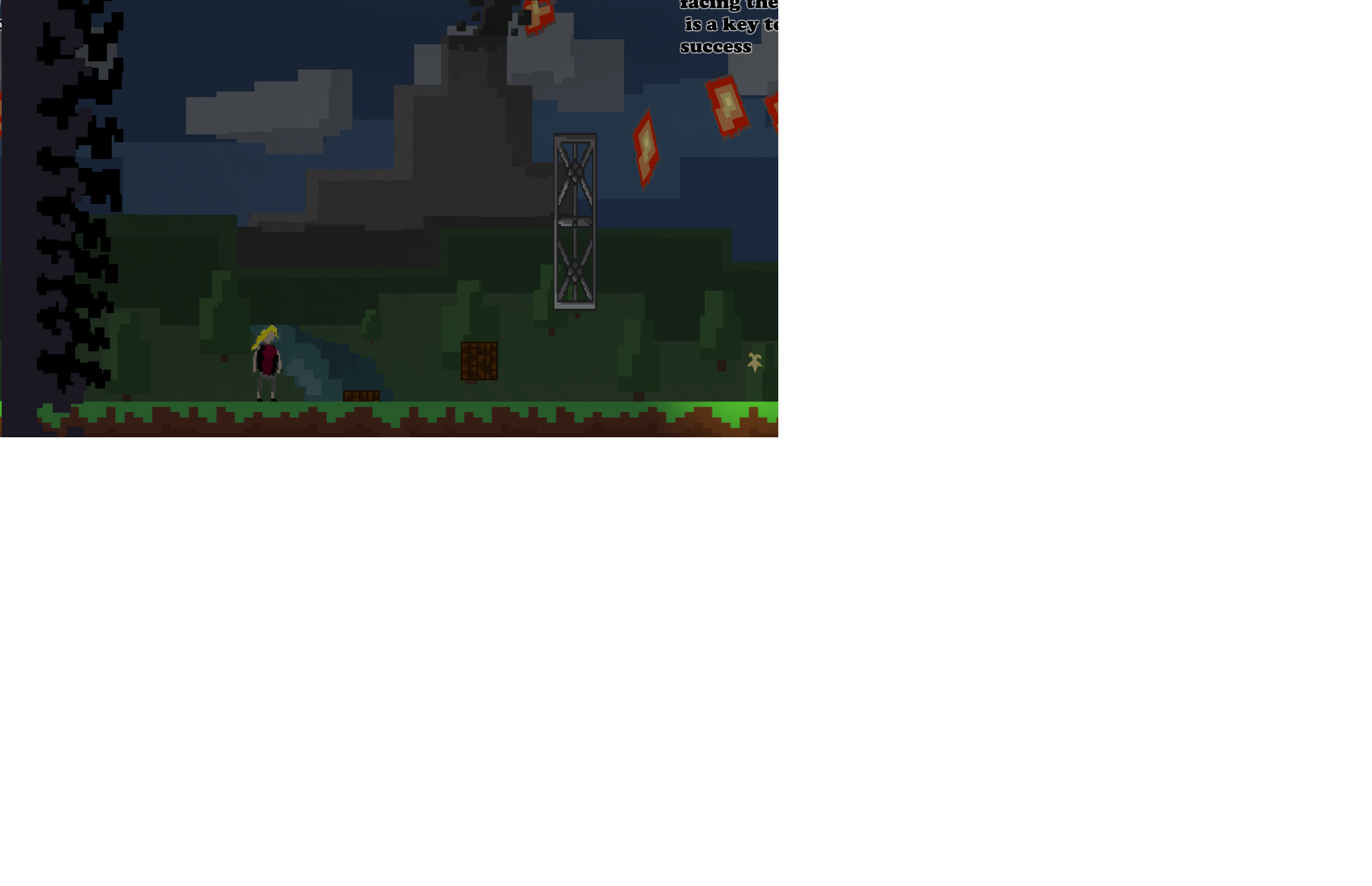
However, I understood with screenshots and other comments that you introduced mechanics in a fun way, like "face your fears", or "it's better to forget sometimes" (to introduce the fact you can't collect all coins in some levels, thing that i really liked), but in my playthrough I wasn't able to read them all (see my screenshot below). If you are using Unity, maybe it's because you are placing your rules in a Canvas, but clearly you need to change the parameters of this Canvas for it to be able to display all items perfectly like it's showed in your editor, for any type on screen. I'm on a 15'' screen by the way.

Anyway, really liked the concept, and enjoyed the game, even though the wall jump can surely be improved !
Good work !


DreamCatcher_Rules_Bug

I'm on the same mood as Xanlosh after playing this game. I was wandering around for 2 minutes after collecting the orbs, wondering if there was a following. The concept can be easily enhanced : for example, the more orbs you collect, the more paintings go to life and pursue you.

Also, you could change the orbs for something with a link with art and paintings. That can be a brush, or even something more interesting : a little sheet of paper with the description/meaning of the painting it awakes (to link this idea with the last).

Anyway, it was just some suggestions in the case you are planing to continue your game.
However, good work, enjoyed the game =) ! Hoping to see you in future jams.

Yeah, we'll do this as soon as possible.