On Sale: GamesAssetsToolsTabletopComics
Indie game storeFree gamesFun gamesHorror games
Game developmentAssetsComics
SalesBundles
Jobs
TagsGame Engines

Redoxeide

117
Posts
22
Followers
A member registered Feb 17, 2021 · View creator page →

Creator of

Recent community posts

Very cool idea!

I would suggest letting the player interact with the stuff that appears and disappears. I am not sure if there is an ending to the game yet, but you could use these interactions with objects to create one if there is none. It could make a very entertaining story/game!

Very nice game! The atmosphere is pretty good as well as the graphics! My only feedback is that I think the tools would benefit a lot from having animations. Also, the sound effect when replacing the light bulb felt a little delayed.

Nice job!

The gameplay is fun. I enjoyed the combat, especially the variation between enemies.

The only thing that felt weird to me about the controls was the dash. I felt that it was a little too long, especially since the player can't change direction while performing it.
Other than that, I had fun and managed to beat it after many attempts!

Very good use of the theme and restriction of zero UI.

The flashlight felt a little weird at times, like it wasn't really being pointed at where I was aiming, and the camera was a little buggy when changing to the daytime scene, but other than that, very well done!

Thank you for playing. That was the original idea but it changed after playtesting. It felt better to have some agency over where the attack was pointing.

if I had "nearest neighbor" selected before scaling down in GIMP the blurriness/etc. would not have appeared?

Correct, you would not get blurriness, but I would still advice trying to draw your sprites at their final resolution and avoid scaling them altogether.

how did you decide on a resolution of 480x270?

So, 16:9 is the most common aspect ratio with 1080p (1920x1080) being the most common monitor resolution used according to steam. Your game's resolution is gonna depend on various things, mainly the kind of game you are making and your art style. For pixel art games you normally pick a low resolution that scales cleanly to as many resolutions that use 16:9 aspect ratio, especially to 1080p. Most common game resolutions for pixel art games are 320x180 and 640x360. I picked 480x270 because I felt 320x180 was too low resolution for my game as I wanted higher detail on some aspects of the game that I couldn't get with that resolution. I could've tried with 640x360 (might still try later), but I felt 480x270 was good enough for what I wanted to make.

480x270 scales cleanly (as in you multiply both numbers by integers) to: 960x540, 1920x1080, 3840x2160. So I got the most popular resolutions covered.

This video by AdamCYounis may help you on choosing a resolution.

how did you know to draw the sprites at 36x24?

I usually start by creating an image the size of the game's resolution filled with a single color that would represent the background of the game (green in this case). I then draw a sprite on a different layer of that image trying to keep it at a size that makes sense. For this game, I knew I would need to place many sprites of around the same size on the scene, so I drew the cow's sprite small-ish compared to the game's resolution. I populated the full image with copies of the sprite to make a mockup of how the game would end up looking. When I was happy with the size of the characters, I then just copied the cow sprite to a separate image of the resulting size (which was 36x24) and exported that image. I later made all other sprites using the cow sprite as reference for size.

You don't really need to confine your sprites to 8x8, 16x16, 64x64, etc. as modern game engines don't have problems with sprites of resolutions that are not powers of 2. There is a benefit to using sprites of sizes that are powers of 2 when it comes to texture page sizes, but I wouldn't worry about that.

game resolution vs. viewport vs game window, are those terms interchangable?

The game window is the final size that your game is rendered to. A game window with a different size than your game's resolution will scale or not scale your game's resolution to match it. Whether it scales your game or not depends on how you set it up. I don't remember for gamemaker, but in Godot there is a stretch mode and aspect settings that you use for this. On itch, the embed size is basically your game window size. For example, I chose 960x540, so my game is scaled to that resolution for the embedded version and, because of the settings I used in Godot, the game is scaled evenly without adding artifacts to the image. Note that the version of Godot that I am using currently has a problem with some web browsers (Firefox at least) and itch web embed, so it might pop-up a new window instead of playing embedded in the page. 

A viewport is an area of the game window where your game will be rendered. Generally, there is a main viewport that you draw your game to, and this main viewport can be composed of one or more viewports. For example when making splitscreen games, you can use one viewport for each player's camera view to be displayed.

Game resolution is the resolution of your main viewport, this will get stretched (or not, depending on settings) to the player's game window.

I know it seems complicated, but you really get used to it with practice. Just keep making games, following tutorials. and trying different things and you will get the hang of it.

I hope this helps!

When it comes to upscaling an image (making it bigger), your image editing software will try to calculate the color of each new pixel that gets added to the resulting image to make it bigger. These new pixels are calculated using one of many techniques, most of which add new colors or blurry pixels close to the edges of your sprites. This is normally not the desired outcome when it comes to pixel art. With pixel art, you usually want clean edges and to keep consistency with your color palette.

"Nearest neighbor" is the name of one technique that only copies the color of the closest pixel to create a new pixel when upscaling. This results in the desired effect of clean edges (not blurry) and an "unbroken" color palette.

You can read more about scaling algorithms here.

Now, I believe that for your game you may have used the scale property of your enemy objects to make them seem bigger. If this is true, this means that your game engine is scaling your sprites with one of the other techniques. To fix this, I believe GameMaker Studio 1.4 used to have a global setting to turn texture interpolation off, so there should be something similar for GameMaker Studio 2 if that's what you are using. On the other hand, if you are scaling your sprites before importing them to GameMaker, your image editing software should have a dropdown menu when using the scaling tool that lets you select what kind of interpolation to use. Simply select "nearest neighbor" when scaling pixel art.

Now, here is the thing, to keep consistency with pixel art you want to have the same scale on all sprites/images regardless of interpolation algorithm used. So, either scale everything the same amount, or keep the scale at 1.0 on every single sprite.

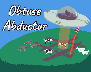
For example, for my game, I chose a game resolution of 480x270 and I drew all sprites according to that size; the cow sprite is 36x24 for example. All sprites are 36x24 but the entire game viewport is then scaled to the right window size keeping the aspect ratio during gameplay.

I recommend you watch this video about Inconsistencies with game art.

Also, there is this series of Pixel art classes by AdamCYounis that you can watch too.

I recommend both of those channels btw.

Hope this helped a little.

(1 edit)

Nice job!

As feedback on the graphics, the big character in the middle seems to be scaled differently than all other characters, which makes it look a little out of place. Try to be consistent with the pixel sizes of your sprites; it helps with the overall look of the game.

The "food" seems to be scaled too, but it seems to be using some kind of linear interpolation, which makes pixel art blurry. You may want to use "nearest neighbor" scaling for pixel art (or preferably redraw the sprite at the correct size, otherwise you get the same situation as with the big character).

I would also recommend being consistent with enemy colors. Either let all enemies use the same colors or have all of them use different ones. As it is, Wrath is the only enemy using a different color palette, which looks a little off.

Remember, consistency is key. Keep it up!

(1 edit)

Very fun game!

Shooting from afar is so satisfying. I also really liked the graphics and the sound effects, especially when getting hit. I also liked the detail of enemies destroyed far away making a different explosion sound.

As for improvement opportunities, I think the HUD could use a health bar, or some other graphic that better displays remaining health. Most of the time I didn't notice when I was about to lose during combat, so I wouldn't retreat and try to heal. You could even make the graphic shake and/or flash red whenever the player gets hit to add to the immersion.

Anyway, nice job!

Very nice visuals. The crt effect is very good.

I did manage to finish the game, but I did find the beginning to be a little too hard on the player.

I think it's very important to let the player get used to your game's physics and collision boxes before putting too many obstacles in front of them. Specially for the kind of platformer that you are going for. The first couple levels felt a little too hard in my opinion. Maybe, instead of having double saw blades first thing of the first level, you could, for example, start with single blades on the floor, so that the player can get used to the movement of the game.

The physics are not bad in my opinion. Maybe the player character could be a little less slippery on the ground, but I think it's fine as it is. I really think my only complaint would be the initial difficulty. Oh, and someone mentioned resetting level elements on player restart and I agree on that. I think resetting elements would let the player develop a muscle memory for the level.

Other than that, I actually enjoyed the game once I got the hang of it!

Well done! I really enjoyed playing!

The orange footprints getting close to me and then just leaving if I stay quiet is such a good detail.

Just a minor detail as feedback: The first couple of levels had many perfectly rectangular walls. I think it would add a lot of flavor if the walls were more irregular or had irregular accents (at least visually) to better represent the cave. The same goes for the death zones and the water. It felt a little weird to "see" perfectly rectangular death zones in a cave. I don't know if the player would be able to walk as freely if the death zones aren't rectangles though. Would need playtesting I think. Just a thought.

Amazing work!

Thank you for playing! Yes, you can get 3 stars on all levels!

Thank you for playing! I am glad you liked the scoring system!

Thank you for playing! Yeah, I think the controls would adapt well to a mobile game too.

Thank you for playing!

Thank you for playing! I had a lot of fun coming up with the concept!

Thank you for playing!

Thank you for playing!

Thank you for playing!

This game is a lot of fun! Well done!

I like the change of music when the yellow zones start moving. It's a very nice detail.

I agree with the other comment; spamming spacebar would be even better. I would suggest adding some sound effects on spacebar press and when the line enters the yellow zone. The highlight of the yellow zone when the line enters could also be more noticeable.

Nice job!

No problem, it's understandable. I tried it on chrome today. I was able to play from start to finish, so the problem seems to be at least with Firefox in case you want to solve it.

Once again, nice job on the game!

Nice game!

Unfortunately, the game crashed three times on me. The first one was when putting away the cat's dish during the tutorial. The second one was when putting away the cat's dish after feeding it for the first time. And the third time was when trying to give the cat medicine (bottle) the morning after the screen shows a static effect (trying not to spoil anything). I am playing on Firefox if that helps.

What I did manage to play was pretty cool. It's a very ambitious project for a 10 day jam. Nice job!

Very interesting idea!

One little detail is that clicking middle mouse on web causes the scrolling mode to start. I think it would be better if the "obtain color" action was bound to something else like spacebar.

Very nice for your first game. Keep it up!

Well done!

I think the concept is very good. The laser having the ability to destroy blocks and healing stations is a good tie to the theme.

The environment looks so good too, with all the details like cables, plants and machines. One thing I would point out though, is that I think the background is a little too busy with some of the background tiles being just as prominent as the actual solid tiles. Sometimes it was hard to tell what was a solid tile and what was background. Maybe lowering the contrast between the colors on the background tiles would help.

I noticed some stutter the first time I shot the laser and the first time I hit some of the blocks I think it was. This makes me think this is caused by godot's shader caching (it also affects particles) and it is specially noticeable on lower-spec systems on web. What I usually do to avoid this stutter, is hide a subviewport containing these particles and shader materials behind a loading screen. The subviewport must be visible at some point for the shaders to be cached though, so I tend to make it tiny (2x2 px). When the loading screen fade out starts, the particles are "shown" for a split second, getting cached, while not really being visible to the player.

There might be other ways to go about it, but this has worked for me so far. You can look up Godot Shader pre-caching if you want to read more about it.

Other than that, nice job! I enjoyed playing your game!

The past/present mechanic is a very clever way to interpret the theme, nice job!

It's a shame there is no sound effects or music. Audio really gives life to games. There are free tools available online that can help you generate/create simple sound effects for your games (mainly thinking about sfxr and successors). I would recommend researching that when you can!

Keep it up!

Interesting interpretation of the theme, especially the quest system. The combat system is very cool with the classes having different abilities.

As feedback on the art style: some of your UI elements are scaled differently than others making them look weird. I would recommend trying to keep the same aspect ratio on all images.

Nice job!

Thank you for playing and for the feedback! 

Thank you for playing!

Thank you for playing!

Thank you for playing!

(1 edit)

Thank you for playing and for the feedback!

I actually thought of your first two suggestions during the jam, but time was not enough to implement it.

About the repetitiveness, I actually had more tiles, events and a leveling system in mind for the tiles, but as you said, time limits what you can do for these games.

I will probably add these features in a future version though.

(1 edit)

Thank you for playing! I agree on the tile swap. I actually planned on popping up a prompt asking if the player wanted to swap tiles. but some other features took precedence and I couldn't get it in in time without proper testing.

Thank you for the feedback!

Thank you for playing!

Thank you for playing!

Thank you for playing! I had some ideas on how to make the gameplay be less repetitive late game, but the time wasn't enough to implement them and really test them.

Thank you for playing!

Thank you for playing!

Thank you for playing!